Multiple Choice Components Properties
The following sections detail the properties of the Multiple Choice section components. The Multiple Choice section components are:
- Checkbox
- Radio Question
- Radio with Image
Based on the Theme you are using, some of the components may appear under a different name or be found under an Advanced category different category, for additional information, see the Theme Overview article.
Checkbox Properties
After adding the checkbox component to the canvas, configure its properties, design its look, and connect it to the Model.
Figure 1 and Table 1 describe the properties of the Checkbox component:
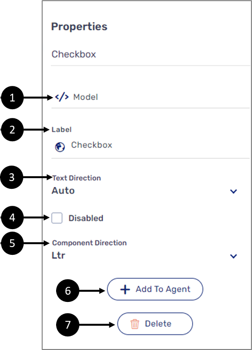
Figure 1: Checkbox Properties Section
Table 1: Checkbox Properties Section
Number | Icon | Name | Description |
1 |
| Model | Enables to connect the component to the Model by:
NOTE
|
2 |
| Label | Enables to set the label of the component NOTE The globe icon allows you to set the label of the component in different languages and will appear only if the Webflow is set with more than one language, for additional information, see the Multi-Language article |
3 | - | Text Direction | Enables to set the text direction of the label:
|
4 | - | Disabled |
|
5 | - | Component Direction | Enables to set the direction of the Checkbox:
|
6 | - | + Add to Agent | Enables to add the component to the Agent screen NOTE This button will only appear if the Journey Sender feature is enabled, for additional information, see the Journey Sender article |
7 | - | Delete | Enables to delete the component |


Radio Question
After adding the Radio Question component, configure its properties, design its look, and connect it to the Model. Figure 2 and Table 2 describe the properties of the Radio Question component:
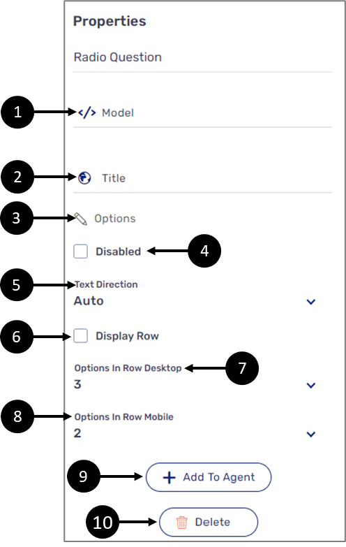
Figure 2: Radio question Properties Section
Table 2: Radio Question Properties Section
Number | Icon | Name | Description |
1 |
| Model | Enables to connect the component to the Model by:
NOTE
|
2 |
| Title | Enables to set the title of the component NOTE The globe icon allows you to set the title of the component in different languages and will appear only if the Webflow is set with more than one language, for additional information, see the Multi-Language article |
3 |
| Options | Displays the Options window |
4 | - | Disabled |
|
5 | - | Text Direction | Enables to set the direction of the radio question:
|
6 | - | Display Row |
|
7 | - | Options In Row Desktop | Enables to set the number of radio question options that will be displayed in a horizontal row, between 1 and 10 NOTE
|
8 | - | Options In Row Mobile | Enables to set the number of radio question options that will be displayed in a horizontal row (for mobile view), between 1 and 10 NOTE
|
9 | - | + Add to Agent | Enables to add the component to the Agent screen NOTE This button will only appear if the Journey Sender feature is enabled, for additional information, see the Journey Sender article |
10 | - | Delete | Enables to delete the component from the canvas |


The Options Window
(See Figure 3)
the Options window enables you to add (1) and set the options of a radio question. Each option is comprised out of a text (2) and a value (3). The text is displayed while using the digital process and value is used for conditions, expressions, or for displaying the selected radio question option on top of a PDF. For additional information, see the Model Implementation and the Creating and Defining a PDF articles
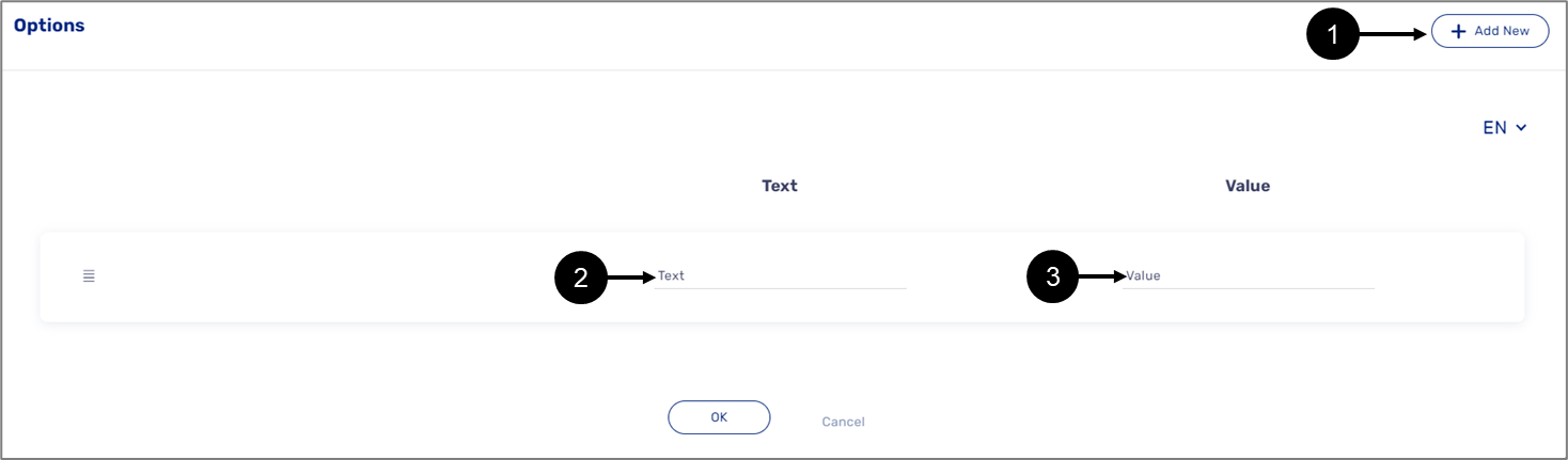
Figure 3: Options Window
How to Videos
To quickly learn how to use Multiple Choice components, watch the following videos:
- Checkbox Component:
- Radio Question: