Input Components Properties
The following sections detail the properties of the Input section components:
- Text Input
- Upload competent
- Signature
- Date Input
- Form Text Area
Based on the Theme you are using, some of the components may appear under a different name or be found under an Advanced category different category, for additional information, see the Theme Overview article.
Text Input
After adding the Text Input component, configure its properties, design its look, and connect it to the Model.
Figure 1 and Table 1 describe the properties of the Text Input component:
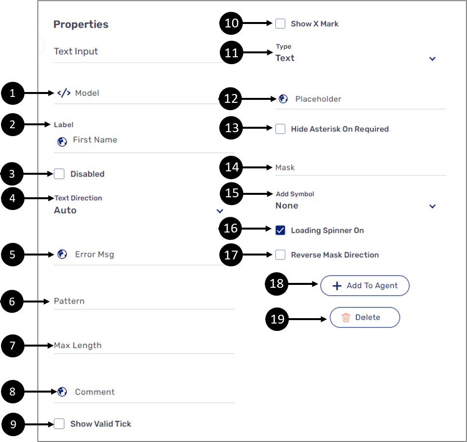
Figure 1: Text Input Properties Section
Table 1: Text Input Properties Section
Number | Icon | Name | Description |
| 1 |  | Model | Enables to connect the component to the Model by:
NOTE
|
2 |
| Label | Enables to add a label to the component NOTE The globe icon allows you to add labels in different languages and will appear only if the Webflow is set with more than one language, for additional information, see the Multi-Language article |
3 | - | Disabled |
|
4 | - | Text Direction | Enables to set the text direction of the component:
|
5 |
| Error Msg | NOTE The Model validations replaced this option, for additional information, see the Validations article |
6 | - | Pattern | Enables to set text input patterns:
|
7 | - | Max Length | Enables to set a maximum input length |
8 |
| Comment | Enables to write a comment underneath the text input field NOTE The globe icon allows you to write the comment in different languages and will appear only if the Webflow is set with more than one language, for additional information, see the Multi-Language article |
9 | - | Show Valid Tick |
|
10 | - | Show X Mark |
|
11 | - | Type | Enables to set the input type:
NOTE When a digital process runs on a mobile device, different keyboards (text or numbers ) will appear automatically |
12 |
| Placeholder | Enables to add a placeholder to the text input field NOTE The globe icon allows you to write the placeholder in different languages and will appear only if the Webflow is set with more than one language, for additional information, see the Multi-Language article |
13 | - | Hide Asterisk On Required |
NOTE A field is set as required using the Model validations, for additional information, see the Validations article |
14 | - | Mask | Enables to input a string of characters that indicates the valid input values:
NOTE
|
15 | - | Add Symbol | Enables to add a symbol next to the text to input:
NOTE An added symbol does not appear on a PDF, it is only visible on the UI of the digital process |
16 | - | Loading Spinner On | Enables to display a spinner when input data is loading automatically NOTE Input data can be loaded automatically when setting the input value to Autocomplete Service using the Model, for additional information, see the Values article |
17 | - | Reverse Mask Direction | Enables to reverse the direction of the mask that was set |
18 | - | + Add to Agent | Enables to add the component to the Agent screen NOTE This button will only appear if the Journey Sender feature is enabled, for additional information, see the Journey Sender article |
19 | - | Delete | Enables to delete the component |


Upload Component
After adding the Upload Component, configure its properties, design its look, and connect it to the Model. Figure 2 and Table 2 describe the properties of the Upload component:
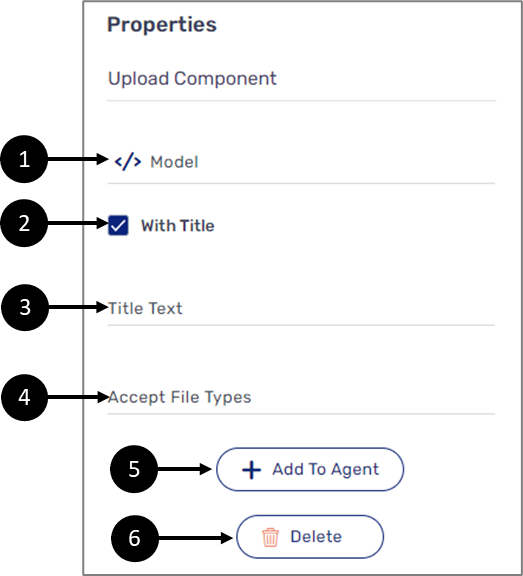
Figure 2: Upload Component Properties Section
Table 2: Upload Component Properties Section
Number | Icon | Name | Description |
1 |
| Model | Enables to connect the component to the Model by:
NOTE
|
2 | - | With Title |
|
3 | - | Title Text | Enables to set the title of the component NOTE The title will be displayed if the With Title option is checked |
4 | - | Accept File Types | EasySend supports all file types for upload, for best practice, it is recommended to limit the file types an end-user can upload while using a digital process to ensure protection and accuracy NOTE
|
5 | - | + Add to Agent | Enables to add the component to the Agent screen NOTE This button will only appear if the Journey Sender feature is enabled, for additional information, see the Journey Sender article |
6 | - | Delete | Enables to delete the component |

Signature
After adding the Signature component, configure its properties, design its look, and connect it to the Model. Figure 3 and Table 3 describe the properties of the Signature component:
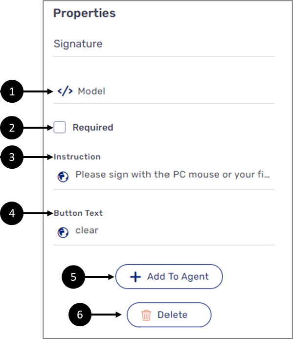
Figure 3: Signature Component Properties Section
Table 3: Signature Component Properties Section
Number | Icon | Name | Description |
13 |
| Model | Enables to connect the component to the Model by:
NOTE
|
2 | - | Required |
|
3 |
| Instruction | Enables to set instructions that describe how to use the component NOTE The globe icon allows you to write instructions in different languages and will appear only if the Webflow is set with more than one language, for additional information, see the Multi-Language article |
4 |
| Button Text | Enables to set the text of the button NOTE The globe icon allows you to write the button text in different languages and will appear only if the Webflow is set with more than one language, for additional information, see the Multi-Language article |
5 | - | + Add to Agent | Enables to add the component to the Agent screen NOTE This button will only appear if the Journey Sender feature is enabled, for additional information, see the Journey Sender article |
6 | - | Delete | Enables to delete the component |


Date Input
After adding the Date Input component, configure its properties, design its look, and connect it to the Model. Figure 4 and Table 4 describe the properties of the Date Input component:
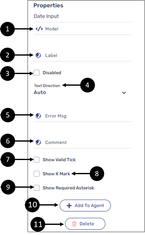
Figure 4: Date Input Component Properties Section
Table 4: Date Input Component Properties Section
Number | Icon | Name | Description |
| 1 |  | Model | Enables to connect the component to the Model by:
NOTE
|
2 |
| Label | Enables to add a label to the component NOTE The globe icon allows you to add labels in different languages and will appear only if the Webflow is set with more than one language, for additional information, see the Multi-Language article |
3 | - | Disabled |
|
4 | - | Text Direction | Enables to set the text direction of the component:
|
5 |
| Error Msg | NOTE This option was replaced by the Model validations, for additional information, see the Validations article |
6 |
| Comment | Enables to write a comment underneath the date input field NOTE The globe icon allows you to write the comment in different languages and will appear only if the Webflow is set with more than one language, for additional information, see the Multi-Language article |
7 | - | Show Valid Tick |
|
| 8 | - | Show X Mark |
|
| 9 | - | Show Required Asterisk |
NOTE A field is set as required using the Model validations, for additional information, see the Validations article |
10 | - | + Add to Agent | Enables to add the component to the Agent screen NOTE This button will only appear if the Journey Sender feature is enabled, for additional information, see the Journey Sender article |
11 | - | Delete | Enables to delete the component |


Form Text Area
After adding the From Text Area component, configure its properties, design its look, and connect it to the Model. Figure 5 and Table 5 describe the properties of the Date Input component:
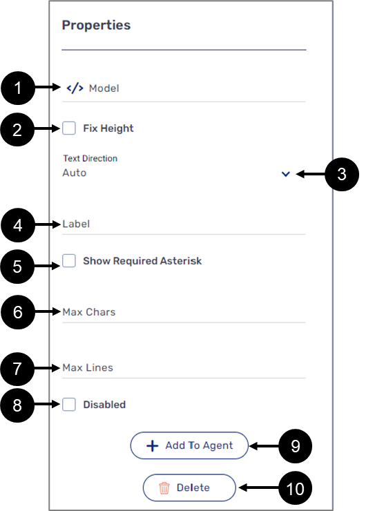
Figure 5: Form Text Area Component Properties Section
Table 5: Form Text Area Component Properties Section
Number | Icon | Name | Description |
| 1 | | Model | Enables to connect the component to the Model by:
NOTE
|
| 2 | - | Fix Height |
|
| 3 | - | Text Direction | Enables to set the text direction of the component:
|
4 |
| Label | Enables to add a label to the component NOTE The globe icon allows you to add labels in different languages and will appear only if the Webflow is set with more than one language, for additional information, see the Multi-Language article |
| 5 | - | Show Required Asterisk |
NOTE A field is set as required using the Model validations, for additional information, see the Validations article |
| 6 | - | Max Chars | Enables to set the maximum number of characters allowed to input |
| 7 | - | Max Lines | Enables to set the maximum number of input lines |
8 | - | Disabled |
|
9 | - | + Add to Agent | Enables to add the component to the Agent screen NOTE This button will only appear if the Journey Sender feature is enabled, for additional information, see the Journey Sender article |
10 | - | Delete | Enables to delete the component |
How to Videos
To quickly learn how to use Input components, watch the following videos.
- Text Input:
- Upload Component:
- Signature:
- Date Input: