Article Overview
The following article details the design capabilities of the Radio with Image component.
Design Guidelines
Figure 1 and Table 1 describe the design capabilities of the Radio with Image component:
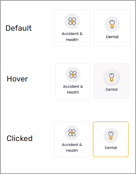
Figure 1: Design Capabilities
Table 1: Design Capabilities
Element | Design attribute | Change on hover? | Change on disable? | Change on focus? | Notes |
| Background | color | Yes | Yes | Yes | |
| Error | color | No | No | No | |
| font | No | No | No |
| |
| align | No | No | No | ||
| Border | color | Yes | Yes | No | |
| radius | No | No | No | ||
| type | No | No | No | ||
| size | No | No | No | ||
| style | No | No | No | For example:
| |
| Title | color | No | No | No | |
| font | No | No | No |
| |
| padding | No | No | No |
| |
| align | No | No | No | ||
| Checkmark | color | No | No | No | |
| Outerbox | color | No | No | No | |
| padding | No | No | No | ||
| box | height, width | No | No | No | |
| Layout | style | No | No | No |
|
| Images | size | No | No | No | |
| Options | color | Yes | Yes | No | |
| background color | Yes | No | No | ||
| font | No | No | No |
| |
| Selected | background color | Yes | No | No | |
| Color | Yes | No | No | ||
| border | No | No | No |
|