Media Components Properties
The following sections detail the properties of the Media section components:
- Dynamic Image
- Preview
Based on the Theme you are using, some of the components may appear under a different name or be found under an Advanced category different category, for additional information, see the Theme Overview article.
Dynamic Image
After adding the Dynamic Image component, configure its properties, design its look, and connect it to the Model. Figure 1 and Table 1 describe the properties of the Dynamic Image component:
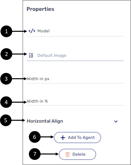
Figure 1: Dynamic Image Properties Section
Table 1: Dynamic Image Properties Section
Number | Icon | Name | Description |
1 |
| Model | Enables to connect the component to the Model by:
NOTE
|
2 |
| Default Image | Enables to set a .jpg or .png as a default image NOTE
|
3 | - | Width in pixels (px) | Enables to set the width of the image in pixels |
4 | - | Width in % | Enables to set the width of the image in percentages |
5 | - | Horizontal Align | Enables to set the horizontal alignment of the image:
|
6 | - | + Add to Agent | Enables to add the component to the Agent screen NOTE This button will only appear if the Journey Sender feature is enabled, for additional information, see the Journey Sender article |
7 | - | Delete | Enables to delete the component from the canvas |


Preview Properties
After adding the Preview component to the canvas, configure its properties. Figure 2 and Table 2 describe the properties of the Preview component:
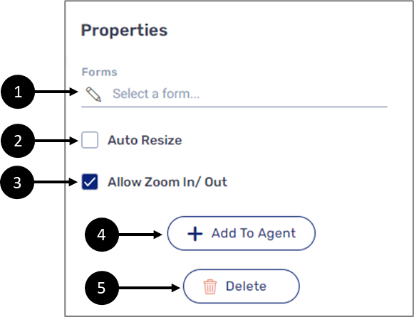
Figure 2: Preview Properties Section
Table 1: Preview Properties Section
Number | Icon | Name | Description |
1 |
| Forms | Enables to attach a PDF form to the component by clicking the pencil icon NOTE
|
2 | - | Auto Resize |
|
3 | - | Allow Zoom In/ Out |
|
4 | - | + Add to Agent | Enables to add the component to the Agent screen NOTE This button will only appear if the Journey Sender feature is enabled, for additional information, see the Journey Sender article |
5 | - | Delete | Enables to delete the component from the canvas |

How to Videos
To quickly learn how to use Media components, watch the following videos.
- Dynamic Image:
- Preview: