Buttons Components Properties
The following sections detail the properties of the Buttons section components:
- Form Button
- Array Buttons
Based on the Theme you are using, some of the components may appear under a different name or be found under an Advanced category different category, for additional information, see the Theme Overview article.
Form Button Properties
After adding the Form Button component to the canvas, configure its properties, design its look, and connect it to the Model.
Figure 1 and Table 1 describe the properties of the From Button component:
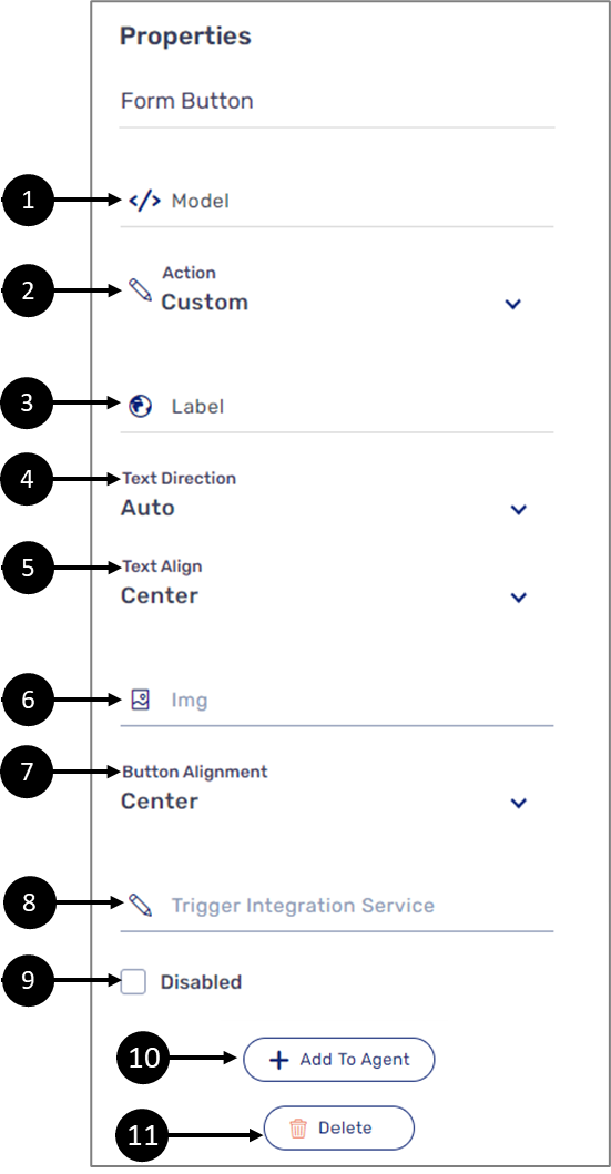
Figure 1: Form Button Properties Section
Table 1: Form Button Properties Section
Number | Icon | Name | Description |
| 1 |  | Model | Enables to connect the component to the Model by:
NOTE
|
| 2 |  | Action | Enables to set the Form Button with a built-in action or with an action customized with code:
NOTE
|
3 |
| Label | Enables to set the label of the component NOTE The globe icon allows you to set the label of the button in different languages and will appear only if the Webflow is set with more than one language, for additional information, see the Multi-Language article |
4 | - | Text Direction | Enables to set the direction of the Form Button label:
NOTE The text direction is noticeable only when special characters such as #,$,? are part of the label text |
5 | - | Text Align | Enables to set the alignment of the label:
|
6 |
| Img | Enables to select an image file such as .jpg and .png to be displayed in addition to the label of the Form Button NOTE Image files must be added to the Theme of the Webflow before they are available for selection. For additional information about Themes, see the Themes Overview article |
7 | - | Button Alignment | Enables to set the alignment of the Form Button:
|
8 |
| Trigger Integration Service | Not covered in this article |
9 | - | Disabled |
|
10 | + Add to Agent | Enables to add the component to the Agent screen NOTE This button will only appear if the Journey Sender feature is enabled, for additional information, see the Journey Sender article | |
11 | - | Delete | Deletes the component |


Array Buttons
After adding the Array Buttons component, configure its properties and connect it to the Model. Figure 2 and Table 2 describe the properties of the Array Buttons component:
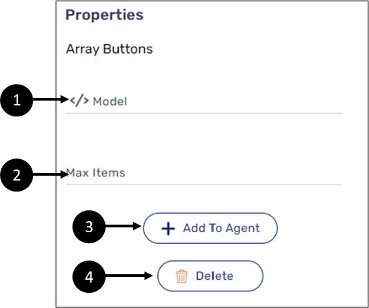
Figure 2: Array Buttons Component Properties Section
Table 2: Array Buttons Component Properties Section
Number | Icon | Name | Description |
1 |
| Model | Enables to connect the component to the Model by:
NOTE
|
2 | - | Max Items | Enables to set the maximum number of array items NOTE trying to add array items above the maximum set number by clicking the Add More button will result in nothing |
3 | - | + Add to Agent | Enables to add the component to the Agent screen NOTE This button will only appear if the Journey Sender feature is enabled, for additional information, see the Journey Sender article |
4 | - | Delete | Enables to delete the component |
