Webflow Structure
- PDF
Webflow Structure
- PDF
Article summary
Did you find this summary helpful?
Thank you for your feedback!
Article Overview
The following article describes the structure of a Webflow.
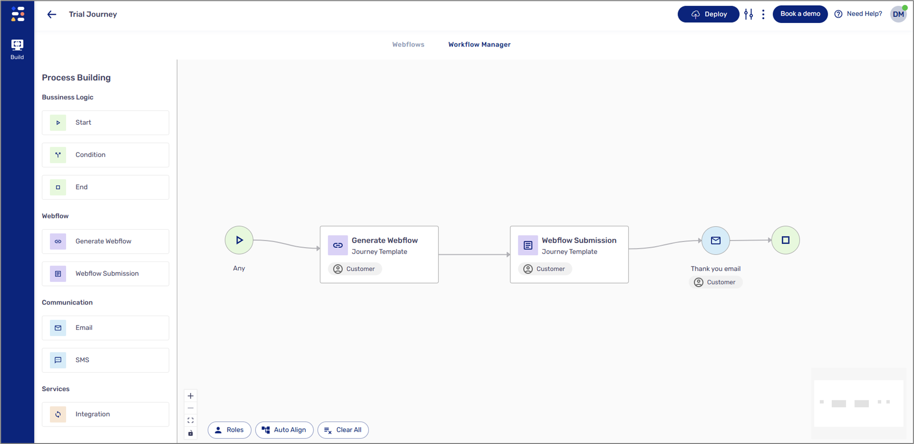
Structure Overview
(See Figure 1)
A Webflow is comprised of the following icons, sections, and tabs:
- Webflows tab - Displays the Webflow screen.
- Workflow Manager tab - Displays the Workflow Manager screen.
- Documents tab - Displays the Documents screen.
NOTE
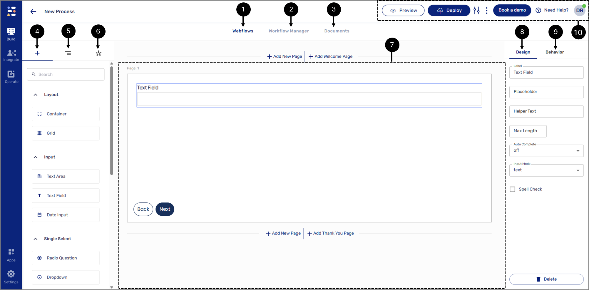
- Components
 - when this icon is clicked, the left section displays a list of components. The components are used to build the physical structure of a digital process.
NOTE
To learn about components, click here.
- Navigator
 - when this icon is clicked, the left section displays the logical structure and hierarchy of the components that were added to the canvas.
NOTE
To learn about the navigator, click here.
- Salesforce
 - when this icon is clicked, the left section displays fields for Salesforce integration.
NOTE
To learn about Salesforce integration, click here.
- Canvas - this section contains the added components.
NOTE
- If a process is not created from scratch, the canvas will contain automatically added components.
- All components besides the page are added by drag and drop.
- Design tab - when this tab is clicked, the right section displays the Design properties of a selected component.
NOTE
To learn more about the Design properties of each component, click here.
- Behavior tab - when this tab is clicked, the right section displays the options to add conditions and validations.
To learn about the Behavior tab, click here.
- The upper section - contains different options and buttons.
- Figure 1: Webflow Structure
The Upper Section
(See Figure 2)
- The upper section displays an icon with the initials of the user currently building the Webflow and its status indicator:
- Green - autosave is on.
- Orange - syncing.
- Red - offline/error
- Display the initials of the user/s currently editing the Webflow
NOTE
You can use the icon to sign out.
- The section enables you to ask for assistance.
- Book a demo - enables you to book a demo with an EasySend specialist.
- Clicking the More Options icon enables you to save a new version of the Webflow.
- Using the Process Settings screen, you can create different roles, configure your Salesforce integration, and set different themes for your process (see Figure 3).
NOTE
To learn more about themes, click here.
- Enables you to deploy the process.
- Enables you to view the process.
NOTE
To learn more about Deploy and Preview, click here.
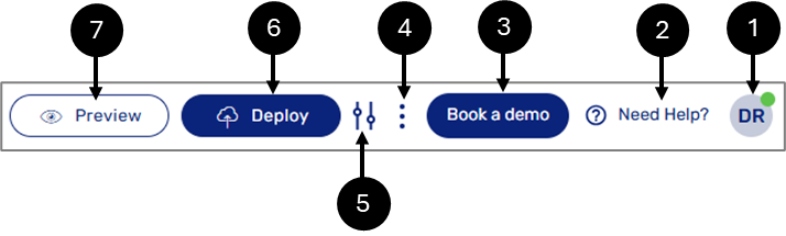
- Figure 2: Upper Section
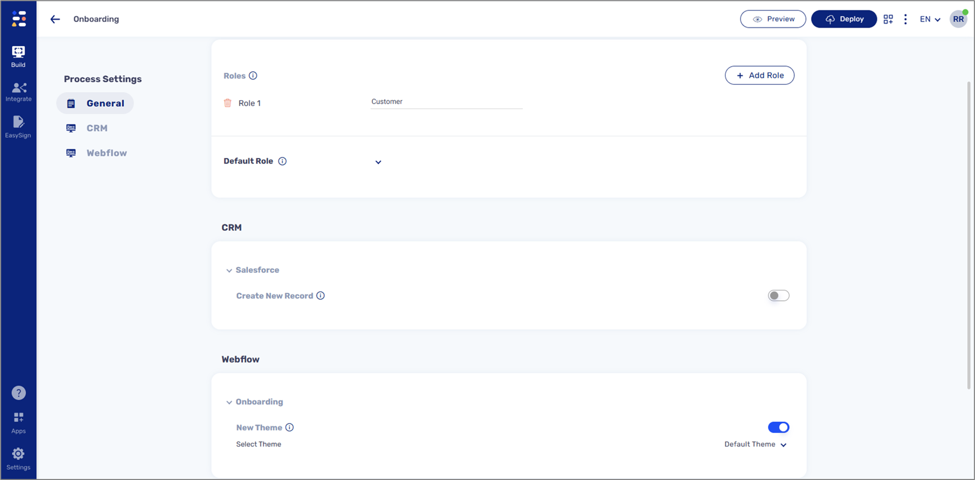
- Figure 3: Process Settings Screen
Deploy and Preview
(See Figure 4)
Deployment and preview refer to the process of publishing a digital process. They can be performed at various stages of development - for example, a user may deploy and preview the process for quality assurance testing or when it’s ready to be shared with the world. When a deployment process ends, it will display an indicator:
- Successful deployment

- The deployment process failed with errors

- The deployment process passed, but with warnings

After a successful deployment from the Webflows screen, a link to the process becomes available for copying and pasting.
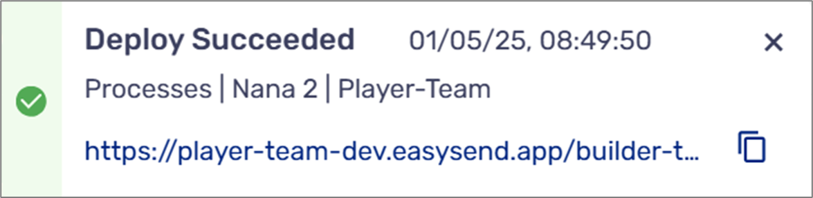
- Figure 4: Process Link
Was this article helpful?