The Add Component Section
The following article describes the most widely used global components.
What is the Add Component Section?
The Add Component section contains all the components you can add to the canvas to build a Webflow. Components are added by dragging them onto the canvas or by clicking them. Based on the Theme you are using, some of the components may appear under a different name or will be found under a different category, for additional information, see the Theme Overview article.
Add Component Section Structure
Figure 1 and Table 1 describe the structure of the Add Component section.
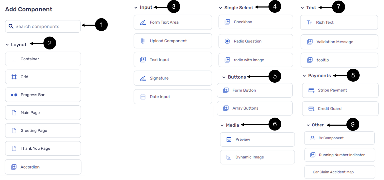
Figure 1: Add Component Section
Table 1: Add Component Section
Number | Name | Description |
1 | Search Bar | Enables the search for components by name within a section |
2 | Layout | Contains the following components:
|
3 | Input | Contains the following components:
|
4 | Single Select | Contains the following components:
|
5 | Buttons | Contains the following components:
|
6 | Media | Contains the following components:
|
7 | Text | Contains the following components:
|
| 8 | Payments | Contains the following components:
NOTE The Payment Solutions components will appear according to customer settings, for additional information please contact our support team |
| 9 | other | Contains the following components:
NOTE The Car Claim Accident Map component will appear according to customer settings, for additional information please contact our support team |
Adding Components Guidelines
(See Figure 2 and Figure 3)
When building a new Webflow, only the page components will be available to add to the canvas at first, either by drag and drop (1) or by clicking the Add a new page button (2) and then clicking the appropriate component (3).
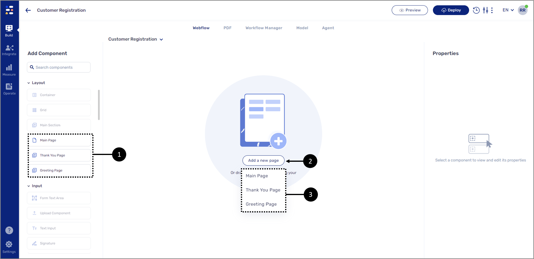
Figure 2: Adding Page Components
Once one of the page components is added the rest of the components become available and can be added on top of them by a drag and drop.
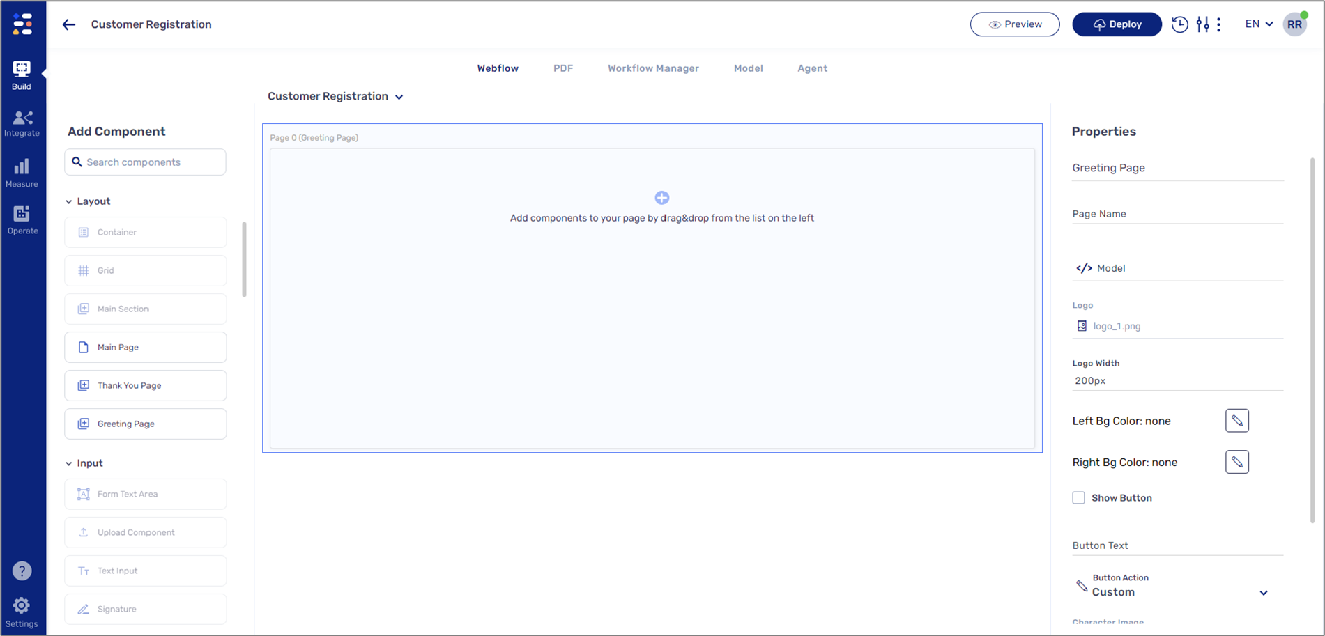
Figure 3: Adding All Components
Layout Components Description
The following components can be found under Layouts:
- Container - a component that contains other components. The Container is used in conjunction with other components like the Grid to ensure that content does not exceed a reasonable width for display. The Container is also used to group components together to apply conditions or permissions.
- Grid - a framework that helps to arrange different components while maintaining a good visual balance.
- Progress Bar - this component visually displays the progression of a digital process.
- Main Page - a gateway to the content, functionality, and logic of the Webflow and the overall Webflow design.
A Webflow will usually contain at least one Main Page. All other components (except for the Greeting and Thank You pages) are added on top of the Main Page.
The Main Page has two built-in Form Button components (for additional details, see the Buttons Components Description section) that will become functional once they are configured through the Properties section. The Main Page also contains a built-in Co-browsing option that enables end-users to send a link of the digital process via email to receive/provide real-time remote assistance. End-users will be able to browse the digital process online together and input information when required.
- Accordion - this component displays/hides other components in a collapsed design.
Figure 4 displays a Main Page (1) with a Progress Bar (2), a Container (3), a Grid (4), and four Text Input components (5). The Main Page also contains a multiple-choice Radio Question component (6):
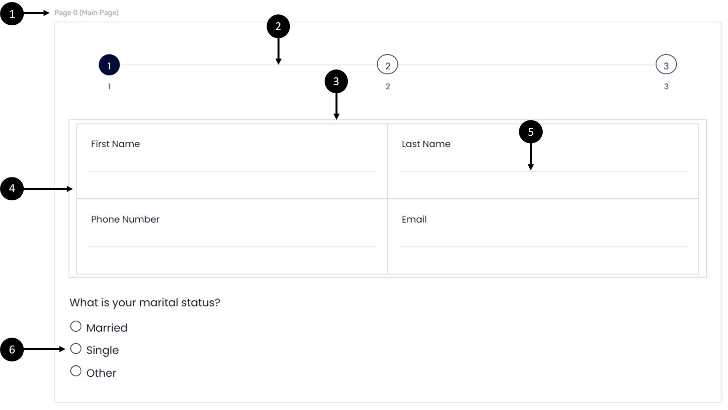
Figure 4: Layout Components
Figure 5 displays a Main Page (1) with an Accordion component (2) containing a Rich Text component (3):
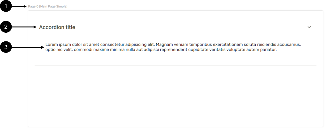
Figure 5: Layout Components - Accordion
When the process is viewed, the Accordion component displays or hides (4) the text (5) (see Figure 6):
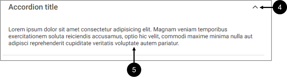
Figure 6: Accordion with Text
Figure 7 displays a Main Page of a digital process. The Main Page contains a Co-browsing button (1) and the email input window (2) that appears when clicking it. The Main Page also contains two built-in Form Buttons to use for navigation (3):
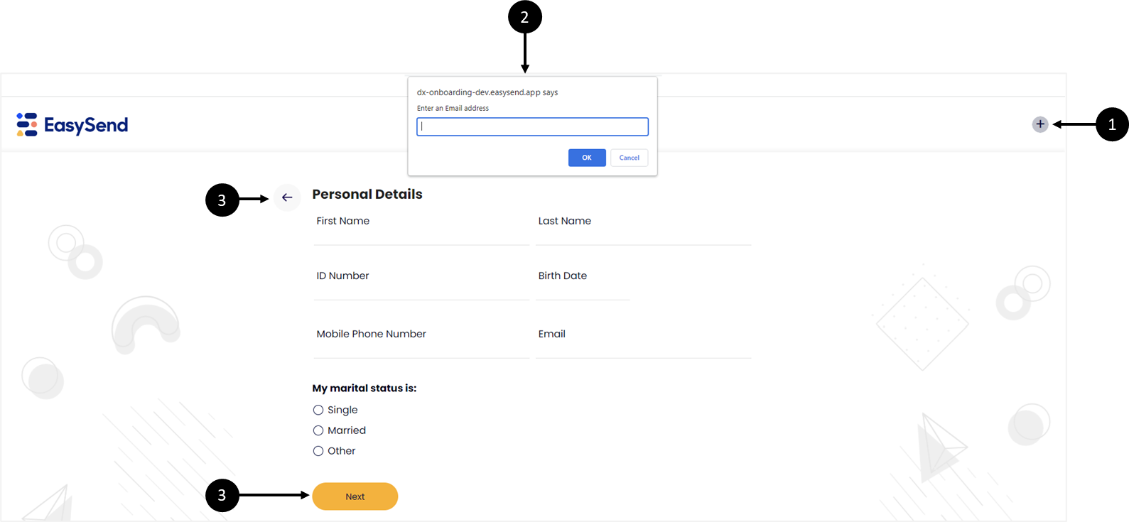
Figure 7: Main Page with Co-browsing and Form Buttons
Co-browsing enables digital process end-users to share the link of a digital process via email and invite other users such as agents or reps to provide real-time online support to quickly bring any processes to a close. With Co-browsing, agents or reps can guide end-users through any digital process whether they are connected through mobile, tablet, or desktop. Data input by the end-users immediately appears on the agent or rep screen and vice versa. When changing a page, the page simultaneously changes for all.
- Greeting Page - a welcome page that your end-users see when they interact with a digital process. It usually contains a text message that tells them what they are about to do and a button that they can click to continue with the rest of the process. The Greeting Page is the first chance for end-users to experience the look and feel of your digital process. Other components, except for the Main Page and the Thank You Page, can also be placed above the Greeting Page. Figure 8 displays an example of a Greeting Page with the following components:
- Dynamic Image (1)
- Rich Text component (2)
- Form Button (3)
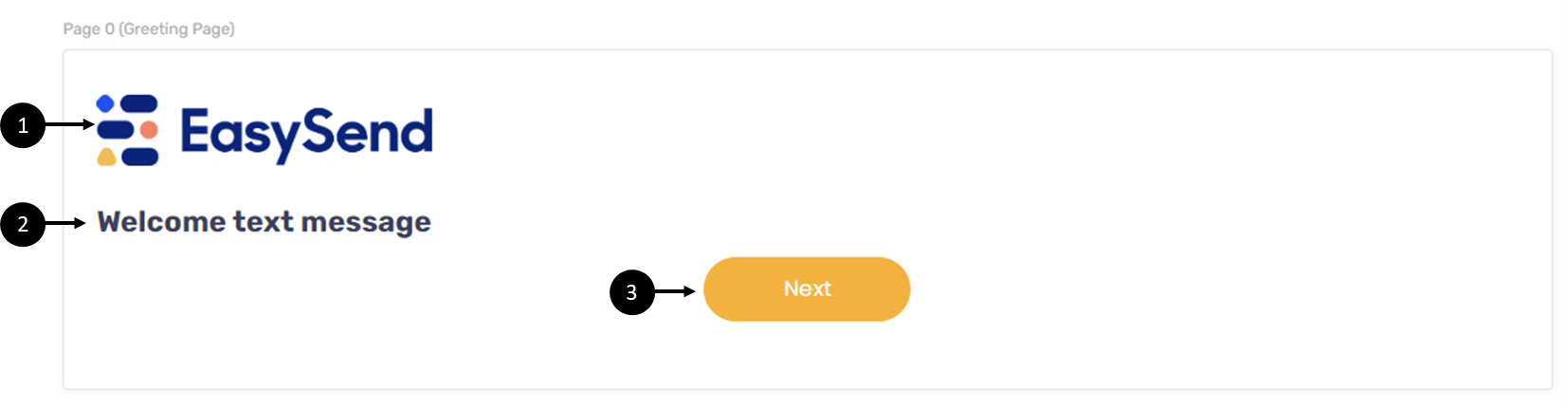
Figure 8: Greeting Page
- Thank You Page - a page that appears at the end of a digital process. It usually contains a text message that indicates to the end-user that a digital process step or the entire digital process was completed. Other components, except for the Main Page and the Greeting Page, can also be placed above the Thank Page. Figure 9 displays an example of a Thank You Page with the following components:
- Dynamic Image (1)
- Br component (2)
- Rich Text component (3)
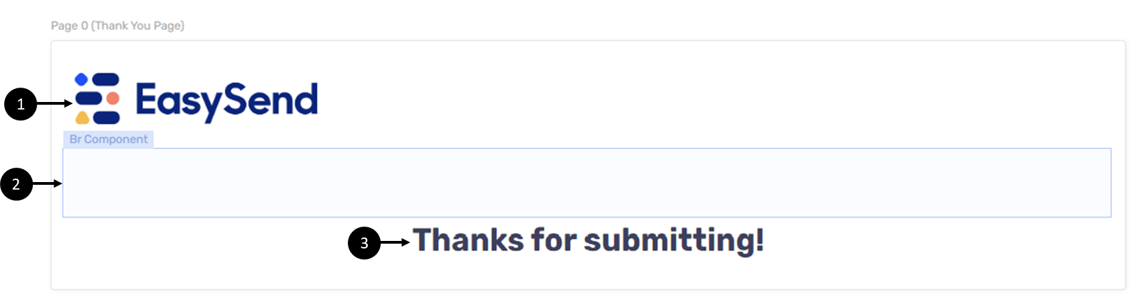
Figure 9: Thank You Page
Input Components Description
The following components can be found under Input:
- Form Text Area - this component is used by end-users to enter a relativity large amount of free text.
- Upload Competent - this component is used for uploading different files as attachments.
You can limit the types of uploaded files through the Properties section of the component. For additional information see the Other Components Properties article.
- Text Input - by default, this component enables end-users to input textual information while interacting with the digital process. Using the Model Values feature, the component can automatically display pre-populated data, when using an expression for example, or display information through an autocomplete function.
- Signature - this component enables end-users to draw a graphic signature in their digital process.
- Date Input - this component enables end-users to enter a date.
Figure 10 displays a Main Page with a Grid. The Grid contains Text Input components (1) and Date Input (2). The Main Page also contains a Form Text Area (3), an Upload component (4), and a Signature (5).
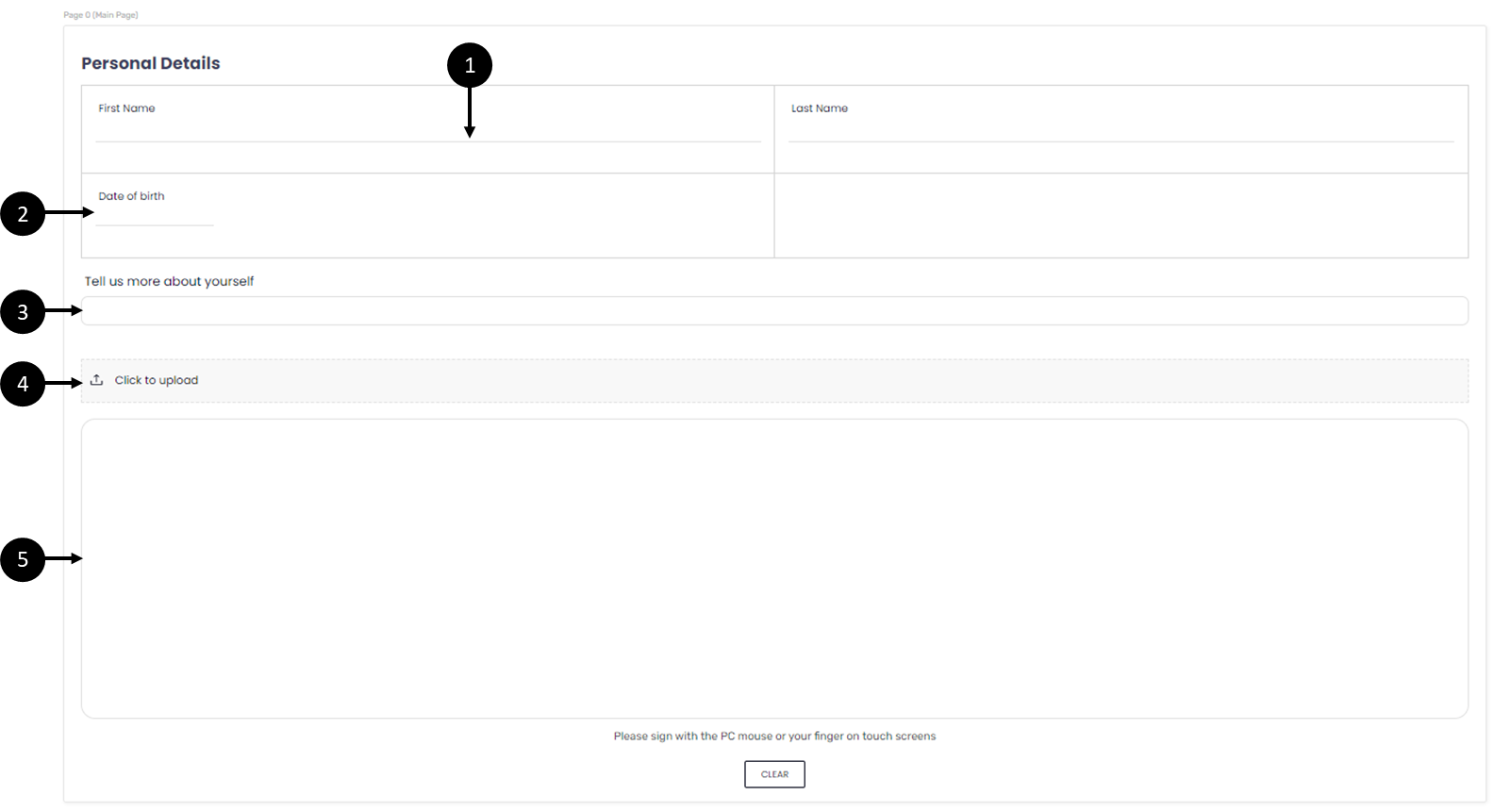
Figure 10: Input Components
Single Select Components Description
The following components can be found under Single Select:
- Checkbox - presents the end-user with a range of options for selection. Within a group of Checkboxes, each operates individually, so the end-user can check or uncheck options independently. The Checkbox has two states that return a value. When checked the returned value is true and when unchecked the returned value is false.
- Radio Questions - radio button groups, in contrast to checkbox groups, limit the choice of the end-user to just one option from the range provided. A Radio Question item has two states, selected and non-selected. When selected, a value is returned. The value is defined through the Properties section.
- Radio with Image - this component is similar to the Radio Question component but its different options include images.
Figure 11 displays a Main Page with four Checkbox components (1), a Radio Question with three options (2), and a Radio with Image with eight options (3):
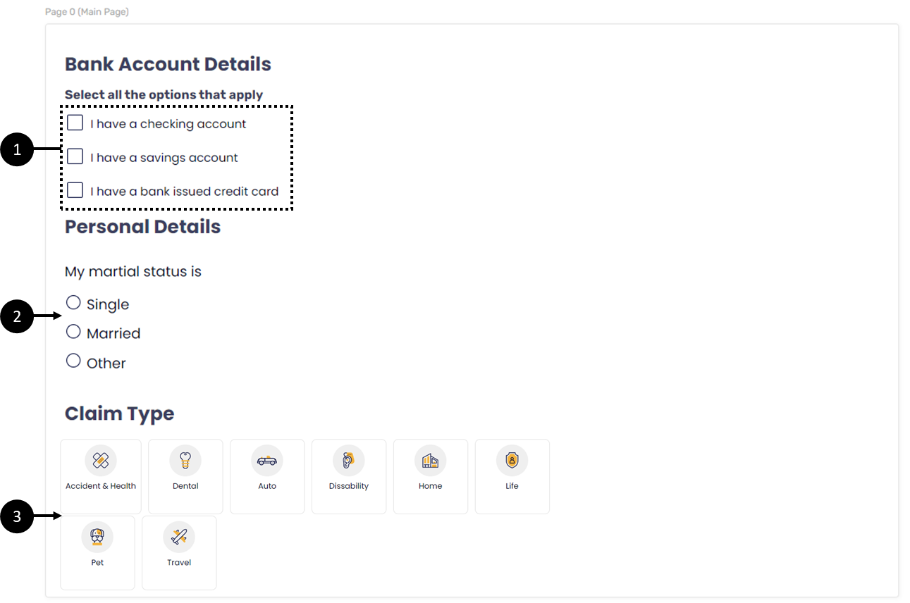
Figure 11: Single Select Components
Buttons Components Description
The following components can be found under Buttons:
- Form Button component - this component enables end-users to perform different actions such as:
- Navigate forward
- Navigate back
- Submit the process
- Create custom actions using code (not covered in this article)
- Array Buttons - this component enables the end-user to perform the following actions:
- Add More - add additional array items.
- Remove - delete an array item.
Figure 12 displays a Main Page with a Container, a Grid, and four Text Input components. The Array Buttons component (1) will enable the end-user to add additional items (Text Input components) or to remove them. The Form Button (2) will enable the end-user to submit the process:
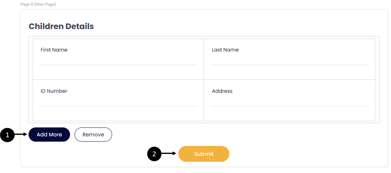
Figure 12: Buttons Components
Media Components Description
The following components can be found under Media:
- Dynamic Image - this component is used for uploading and displaying images. Often used for Uploading a logo image.
Images must first be uploaded to the theme selected in the Webflow. For additional information please contact our support team.
- Preview - this component displays a preview of the PDF that was uploaded to the digital process:
Figure 13 displays a Main Page with a Dynamic Image (1) and a Preview (2):
Figure 13: Media Components
Text Components Description
The following components can be found under Text:
- Rich Text - this component enables you to add static text or variables to the Main Page and edit them. The Rich Text components editing options are:
- Typographical emphasis (Bold, Italic, Underline, and Strikethrough)
- Create lists (ordered/unordered)
- Decrease/increase indent
- Text direction
- Font (type, size)
- Style (normal or headings)
- Adding variables
- Text and background color
- Line height
- Adding links
- Clear format
- Validation Message - this component displays an error message in case a validation was triggered. The component must be implemented with code. It can be placed anywhere in the Webflow and it is not attached to another component but to a data item.
- Tooltip - this component displays help text while using the digital process. The text will appear when hovering above the component.
Figure 14 displays a Main Page with a Rich Text (1), a Tooltip (2), and a Validation Message (3):
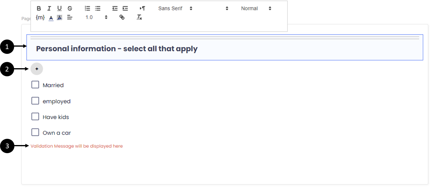
Figure 14 : Rich Text and Preview
Payment Solutions Components Description
The following components can be found under Payment Solutions:
- Stripe - a global payment-processing platform that provides infrastructure for businesses to accept and manage online payments. Integrating Stripe with EasySend enables one-time and recurring payment processing. There are two Stripe components:
- Stripe Set Price - this component is used when the price of a Stripe product is fixed or dynamically calculated.
- Stripe Catalog Price - this component is used when there is an existing pre-configured Stripe price ID.
- Credit Guard is a global payment-processing platform that provides infrastructure for accepting and managing online payments.
Figure 15 displays a Main Page (1) with an added Stripe Payment component (2):
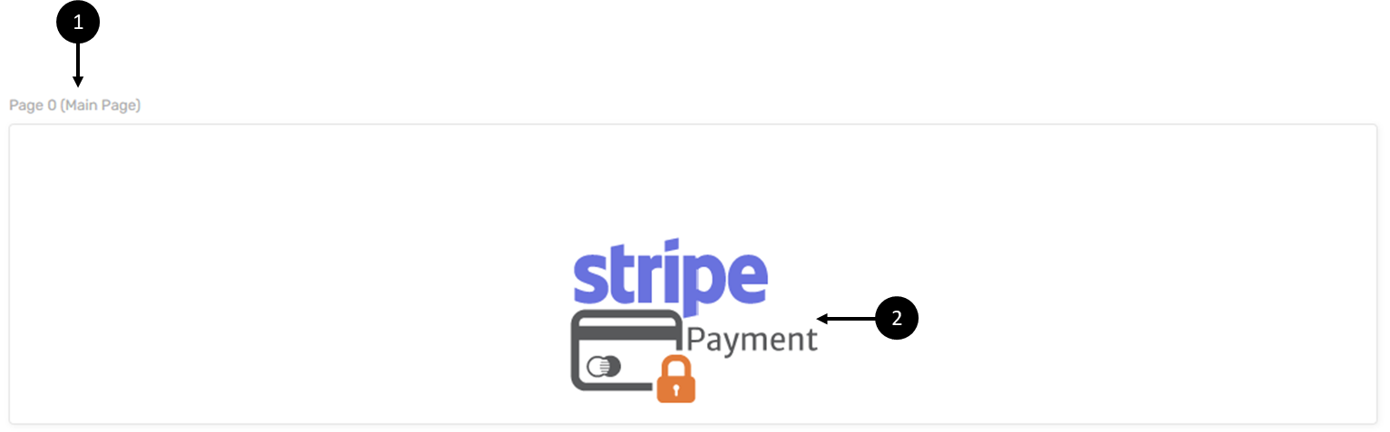
Figure 15: Stripe Payment Component
Figure 16 displays a Main Page (1) with an added Credit Guard component (2):
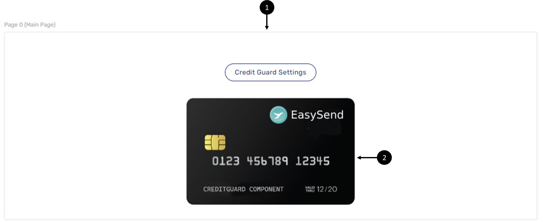
Figure 16: Credit Guard Component
Other Components Description
The following components can be found under Other:
- Br Component - this component creates spacing between components.
- Running Number Indicator - this component creates serial numbering for array items.
Figure 17 displays a Main Page (1) with a Dynamic Image for a logo (2), a Br Component (3) for spacing, a Container (4) containing a Running Number Indicator (5), and a Grid (6) with two Text Input components (7), and Array Buttons (8):
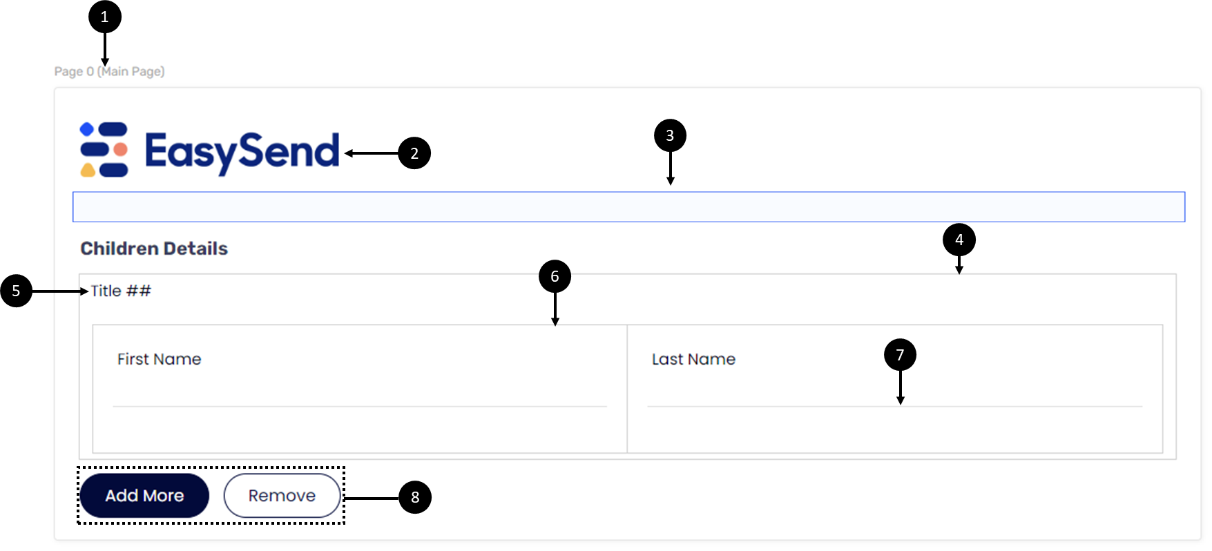
Figure 17: Other Components Part
- Car Claim Accident Map - while using a digital process for car accident claims, in addition to filling in all the required information such as policy type and other driver details, the end-user can use the Car Claim Accident Map to draw, visually display, and describe the steps and events that led to the accident.
To add the Car Claim Accident Map component to a Webflow, some configurations to its Properties are required. To display its image, a PDF must be added, defined, and attached to the Preview component.
Figure 18 displays a Main Page (1) with an added Car Claim Accident Map component (2) and a second Main Page (3) with a Preview component (4):
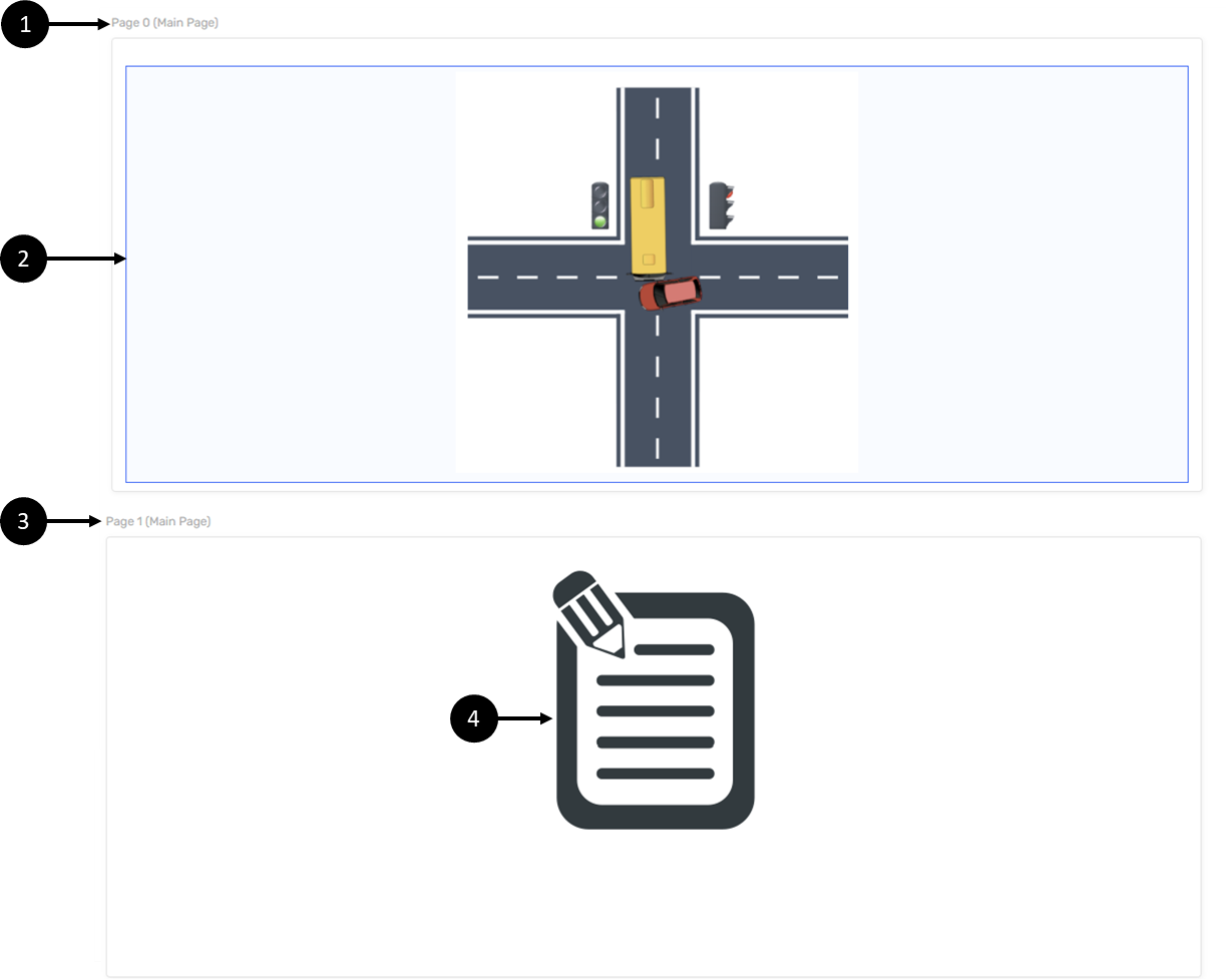
Figure 18: Car Claim Accident Map Component
If the Car Claim Accident Map component is not available, or if any assistance is required with adding it to a Webflow, please contact our support team.
The Properties Section
The following sections describe the Properties section of a Webflow.
What is the Properties Section?
The Properties section appears when components are added to the canvas of a Webflow.
Each component has its unique section with relevant properties. Properties are used to define different aspects of a component, for instance:
- Set up the look and feel of a component, such as a background picture, image, label text, alignment, height, width, and size.
- Define functionality of From Buttons and values of Radio Question items.
- Connect between a Preview component and a PDF form.
Using the Properties section, you can delete components from the Webflow, add them to the Journey Sender (for additional information, see the Journey Sender article), and connect them to the Model (for additional information, see the Model Overview and the Setting Up the Model articles).
Figure 19 displays the Properties section of a Dynamic Image Component:
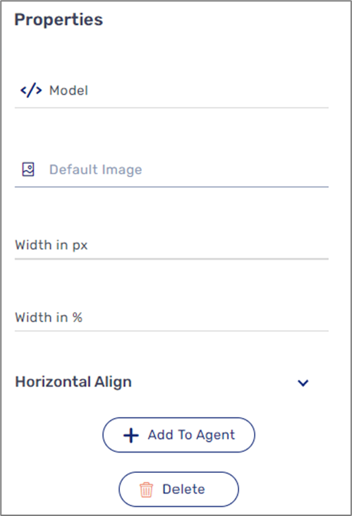
Figure 19: Dynamic Image Properties Section
The Properties Section and Model
(See Figure 20)
The Model is the backend of the digital process. Adding components to the canvas of a Webflow creates the structure of a digital process, but for a digital process to function, to be able to receive and display data, and to work by what you have defined and specified, the added components must be connected to the Model. Using the Model you can perform the following actions:
- Select the field type of each component, for example, string, object, or signature.
- Set input methods such as manual user input or an autocomplete service.
- Apply conditions.
- Add validation rules.
- Assign permissions.
The connection between components and the Model is defined in the Properties Section (1), for example:
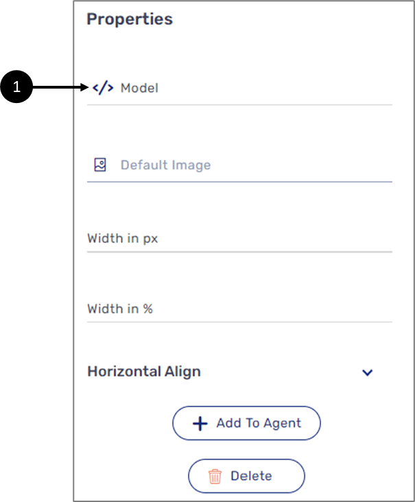
Figure 20: Model Field Connection