Article Overview
The following article describes level AA Web Content Accessibility Guidelines (WCAG) and how to implement them using EasySend's platform.
EasySend and the WCAG
WCAG were developed by the World Wide Web Consortium (W3C) and are widely accepted as the go-to standard for digital accessibility conformance. At the core of WCAG are testable requirements known as success criteria.
There are different success criteria, with each one assigned a level. It’s important to note that conformance at higher levels indicates conformance at lower levels. For example, by conforming to AA, a web page meets both the A and AA conformance levels. EasySend's platform supports success levels criteria A and AA. EasySend is committed to complying with accessibility standards to bring an easy way to create WCAG-compliant digital processes.
WCAG Level AA – Mid-Range Conformance
Level AA is the mid-range conformance level for accessibility requirements. Meeting these requirements is the level of conformance that most organizations aim to reach because it is above the minimum requirement but lower than the optimal AAA level, which may not always be possible.
At this level, within the current guidelines (WCAG 2.1) there are different criteria that EasySend's platform meets (see Table 1):
Table 1: Level AA Criteria
| Number | Version | Criterion | Link to Section |
| 1 | 1.3.4 | Orientation | Click here |
| 2 | 1.3.5 | Identify Input Purpose | Click here |
| 3 | 1.4.3 | Contrast Minimum | Click here |
| 4 | 1.4.4 | Resize Text | Click here |
| 5 | 1.4.5 | Images of Text | Click here |
| 6 | 1.4.10 | Reflow | Click here |
| 7 | 1.4.11 | Non-Text Contrast | Click here |
| 8 | 1.4.12 | Text Spacing | Click here |
| 9 | 1.4.13 | Content on Hover or Focus | Click here |
| 10 | 2.4.6 | Headings and Labels | Click here |
| 11 | 2.4.7 | Focus Visible | Click here |
| 12 | 3.1.2 | Language of Parts | Click here |
| 13 | 3.2.3 | Consistent Navigation | Click here |
| 14 | 3.2.4 | Consistent Identification | Click here |
| 15 | 3.3.3 | Error Suggestion | Click here |
| 16 | 3.3.4 | Error Prevention (Legal, Financial, Data) | Click here |
| 17 | 4.1.3 | Status Messages | Click here |
Orientation
The following sections describe the Orientation success criterion, what is it, and how to implement it in EasySend's platform.
What does it mean?
This success criterion requires that your website adapts to portrait and landscape views.
General Usage Examples
- Do not restrict your application or website to just work in landscape or portrait mode
- Make sure to honor the device settings while displaying the application in landscape or portrait mode
- How to Implement Using EasySend's Platform
How to Implement Using EasySend's Platform
Using custom code in the page components or custom components - please contact EasySend support for additional information
Identify Input Purpose
The following sections describe the Identify Input Purpose success criterion, what is it, and how to implement it in EasySend's platform.
What does it mean?
This success criterion requires that the purpose of input fields must be programmatically determinable.
General Usage Examples
- Provide programmatically determinable input purpose
- appropriate token values while using autocomplete attributes
- Do not use autocomplete on input fields that do not ask for user data
How to Implement Using EasySend's Platform
(See Figure 1)
- Verify that you are using the current input method (1) for data items connected to data input components, for example:
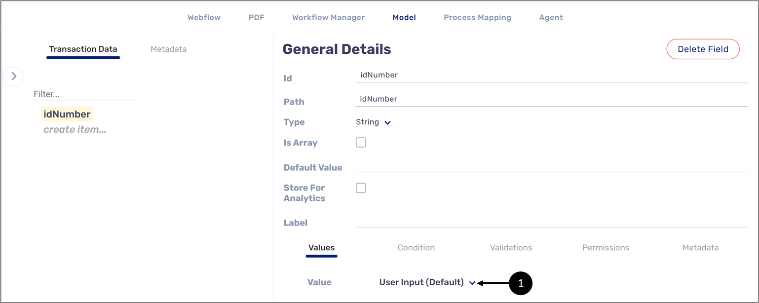
Figure 1: User Input Method
- Using custom code in the page components or custom components - please contact EasySend support for additional information
Contrast Minimum
The following sections describe the Meaningful Sequence success criterion, what is it, and how to implement it in EasySend's platform.
What does it mean?
This success criterion requires that the texts and images of texts that are regular in size meet the color contrast ratio of 4.5:1 against their background color.
General Usage Examples
- Develop the style guide in such a way that all the crucial texts meet the minimum contrast
- Choose color schemes that are contrastive enough for everyone to see and read
- Provide a “Contrast” mode with the help of alternative CSS if you cannot Design and develop the content with the minimum contrast requirement
How to Implement Using EasySend's Platform
Design your style guide using your theme.
Resize Text
The following sections describe the Resize Text success criterion, what is it, and how to implement it in EasySend's platform.
What does it mean?
This success criterion requires that Text can be resized to 200% without loss of content or function.
General Usage Examples
- Where browsers do not support or provide zoom functionality (IE6 as an example), provide alternative CSS for scaling purposes
- When zoomed to 200%, ensure there is not much horizontal scrolling (a best practice)
- Where lengthy user interface components or content like the subject line of an email is there, truncate and provide ways along with the instructions to access the content.
How to Implement Using EasySend's Platform
This criterion is supported by EasySend's platform - please contact EasySend support for additional information.
Images of Text
The following sections describe the Images of Text success criterion, what is it, and how to implement it in EasySend's platform.
What does it mean?
This success criterion requires that images of text will not be used.
General Usage Examples
- Provide site-wide controls to customize the images of texts when there are dynamically generated images of texts
- Use keyboard-generated symbols wherever possible instead of making them images
How to Implement Using EasySend's Platform
(See Figure 2)
Use the Add Symbol (1) property of the Text Input component to add different symbols (2).
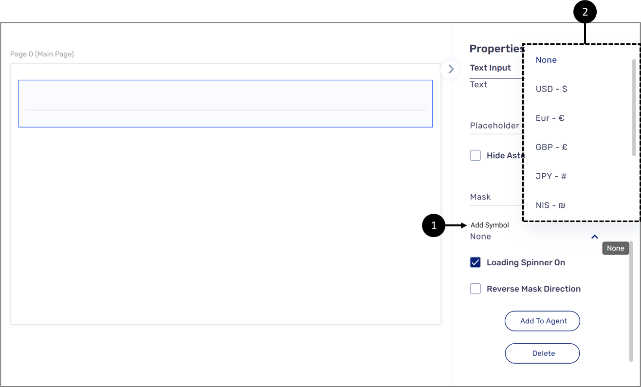
Figure 2: Required Validation
Reflow
The following sections describe the Reflow criterion, what is it, and how to implement it in EasySend's platform.
What does it mean?
This success criterion requires that content retains meaning and function without scrolling in two dimensions.
General Usage Examples
- Use Responsive Web Design (RWD) from the conception of design itself
- Use accessible links, modals, and toggle-type elements to show or hide content
- Avoid horizontal scroll bars in 400% zoom
- Avoid content overlaps, clipping, content loss, and functionality loss
How to Implement Using EasySend's Platform
Using custom code in the page components or custom components - please contact EasySend support for additional information
Non-Text Contrast
The following sections describe the Non-Text Contrast criterion, what is it, and how to implement it in EasySend's platform.
What does it mean?
This success criterion requires that The contrast between user interface components, graphics, and adjacent colors is at least 3:1.
General Usage Examples
- Ensure hit-areas and focus indicators have a 3:1 contrast ratio with their inner or outer background
- Ensure the checked/unchecked states meet the 3:1 ratio against their adjacent color to distinguish the states
- Ensure appropriate color combinations are chosen and defined for UI components to avoid uncomfortable retrofitting
How to Implement Using EasySend's Platform
(See Figure 3 to Figure 5)
- Use the theme to set different colors to a component by adding new colors as theme variables and linking them to relevant component vars, for example:

Figure 3: Color Theme Variable
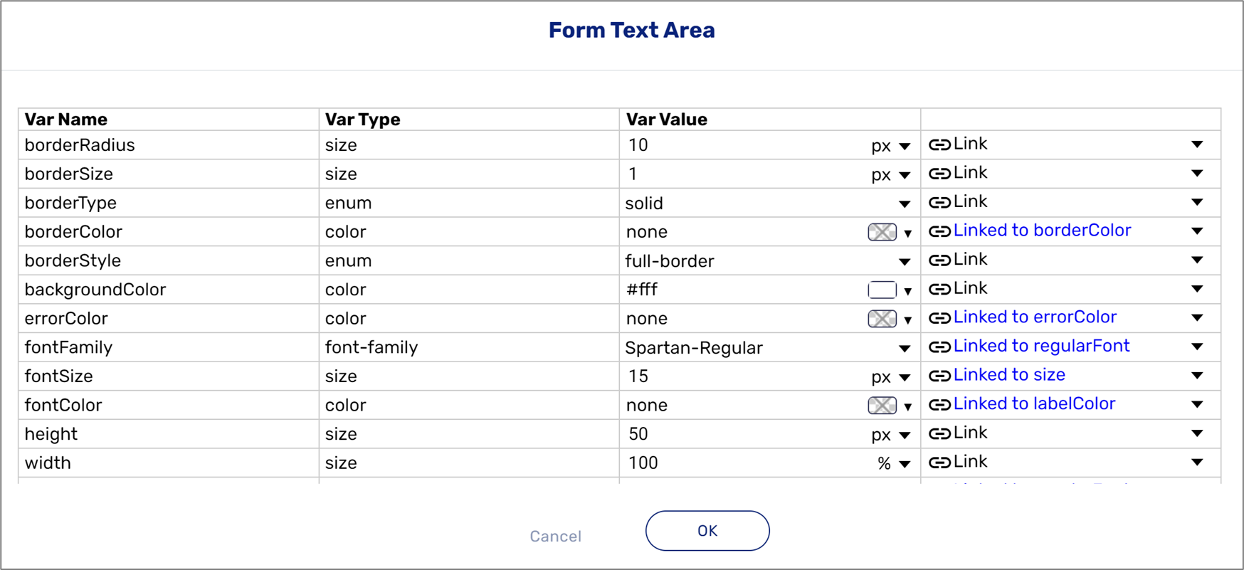
Figure 4: Linking Variables
- Use the theme to edit relevant Checkbox component variables to ensure that the checked/unchecked states meet the 3:1 ratio against their adjacent color to distinguish the states, for example:
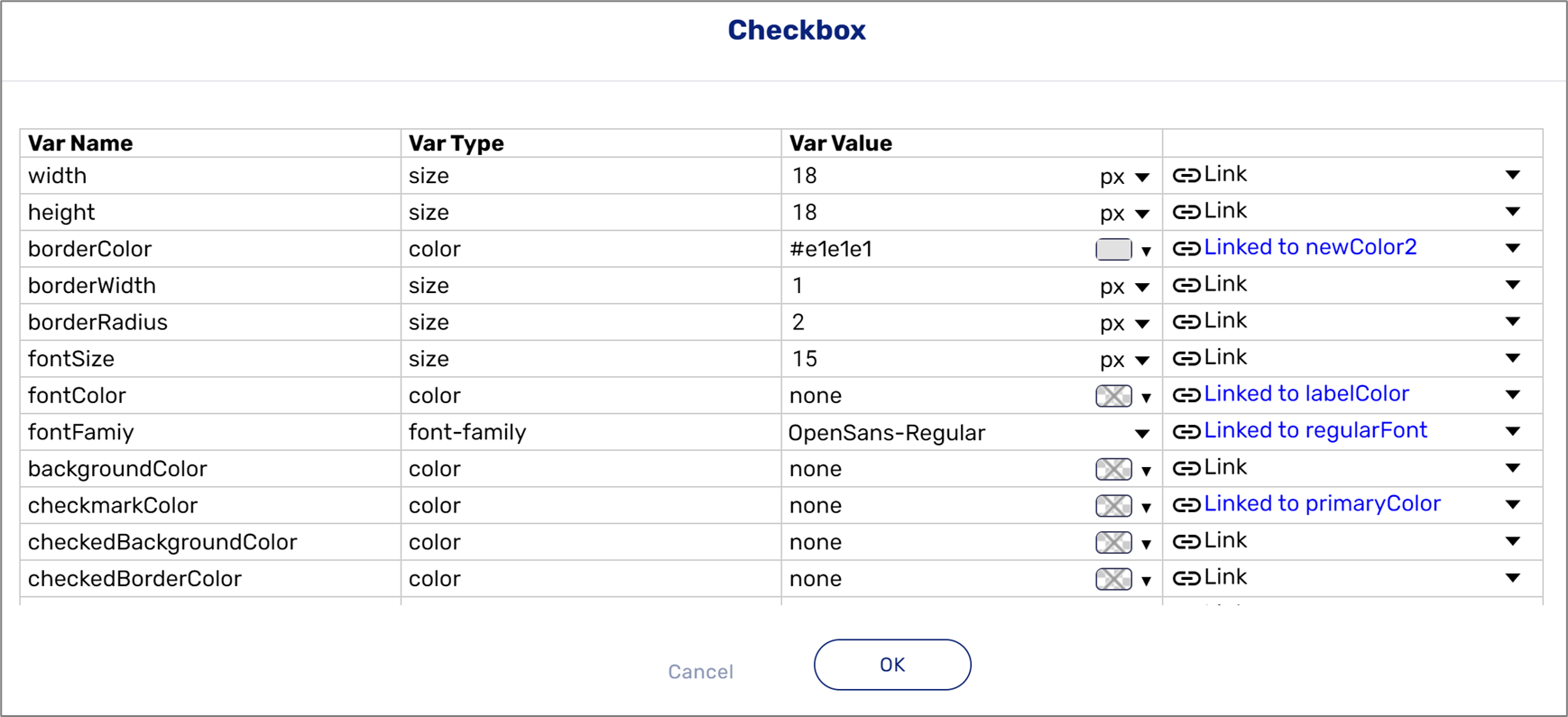
Figure 5: Checkbox Component Variables
- Design your style guide using your theme
Text Spacing
The following sections describe the Text Spacing criterion, what is it, and how to implement it in EasySend's platform.
What does it mean?
This success criterion requires that content and function retain meaning when users change elements of text spacing.
General Usage Examples
- Do not use fixed containers in your CSS styles
- Make sure that content reflows without overlapping or text cut-offs
- Use relative units of font size, line height, spaces between characters, words, lines, and paragraphs
How to Implement Using EasySend's Platform
(See Figure 6 and Figure 7)
- Use the Rich Text component to set line heights (1), for example:
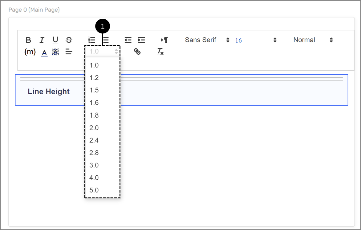
Figure 6: Rich Text Component - Line Height
- Use the theme to link all global components' relevant size vars (1) to size theme vars (em) (2), for example:

Figure 7: Size Vars
- Using custom code in the page components or custom components - please contact EasySend support for additional information.
Content on Hover or Focus
The following sections describe the Content on Hover or Focus criterion, what is it, and how to implement it in EasySend's platform.
What does it mean?
This success criterion requires that when hover or focus triggers content appear, it is dismissible, can be hovered above, and persistent.
General Usage Examples
- Provide a method to dismiss the additional content that appears on hover or keyboard focus
- Make sure that content is present until the user moves away the mouse pointer from the triggering element or content block
- Make sure that experience is persistent
How to Implement Using EasySend's Platform
This criterion is supported by EasySend's platform - please contact EasySend support for additional information.
Headings and Labels
The following sections describe the Headings and Labels criterion, what is it, and how to implement it in EasySend's platform.
What does it mean?
This success criterion requires that headings and labels describe the topic or purpose.
General Usage Examples
- Headings must be clear, concise, and descriptive
- Headings must follow a sequential order to avoid confusion
- Ensure that headings are consistent throughout the site
- Ensure that labels are descriptive enough so that users can take necessary actions
How to Implement Using EasySend's Platform
(See Figure 8 to Figure 10)
- Heading:
- When creating a custom page component - please contact EasySend support for additional information
- When creating a custom component for a heading - please contact EasySend support for additional information
- Using the Rich Text component (1) to set heading levels (2), for example:

Figure 8: Using the Rich Text Component to Set Heading Levels
- Enter components label names and contexts correctly using their Properties section, for example:
- The Label property (3) of the Text Input, Checkbox, and the Text Area components (4)
- The Title property (5) for the Radio Question component (6)
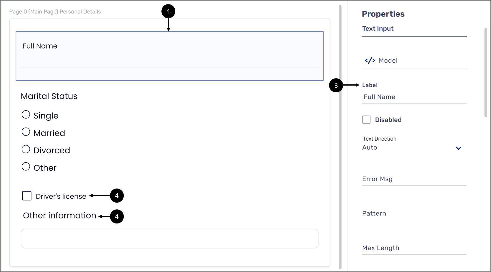
Figure 9: The Label Property for Multiple Components
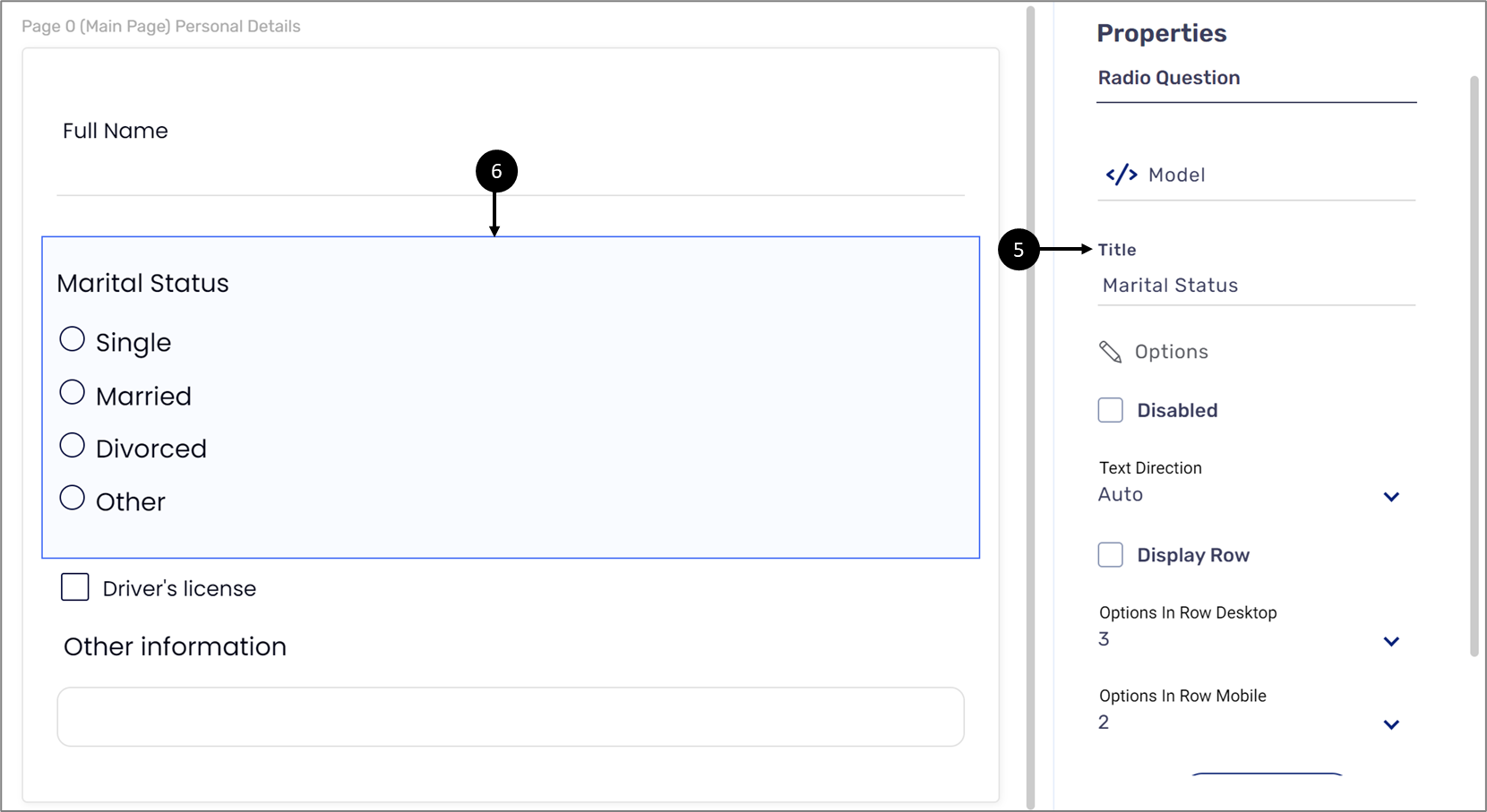
Figure 10: The Title Property for the Radio Question Component
Focus Visible
The following sections describe the Focus Visible criterion, what is it, and how to implement it in EasySend's platform.
What does it mean?
This success criterion requires that keyboard focus is visible when used.
General Usage Examples
- Let browsers handle the visible focus for active components
- Ensure that the active component is provided with a visible focus
- Ensure that when the user is navigating through the page using a keyboard visible focus moves along for every element presented on the page Ensure that there is sufficient contrast between the visible focus and the background of the element
How to Implement Using EasySend's Platform
(See Figure 11 and Figure 12)
To apply visible focus on digital process components, access the relevant theme, locate the global component, click the three dots (1), and then Edit Vars (2), for example:
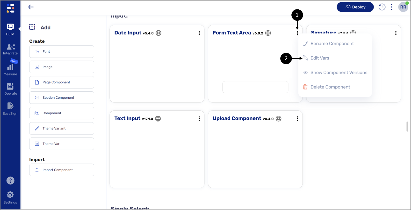
Figure 11: Global Component Edit Vars
When the window appears, edit the borderFocusWidth (3) and the borderFocusColor (4) variables, for example:
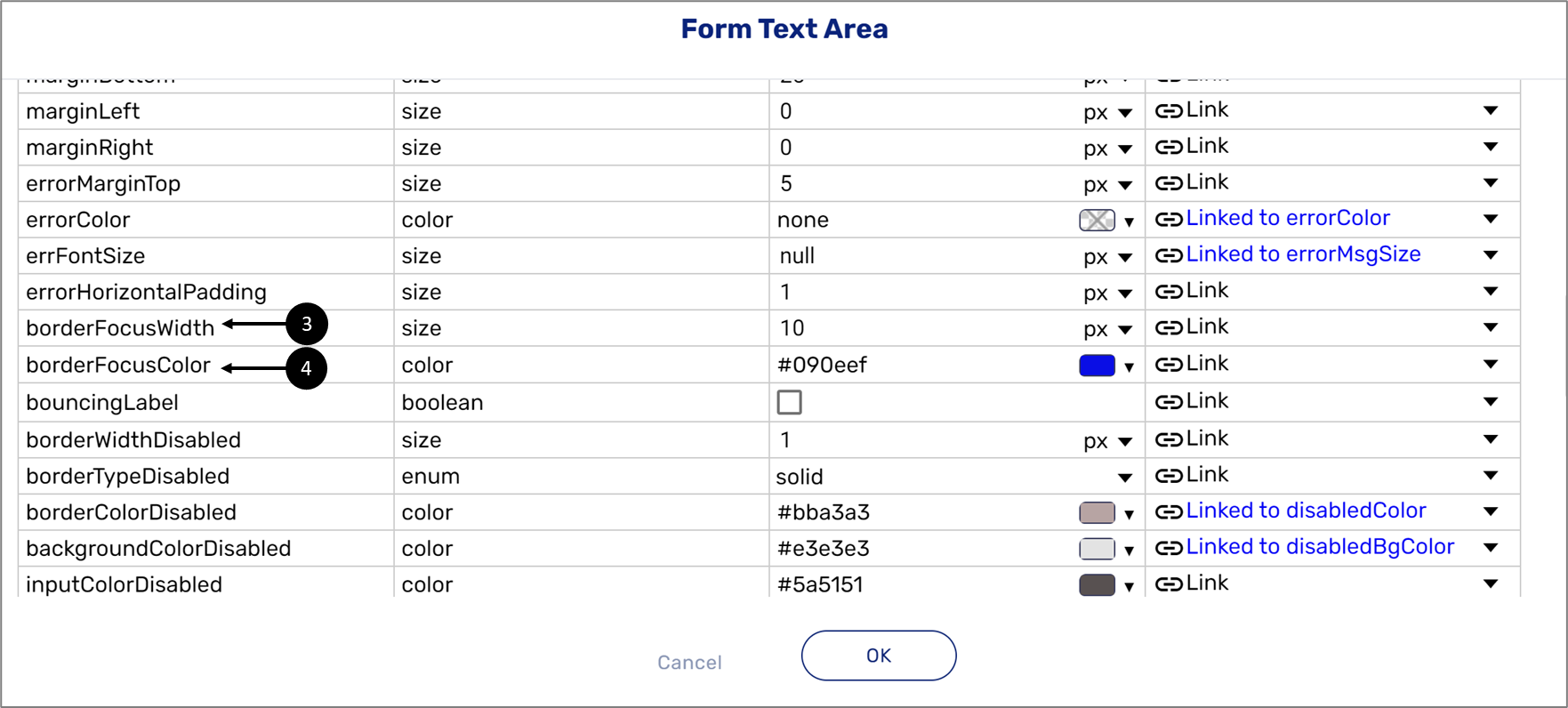
Figure 12: Focus Variables
Language of Parts
The following sections describe the Language of Parts criterion, what is it, and how to implement it in EasySend's platform.
What does it mean?
This success criterion requires that each part of a webpage has a default human language assigned.
General Usage Examples
- Ensure to use the appropriate language code (lang=”fr”) wherever the text is in other languages
- Ensure appropriate language token is used in the lang attribute (lang=”pt-br”)
- Do not use multi-pointer or path-based gestures as a sole method to control content
- Provide single tap or double tap/click as alternatives
How to Implement Using EasySend's Platform
This criterion is supported by EasySend's platform - please contact EasySend support for additional information.
Consistent Navigation
The following sections describe the Consistent criterion, what is it, and how to implement it in EasySend's platform.
What does it mean?
This success criterion requires consistent position menus and standard controls.
General Usage Examples
- Keep navigational menus in the same location
- Present the navigational menus in the same order on all pages
- Represent all the standard components like Dynamic Image in the same location
How to Implement Using EasySend's Platform
When building a Webflow be consistent with where you place components. Copy and paste Pages and leave components such as buttons and images in the same locations.
Consistent Identification
The following sections describe the Consistent Identification criterion, what is it, and how to implement it in EasySend's platform.
What does it mean?
This success criterion requires the identification of components with the same function consistently.
General Usage Examples
- Icons and images that are used repeatedly and provide the same function must be provided with the same alternative text
- Components with the same function are named and labeled consistently
How to Implement Using EasySend's Platform
(See Figure 13 to Figure 16)
- When adding a Dynamic Image component (1) to a Webflow, use the Properties section to provide alternative text (2), for example:
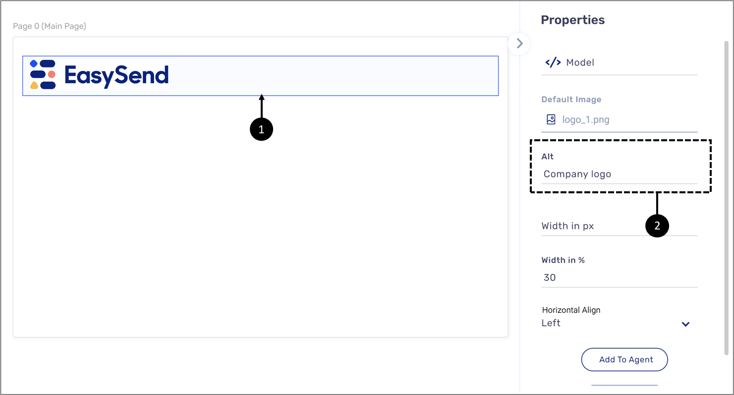
Figure 13: Dynamic Image and Alternative Text Property
- Enter components label names and contexts correctly using their Properties section, for example:
- The Label property (3) of the Text Input, Checkbox, and the Text Area components (4)
- The Title property (5) for the Radio Question component (6)

Figure 14: The Label Property for Multiple Components

Figure 15: The Title Property for the Radio Question Component
- Heading:
- When creating a custom page component - please contact EasySend support for additional information
- When creating a custom component for a heading - please contact EasySend support for additional information
- Using the Rich Text component (7) to set heading levels (8), for example:
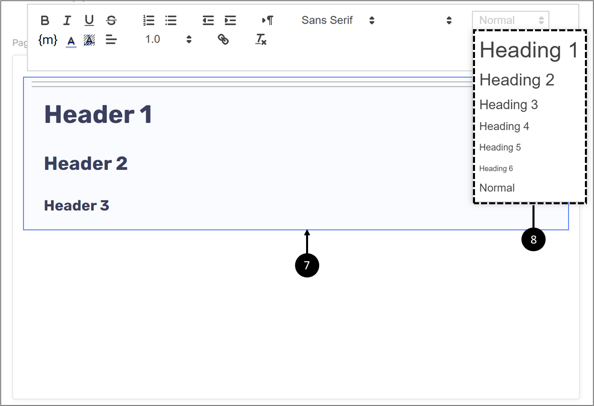
Figure 16: Using the Rich Text Component to Set Heading Levels
Error Suggestion
The following sections describe the Error Suggestion criterion, what is it, and how to implement it in EasySend's platform.
What does it mean?
This success criterion requires that correction suggestions be made when users make mistakes.
General Usage Examples
- Provide descriptive errors
- Provide visible hints that will enable the users to avoid errors during form submissions
- Move the focus to the form control that has the error once validation failed
- Mark the required fields with an asterisk visually
How to Implement Using EasySend's Platform
(See Figure 17 to Figure 21)
- Add validations (1) to data items (2) connected to input components, for example:

Figure 17: Required Validation
- Edit the Theme to display suitable colors for the validation message, for example:
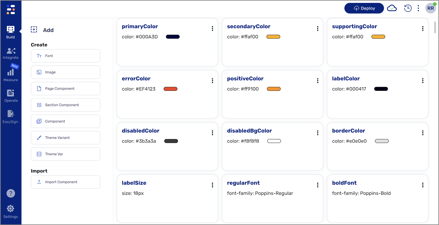
Figure 18: Theme
- If necessary, edit the validation message, for example:
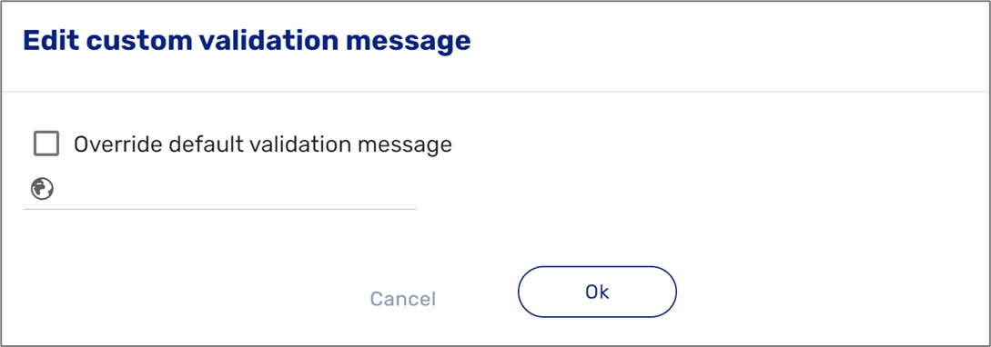
Figure 19: Using the Rich Text Component to Write Textual Instructions
- Use the Comment property (3) of a Text Input to write textual instructions (4), for example:
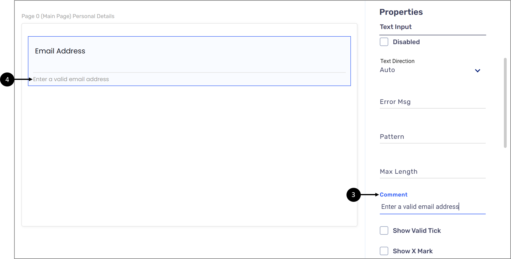
Figure 20: Using the Comment Property to Write Textual Instructions
- Use the Label property (5) to add an asterisk next to the name of the component, for example:
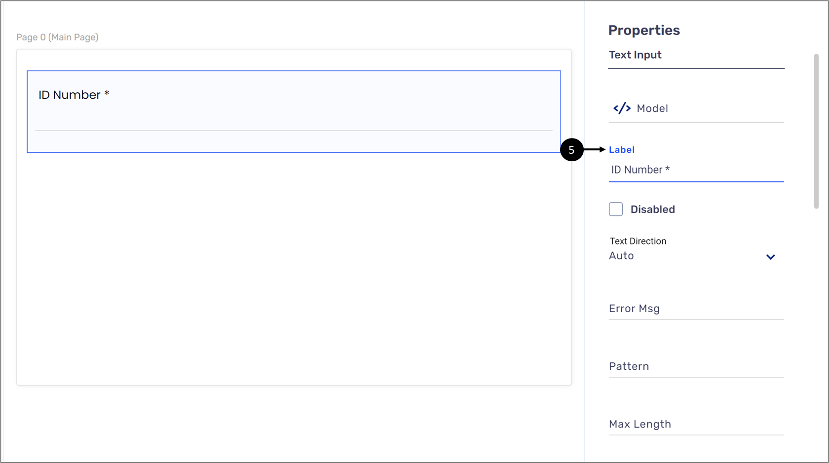
Figure 21: Using the Label Property to Add an Asterisk
Error Prevention (Legal, Financial, Data)
The following sections describe the Error Prevention (Legal, Financial, Data) criterion, what is it, and how to implement it in EasySend's platform.
What does it mean?
This success criterion requires checking, confirming, and allowing the reversal of pages that cause important commitments.
General Usage Examples
- Make sure proper hints are provided to fill the data in the forms
- Provide a review information screen where user-provided information is populated
- Provide a checkbox where users can confirm that they have reviewed all the information and are ready to submit
- Enable the submit button only when a user checks the checkbox
- Provide a confirmation screen or dialogue when users delete any data
How to Implement Using EasySend's Platform
(See Figure 22 to Figure 29)
- Add validations (1) to data items (2) connected to input components, for example:

Figure 22: Required Validation
- Edit the Theme to display suitable colors for the validation message, for example:

Figure 23: Theme
- If necessary, edit the validation message, for example:

Figure 24: Using the Rich Text Component to Write Textual Instructions
- Use the Comment property (3) of a Text Input to write textual instructions (4), for example:

Figure 25: Using the Comment Property to Write Textual Instructions
- Upload the original PDF of the digital process, define its fields to display data, and connect the form to a Preview component, for example:

Figure 26: PDF and Preview
- Add a Checkbox component where users can confirm that they reviewed all the information and they are ready to submit, for example:
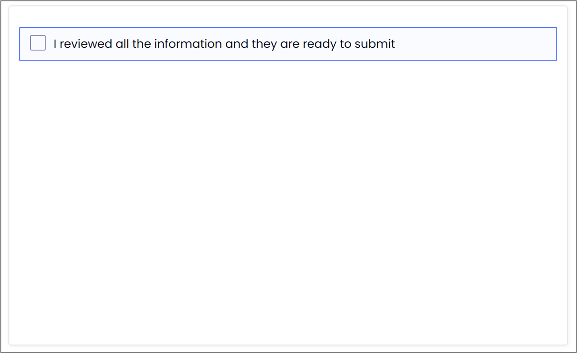
Figure 27: Checkbox
- Add a condition that will enable the submit button only when a user checks the checkbox, for example:
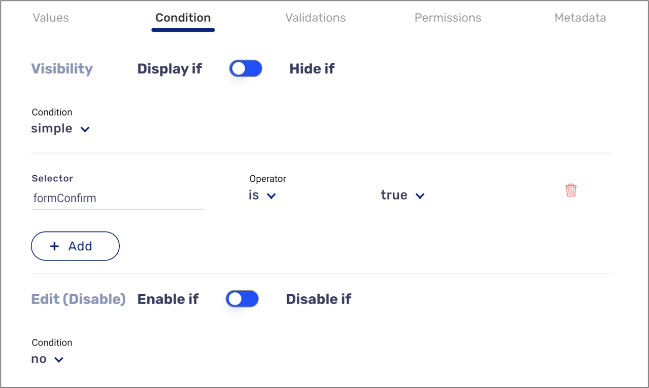
Figure 28: Condition
- Add a Thank You Page to provide a confirmation screen or dialogue when users delete any data, for example:
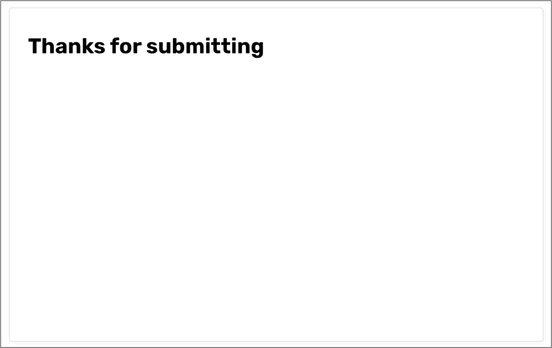
Figure 29: Thank You Page
Status Messages
The following sections describe the Status Message criterion, what is it, and how to implement it in EasySend's platform.
What does it mean?
This success criterion requires that all messages indicating success or errors are read out by a screen reader.
General Usage Examples
- Ensure all success toasts and error messages are announced by a screen reader
- Do not fill the pages with live regions
- Decide which is an important update and qualifies a status message intelligently
- Ensure focusable messages are not considered status messages
How to Implement Using EasySend's Platform
Implement this for preview and submission pop-up custom components - for additional information, please contact our support team.