Article Overview
The following article describes the available visuals in EasySend analytics.
The Visuals Section
(See Figure 1)
After creating an analysis, as described in the Analysis Overview article, it appears with the visuals section by default (1).
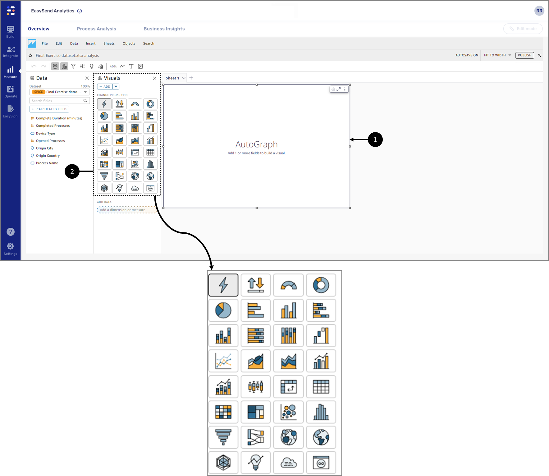
Figure 1: Visuals Section
The Visuals section contains all the visuals you will use to create a visual is a graphical representation of your data.
 .
.Visual Types
(See Figure 2)
The analysis screen first appears with one sheet (Sheet 1) and an AutoGraph visual (1) by default.
AutoGraph automatically selects the best type of visualization for the dataset fields that you select. You can also choose and add your visuals and enhance your analytics by applying filters, changing color, and more.
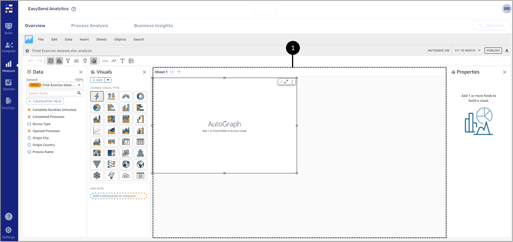
Figure 2: Sheet 1 and an AutoGraph
You can add a wide variety of visuals in an analysis.
AutoGraph
(See Figure 3)
AutoGraph is not a visual type itself but instead lets you tell EasySend analytics choose the visual type for you. When you create a visual by choosing AutoGraph and then selecting fields, EasySend analytics uses the most appropriate visual type for the number and data types of the fields you select.

Figure 3: AutoGraph Icon
Key Performance Indicator (KPI)
(See Figure 4 and Figure 5)
KPIs are used to visualize a comparison between a key value and its target value.
A KPI displays:
- A value comparison.
- The two values being compared.
- A progress bar.
For example:
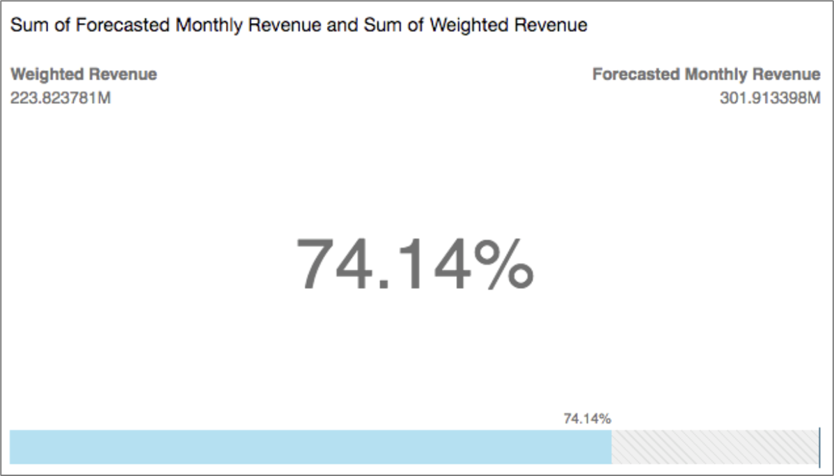
Figure 4: KPI Visual Example
Figure 5: KPI Icon
The KPI visual supports the following features:
- Changing/removing title.
- Changing comparison method:
- Auto.
- Difference.
- Percent.
- The difference as a percent.
- Changing the displayed primary value:
- Comparison (default).
- Actual.
- Displaying/removing the progress bar.
Gauge Chart
(See Figure 6 and Figure 7)
Gauge charts are used to compare values for items in a measure. You can compare them to another measure or a custom amount.
In a gauge chart, a measurement can exist alone or in relation to another measurement. Each color section in a gauge chart represents one value. In the following example, we are comparing actual sales to the sales goal, and the gauge shows that we must sell an additional 33.27% to meet the goal.
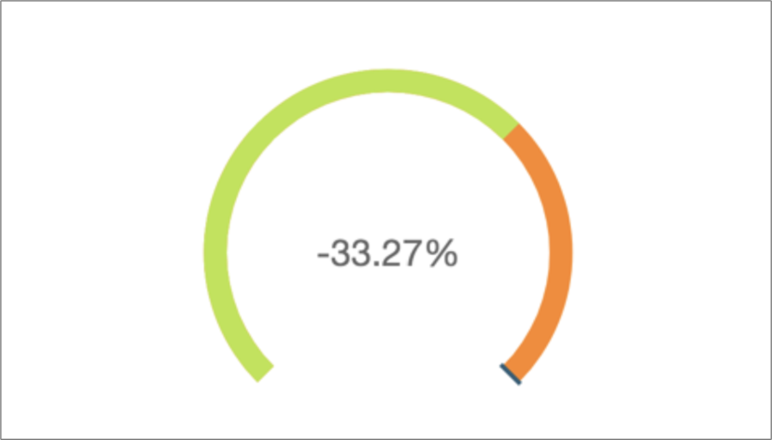
Figure 6: Gauge Chart Example

Figure 7: Gauge Chart Icon
The gauge chart visual supports the following features:
- Changing legend display.
- Changing title display.
- Formatting gauge by customizing the:
- Displayed value.
- Comparison method.
- Axis and arc style.
- Gauge thickness.
- Changing visual colors:
- Foreground color (filled area, the value).
- Background color (unfilled area, the target value).
- Performing field aggregation.
Donut Chart
(See Figure 8 and Figure 9)
Donut charts are used to compare values for items in a dimension. The best use for this type of chart is to show a percentage of the total amount.
Each wedge in a donut chart represents one value in a dimension. The size of the wedge represents the proportion of the value for the selected measure that the item represents compared to the whole for the dimension. Donut charts are best when precision isn't important and there are few items in the dimension, for example:
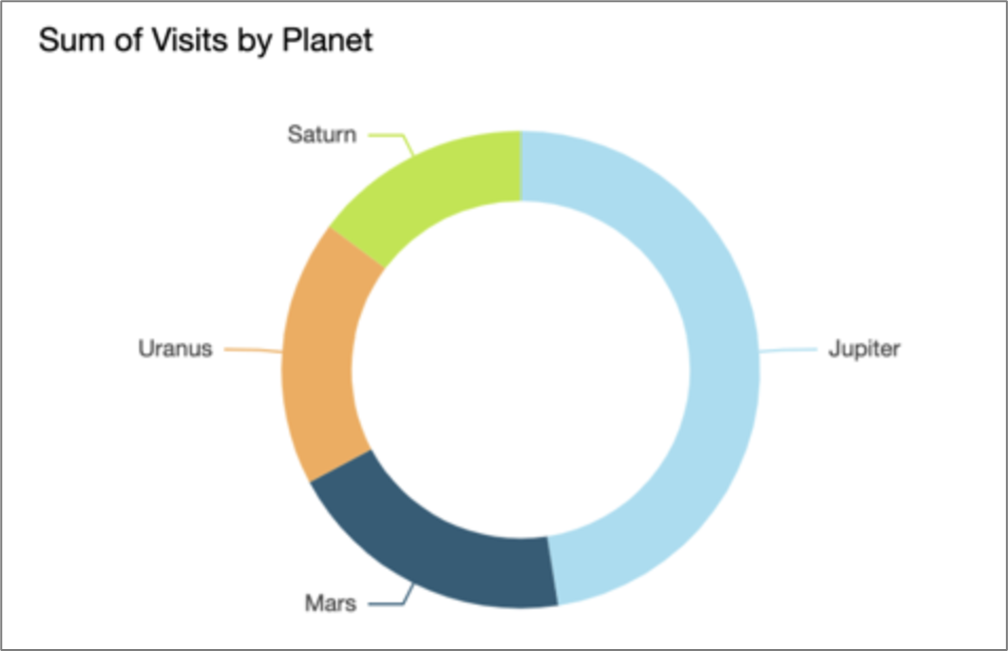
Figure 8: Donut Chart Example
Figure 9: Donut Chart Icon
The donut chart visual supports the following features:
- Changing legend display.
- Changing title display.
- Changing the visual colors.
- Focusing/excluding elements - when using a date field as a dimension a wedge can only be focused and not excluded.
- Sorting according to:
- Value.
- Group.
- Color.
- Performing field aggregation (value only).
- Adding drill-downs:
- Group.
- Color.
- Choosing size - setting the thickness of the donut chart:
- Small.
- Medium.
- Large.
- Showing totals.
Pie Chart
(See Figure 10)
Pie charts are used to compare values for items in a dimension. The best use for this type of chart is to show a percentage of the total amount.
Each wedge in a pie chart represents one item in the dimension. Wedge size represents the proportion of the value for the selected measure that the item represents compared to the whole for the dimension. Pie charts are best when precision isn't important and there are few items in the dimension.
Figure 10: Pie Chart Icon
The pie chart visual supports the following features:
- Changing legend display.
- Changing title display.
- Showing/hiding axis labels.
- Changing the visual colors.
- Focusing/excluding elements - when using a date field as a dimension a wedge can only be focused and not excluded.
- Sorting according to:
- Value.
- Group.
- Color.
- Performing field aggregation (value only).
- Adding drill-downs:
- Group.
- Color.
Bar Charts
(See Figure 11)
EasySend analytics supports the following types of bar charts with either horizontal or vertical orientation:
- Single measure - shows values for a single measure for a dimension.
- Multi measure - shows values for multiple measures for a dimension.
- Clustered - shows values for a single measure for a dimension, grouped by another dimension.
- Stacked - like a clustered bar chart, it displays a measure for two dimensions. However, instead of clustering bars for each child dimension by the parent dimension, it displays one bar per parent dimension. It uses color blocks within the bars to show the relative values of each item in the child dimension. The color blocks reflect the value of each item in the child dimension relative to the total for the measure. A stacked bar chart uses a scale based on the maximum value for the selected measure.
- Stacked 100% - like a stacked bar chart. However, in a stacked 100% bar chart, the color blocks reflect the percentage of each item in the child dimension, out of 100%.

Figure 11: Bar Chart Icons
The bar chart visuals support the following features:
- Changing legend display.
- Changing title display.
- Changing axis range.
- Showing/hiding:
- Axis lines.
- Grid lines.
- Axis labels.
- Axis sort icons.
- Changing the visual colors.
- Focusing/excluding elements - when using a date field as a dimension a wedge can only be focused and not excluded.
- Sorting according to:
- Axis.
- Values.
- Performing field aggregation (value only).
- Adding drill-downs:
- Axis.
- Group.
- Color.
- Showing data labels.
- Showing stacked bar chart totals (when choosing data labels).
Waterfall Chart
(See Figure 12)
Waterfall charts are used to visualize a sequential summation as values are added or subtracted. In a waterfall chart, the initial value goes through a (positive or negative) change, with each change represented as a bar. The final total is represented by the last bar. Waterfall charts are also known as bridges because the connectors between the bars bridge the bars together, showing that they visually belong to the same story.
Waterfall charts are most used to present financial data because you can show change within one time or from one period to another. This way, you can visualize the different factors that have an impact on your project cost. You can also use waterfall charts to present statistical data, for example, how many new customers you added and how many left your company within a year.

Figure 12: Waterfall Chart Icon
Line Charts
(See Figure 13 to Figure 16)
Line charts are used to compare changes in measure values over a period, for the following scenarios:
- One measure over a period, for example, gross sales by month.
- Multiple measures over a period, for example, gross sales and net sales by month.
- One measure for a dimension over a period, for example, the number of flight delays per day by airline.
EasySend analytics support three types of line charts:
- Regular
- Area
- Stacked
Regular line charts show the individual values of a set of measures or dimensions against the range displayed by the Y-axis.
Area line charts differ from regular line charts in that each value is represented by a colored area of the chart instead of just a line, to make it easier to evaluate item values relative to each other.
Figure 13 displays an example of a line chart:
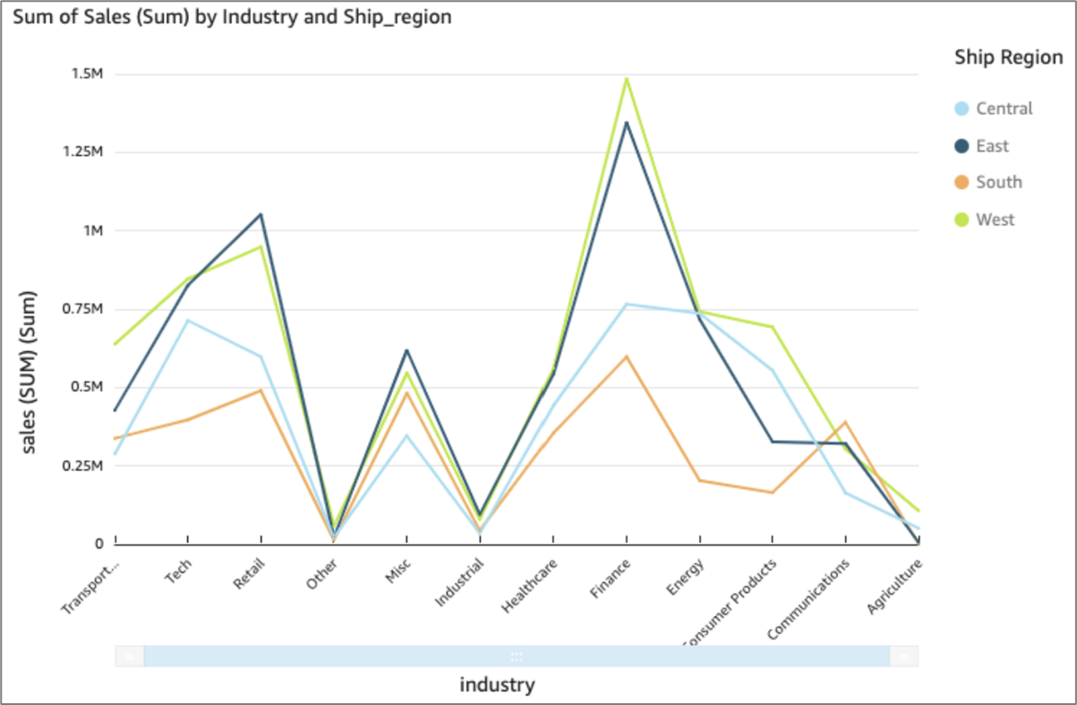
Figure 13: Line Chart Example
Figure 14 displays an area line chart. In this version of a line chart, the area between the line and the X-axis is filled with color.
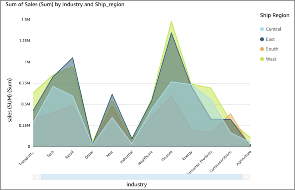
Figure 14: Area Line Chart Example
A stacked line chart is a line chart in which lines do not intersect because they are cumulative at each point. Stacked Line charts show the contribution to trends in the data. This is done by stacking lines on top of each other. Stacked Line charts are used with data that can be placed in an order, from low to high. The charts are used when you have more than one data column which all add up to the total trend.
Figure 15 displays a stacked area line chart. In this version of a line chart, the area between the line and the X-axis is filled with color. Also, the individual lines are layered to show the relationships more clearly between them. The values on the Y-axis show the scale of the differences between data points.
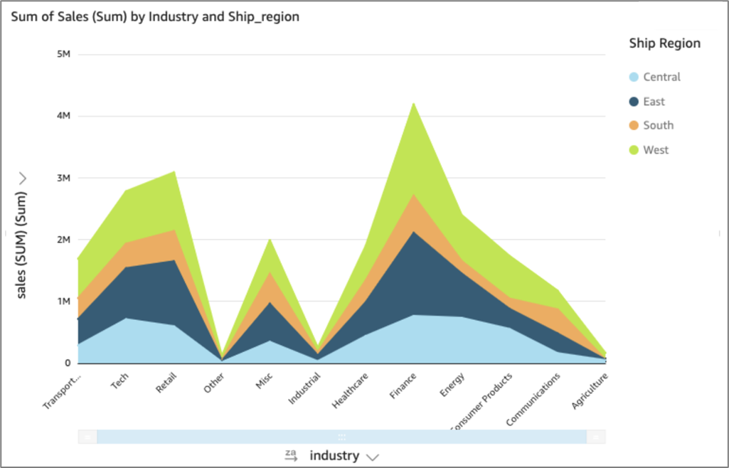
Figure 15: Stacked Line Chart Example

Figure 16: Line Chart Icons
The line chart visuals support the following features:
- Changing legend display.
- Changing title display.
- Changing axis range.
- Showing/hiding:
- Axis lines.
- Grid lines.
- Axis labels.
- Axis sort icons.
- Changing the visual colors.
- Focusing/excluding elements - any line can be focused or excluded, except in the following cases (only focus on a line not exclude it):
- You created a multi-dimension line chart and used a date field as the dimension for the line color.
- You created a measure or multi-measure line chart and used a date field as the dimension for the X-axis.
- Sorting according to - you can sort data for numeric measures in the X-axis and Value field wells. Other data is automatically sorted in ascending order.
- Performing field aggregation - you must apply aggregation to the field that you choose for the value and cannot apply aggregation to the fields you choose for the X-axis and color.
- Adding drill-downs - you can add drill-down levels to the X-axis and Color field wells.
Bar Combo Charts
(See Figure 17)
Combo charts are used to create one visualization that shows two different types of data, for example, trends and categories.
Combo charts are also known as line and column (bar) charts because they combine a line chart with a bar chart.
There are two types of combo charts:
- Clustered bar combo charts - display sets of single-color bars where each set represents a parent dimension, and each bar represents a child dimension. Use this chart to make it easy to determine values for each bar.
- Stacked bar combo charts - display multi-color bars where each bar represents a parent dimension, and each color represents a child dimension. Use this chart to make it easy to see relationships between child dimensions within a parent dimension. This chart shows the total value for the parent dimension and how each child adds to the total value. To determine the value for each child dimension, the chart reader must compare the size of the color section to the data labels for that axis.
Both types of combo charts require only one dimension on the X-axis but are usually more effective when also displaying at least one measure under Lines.
Because each chart works differently, it can be helpful to understand the following points:
- The data points in each series render on different scales. Combo charts use a scale based on the maximum value for the selected measure.
- The distance between the numbers on the axis won't match between the lines and bars, even if you select the same scale for each chart type.
- For clarity, try to use different units for the measure in each data series.
Figure 17: Bar Combo Chart Icons
The bar chart visuals support the following features:
- Changing legend display.
- Changing title display.
- Changing axis range.
- Showing/hiding:
- Axis lines.
- Gridlines.
- Axis labels.
- Axis sort icons.
- Changing the visual colors.
- Focusing/excluding elements - you can focus on or exclude any bar on the chart, except when you are using a date field as the dimension for the axis. In that case, you can only focus on a bar, not exclude it.
- Sorting according to - you can sort on the fields you choose for the axis and the values.
- Performing field aggregation - you must apply aggregation to the field or fields you choose for the value. You can't apply aggregation to the fields you choose for the axis or group/color.
- Adding drill-downs - you can add drill-down levels to the axis and Group/Color field wells.
- Synchronizing Y-axis - Synchronize the Y-axis for both bars and lines into a single axis.
Box Plot
(See Figure 18)
Box plots, also known as box and whisker plots, display data pooled from multiple sources into one visual, helping you make data-driven decisions. Box plot is used to visualize how data is distributed across an axis or over time, for example, flights delayed over 7 days. Typically, a box plot details information in quarters:
- Minimum – The lowest data point excluding outliers.
- Maximum – The highest data point excluding outliers.
- Median – The middle value of the dataset.
- First Quartile – The middle value between the smallest number and the median of the dataset. The first quartile doesn't include the minimum or the median.
- Third Quartile – The middle value between the largest number and the median of the dataset. The third quartile doesn't include the maximum or the median.

Figure 18: Waterfall Chart Icon
Pivot Table
(See Figure 19)
Pivot tables are used to show measure values for the intersection of two dimensions.
Using a pivot table, you can do the following:
- Specify multiple measures to populate the cell values of the table, so that you can see a range of data
- Cluster pivot table columns and rows to show values for subcategories grouped by related dimensions
- Sort values in pivot table rows or columns
- Apply statistical functions
- Add totals and subtotals to rows and columns
- Use infinite scroll
- Transpose fields used by rows and columns
Figure 19: Pivot Table Icon
The pivot table visual supports the following features:
- Changing title display.
- Focusing/excluding elements - you can focus on or exclude any column or row, except when you are using a date field as one of the dimensions. In that case, you can only focus on the column or row that uses the date dimension, not exclude it.
- Sorting - you can sort fields in the Rows or Columns field wells alphabetically or by a metric in ascending or descending order.
- Performing field aggregation:
- You must apply aggregation to the field or fields you choose for the value. You can't apply aggregation to the fields that you choose for the rows or columns.
- If you choose to create a multi-measure pivot table, you can apply different types of aggregation to the different measures. For example, you can show the sum of the sales amount and the maximum discount amount.
- Showing and hiding totals and subtotals:
- You can show or hide totals and subtotals for rows and columns.
- Metrics automatically roll up to show subtotals when you collapse a row or column. If you use a table calculation, use aggregates to display roll-ups.
- Exporting or copying data:
- You can export all the data to a CSV file.
- You can select and copy the content of the cells.
- Conditional formatting - You can add conditional formatting for values, subtotals, and totals.
Table
(See Figure 20)
Table visual is used to see a customized table view of your data. To create a table visual, choose at least one field of any data type. You can add as many columns as you need, up to 200.
Additional information:
- Table visuals do not display legend.
- You can hide or display the title on a table.
- You can also hide or display totals and choose to show totals at the top or the bottom of the table.
Figure 20: Table Icon
Heat Map
(See Figure 21 and Figure 22)
Heat maps are used to show a measure for the intersection of two dimensions, with color coding to easily differentiate where values fall in the range. Heat maps can also be used to show the count of values for the intersection of the two dimensions.
Each rectangle on a heat map represents the value for the specified measure for the intersection of the selected dimensions. Rectangle color represents where the value falls in the range for the measure, with darker colors indicating higher values and lighter colors indicating lower ones.
Figure 21 displays a heat map showing which products are most used by the customers in these countries, measured by a simple count.
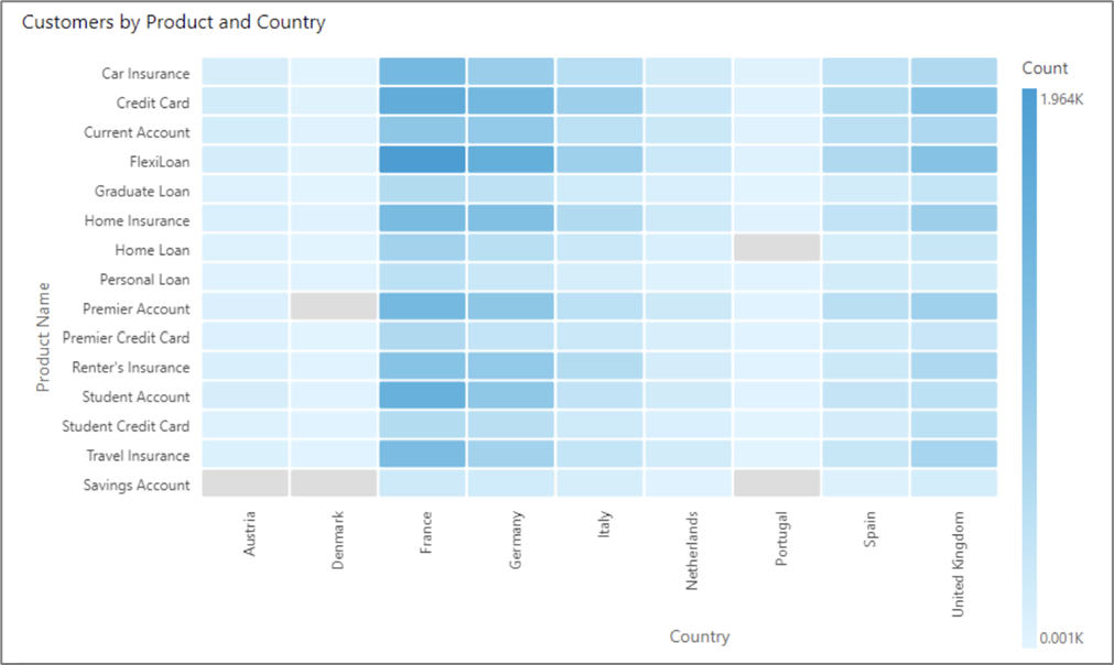
Figure 21: Heat Map Example

Figure 22: Heat Map Icon
The heat map visual supports the following features:
- Changing legend display.
- Changing title display.
- Focusing/excluding elements - you can focus on or exclude a rectangle in a heat map, except when you are using a date field as the dimension of the row. In that case, you can only focus on a rectangle, not exclude it.
- Sorting - you can sort by the fields you choose for the columns and the values.
- Performing field aggregation - you must apply aggregation to the fields you choose for the value and cannot apply aggregation to the fields you choose for the rows or columns.
- Adding drill-downs - you can add drill-down levels to the Rows and Columns field wells.
Tree Map
(See Figure 23)
Tree maps are used to visualize one or two measures for a dimension.
Each rectangle on the tree map represents one item in the dimension. Rectangle size represents the proportion of the value for the selected measure that the item represents compared to the whole for the dimension. You can optionally use a rectangle color to represent another measure for the item. Rectangle color represents where the value for the item falls in the range for the measure, with darker colors indicating higher values and lighter colors indicating lower ones.

Figure 23: Tree Map Icon
The tree map visual supports the following features:
- Changing legend display.
- Changing title display.
- Focusing/excluding elements - you can focus on or exclude a rectangle from a tree map, except when you are using a date field as the dimension. In that case, you can only focus on a rectangle, not exclude it.
- Adding drill-downs - you can add drill-down levels to the Group by field well.
Scatter Plots
(See Figure 24)
Scatter plots are used to visualize two or three measures for a dimension.
Each bubble on the scatter plot represents one item in the dimension. The X and Y axes represent two different measures that apply to the dimension. A bubble appears on the chart at the point where the values for the two measures for an item in the dimension intersect. Optionally, you can also use bubble size to represent an additional measure.
Figure 24: Tree Map Icon
The scatter plots visual supports the following features:
- Changing legend display - scatter plots display a legend if you have the Group/Color field well populated.
- Changing title display.
- Changing axis range - you can set the range for both the X and Y axes.
- Showing/hiding:
- Axis lines.
- Grid lines.
- Axis labels.
- Axis sort icons.
- Changing visual colors.
- Focusing/excluding elements - you can focus on or exclude a bubble in a scatter plot, except when you are using a date field as a dimension. In that case, you can only focus on a bubble, not exclude it.
- Performing field aggregation - you must apply aggregation to the fields you choose for the X-axis, Y-axis, and size, and cannot apply aggregation to the field that you choose for the group or color.
- Adding drill-downs - you can add drill-down levels to the Group/Color field well.
Histograms
(See Figure 25)
Histogram charts are used to display the distribution of continuous numerical values in your data. To create a histogram, you use one measure. A new histogram initially displays ten bins (also called buckets) across the X-axis. These appear as bars on the chart. You can customize the bins to suit your dataset. The Y-axis displays the absolute count of the values in each bin.
Figure 25: Tree Map Icon
The histogram visual supports the following features:
- Changing title display.
- Showing/hiding:
- Axis lines.
- Grid lines.
- Axis labels.
- Axis sort icons.
- Changing visual colors.
Funnel Chart
(See Figure 26)
A funnel chart is used to visualize data that moves across multiple stages in a linear process. In a funnel chart, each stage of a process is represented in blocks of different shapes and colors. The first stage, known as the head, is the largest block and is followed by the smaller stages, known as the neck, in a funnel shape. The size of the block representing each stage in a funnel chart is a percentage of the total and is proportionate to its value. The bigger the size of the block, the bigger its value.
Funnel charts are often useful in business contexts because you can view trends or potential problem areas in each stage, such as bottlenecks. For example, they can help you visualize the amount of the potential revenue in each stage of a sale, from first contact to final sale and on through maintenance.
Figure 26: Funnel Chart Icon
Sankey Diagram
(See Figure 27)
Sankey diagrams are used to show flows from one category to another or paths from one stage to the next.
For example, a Sankey diagram can show the number of people migrating from one country to another. A Sankey diagram can also show the path a web visitor takes from one page to the next on a company website, with stops along the way.
To use a sankey diagram your dataset should contain a measure and two dimensions (one dimension containing source categories and another containing destination categories).
Figure 27: Sankey Diagram Icon
The histogram visual supports the following features:
- Changing title display.
- Showing/hiding:
- Axis lines.
- Grid lines.
- Axis labels.
- Axis sort icons.
- Changing visual colors.
The sankey diagram visual supports the following features:
- Changing title display.
- Focusing on or excluding elements.
- Performing field aggregation.
Points on Map
(See Figure 28)
Points on map show the difference between data values for each location by size. Each point on this type of map corresponds to a geographic location in your data, such as a country, state or province, or city. The size of the points on the map represents the magnitude of the field in the Size field well, in relation to other values in the same field. The color of the points represents the values in the Color field well.
Figure 28: Points on Map Icon
Filled Map
(See Figure 29)
A filled map shows the difference between data values for each location by varying shades of color.
Figure 29: Filled Map Icon
Radar Chart
(See Figure 30 and Figure 31)
Radar charts, also known as spider charts, are used to visualize multivariate data in EasySend analytics. In a radar chart, one or more groups of values are plotted over multiple common variables. Each variable has its own axis, and each axis is arranged radially around a central point. The data points from a single observation are plotted on each axis and connected to each other to form a polygon. Multiple observations can be plotted in a single radar chart to display multiple polygons, which makes it easier to spot outlying values for multiple observations quickly.
Figure 30 displays an image of a radar chart:
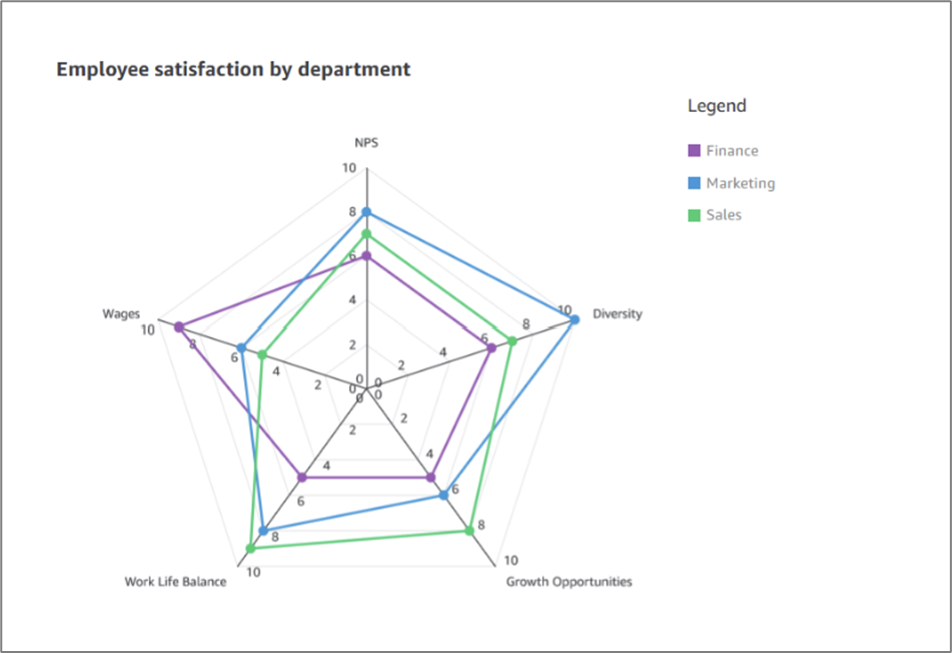
Figure 30: Radar Chart Example
Figure 31: Radar Chart Icon
The radar chart visual supports the following features:
- Changing legend display.
- Changing title display.
- Changing axis range.
- Changing visual colors.
- Focusing on or excluding elements.
- Sorting - you can only sort data fields that are in the Category and Color field wells.
- Performing field aggregation.
- Choosing size.
Word Clouds
(See Figure 32 and Figure 33)
Word clouds are used to display how often a word is used in relation to other words in a dataset. The best use for this type of visual is to show word or phrase frequency.
Each word in a word cloud represents one or more values in a dimension. The size of the word represents the frequency of a value's occurrence in a selected dimension, in proportion to the occurrences of other values in the same dimension.
Figure 32 displays an image of a word cloud:
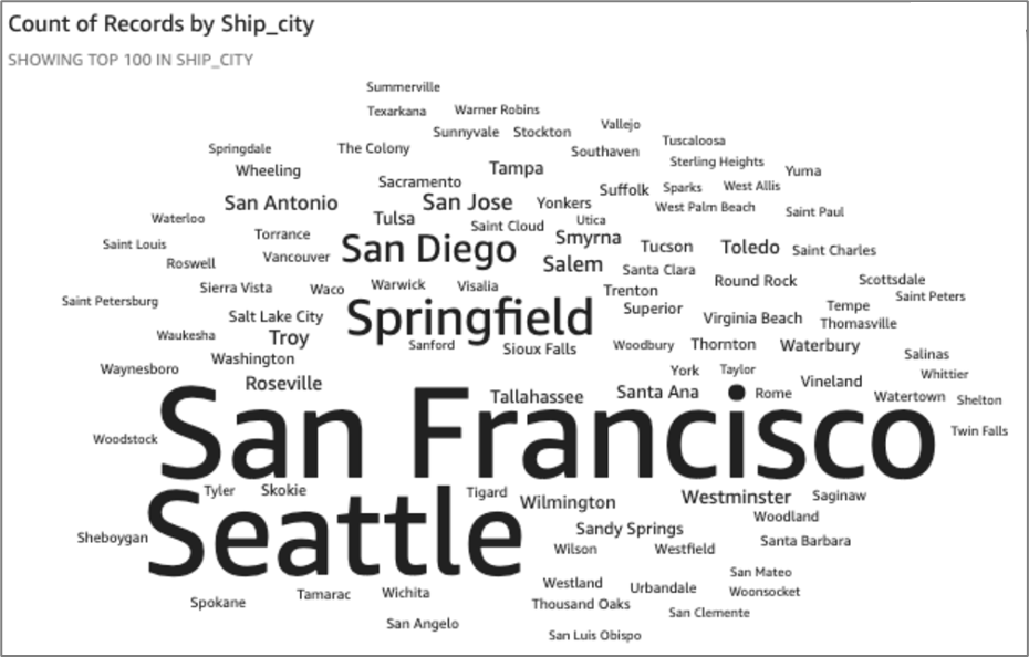
Figure 32: Word Cloud Example
Figure 33: Word Cloud Icon
The word cloud visual supports the following features:
- Changing title display.
- Changing visual colors.
- Focusing on or excluding elements.
- Sorting.
- Performing field aggregation - you cannot apply aggregation to the field that you choose for Group by. You must apply aggregation to the field that you choose for Size.
- Adding drill-downs - you can add drill-down levels to the Group by field well.
- Using format options:
- Vertical words.
- Emphasize scale.
- Use a fluid layout.
- Use lowercase.
- Set the amount of padding between words.
- Set the maximum string length for the word cloud (default is 40).
- Choose the number of words for the Group by field (default is 100; maximum is 500).
Custom Visual Content
(See Figure 34)
You can embed web pages and online videos, forms, and images in your dashboards using the custom visual content chart type.
For example, you can embed EasySend’s custom backgrounds or embed the image of your company logo in your dashboards.
The following limitations apply to custom visual content:
- Only https URL schemes are supported.
- Custom visual content isn't supported in email reports.
- Images and websites that use hotlink protection will not load in custom visuals.
Figure 34: Custom Visual Content Icon
How to Add Visuals
(See Figure 35 to Figure 39)
You can add a visual in several ways:
- Select the dataset fields that you want (1), and use AutoGraph (2) to let EasySend Analytics determine the most appropriate visual type.
- Choose a specific visual from the Visuals section (3).
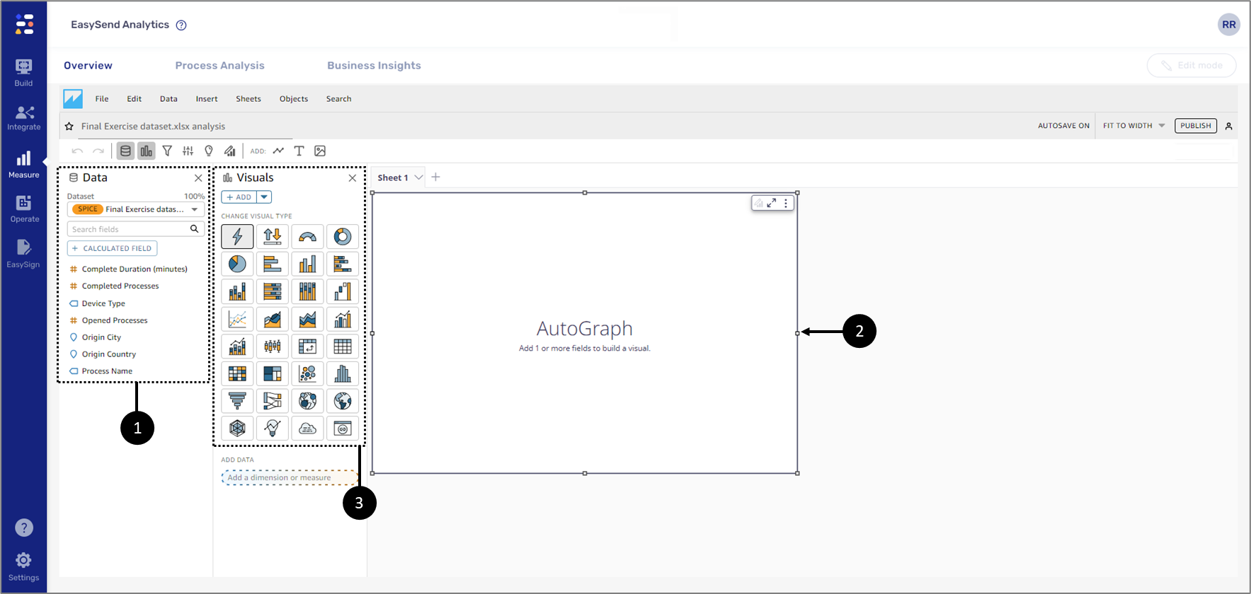
Figure 35: Adding a Visual Part 1 of 4
- Additional visuals can be added by clicking:
- Add visual (4) and selecting a visual type (5).
- The + ADD button (6) to automatically add an additional AutoGraph.
- The dropdown (7) to add other types of visuals.
- The Sheets tab (8) and clicking Add Sheet (9) to automatically add an additional AutoGraph.
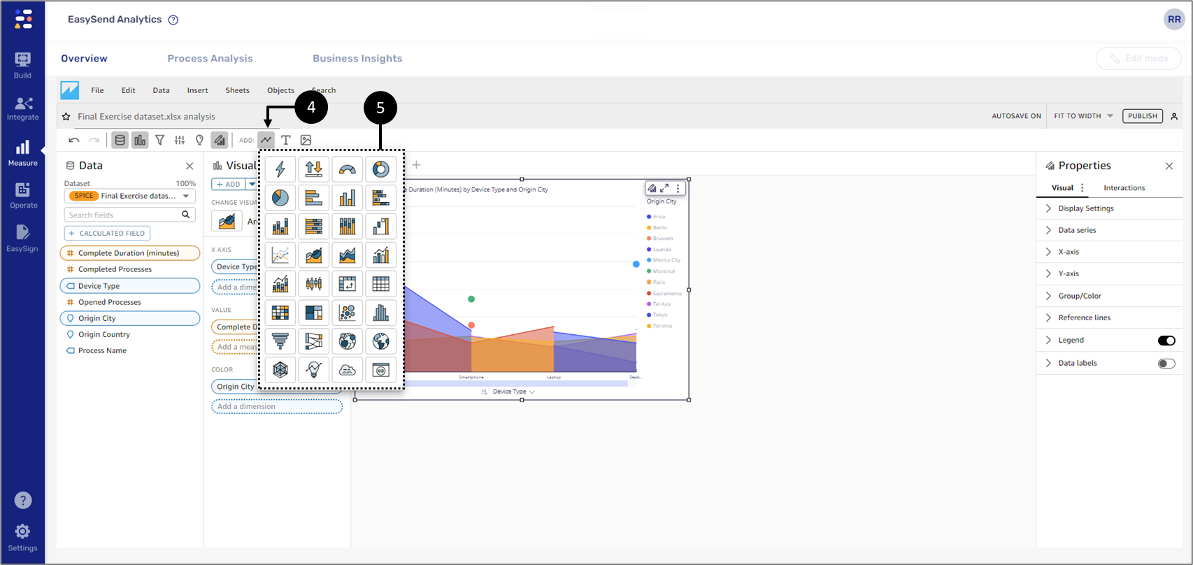
Figure 36: Adding a Visual Part 2 of 4
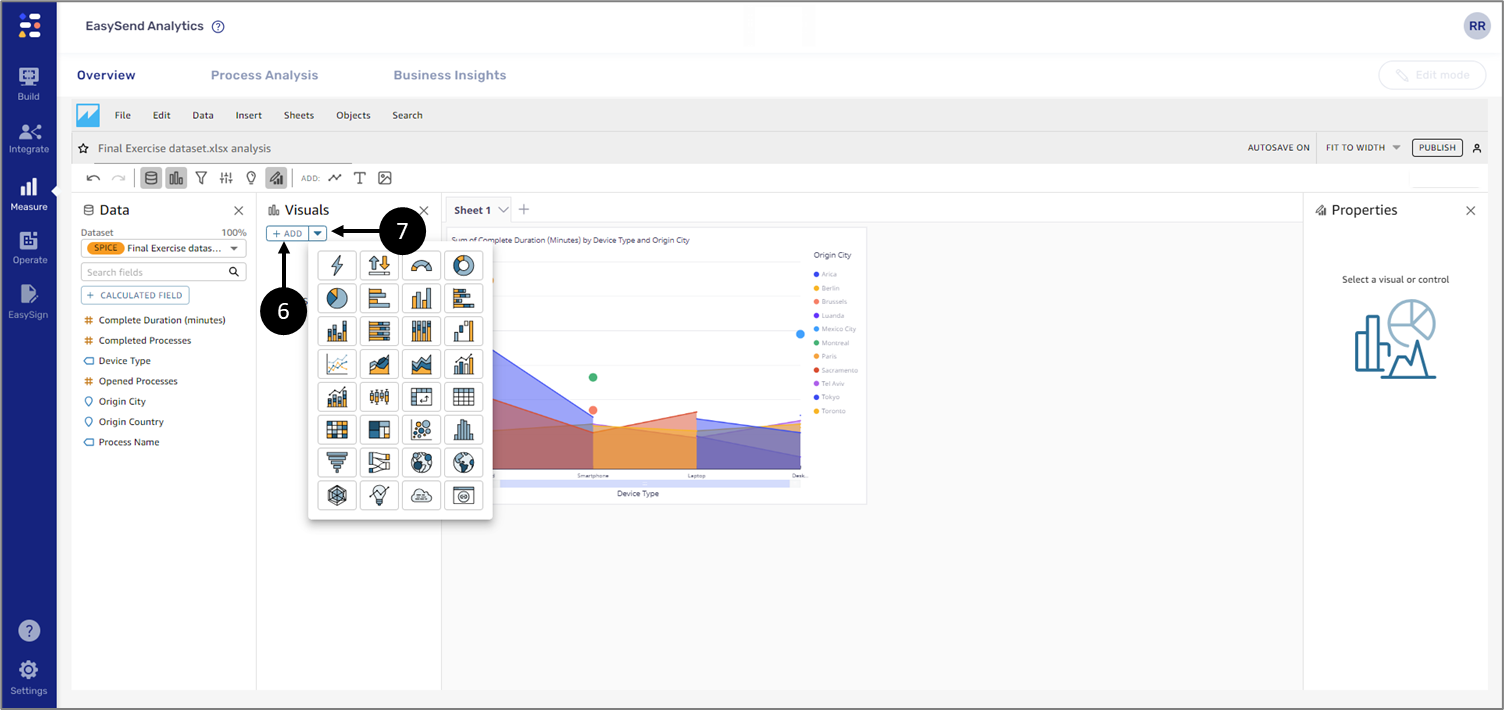
Figure 37: Adding a Visual Part 3 of 4
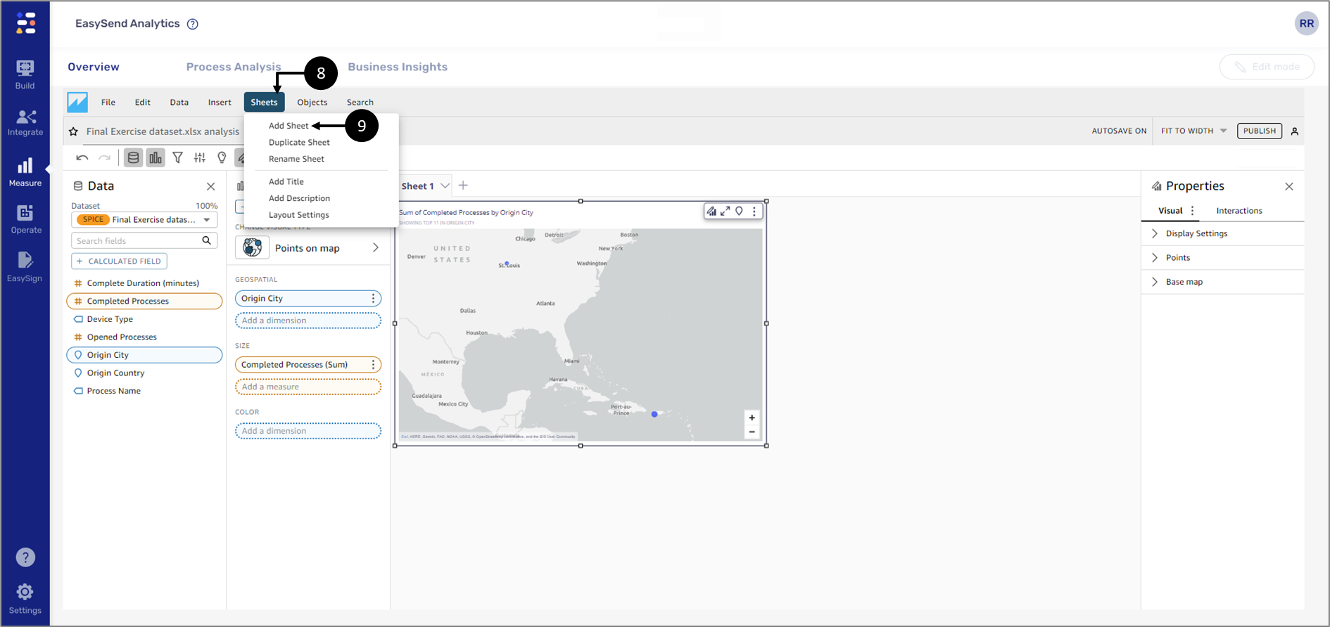
Figure 38: Adding a Visual Part 4 of 4
- After adding a visual, it is also passible to change its type (8).
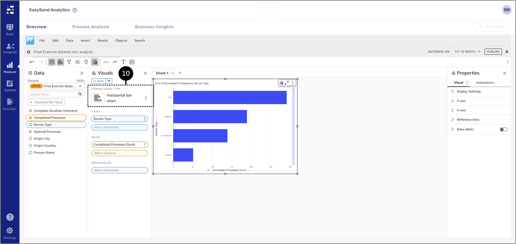
Figure 39: Changing Visual Type
To create a useful visual, it helps to know what question you are trying to answer as specifically as possible. It also helps to use the smallest dataset that can answer that question. Doing so helps you create simpler visuals that are easier to analyze.
How to embed EasySend’s custom Backgrounds
(See Figure 40 to Figure 49)
To embed EasySend’s custom backgrounds while using a Custom Visual content, perform the following steps:
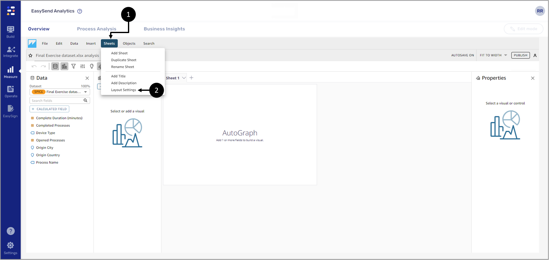
Figure 40: Applying Free-form Sheet Layout 1 of 2
- Click Sheets (1).
- Click Layout Settings (2).
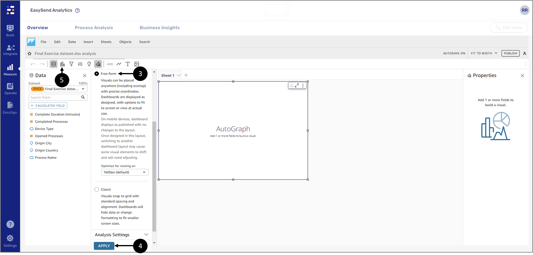
Figure 41: Applying Free-form Sheet Layout 2 of 2
- Select Free-from (3).
- Click APPLY (4).
- Click Visualize (5).
- If an AutoGraph visual is already added to the sheet:
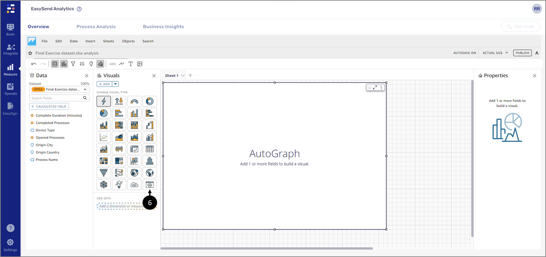
Figure 42: Custom Visual Content 1 of 2
- Click Custom Visual content (6).
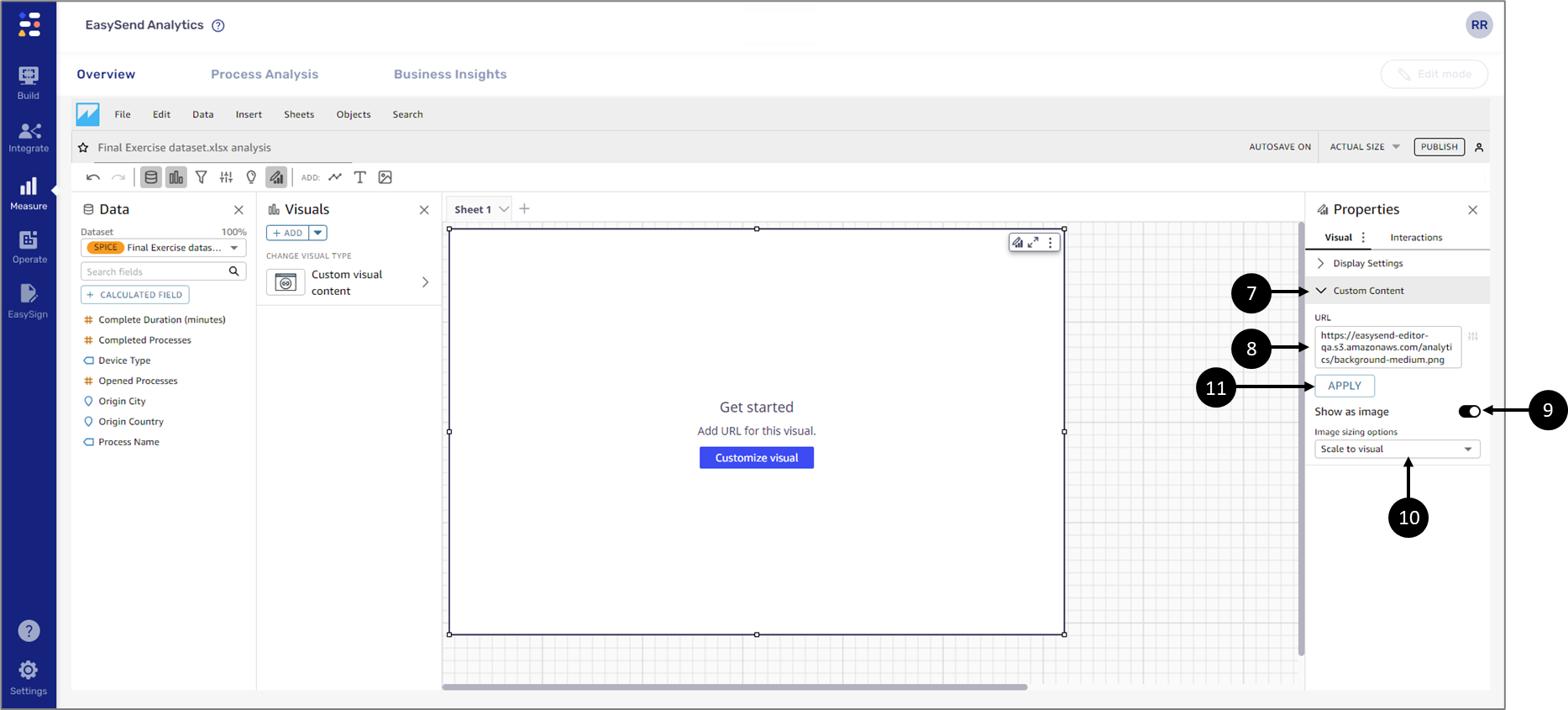
Figure 43: Custom Visual Content 2 of 2
- Click Custom Content (7).
- Add one of the following URLs (8):
- Small background - https://easysend-editor-qa.s3.amazonaws.com/analytics/background-small.png
- Medium background - https://easysend-editor-qa.s3.amazonaws.com/analytics/background-medium.png
- Big background - https://easysend-editor-qa.s3.amazonaws.com/analytics/background-large.png
- Toggle the Show as image switch to on (9).
- Select the Scale to visual option (10).
- Click APPLY (11).
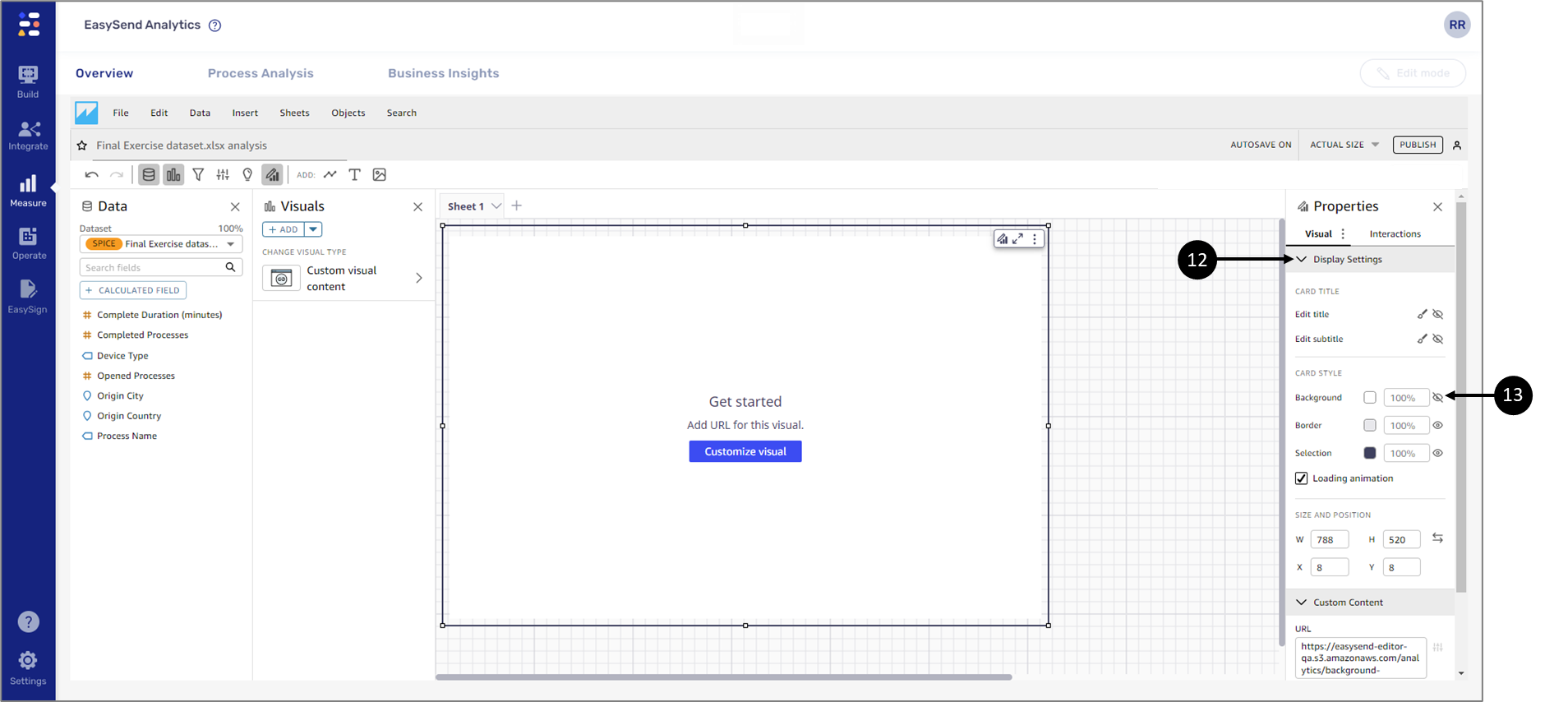
Figure 44: Display Settings
- Click DisplaySettings (12).
- Click the eye icon (13) to hide the Background.
- If an AutoGraph visual is not available on the sheet:
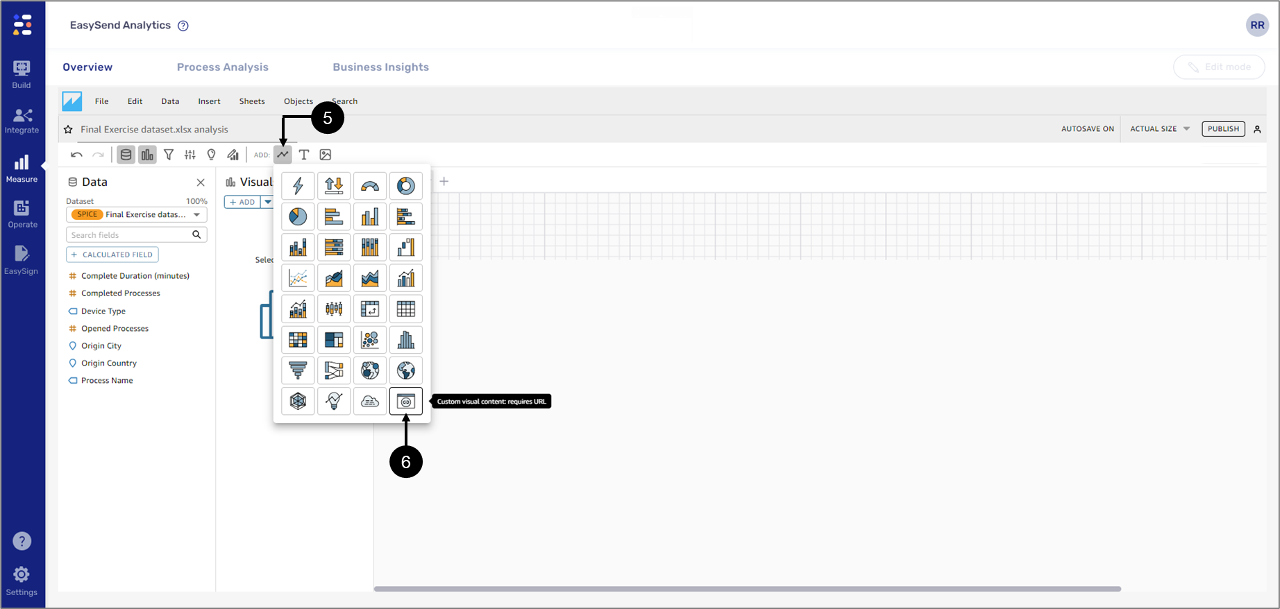
Figure 45: Add Custom Visual Content Visual
- Click Add visual (5).
- Click Custom Visual Content (6).

Figure 46: Custom Visual Content
- Click Custom Content (7).
- Add one of the following URLs (8):
- Small background - https://easysend-editor-qa.s3.amazonaws.com/analytics/background-small.png
- Medium background - https://easysend-editor-qa.s3.amazonaws.com/analytics/background-medium.png
- Big background - https://easysend-editor-qa.s3.amazonaws.com/analytics/background-large.png
- Toggle the Show as image switch to on (9).
- Select the Scale to visual option (10).
- Click APPLY (11).

Figure 47: Display Settings
- Click DisplaySettings (12).
- Click the eye icon (13) to hide the Background.
To use the custom background with other visuals, add a new visual to the sheet. Once the visual is placed, use the left click to grab it by its borders and drag and drop it on top of the background (See Figure 43):
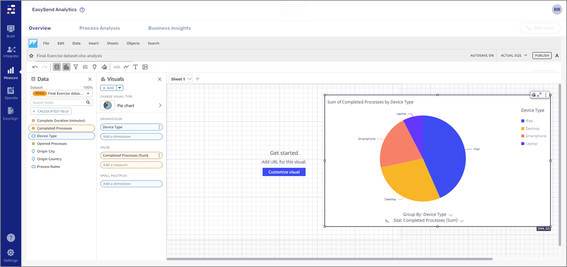
Figure 48: Drag and Drop a Visual
Adjust the visual to fit the background and Configure it as required. It is possible to remove the border of the visual that is placed on top of the background by accessing its format options, clicking Display Settings (1) and clicking the eye icon (2) to hide the Border (see Figure 44):
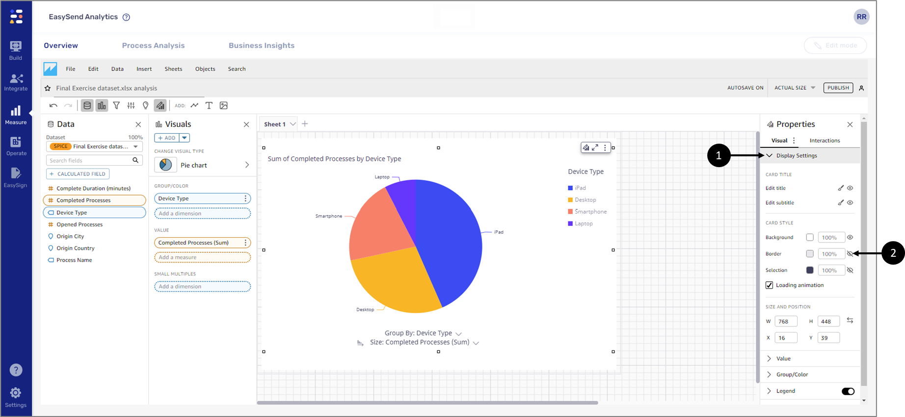
Figure 49: Visual on Top of Background