What are the Model Validations?
Model validations are used to check the integrity of the information that an end-user inputs while interacting with a digital process. The implementation of different validations is done by using Webflow components and data items from the Model.
How to Implement Validations
Validation is implemented on a transaction data item associated with different Webflow components, such as Text Input and Radio Question. For example, using validations, you can check if an email address was input according to the email address format or turn a field into a required field.
Validations Usage Example
Figure 1 displays a Webflow with three Text Input components and a Radio Question component. The email information that the user needs to fill out must be checked and validated to ensure that it is written correctly according to the address structure of an email. In addition, it is mandatory to select a marital status to proceed with the Webflow:
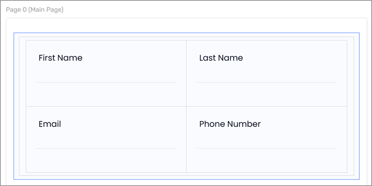
Figure 1: Webflow Components
Figure 2 displays the Model of the Webflow. The Model contains four transaction data items, The email (1) and the phoneNumber (2) transaction data items need to be implemented with appropriate validations:
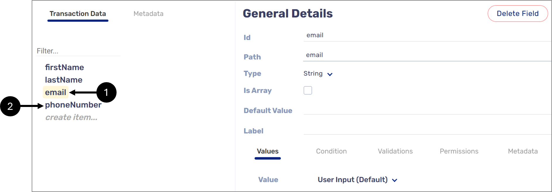
Figure 2: The Model
When clicking the Validations tab (3) an Add field appears (4) where all the existing validations are searchable according to their name (see Figure 3):
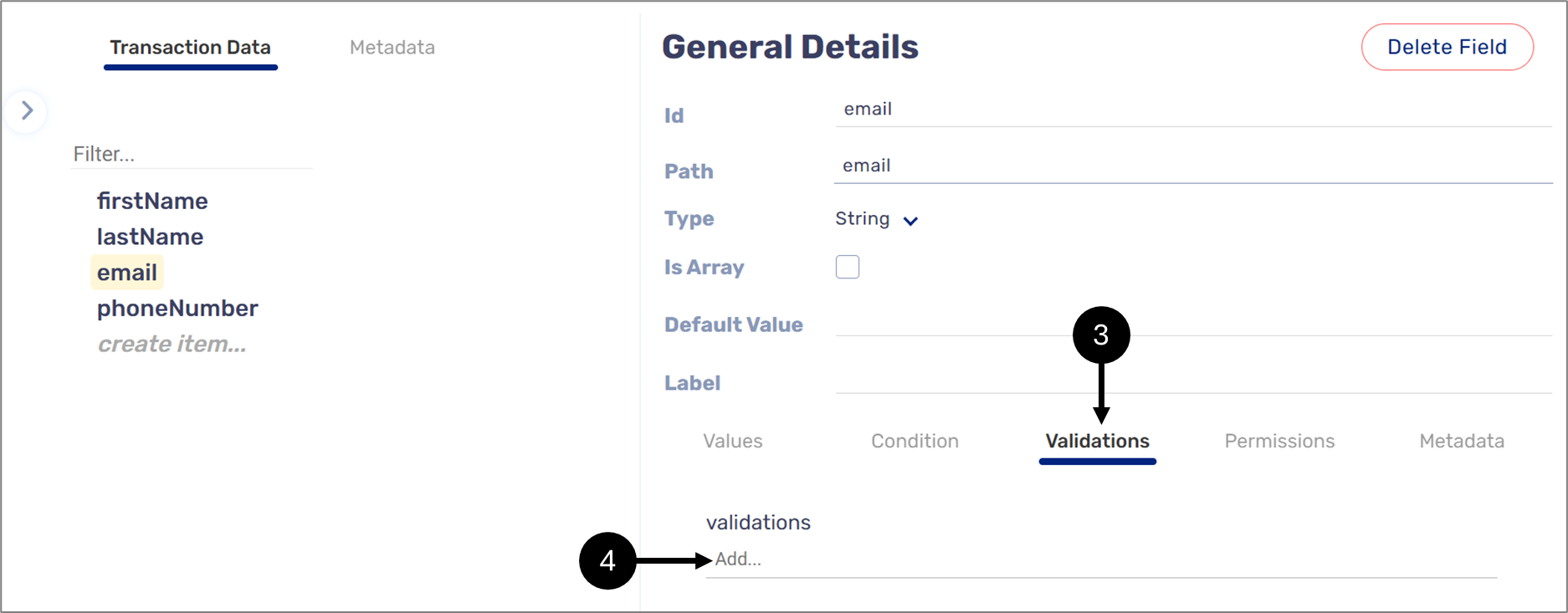
Figure 3: Validations
For the email transaction data item, the appropriate validation is email (EasySend)() (5) (see Figure 4):
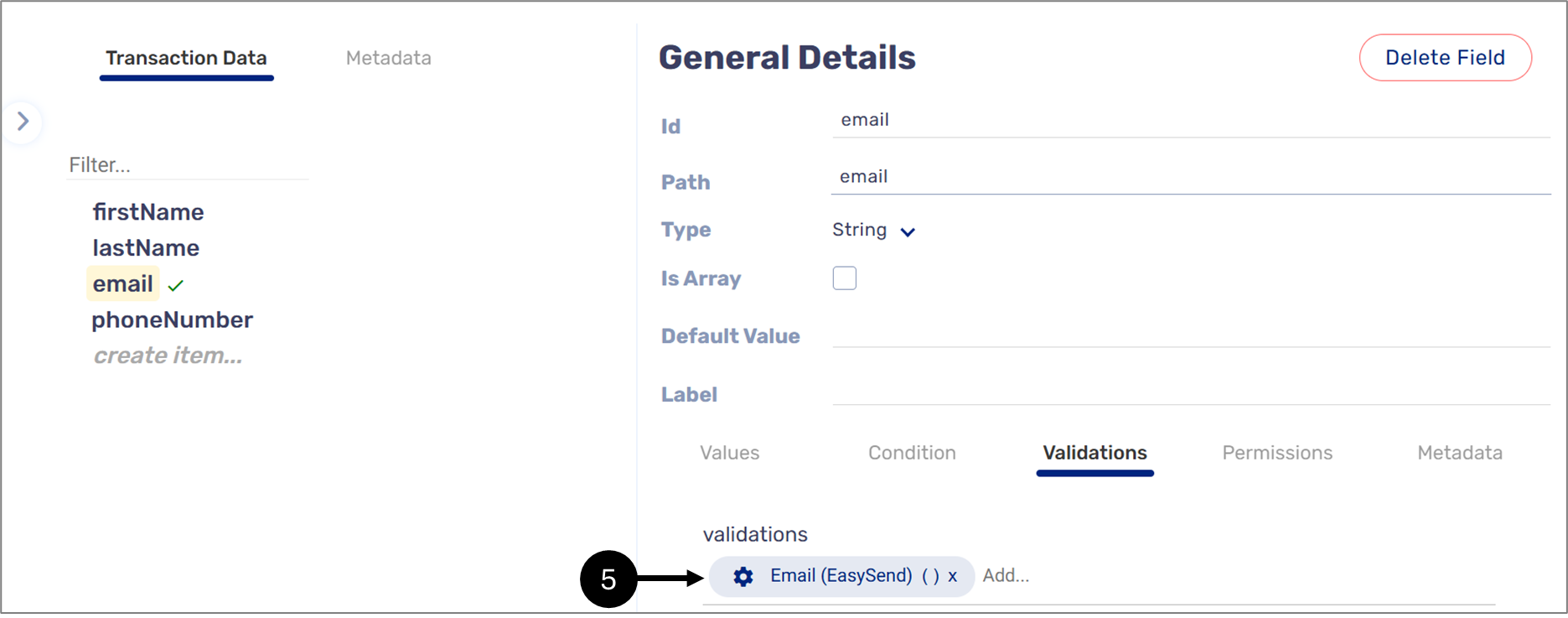
Figure 4: Email Validation
For the phoneNumber data item, the appropriate validation is Numbers Only (EasySend)() (6) (see Figure 5):
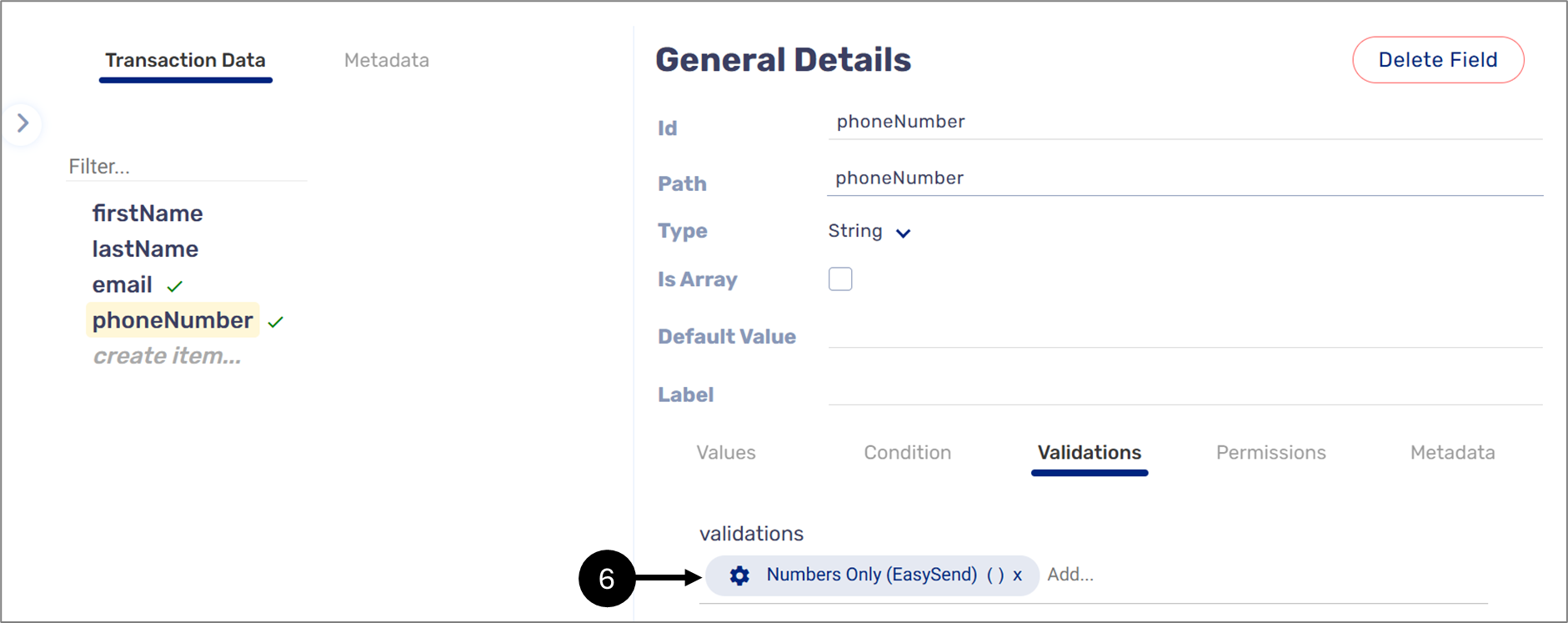
Figure 5: Numbers Only Validation
When a transaction data item is implemented with a validation, the  icon appears next to it.
Each added validation can be configured (7) with a custom validation message, instead of a default validation message, which will be displayed when it is triggred (see Figure 6):
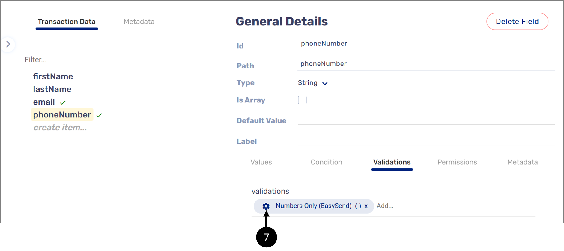
Figure 6: Validation Configuration
The Edit custom validation message window enables to override the default validation message by checking the checkbox (8) and by entering a new custom message (9) (see Figure 7):
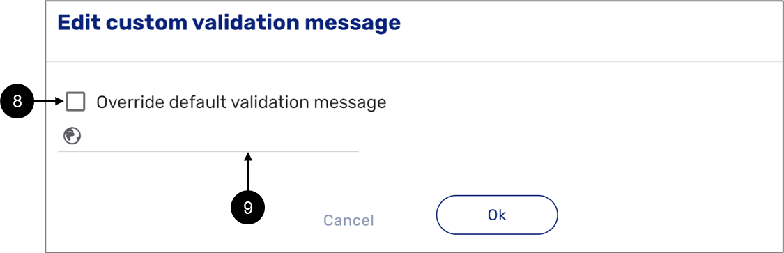
Figure 7: Edit custom validation message
Figure 8 displays the validation messages when the input data is not valid:
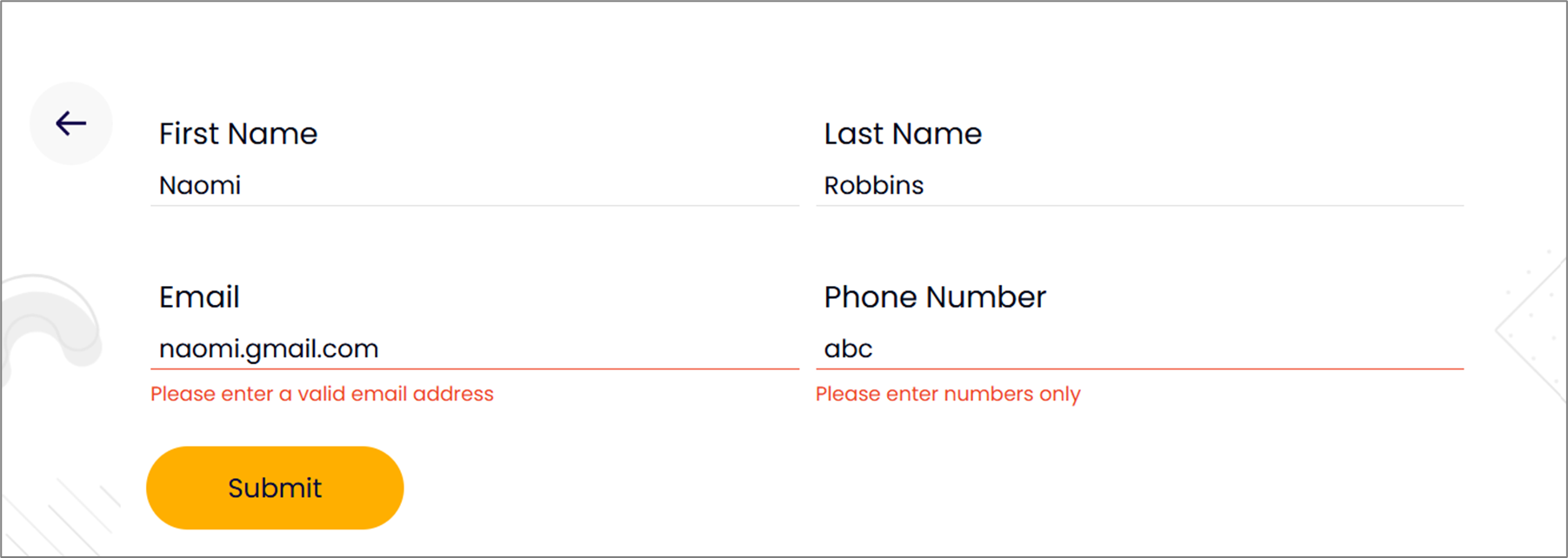
Figure 8: Validation Messages
- To manage the validations in your environment, navigate to the Validations screen.
- If you added validation in the Model screen and it is not functioning properly, perform a deployment using the Validations screen.
- For detailed information about the Validations screen, see the sections below.
- EasySend does not support required validations such as the Required (EasySend) () validation anymore. To set a data item as required, see the Required Validation section.
- Previously used required validations are still available, if deleted/removed from the Model page, they cannot be restored.
The Validations Screen
(See Figure 9 to Figure 11)
A list of validations in your environments can be found under the Validations screen. To access it, click Build (1) and then Validations (2).
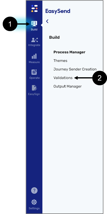
Figure 9: Build -> Validations
The Validations screen is divided into two sections:
- Custom Validations (3) - displays validations that were custom-built for your environment.
- EasySend Validations (4) - displays built-in EasySend validations.
- For a list of built-in EasySend validations, click here.
- In the Model screen, when a custom validation and an EasySend validation have the same name:
- The word EasySend will appear next to the name of the EasySend Validation.
- No specification will appear next to a custom validation.
- When adding a validation that was created using the validations bank (not covered in this article), the word process will appear next to its name.
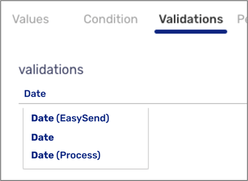
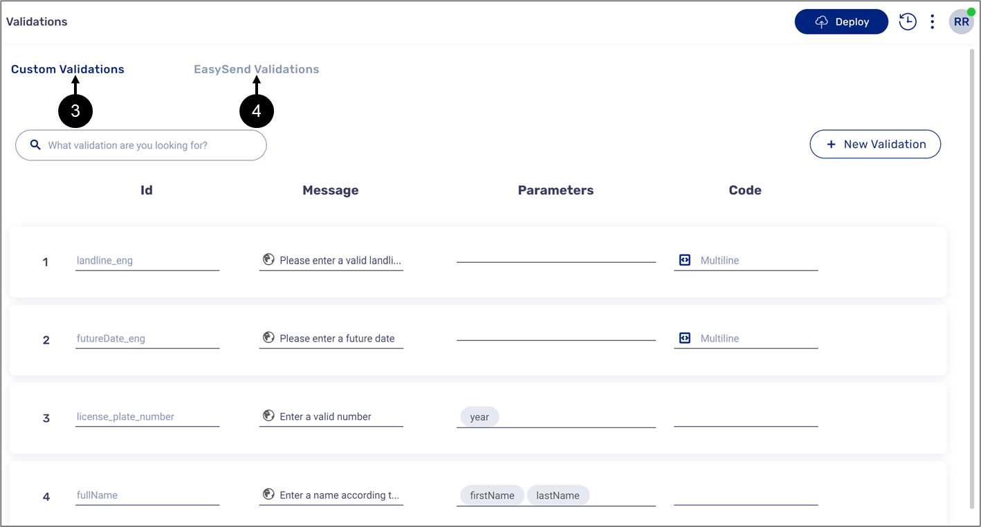
Figure 10: Validation Screen - Custom and EasySend Validations
Both sections display the following information:
- Id (5) - the name of the validations. The Id is used when adding the validation in the Model screen.
- Message (6) - the text that will appear when the validation is triggered in the digital process.
- Parameters (7) - the variables the validation needs to function properly. The parameters are used when within the code of the validation.
- Code (8) - contains the validation's lines of code.
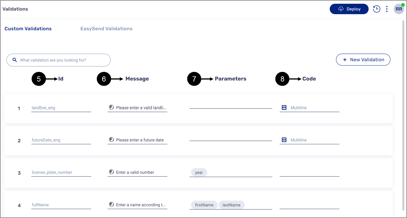
Figure 11: Validations Information
Edit Custom Validation
(See Figure 12 to Figure 16)
You can only edit the validations located under the Custom Validations section. To edit, hover over the desired validation and click the pencil icon (1).

Figure 12: Editing Information
Clicking the pencil icon displays the Edit Validation window that allows you to edit the:
- Id
- Parameters
- Message
- Code
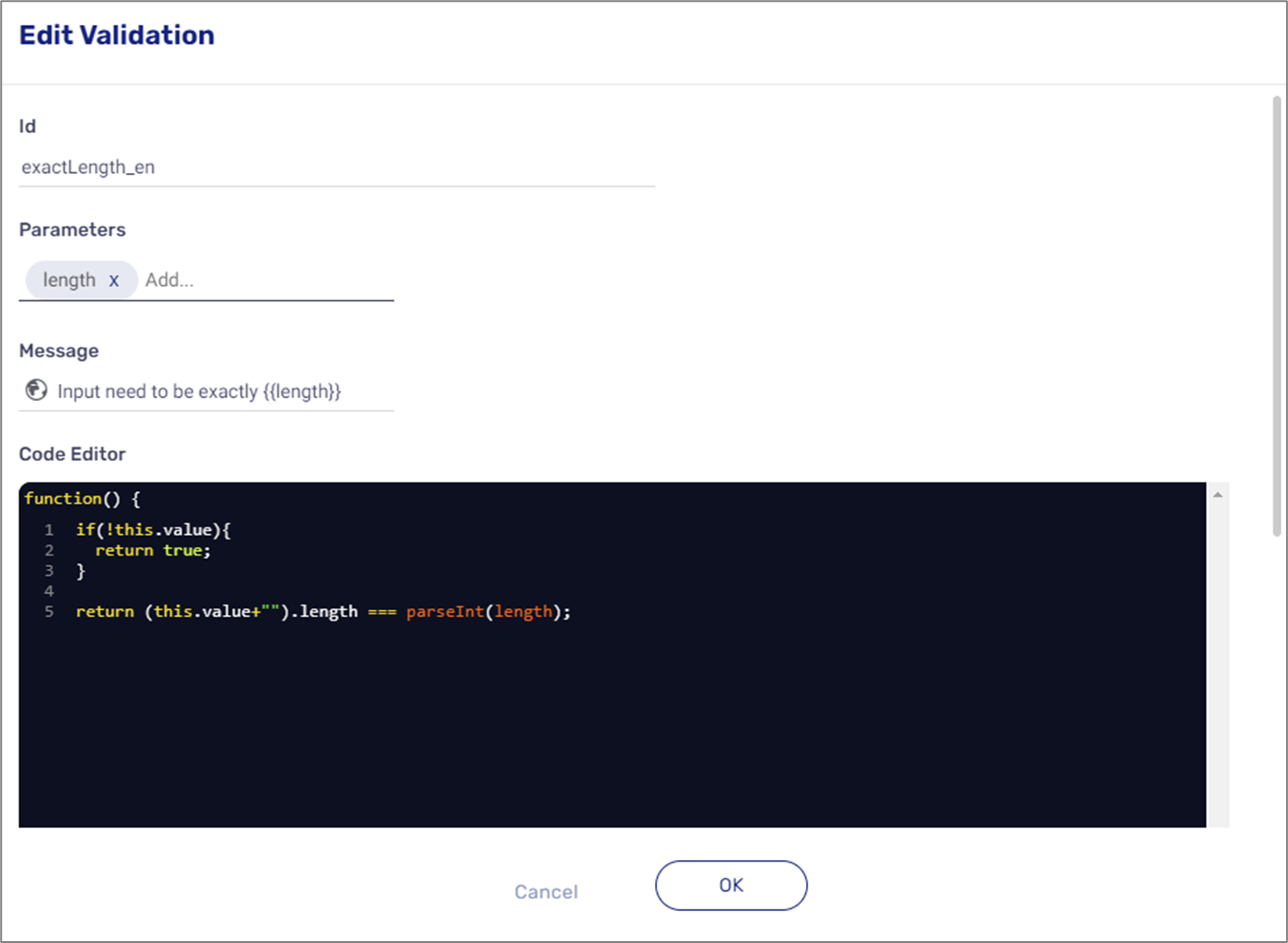
Figure 13: Editing Validation Window
The globe icon appears when multiple languages exist in your environment.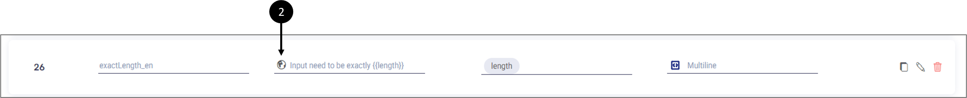
Figure 14: Globe Icon
Clicking the globe icon displays a window that allows you to input a message for each language.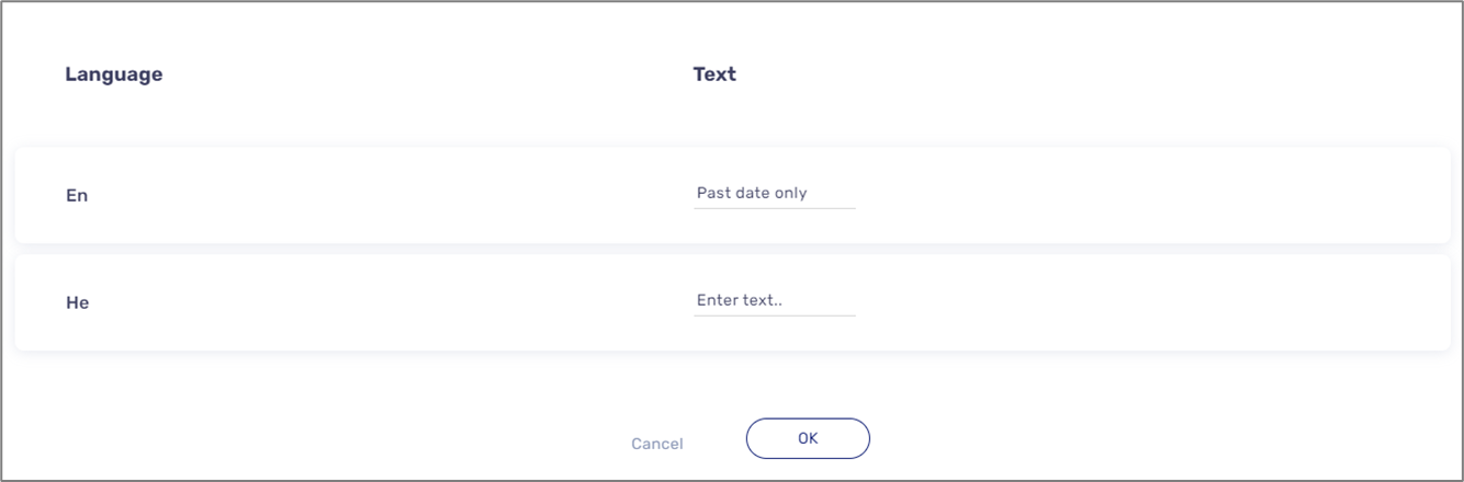
Figure 15: Languages
the code icon (3) allows you to edit the validation code.
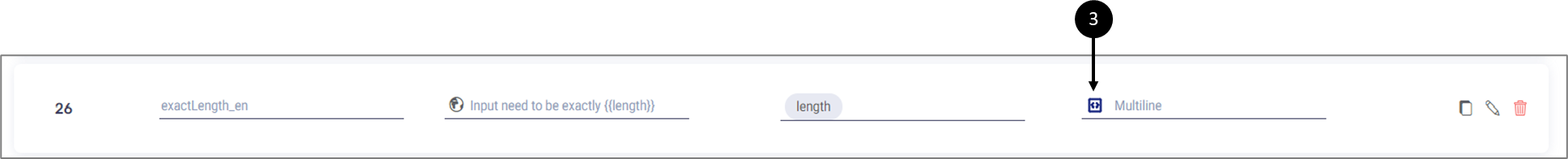
Figure 16: Code Icon
Clicking it displays the Edit code window:
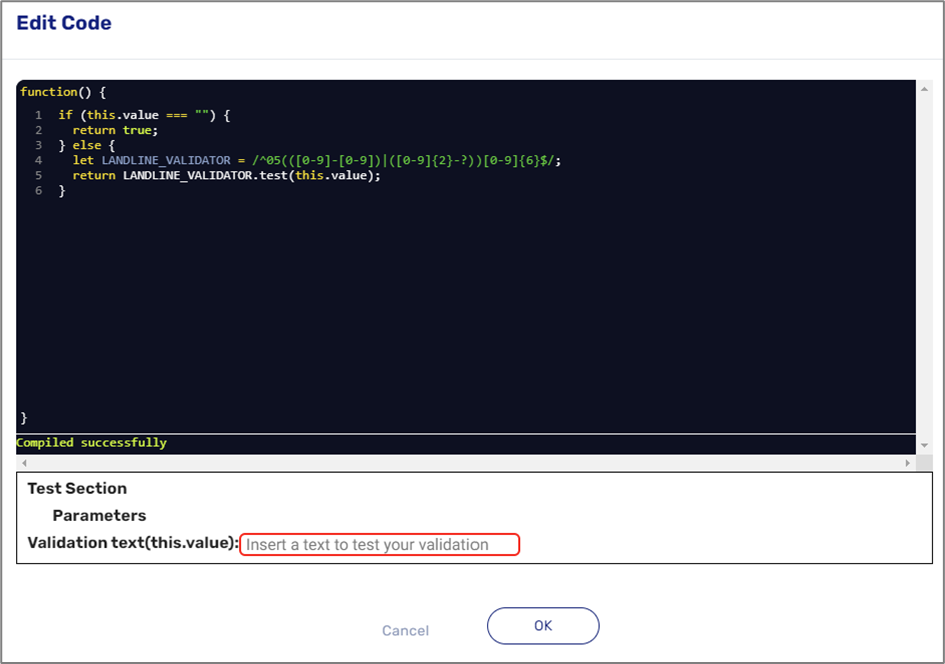
Figure 17: Edit Code Window
Duplicate a Validation
(See Figure 18 to Figure 20)
Validations from both sections can be duplicated. To duplicate a validation, hover above it and click the icon (1).
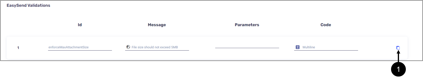
Figure 18: Duplicate Icon
Clicking the Icon displays the Duplicate Validation window that allows you to edit it.
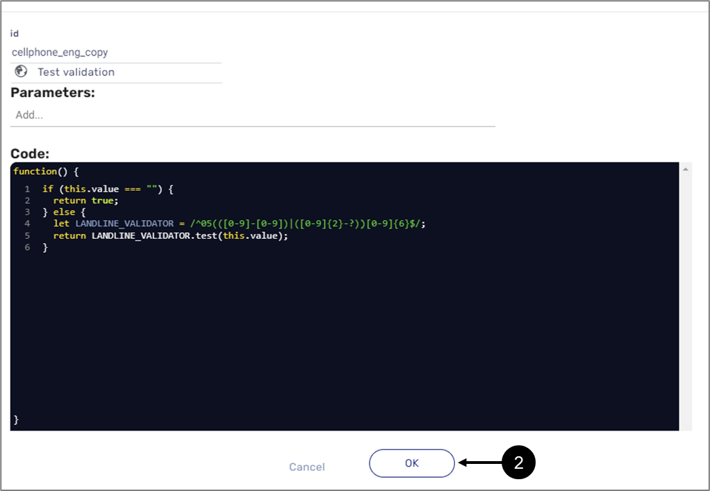
Figure 19: Duplicate Validation Window
After clicking OK (2), the validation will be added at the bottom of the Custom Validation section (3).
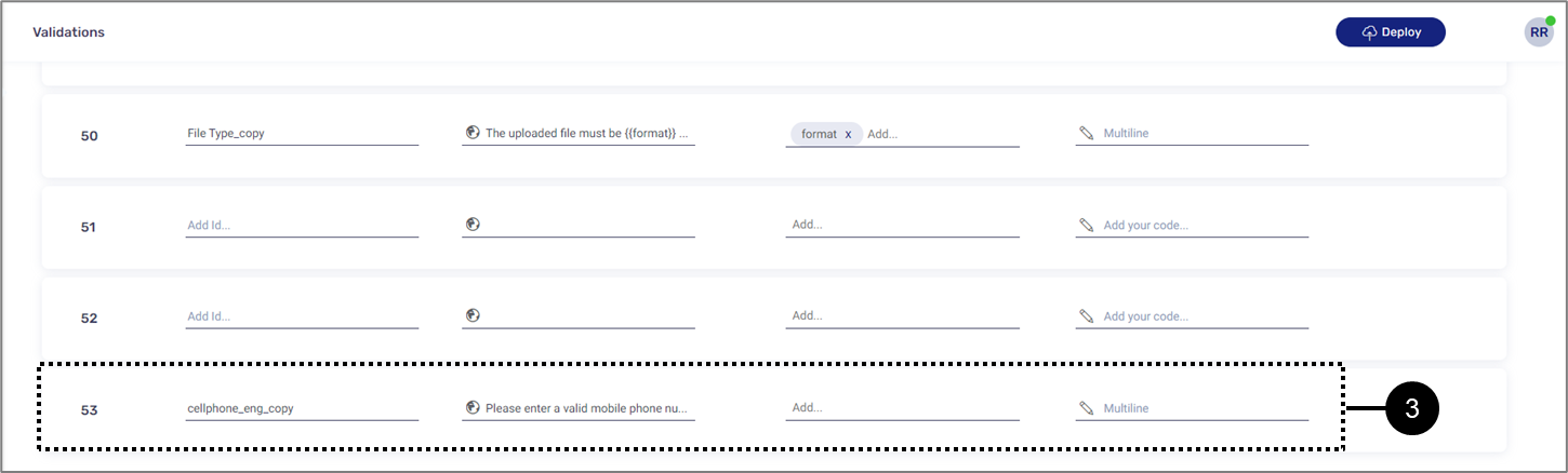
Figure 20: Added Duplicated Validation
Adding a new Custom Validation
(See Figure 21 to Figure 23)
To add a new custom validation, click the + New Validation button (1).
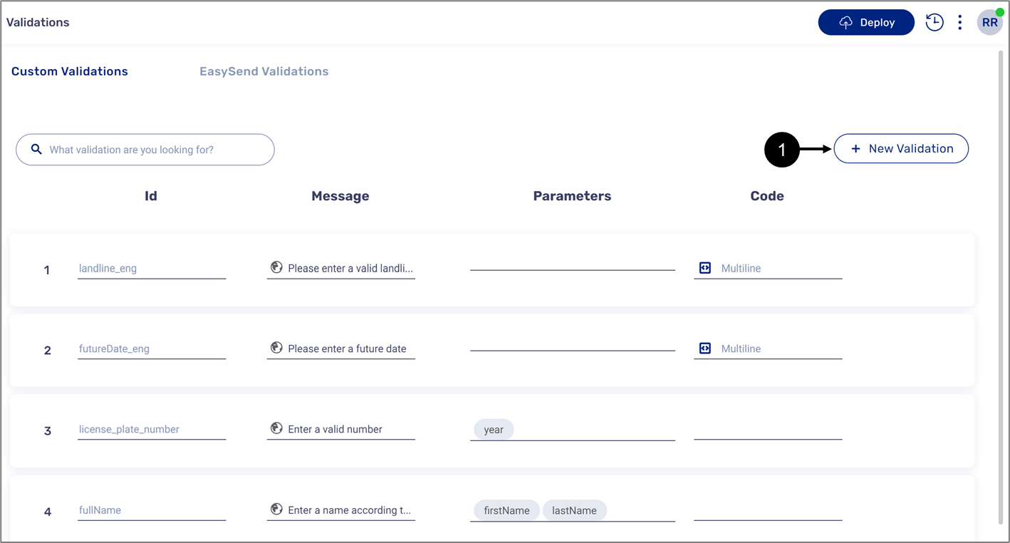
Figure 21: + New Validation
When the Edit Validation window appears, enter all the required data.
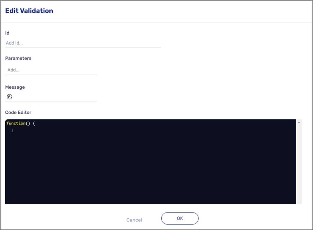
Figure 22: Edit Validation Window
After clicking OK (2), the validation will be added at the bottom of the Custom Validation section (3).
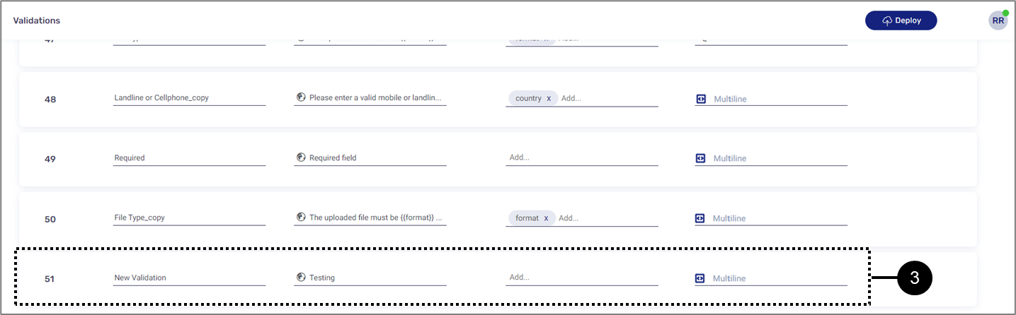
Figure 23: Added Validation
Validations Screen Deployment
(See Figure 24 to Figure 26)
Initiating a deployment process from the Validations screen is needed when:
- Validations are available to add using the Model screen but they are not functioning properly while using the digital process.
- A custom validation was added.
- A custom validation was edited.
- A validation was duplicated.
- A custom validation was deleted.
To initiate the deployment process:
- Click the Deploy button (1).
- If necessary, select a relevant server.
- Wait for the deployment process to finish.
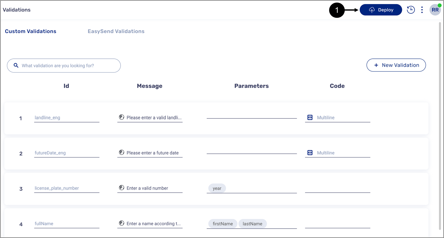
Figure 24: Deploy Button
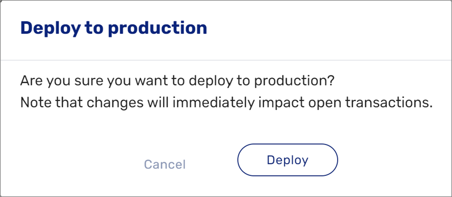
Figure 25: Deploy to Production
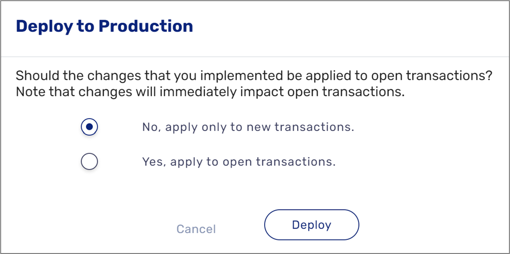
Figure 26: Deploy to Production - Apply to Transactions
Built-in EasySend Validations
Table 1 describes the built-in EasySend validations.
Table 1: Validations
Number | Name | Description | Parameter/s |
1 | Numbers Only | Allows to enter only numeric values | - |
2 | Decimal Number | Allows to enter a number or a number with a separator (dot or comma) | - |
3 | Decimal Digits | Determines how many digits after the separator (dot or comma) are allowed | digits - a number |
4 | Number Range | Allows to enter a specific numeric value or range |
|
5 | Greater Than | Allows to enter numbers bigger than a minimum value | min - a number |
6 | Less Than | Allows to enter numbers up to a maximum value | max - a number |
7 | Letters Only | Allows to enter only letters (in any language, or of one of the supported) | Language, for example:
|
8 | Checks for a valid email address | - | |
9 | Cellphone | Checks for a valid cellphone number | Country, for example:
|
10 | Landline | Checks for a valid landline number | Country, for example:
|
11 | Date | Checks for date format, supports all separators such as slash (/), dot (.), and dash (-) | Format, for example:
|
12 | Past Date | Allows to enter dates up to the current date, supports all separators such as slash (/), dot (.), and dash (-) | Format, for example:
|
13 | Future Date | Allows to enter dates from the current date and so on, supports all separators such as slash (/), dot (.), and dash (-) | Format, for example:
|
14 | Date Range | Allows to enter a specific date between some date range | Format, for example:
|
15 | Within X days from today | Checks if an entered date is in the range of x days from today, supports all separators such as slash (/), dot (.), and dash (-) | Format, for example:
|
16 | Date X days before today | Checks if an entered date is in the range of x days before today, supports all separators such as slash (/), dot (.), and dash (-) | Format, for example:
|
17 | Length Range | Allows to enter a specific or a range of characters |
|
18 | Min Length | Sets the number of characters to be bigger than some value | min - a number |
19 | Max Length | Sets the number of characters to be less than some value | max - a number |
20 | Exact Length | Allows to enter an exact number of characters | Length - a number |
21 | Identification Number | Checks for a valid identification number | Country, for example:
|
22 | International Bank Account Number (IBAN) | Identifies a valid bank account number | - |
23 | File Type | Allows to upload only the specified file types | Format, for example:
|
| 24 | Max File Size | Checks that the file weight does not exceed the specified size |
NOTE Please note that you cannot exceed the size limit of a single uploaded file - 5MB or the size limit of multiple uploaded files - 30MB |
| 25 | Formula Validation | Uses the field value calculated by a formula (must be boolean) | - |
| 26 | Required Checkbox | Checks that a checkbox was marked as true | - |
| 27 | Landline or Cellphone | Checks for a valid landline number or a valid cellphone number | Country, for example:
|
| 28 | enforceMaxAttachmentSize | Limits the size of a single uploaded file - to 5MB | - |
| 29 | enforceTotalMaxAttachmentSize | Limits the size of combined uploaded files - to 30MB | - |
| 30 | enforceFinishOngoingUploads | Enforce to wait for files to finish uploading before moving to next page | - |
| 31 | Required | Turns a field into a mandatory field | - |
- A required field is indicated by an asterisk (*) next to its name.
- A required data item doesn't display a green V next to its name
How to Videos
To quickly learn how to use validations, watch the following videos:
- Exact Number of Characters:
- Maximum Number of Characters:
- Email:
- Only Letters:
- Only Numbers:
- Past Date:
- Minimum Number of Characters:
- Valid Date:
- Future Date: