Article Overview
The following article describes the Theme feature of the Builder platform. It explains what the Theme is used for and details its structure. The article also provides information about global components and how to use multi-branding.
Way to Use a Theme?
EasySend supports full brand customization of your digital processes.
The Builder separates the configuration of the business logic of your digital processes and the configuration of your branding. While business logic is managed per digital process, the brand guidelines are set up in the Theme area. The Theme includes the following:
- All the components that can be dragged and dropped into the canvas while building a Webflow
- Colors
- Styles
- Fonts
- Logos
- backgrounds
Using the Theme, each customer can configure its own unique user experience.
Navigate to the Themes Screen
(See Figure 1)
To navigate to the Themes screen, perform the following steps:
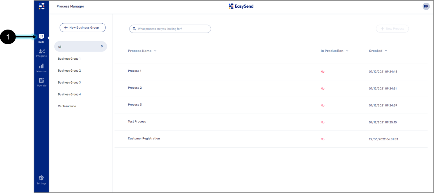
Figure 1: Build Tab
- Click the Build tab (1).
Result:
The Build tab options appear:
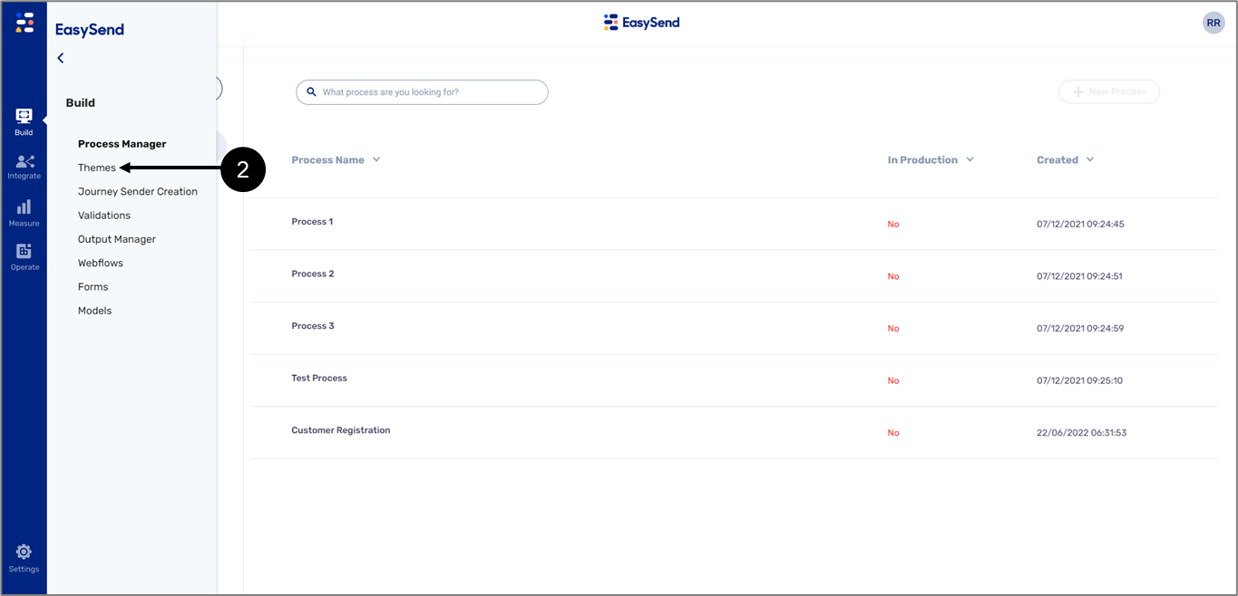
Figure 2: Themes Option
- Click the Themes option (2).
Themes Screen Description
Figure 2 and Table 1 describe the structure of the Themes screen.
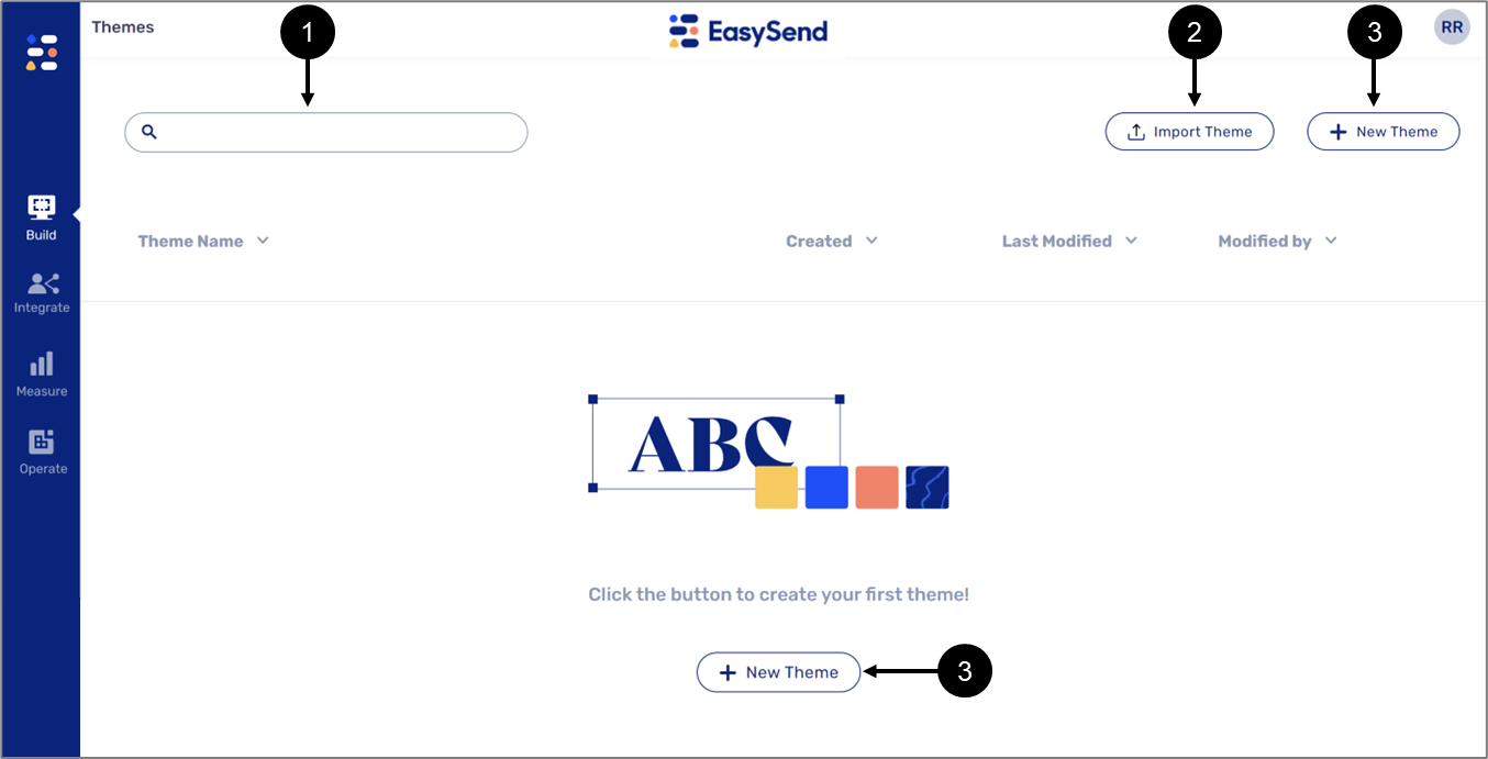
Figure 3: Theme Screen
Table 1: Theme Screen
Number | Name | Description |
1 | Search Bar | Enables to search a Theme |
2 | Import Theme | Enables to import an existing Theme to your environment |
3 | New Theme | Enables to create a new Theme |
When creating or importing Themes, they will appear in a list (4) with the following information:
- Theme Name
- Created
- Last Modified
- Modified By
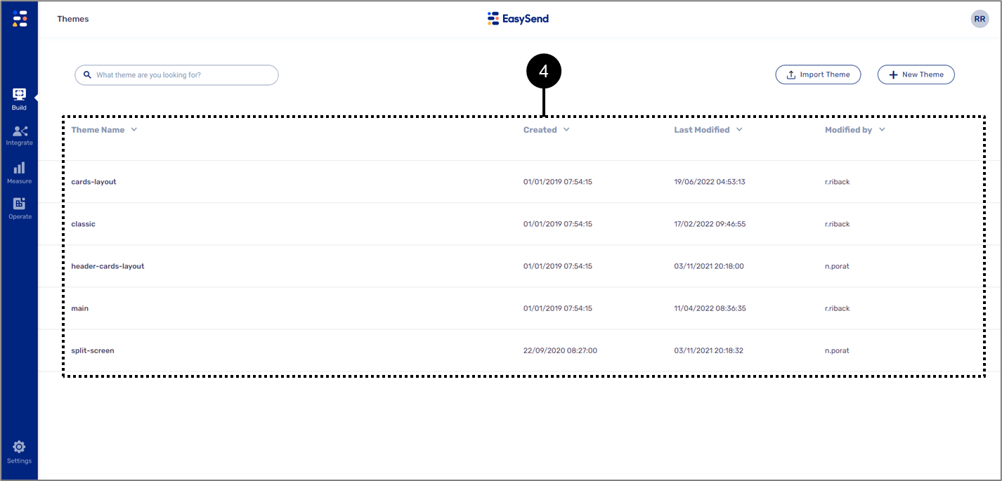
Figure 3: Theme Screen
Editing a Theme
To edit a Theme, click its name and wait for the editing screen to appear. The screen is divided into a few sections:
- Add
- Variables
- Fonts
- Images
- Pages & Sections
- Components
Add Section
Figure 4 and Table 2 describe the structure of the Add section.
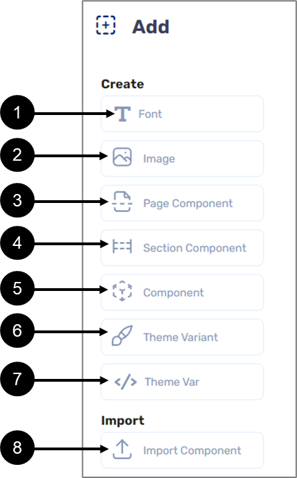
Figure 4: Add Section
Table 2: Add Section
Number | Sub-Section | Icon | Name | Description |
1 | Create |
| Font | Enables to add new fonts to the Fonts section NOTE For additional information, see the Fonts section |
| 2 |  | Image | Enables to add new images to the Images section NOTE For additional information, see the Images section | |
| 3 |  | Page Component | Enables to add a new Page component to the Page & Sections section NOTE For additional information, see the Page & Sections section | |
| 4 |  | Section Component | Enables to add a new Section component to the Page & Sections section NOTE For additional information, see the Page & Sections section | |
| 5 |  | Component | Enables to add custom components to the Theme NOTE This topic is not covered in this article, for additional information please contact our support team | |
| 6 |  | Theme Variant | Enables to create a variant of the current Theme NOTE For additional information, see the Theme Variants section | |
| 7 |  | Theme Var | Enables to create Theme variables and add them to the Variables section NOTE For additional information, see the Variables section | |
8 | Import |
| Import Component | Enables to add a new global component to the Theme NOTE For additional information, see the Adding Global Components section |


Variables
(See Figure 5)
The Variables section contains different types of variables:
- size
- color
- font-family
- boolean
- string
- image
- enum
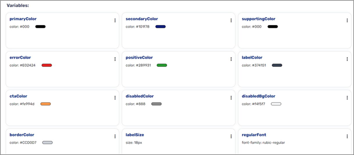
Figure 5: Variables
Variables are added using the Theme Var option from the Add section (see Figure 6):
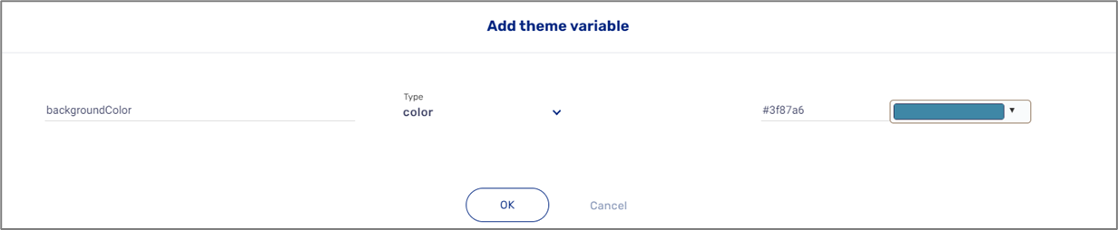
Figure 6: Add Theme variable Window
Fonts
(See Figure 7)
The Fonts section contains different types of fonts. The fonts will appear on the Rich Text component. 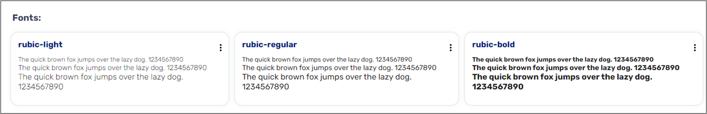
Figure 7: Fonts
Fonts are added using the Fonts option from the Add section (see Figure 8):
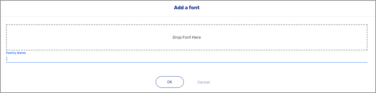
Figure 8: Add a font Window
Images
(See Figure 9)
Images are used for logos, background pictures, and icons implemented on image components and Main Page and Greeting Page components.
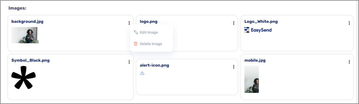
Figure 9: Images
Images are added using the Images option from the Add section (see Figure 10):
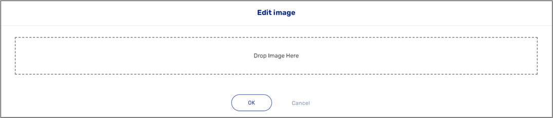
Figure 10: Edit image Window
Pages & Sections
(See Figure 11)
This section contains three components:
- Greeting Page
- Main Page
- Main Section
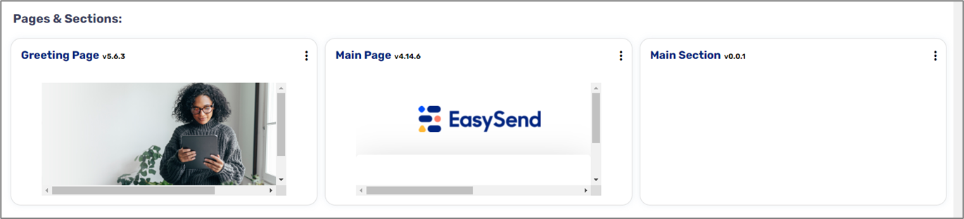
Figure 11: Pages & Sections
Pages and sections are added using the Page Component and the Section Component options from the Add section (see Figure 12):
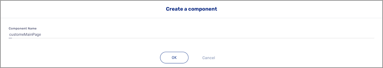
Figure 12: Create a component Window
The components under Pages & Sections are custom components. This article does not cover the topic of custom components, for additional information please contact our support team.
Global Components
(See Figure 13)
Global components are used to build your Webflows. They are imported into a Theme using the Add section and edited through variables. Global components are identified by a
globe icon (1).
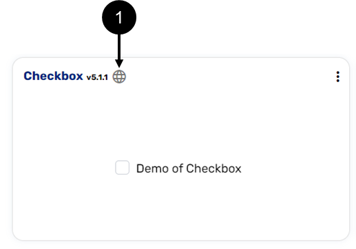
Figure 13: Global Component Globe Indicator
Adding Global Components
(See Figure 14)
Global components are imported and added using the Import component option from the Add section. The option displays the Import Component window, where you can choose the type of component from the dropdown (1), view a preview (2), and set a Display name (3).
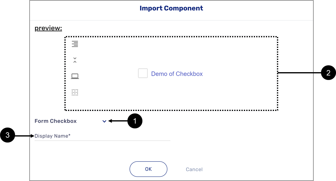
Figure 14: Import Component Window
The components will appear in one of the Theme sections according to their type:
- Buttons
- Multiple Choice (checkbox and radio question components)
- Other - all other global components
Global Components Options
Additional options for a global component appear after clicking the  icon. Figure 15 and Table 3 describe the global component options.
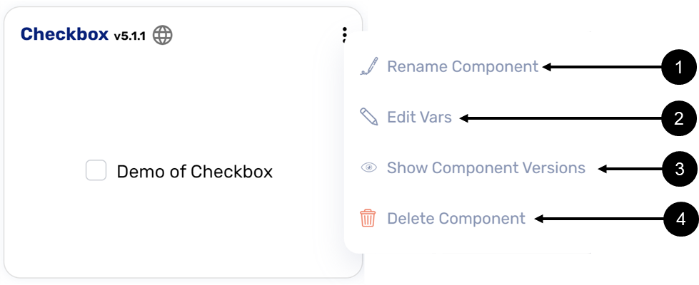
Figure 15: Global Components Options
Table 3: Global Components Options
Number | Icon | Name | Description |
1 |
| Rename Component | Enables to rename the component |
2 |
| Edit Vars | Enables to edit the variables of the component (for additional information, see the Edit Global Components section) |
3 |
| Show Component Versions |
|
4 |
| Delete Component | Enables to delete the component |


Edit Global Components
(See Figure 16 and Figure 17)
Global components are edited by configuring variables. Clicking the Edit Vars option opens a window that displays a list of variables connected to the component with the following information:
- Var Name
- Var Type
- Var Value
- Link
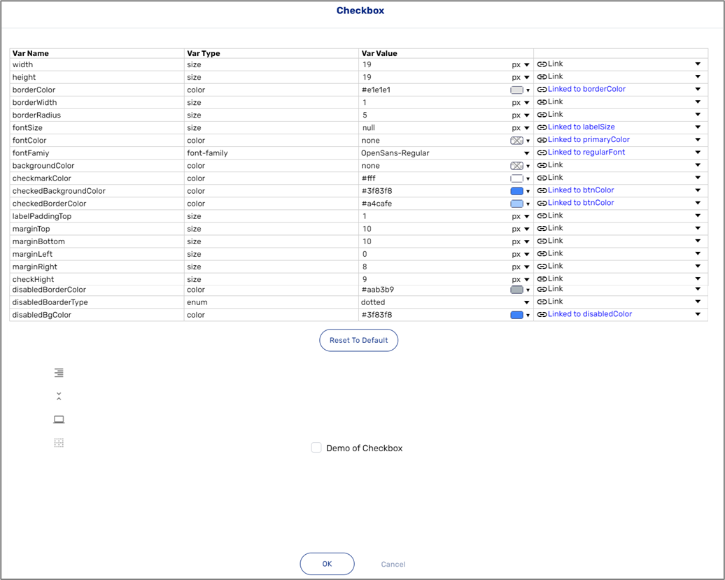
Figure 16: Global Component Variables
The value of a variable can be set manually using the Var Value column, but if a variable is linked to one of the Theme's variables, the Var Value is then overridden. For example, the width variable (1) is not linked to any Theme variable (2), so its value is set manually to 19 (3). The height variable (4) is linked to the inputSize Theme variable (5), so its value is set according to it, and its manual Var Value (6) is overridden.
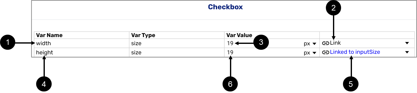
Figure 17: Variables and Values
Why Link to a Theme Variable?
(See Figure 18 and Figure 19)
It is important to understand the advantage of linking global components to a Theme variable, it enables you to edit them in bulk. If a few global components are connected to the same Theme variable, when editing it, the changes will be applied to all of them. For example, if the checkbox and the Radio Question global components are connected to the regularFont Theme variable (1), when editing it and changing its font type (2), the changes will be applied to both at once.
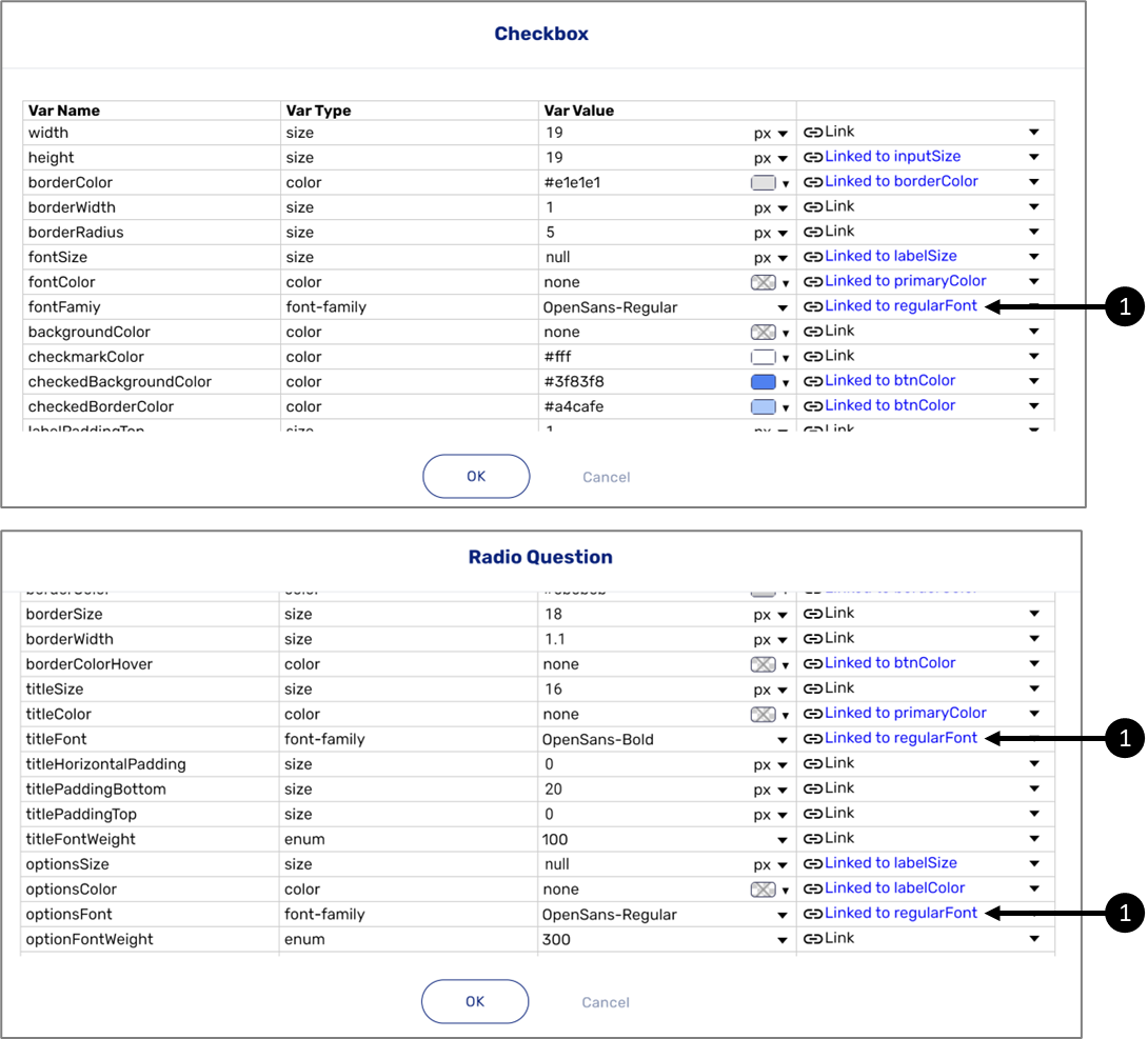
Figure 18: Global Components and Variables
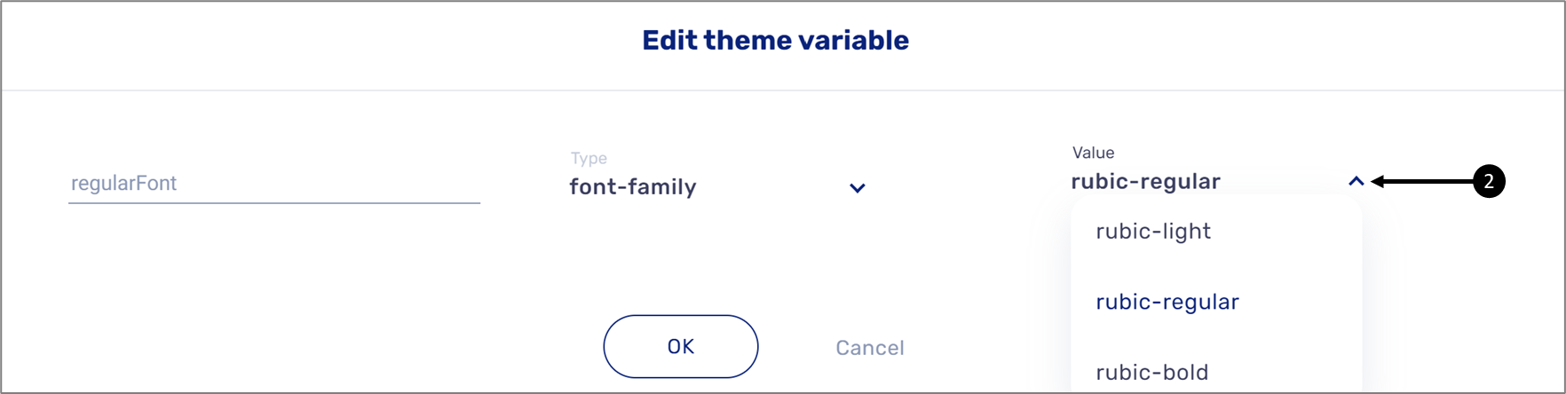
Figure 19: Edit theme variable window
Components Versions
(See Figure 20)
Components are updated when a change affects them, for example, a visual change or a change in their code. The change is reflected in the displayed version of each
component (1):
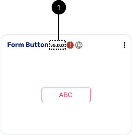
Figure 20: Component Version
When updating the version of a component, the change can occur in three different levels:
- Major
- Minor
- Patch
For example, if the version of the component is v5.0.0, when the update is major, the new version will be v6.0.0, if the update is minor the new version will be v5.1.0, and if the update is a patch then the new version will be v5.0.1.
When and How to Perform a Version Update of a component?
(See Figure 21)
The request to update the version of a global component is received automatically by EasySend as indicated by the indicator (1) appearing next to the version number of the component.
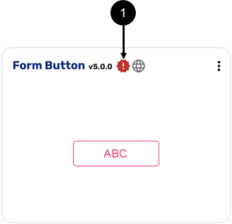
Figure 21: Updated Needed Indicator
To update the version of a component, perform the following steps (see Figure 22 to Figure 26):
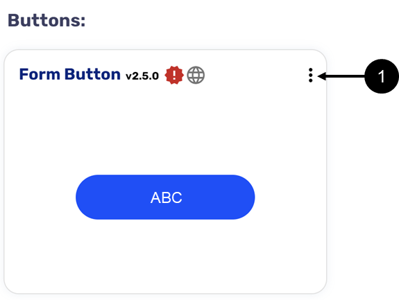
Figure 22: Additional Options Icon
- Click the additional options icon (1) of the desired global component.
Result:
Additional options appear:
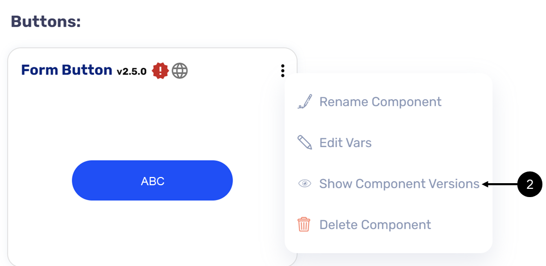
Figure 23: Show Component Versions Option
- Click the Show Component Versions option (2):
Result:
The Version History window appears:
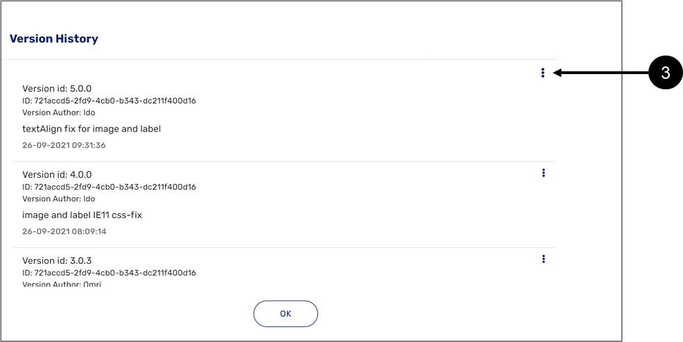
Figure 24: Version History Window
- Click the additional options icon (3) of the desired version.
Result:
The Set option (4) appears:
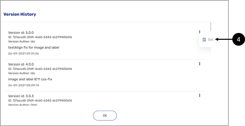
Figure 25: Set Option
- Click the Set option (4).
Result:
The version of the component is updated (5), and the update required indicator disappears:
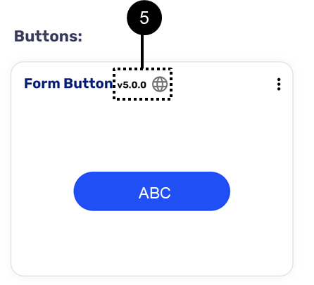
Figure 26: Updated Component Version
Theme Variants
You can use your Theme and create more than one look and feel design in the same digital process. For example, in addition to the main brand, you may want to have a youth brand.
To answer this need, EasySend provides the ability to create Theme variants and configure multiple designs in one Theme while maintaining a single process.
Theme variants functionality will affect the high-level design of the process which includes:
- Images (for background, logo, and icons)
- Colors
- font family
- font size
How to Create a Theme Variant?
(See Figure 27 to Figure 40)
To create a Theme variant , perform the following steps:
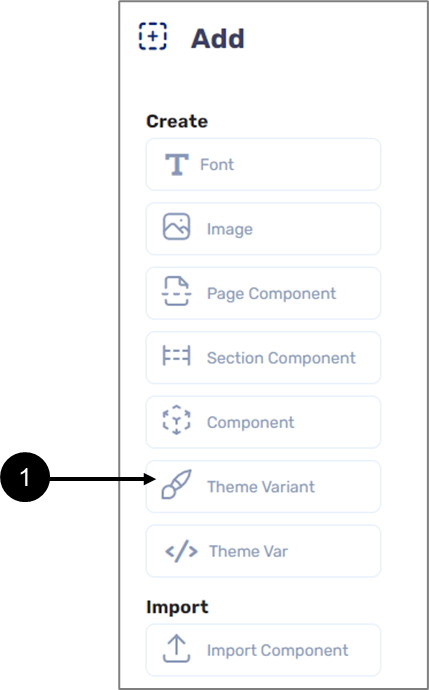
Figure 27: Updated Component Version
- Click the Theme Variant option (1).
Result:
The Add Theme variant window appears:
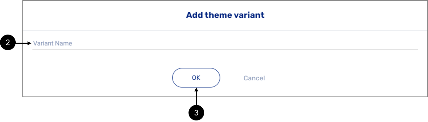
Figure 28: Add Theme variant Window
- Enter the Variant Name (2).
The variant name must not be empty and contain only lowercase letters, uppercase letters, numbers, and an underscore ('_').
- Click the OK button (3).
Result:
The new variant is added under the Theme variants section, and it is the active one:
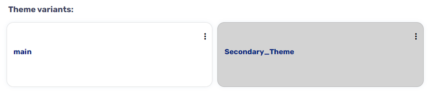
Figure 29: New Theme Variant
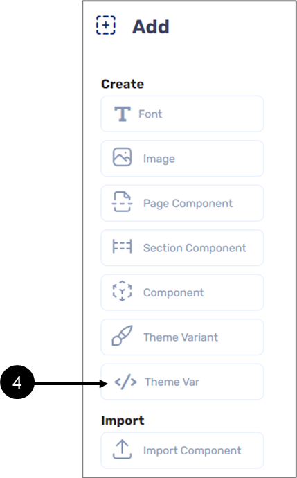
Figure 30: New Theme Variant
Now add a Theme variable, the example will continue with a color Theme variable:
- Click the Theme Var option (4).
Result:
The Add Theme variable window appears:
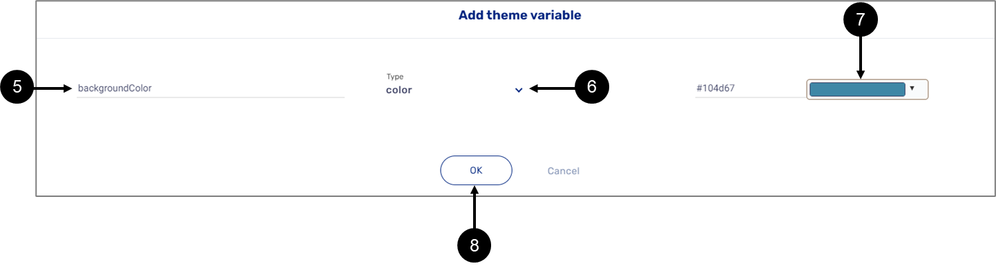
Figure 31: Add Theme variable Window
- Enter a Var Name (5).
- Select the Type (6) (color).
- Select the color (7).
- Click the Ok button (8).
Result:
The new color Theme variable (9) is added to the Variables section:
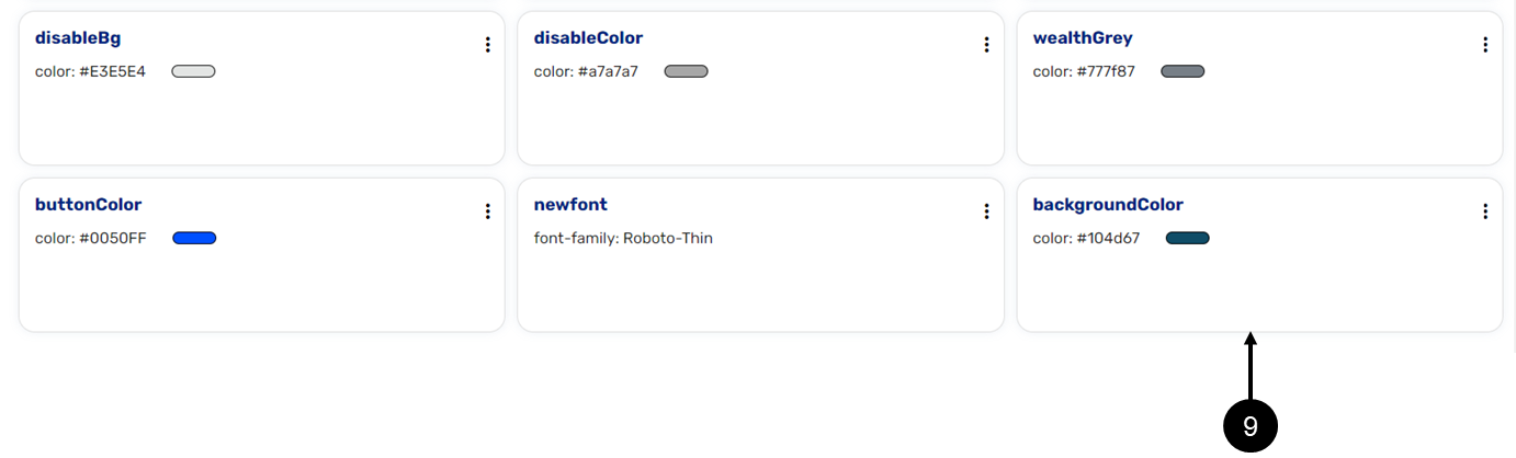
Figure 32: New Color Theme Variable
The newly added Theme variable appears on both Theme variants but when applying changes to it the changes will be implemented only on the current active selected Theme variant, for example:
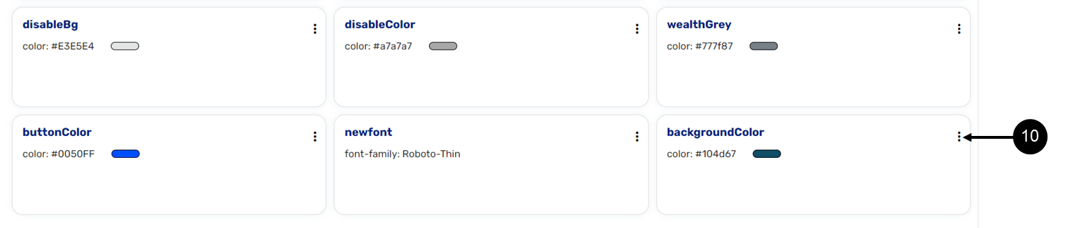
Figure 33: New Color Theme Variable
- Click the additional options icon (10) of the added color Theme variable.
Result:
Additional options appear:
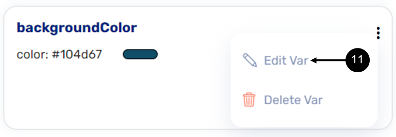
Figure 34: Edit Var Option
- Click the Edit Var option (11).
Result:
The Edit Theme variable window appears:
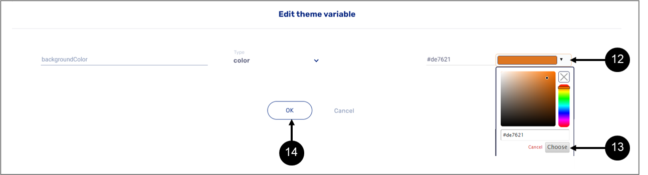
Figure 35: Edit Theme variable Window
- Click the dropdown (12) and select a new color.
- Click the Choose button (13).
- Click the OK button (14).
Result:
The color Theme variable has a new color:
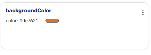
Figure 36: Theme variable with New Color
To verify that the change only occurred on the selected active Theme variant, switch between them:
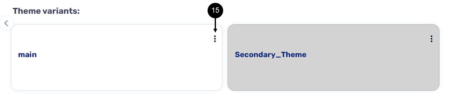
Figure 37: Additional Options Icon
- Click the additional options icon (15).
Result:
The Select Variant option (16) appears:
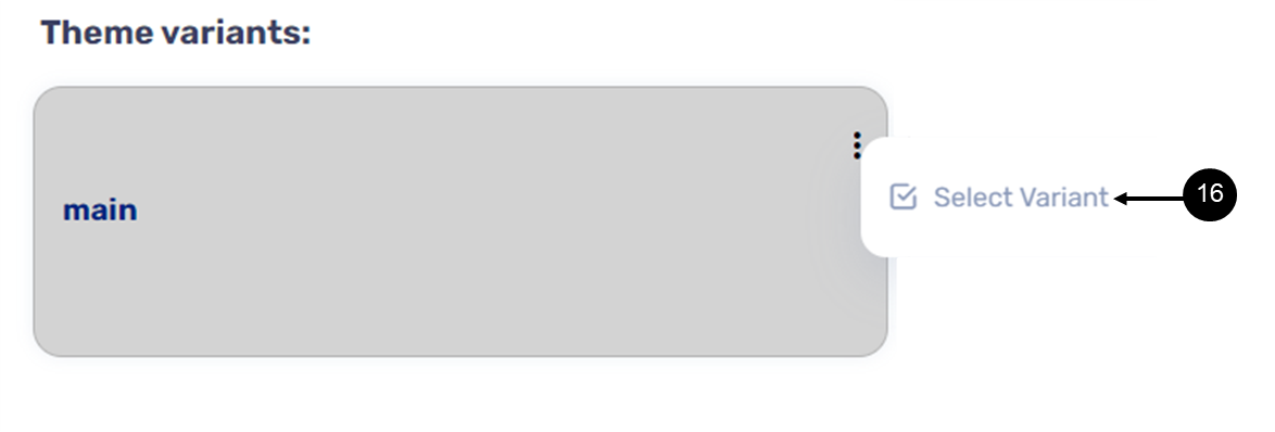
Figure 38: Selected Variant Option
- Click the Select Variant option (16).
Result:
The Theme variant is selected as the current active Theme.
- Locate the color Theme variable and verify the color is different from the one that was set in the second variant.
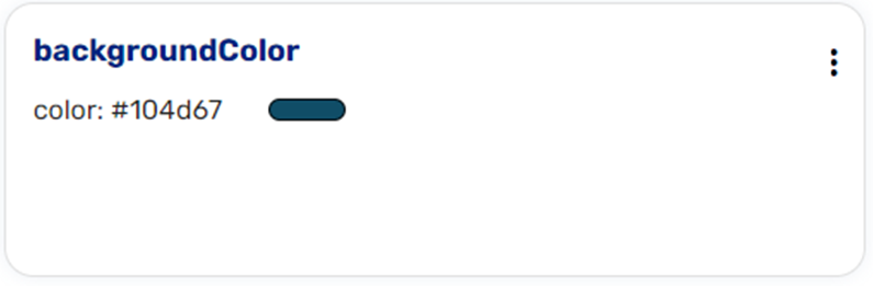
Figure 39: Color Theme Variable
How to Use Theme Variants?
To use Theme variants, first use the Process Settings screen to verify that the correct Theme is attached to the Webflow:
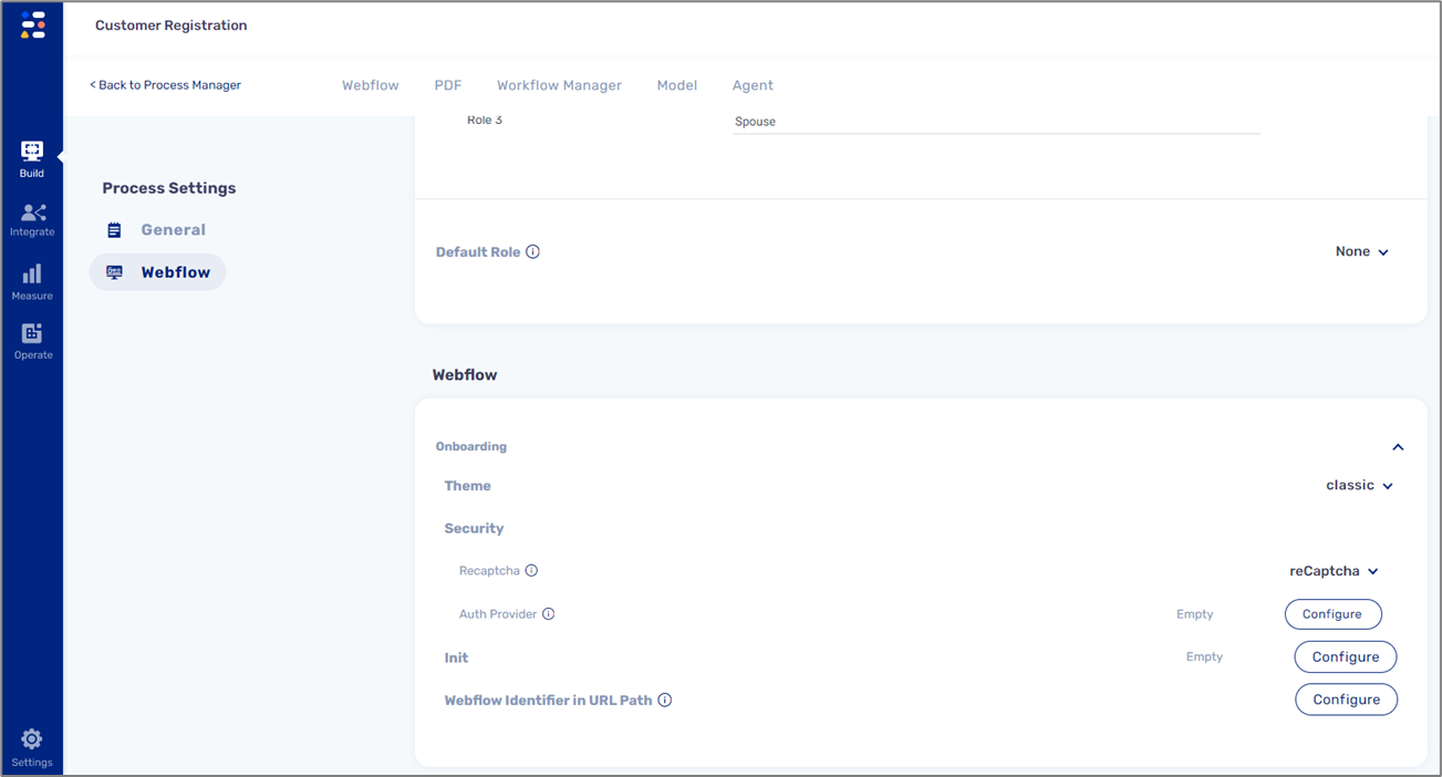
Figure 40: Process Settings Screen - Select a Theme
Second, the name of the Theme variant must appear in the URL of the digital process to be active. For example, by adding the name of the Theme variant to a digital process link that is sent through a workflow step:

Figure 41: Digital Process Link with a Theme Variant Name
When initiating the the digital process, for example through the Journey Sender, the link containing the name of the Theme variant will be received and clicked by the end-user. The process will appear with the design of the theme variant.