Article Overview
The following article details the design capabilities of the Text Input component.
Design Guidelines
Figure 1 and Table 1 describe the design capabilities of the Text Input component:
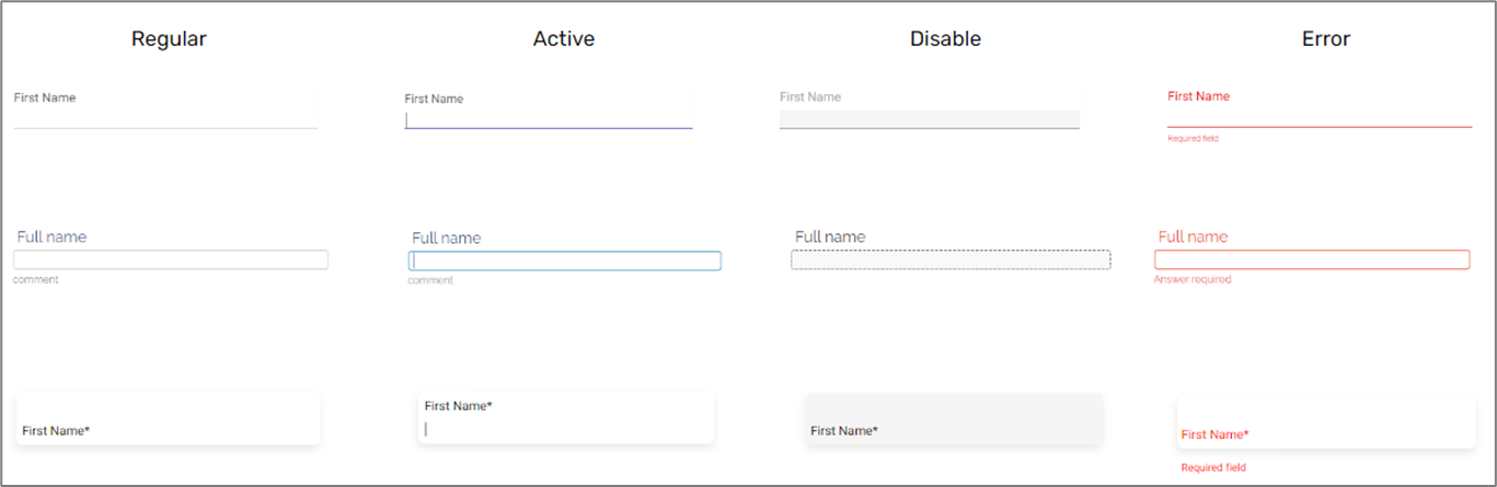
Figure 1: Design Capabilities
Table 1: Design Capabilities
Element | Design attribute | Change on hover? | Change on disable? | Change on error? | Notes |
Input | font | No | No | No |
|
| color | No | Yes | Yes | ||
| width | No | No | No | ||
| Label | font | No | No | No |
|
| scale % focused | No | No | No | ||
| color | No | Yes | Yes | ||
| color filled | No | No | No | ||
| padding | No | No | No |
| |
| bouncing label | No | No | No | ||
| Background | color | No | Yes | No | |
| Border | width | No | Yes | No | |
| color | No | Yes | Yes | ||
| radius | No | No | No | ||
| type | No | Yes | No | ||
| Max. dropdown height | No | No | No | ||
| Error | color | No | No | No | |
| margin top | No | No | No | ||
| font size | No | No | No | ||
| Comment color | No | No | No | ||
| Margins | No | No | No |
| |
| Placeholder | color | No | No | No | |
| font size | No | No | No | ||
| Layout type | No | No | No | 3 options, see Figure 1 | |
| Symbol | padding | No | No | No | |
| direction | No | No | No | ||
| Spinner | width | No | No | No | |
| background color | No | No | No | ||
| color | No | No | No | ||
| Shadow | color | No | No | No | |
| width | No | No | No | ||
| height | No | No | No | ||
| blur | No | No | No |