Article Overview
The following article describes the Design properties of the Text Field component.
Viewing Design Properties
(See Figure 1)
To view the design properties of the Text Field component, perform one of the following:
- Drag and drop it onto its desired location in the canvas and click it.
- If the component is already added to the canvas, locate and click it.
- If the component is already added to the canvas, locate and click it using the Navigator.
The Design properties will appear in the right section under the Design tab.
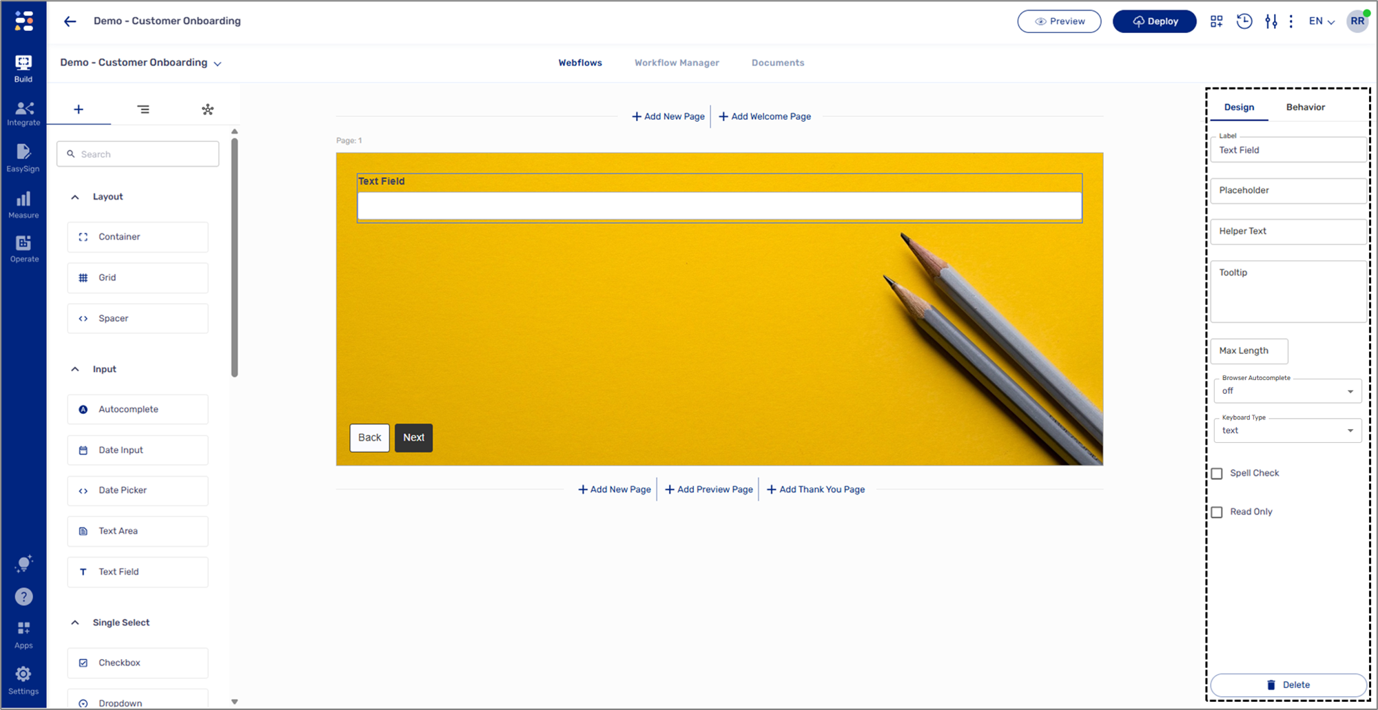
Figure 1: Design Properties
Text Field Design Properties
(See Figure 2)
The Text Field component has the following Design properties:
- Label - enables you to set the display name of the component. The name will be visible to end-users when interacting with the digital process.
- Placeholder - a filler, temporary text that will be displayed to end-users when interacting with the digital process. The placeholder text cannot be deleted and will remain until the end-user inputs new text.
- Helper Text - a text designed to guide end-users regarding the required input.
- Tooltip - enables you to add a tooltip to the component. The tooltip appears when the journey is active.
- Max Length - the maximum number of characters (including spaces and enter) end-users can input when interacting with the digital process.
- Browser Autocomplete - predicts and fills in form data:
- name
- street-address
- address-line1
- address-line2
- country
- country-name
- postal-code
- bday
- sex
- tel
- Keyboard Type - sets a specific type of keyboard for data input (for mobile only):
- text
- tel
- url
- numeric
- decimal
- search
- Spell Check:
- When checked - spellcheck for the information input by end-users is on.
- When not checked - spellcheck is disabled.
- Read Only:
- When checked - the component is locked for data input.
- When not checked - the component is used for data input.
- Delete - removes the component from the canvas.
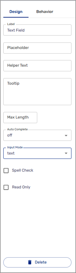
Figure 2: Text Field Design Properties