Article Overview
The following article details the design capabilities of the Text Area component.
Design Guidelines
Figure 1 and Table 1 describe the design capabilities of the Text Area component:
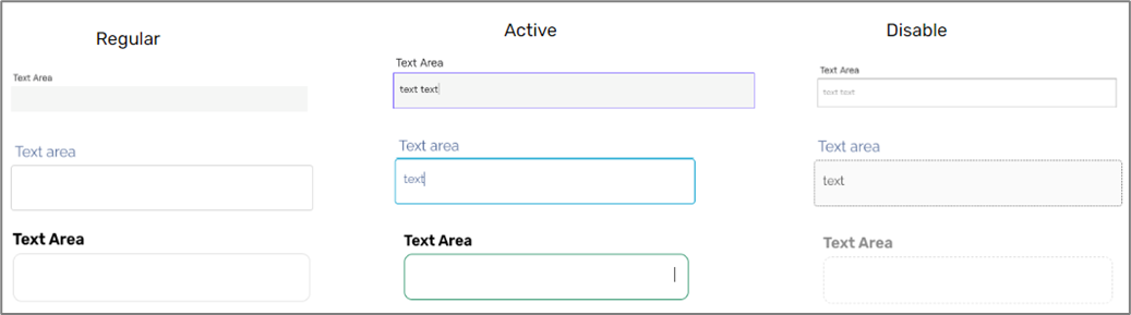
Figure 1: Design Capabilities
Table 1: Design Capabilities
Element | Design attribute | Change on error? | Change on disable? | Change on focus? | Notes |
Input | color | No | Yes | No | |
| Label | font | No | No | No |
|
| vertical | No | No | No | ||
| color | Yes | Yes | No | ||
| after-focus font size | No | No | No | ||
| padding | No | No | No | horizontal | |
| bouncing label | No | No | No | ||
| Background | color | No | Yes | No | |
Border | color | No | Yes | Yes | |
| width | No | Yes | Yes | ||
| type | No | Yes | No | ||
| radius | No | No | No | ||
| size | No | No | No | ||
| style | No | No | No | Dotted/solid | |
| Font | family | No | No | No | |
| size | Yes | No | No | ||
| color | Yes | No | No | ||
| Text padding | No | No | No | ||
| Margins | Yes | No | No |
| |
| Height, width | No | No | No |