Article Overview
The following article describes the structure of the new Workflow Manager.
Structure Overview
(See Figure 1)
The Workflow Manager is divided into two main sections: Process Building (1) and the work area (2).
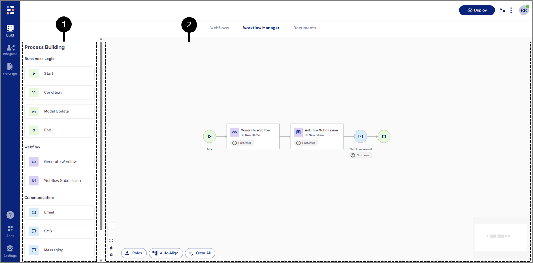
Figure 1: Workflow Manager Structure
Process Building
(See Figure 2)
This section contains a process's building blocks:
- Business Logic
- Start
- Condition
- Model Update
- End
- Webflow:
- Generate Webflow
- Webflow Submission
- Communication:
- SMS
- Massging
- Services
- Integration
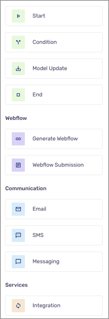
Figure 2: Process Building
Work Area
(See Figure 3 to Figure 5)
The work area acts as the Workflow Manager's canvas, where you can design and visualize your digital process workflow. By dragging and dropping building blocks onto the canvas, you can map out the flow of your process. Connections between building blocks are drawn using arrows to represent their relationships, data flow, and the sequence of operations. Once placed, each building block on the canvas has customizable properties, allowing for precise configuration. Building blocks can also be easily deleted or duplicated to adapt your workflow as needed, giving you full flexibility in crafting your process. When accessing the Workflow Manager for the first time, it appears with a default visualization.
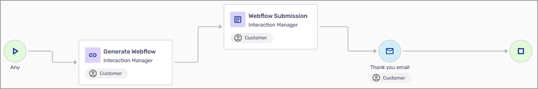
Figure 3: Default Visualization
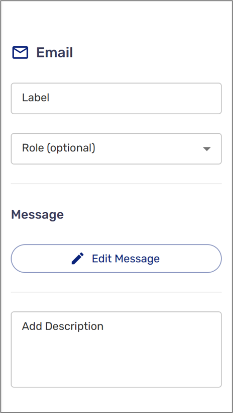
Figure 4: Email Properties
The work area has a mini-map (1) that displays the placed building blocks and the following buttons:
- Zoom in (2)
- Zoom out (3)
- Fit view (4)
- Toggle interactivity on/off (5)
- Highlight components according to roles (6)
- Auto-align, reorganize the building blocks in the work area (7)
- Clear All (8)
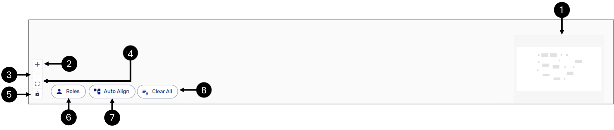
Figure 5: Work Area Map and Buttons
Control your Workflow with the Mouse
The left click of the mouse can be used to drag and select multiple components. The right click of the mouse or the Space bar, with the left click of the mouse, can be used to drag all the placed building blocks around the canvas.