Article Overview
The following article describes the Design properties of the Spacer component.
Viewing Design Properties
(See Figure 1)
To view the design properties of the Spacer component, perform one of the following:
- Drag and drop it onto its desired location in the canvas and click it.
- If the component is already added to the canvas, locate and click it.
- If the component is already added to the canvas, locate and click it using the Navigator.
The Design properties will appear in the right section under the Design tab.
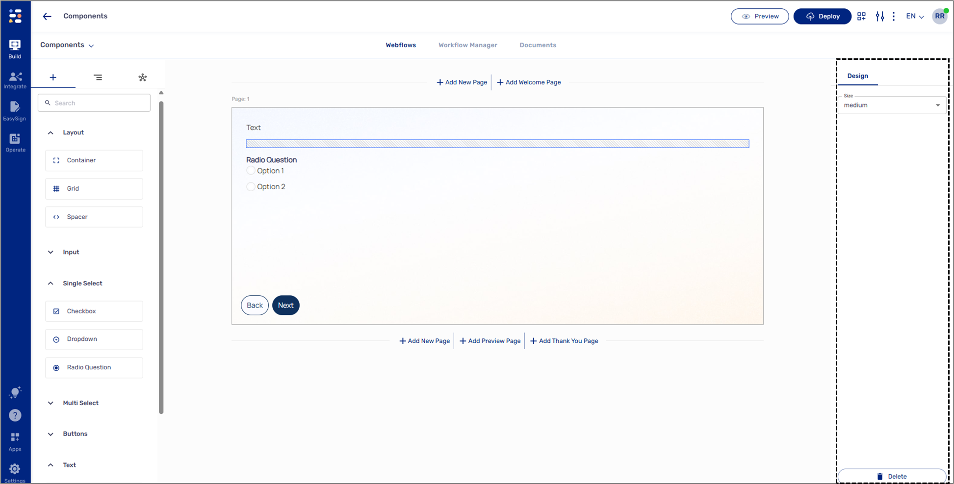
Figure 1: Design Properties
Spacer Design Properties
(See Figure 2)
The Spacer component has the following Design properties:
- Size:
- small
- medium (default)
- large
- Delete - removes the component from the canvas.
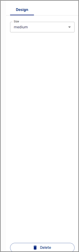
Figure 2: Spacer Design Properties