Radio Group
- PDF
Radio Group
- PDF
Article summary
Did you find this summary helpful?
Thank you for your feedback!
Article Overview
The following article describes the Design properties of the Radio Group component.
Viewing Design Properties
(See Figure 1)
To view the design properties of the Radio Group component, perform one of the following:
- Drag and drop it onto its desired location in the canvas and click it.
- If the component is already added to the canvas, locate and click it.
- If the component is already added to the canvas, locate and click it using the Navigator.
The Design properties will appear in the right section under the Design tab.
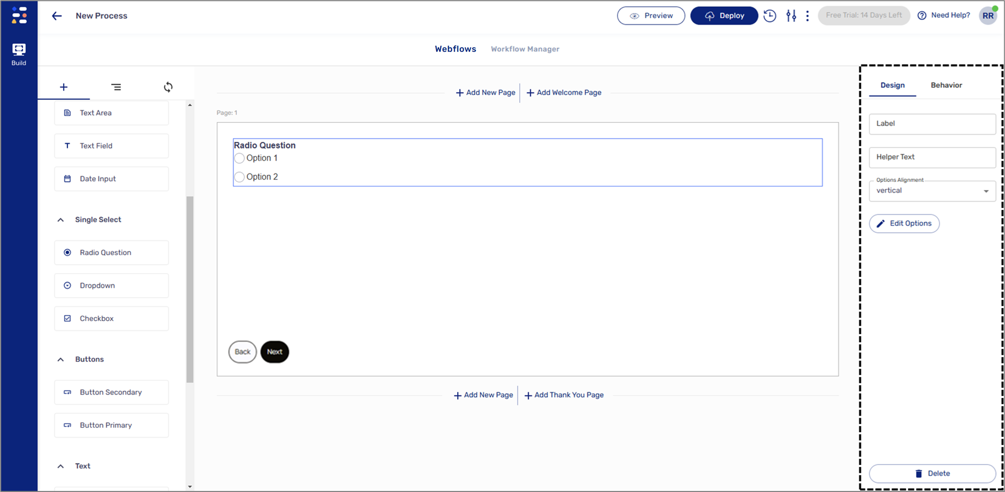
Figure 1: Design Properties
Radio Group Design Properties
(See Figure 2)
The Radio Group component has the following Design properties:
- Label - enables you to set the display name of the component. The name will be visible to end-users when interacting with the digital process.
- Helper Text - a text designed to guide end-users regarding the required input.
- Options Alignment:
- vertical
- horizontal
- Edit Options - enables you to add Radio Group options.
NOTE
To learn more about Edit Options, click here.
- Delete - removes the component from the canvas.
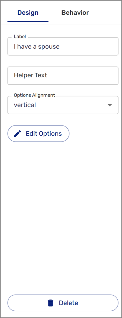
Figure 2: Radio Group Design Properties
Edit Options
(See Figure 3)
When clicking the Edit Options button, the Options window appears. This window enables you to add Radio Group options. Each option contains a Value (1) and a Key (2). The Value is the text that will be displayed to the end-user while interacting with the digital process. The Key is the returned value of the selected option, it will be used for behavioral conditions.
Each option can be removed by clicking the delete button (3). Options can be rearranged by using drag and drop (4). The Add Key option (5) enables you to add additional Radio Group options.
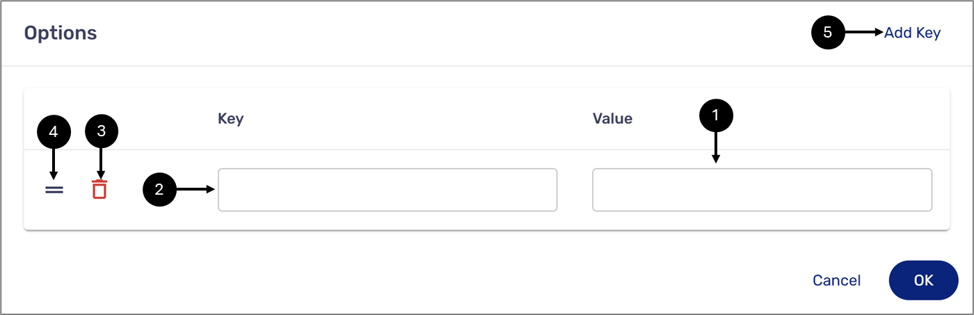
Figure 3: Radio Group Options
Was this article helpful?