Primary Button
- PDF
Primary Button
- PDF
Article summary
Did you find this summary helpful?
Thank you for your feedback!
Article Overview
The following article describes the Design properties of the Primary Button component.
Viewing Design Properties
(See Figure 1)
To view the design properties of the Primary Button component perform one of the following:
- Drag and drop it onto its desired location in the canvas and click it.
- If the component is already added to the canvas, locate and click it.
- If the component is already added to the canvas, locate and click it using the Navigator.
The Design properties will appear in the right section under the Design tab.
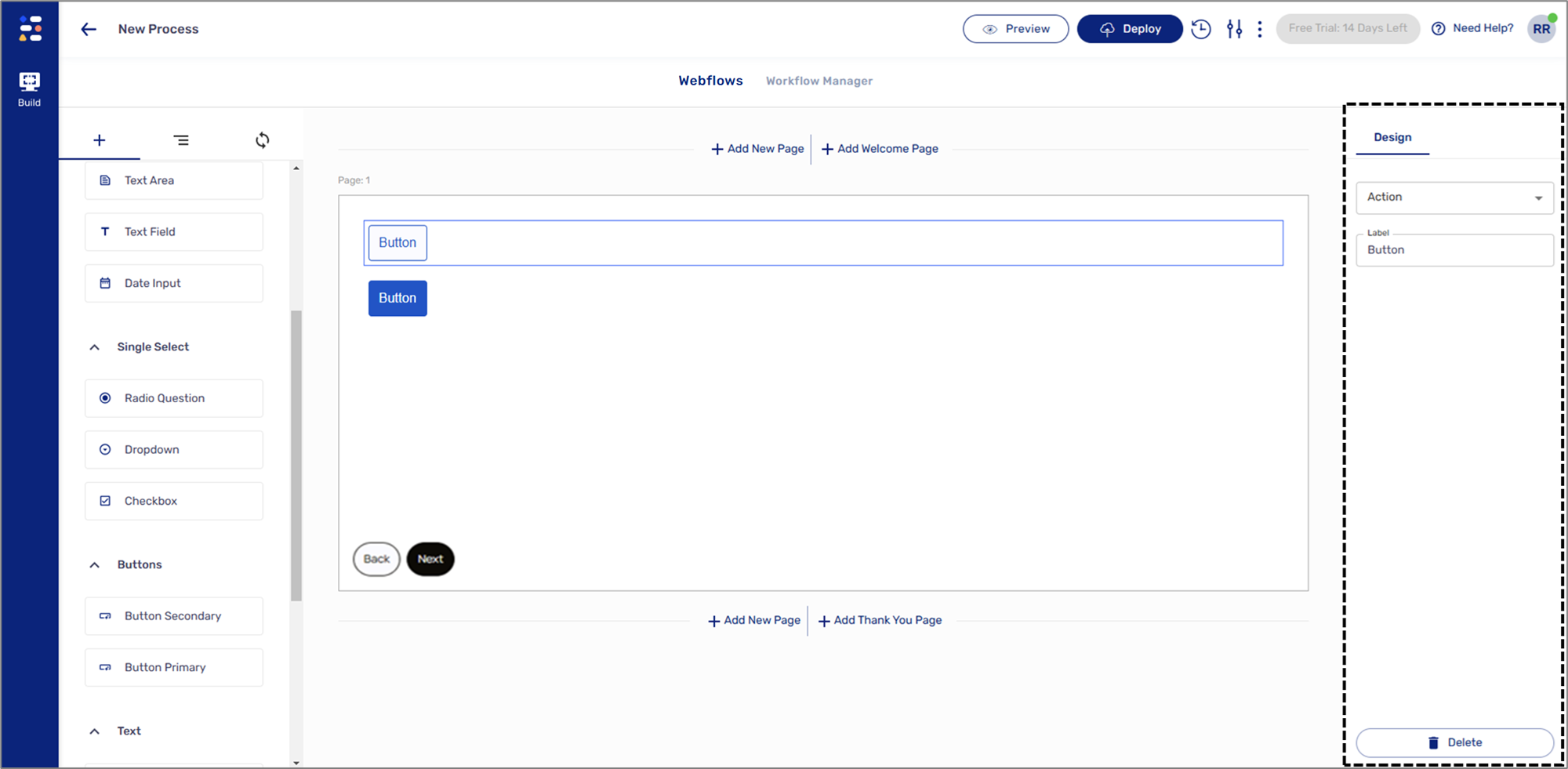
Figure 1: Design Properties
Primary Button Design Properties
(See Figure 2)
The Primary Button component has the following Design properties:
- Action:
- Back - navigate to the previous page.
- Next - advance to the next page.
- Submit - upload the process and advance to the next page, if exists.
- Label - enables you to set the display name of the component. The name will be visible to end-users when interacting with the digital process.
- Delete - removes the component from the canvas.
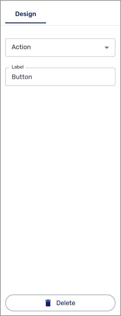
Figure 2: Primary Button Design Properties
NOTE
The Design properties of the Secondary Button component are identical.
Was this article helpful?