Article Overview
The following article describes the Pages tab.
Pages Tab Overview
(See Figure 1)
Using this tab you can edit your pages:
- Welcome
- Main
- Thank-You
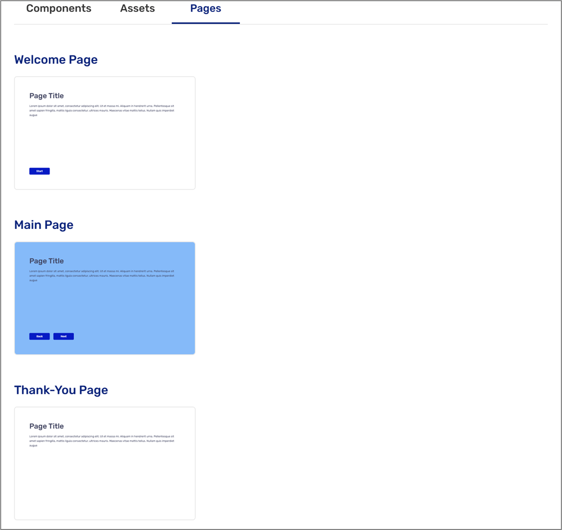
Figure 1: Pages
Editing Pages
(See Figure 2)
Clicking each page displays the Edit Page screen. The page has a preview section (1) that displays the current design with the ability to switch between two different views and alignments:
- Left to right (2)
- Right to left (3)
- PC (4)
- Mobile (5)
The design properties are (6):
- Layout
- Full Width
- Two-columns
- Content Box
- Padding
- 1 rem (16px)
- 2 rem (32px)
- 3 rem (48px)
- 4 rem (64px)
- 5 rem (80px)
- Background color
- Background image
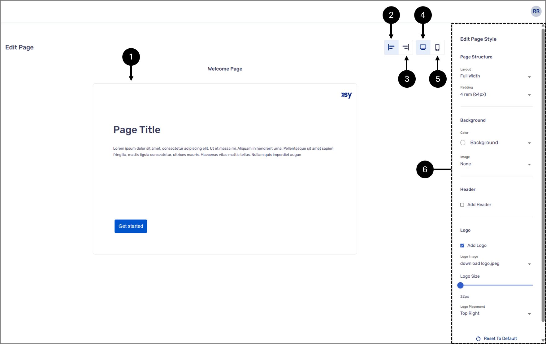
Figure 2: Editing Pages
Editing Header
(See Figure 3)
When checking the Add Header checkbox, a header is added to the page, and the following design options appear:
- Border color
- Logo
- Background
- Add shadow - yes/no
- Size (for desktop)
- Content align:
- Start
- Center
- End
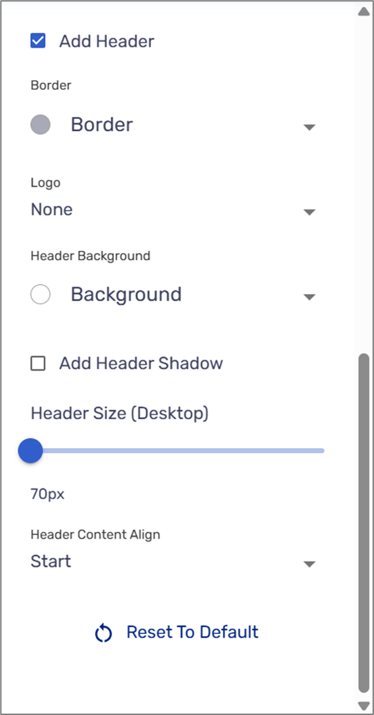
Figure 3: Header
Content Box Design
(See Figure 4)
If the selected layout is Content, the following design options appear:
- Background
- Border color
- Border Width
- Add box shadow - yes/no
- Border radius:
- None (0px)
- Small (4px)
- Normal (12px)
- Large (30px)
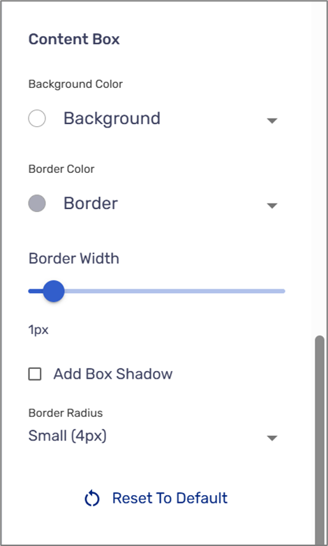
Figure 4: Content Box
Logos
(See Figure 3)
When checking the Add Logo checkbox, a logo is added to the page, and the following design options appear:
- Logo Image - select a logo image from the Assets section
- Logo Size
- Background
- Logo Placement:
- Top Left
- Top Center
- Top Right
- Bottom Left
- Bottom Center
- Bottom Right
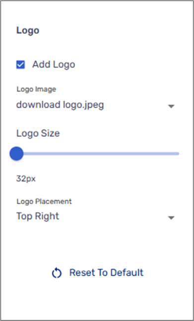
Figure 5: Header
Adding a Progress Bar
(See Figure 6)
A progress bar can be added to the Main Page component to visually indicate the end user’s progress as they move through the digital process. To enable it, check the box (1) and then set the primary (2) and secondary (3) colors.
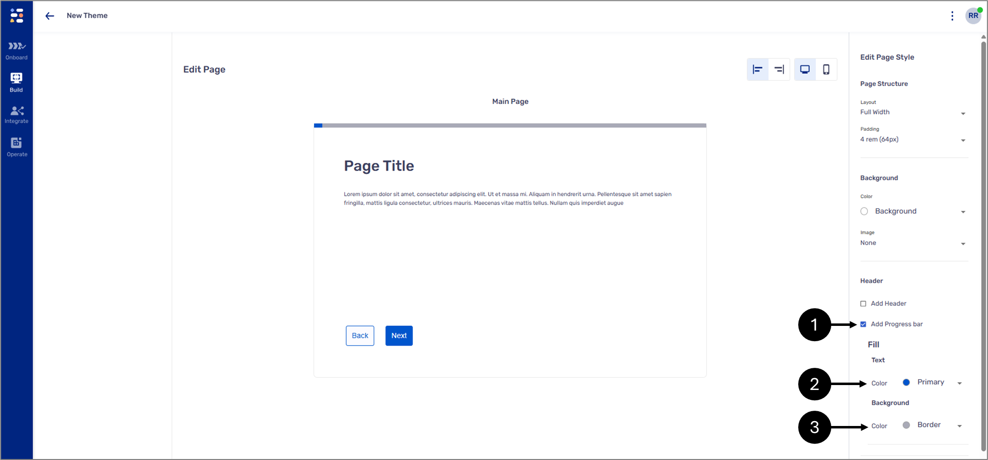
Figure 6: Progress Bar