Article Overview
The following article describes the Design properties of the Page component.
Viewing Design Properties
(See Figure 1)
To view the design properties of the Page component perform one of the following:
- Click the + Add A New Page option.
- If the component is already added to the canvas, locate and click it.
- If the component is already added to the canvas, locate and click it using the Navigator.
The Design properties will appear in the right section under the Design tab.
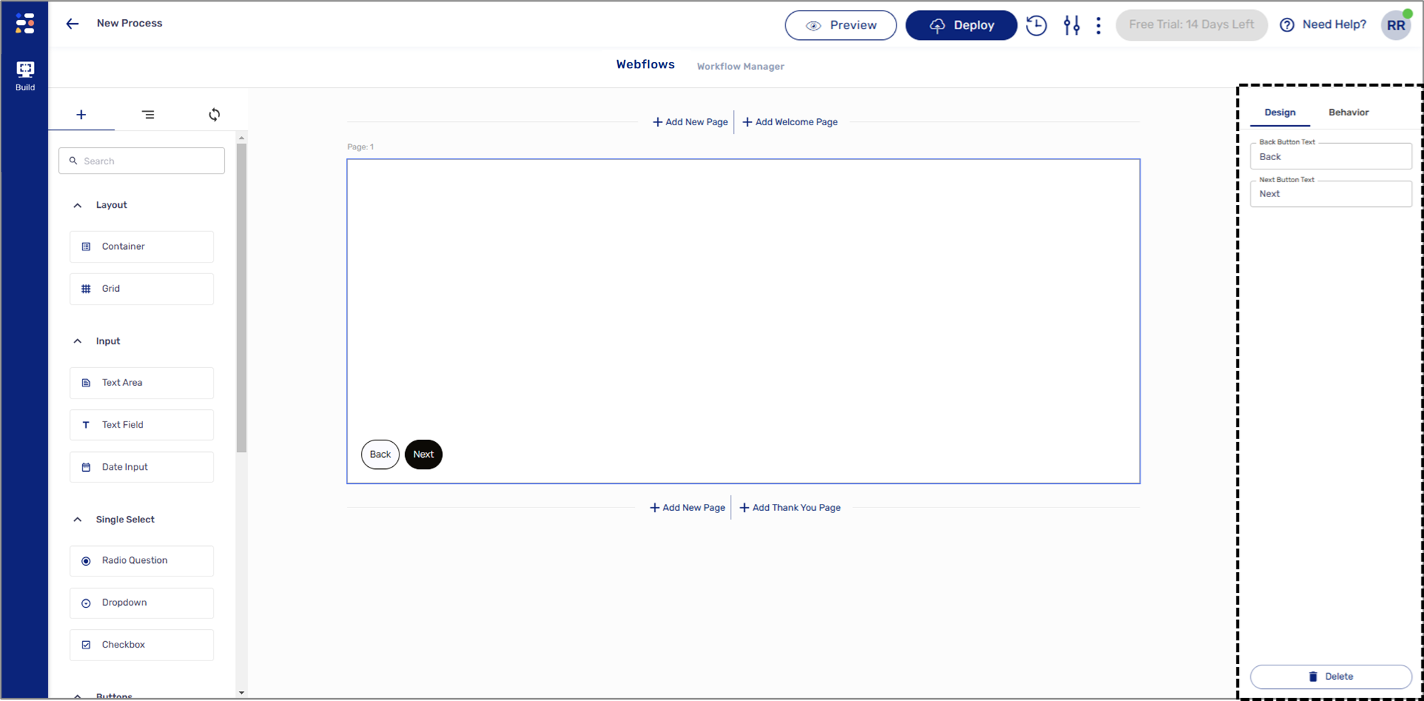
Figure 1: Design Properties
Page Design Properties
(See Figure 2)
The Page component has the following Design properties:
- Back Button Text - enables you to set the label of the back button.
- Next Button Text - enables you to set the label of the next/submit button.
- Delete - removes the component from the canvas.
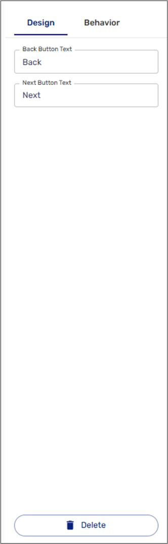
Figure 2: Page Design Properties
NOTE
The colors, background, fonts, and design buttons of the Page component are set using a Theme. For additional information about themes, click here.