Other Components Properties
The following sections detail the properties of the Other section components. The Other section components are:
- Br Component
- Running Number Indicator
- Car Claim Accident Map
Based on the Theme you are using, some of the components may appear under a different name or be found under an Advanced category different category, for additional information, see the Theme Overview article.
Line Break (Br) Component
After adding the Br component, configure its properties and design its look.
Figure 1 and Table 1 describe the properties of the Br component:
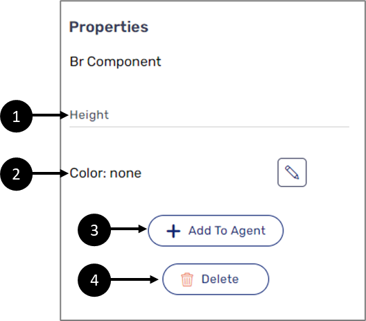
Figure 1: Br Component Properties Section
Table 1: Br Component Properties Section
Number | Icon | Name | Description |
1 | - | Height | Enables to set the height of the component in pixels NOTE The height must be comprised from a number and px, for example: 10px |
2 |
| Color | Enables to set the color of the component NOTE The color is selected from a color palette or the Theme of the Webflow. For additional information about Themes, see the Themes Overview article |
3 | - | + Add to Agent | Enables to add the component to the Agent screen NOTE This button will only appear if the Journey Sender feature is enabled, for additional information, see the Journey Sender article |
4 | - | Delete | Enables to delete the component |

Running Number Indicator
After adding the Running Number Indicator component, connect it to the Model. Figure 2 and Table 2 describe the properties of the Running Number Indicator component:
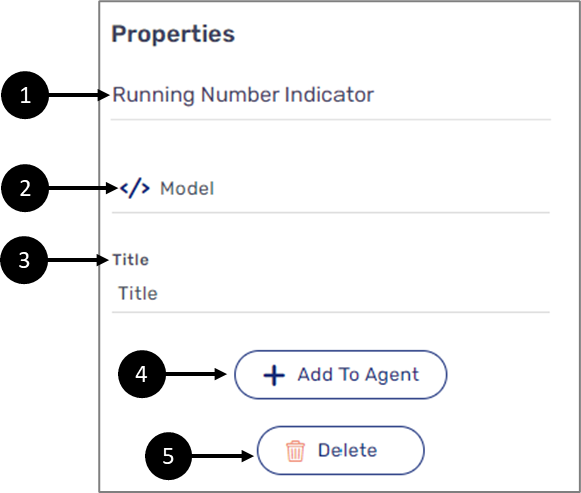
Figure 2: Running Number Indicator Component Properties Section
Table 2: Running Number Indicator Component Properties Section
Number | Icon | Name | Description |
1 |
| Model | Enables to connect the component to the Model by:
NOTE
|
2 | - | Title | Enables to set the title that will be displayed when a new array item is created |
3 | - | + Add to Agent | Enables to add the component to the Agent screen NOTE This button will only appear if the Journey Sender feature is enabled, for additional information, see the Journey Sender article |
4 | - | Delete | Enables to delete the component |

Car Claim Accident Map
After adding the Car Claim Accident Map component, configure its properties. Figure 3 and Table 3 describe the properties of the Car Claim Accident Map component:
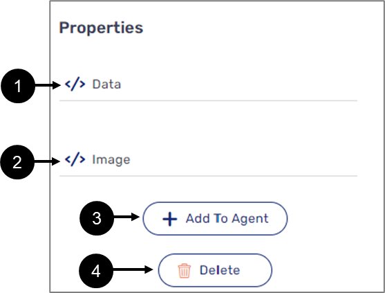
Figure 3: Car Claim Accident Map
Table 3: Car Claim Accident Map
Number | Icon | Name | Description |
1 |
| Data | Enables to connect the component to the Model by:
NOTE
|
2 |
| Image | Enables to connect the component to the Model by:
NOTE
|
3 | - | + Add to Agent | Enables to add the component to the Agent screen NOTE This button will only appear if the Journey Sender feature is enabled, for additional information, see the Journey Sender article |
4 | - | Delete | Enables to delete the component |
