Article Overview
The following article describes how to format a visual, create drill-downs, and add filters.
Formatting a Visual
(See Figure 1 and Figure 2)
You can choose from a variety of options to format and style your data visualizations. To format a visual, perform the following steps:
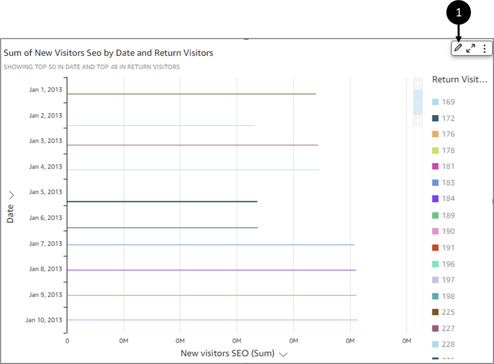
Figure 1: Format Data
- Select a desired visual
- Click the Format visual icon in the upper-right corner (1).
Result:
The Format visual pane appears:
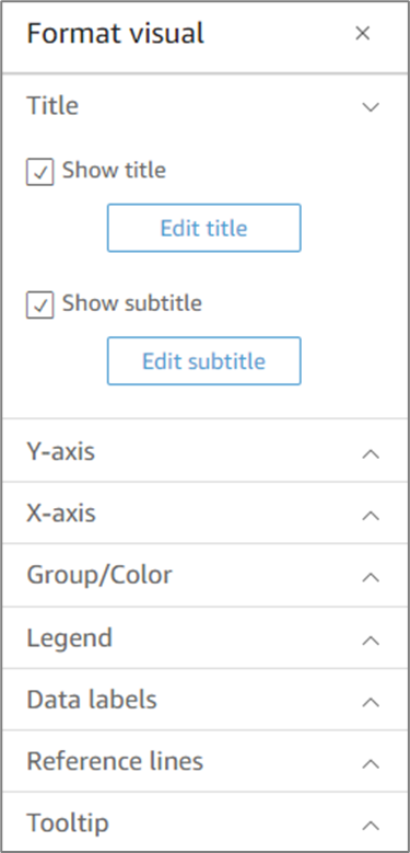
Figure 2: Format Visual
Visual Formatting per Type
The following section specifies the supported format options per visual:
- Bar charts (both horizontal and vertical) support the following formatting:
- Customize, display, or hide title, field labels, and data labels.
- Customize, display, or hide legend (exceptions: simple charts without clustering or multiple measures do not show a legend).
- Specify axis range and steps on the x-axis for horizontal bar charts and on the y-axis for vertical bar charts.
- Choose how many data points to display on the x-axis for vertical bar charts, and on the y-axis for horizontal bar charts.
- Show or hide axis lines, axis labels, axis sort icons, and chart grid lines.
- Customize, display, or remove reference lines.
- Show or hide the "other" category.
Horizontal bar charts support sorting by the y-axis and Value. Vertical bar charts support sorting by the x-axis and Value. Stacked bar charts support showing totals.
- Box plots support the following formatting:
- Customize, display, or hide titles.
- Customize, display, or hide the legend.
- Specify the axis range and label tick on the x-axis and axis range and step on the y-axis.
- Show or hide axis lines, axis labels, axis sort icons, and chart grid lines.
- Choose how many data points to display on the y-axis.
- Show or hide the “other” category.
- Add reference lines.
- Combo charts support the following formatting:
- Customize, display, or hide title, field labels, and data labels.
- Customize, display, or hide legend (exception: simple charts without clustering, stacking, or multiple measures do not show a legend).
- Specify the axis range on bars and lines.
- Synchronize the Y axes for both bars and lines into a single axis.
- Choose how many data points to display on the x-axis.
- Show or hide axis lines, axis labels, axis sort icons, and chart grid lines.
- Customize, display, or remove reference lines.
- Show or hide the "other" category.
Combo charts support sorting by the x-axis, Bars, and Lines.
- Donut charts support the following formatting:
- Customize, display, or hide title, data labels, and legend.
- Customize, display, or hide the labels for group or color and value fields.
- Choose how many slices to display from Group/Color.
- Show or hide the "other" category.
- Filled maps support the following formatting:
- Customize, display, or hide titles.
- Customize, display, or hide the legend.
Filled maps support sorting by Location and Color.
- Funnel charts support the following formatting:
- Customize, display, or hide title, and data labels.
- Customize, display, or hide the labels for group or color and value fields.
- Choose how many stages to display in the Group by field.
- Show or hide the "other" category.
Funnel charts support sorting by Group by and Value.
- Gauge charts support the following formatting:
- Customize, display, or hide titles. Display or hide axis labels.
- Customize how to display the value or values: hidden, actual value, comparison.
- Choose the comparison method (available when you use two measures).
- Choose the axis range and padding to display in the gauge chart.
- Choose the arc style (degrees from 180 to 360) and arc thickness.
Gauge charts do not support sorting.
- Geospatial charts (maps) support the following formatting:
- Customize, display, or hide title and legend.
- Choose the base map image.
- Choose to display map points with or without clustering.
- Heat maps support the following formatting:
- Customize, display, or hide title, legend, and labels.
- Choose how many rows and columns to display.
- Choose colors or gradients.
- Show or hide the "other" category.
Heat maps support sorting by Values and Columns.
- Histogram charts support the following formatting:
- Customize, display, or hide title, field labels, and data labels.
- Specify the axis range, scale, and steps on the y-axis.
- Choose how many data points to display on the x-axis.
- Show or hide axis lines, axis labels, axis sort icons, and chart grid lines.
Histogram charts do not support sorting.
- Key performance indicators (KPIs) support the following formatting:
- Customize, display, or hide titles.
- Display or hide trend arrows and progress bar.
- Customize comparison method as auto, difference, percent (%), or difference as percent (%).
- Customize the primary value displayed to be comparison or actual.
- Conditional formatting.
KPIs do not support sorting.
- Line charts support the following formatting:
- Customize, display, or hide title, field labels, and data labels.
- Customize, display, or hide legend (exception: simple charts do not show a legend).
- Specify the axis range and steps (on the y-axis).
- Choose how many data points to display on the x-axis.
- Show or hide axis lines, axis labels, axis sort icons, and chart grid lines.
- Customize, display, or remove reference lines.
- Customize the styling of lines and the markers for data points on a line.
- Show or hide the "other" category, except when the x-axis is a date.
Line charts support sorting by the x-axis and Value for numeric purposes only.
- Pie charts support the following formatting:
- Customize, display, or hide title, data labels, and legend.
- Customize, display, or hide the labels for group or color and value fields.
- Show metrics as values, percentages, or both.
- Choose how many slices to display from the Group/Color field.
- Show or hide the "other" category.
Pie charts support sorting by Value and Group/Color.
- Pivot tables support the following formatting:
- Customize, display, or hide titles.
- Customize, display, or hide the labels for column, row, and value fields.
- Customize the font sizes for table headers and cells/body.
- Display or hide totals and subtotals on rows or columns.
- Custom labels for totals or subtotals.
- Choose additional styling options: fit table to view, hide +/- buttons, hide column. field names, hide duplicate labels when using a single metric.
- Conditional formatting.
Pivot tables support sorting by Column and Row.
- Scatter plots support the following formatting:
- Customize, display, or hide title, legend, field labels, and data labels.
- Customize, display, or remove reference lines.
- Specify the axis range (on the x-axis and y-axis).
- Show or hide axis lines, axis labels, axis sort icons, and chart grid lines.
Scatter plots do not support sorting.
- Tables support the following formatting:
- Customize, display, or hide title, legend, and columns.
- Customize, display, or hide the column names for group-by and value fields.
- Customize the font sizes for table headers and cells/body.
- Display or hide totals at the top or bottom of the table.
- Provide a custom label for totals.
- Add conditional formatting.
- Tree maps support the following formatting:
- Customize, display, or hide title and legend.
- Customize, display, or hide the labels for group-by, size, and color fields.
- Choose colors or gradients.
- Choose how many squares to display from the Group by field.
- Show or hide the "other" category.
Tree maps support sorting by Size, Group, and Color.
- Waterfall charts support the following formatting:
- Customize, display, or hide title or subtitles.
- Customize the total label.
- Specify the x-axis label size and orientation and the y-axis label range and orientation.
- Show or hide axis lines, axis labels, axis sort icons, and chart grid lines.
- Show or hide the "other" category.
- Customize the legend size and position.
- Customize and display or hide data labels.
- Word clouds support the following formatting:
- Customize, display, or hide titles.
- Customize the word color, and the number of words to display from the Group by field.
- Show or hide the "other" category
- Choose additional styling options: allow vertical words, emphasize scale, or work. with a fluid layout, lowercase, padding level, or maximum string length.
Word clouds support sorting by Group.
Style
(See Figure 3)
When formatting a visual, under Style, the following options appear:
- Toggle background color on/off
- Toggle border color on/off
- Toggle selection color on/off
- Toggle animation loading on/off
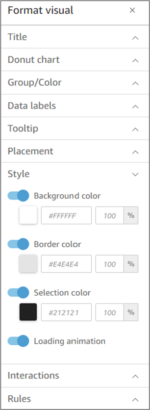
Figure 3: Style Options
Tooltip
(See Figure 4 to Figure 7)
When you hover your cursor over any graphical element in a visual, a tooltip appears with information about that specific element. For example, when you hover your cursor over dates in a line chart, a tooltip appears with information about those dates. By default, the fields in the Fields well determine what information is displayed in tooltips. Tooltips can display up to 10 fields.
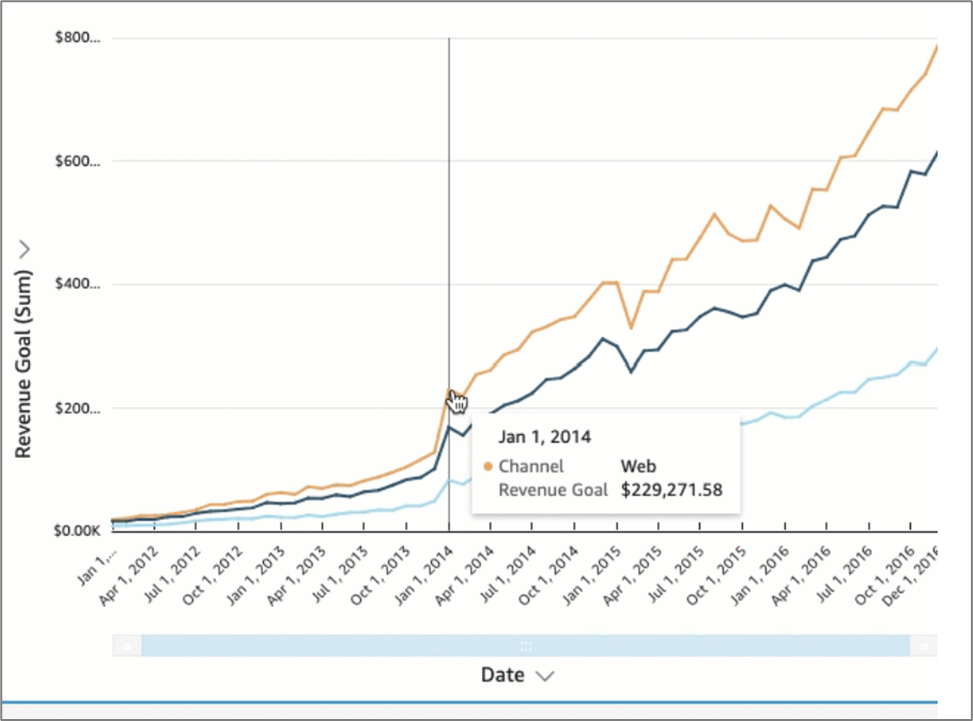
Figure 4: Format Visual
You can provide your viewers with additional information about data in your visual, customizing what viewers can see. You can even prevent tooltips from appearing when viewers hover a cursor over an element. To customize tooltips in a visual, perform the following steps:
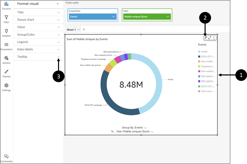
Figure 5: Tooltip
- Choose the desired visual you want to format (1).
- Click the Format visual icon (2).
- Click the Tooltip dropdown (3).
Result:
The tooltip options appear:
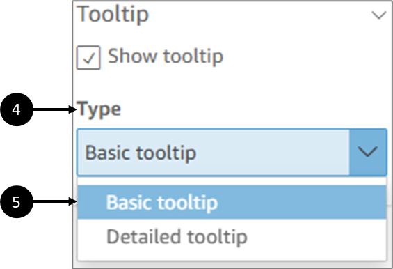
Figure 6: Tooltip Options
- Under Type (4), select the Detailed tooltip option (5).
Result:
Detailed tooltip options appear:
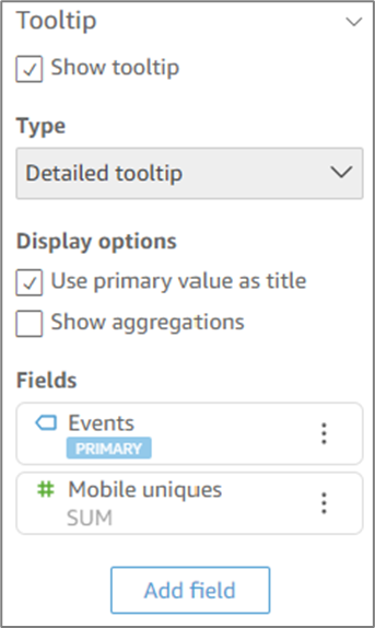
Figure 7: Detailed Tooltip
Detailed Tooltip Options
(See Figure 8)
- Use primary value as title:
- When checked - displays the primary field value as the title in the tooltip.
- When not checked - hides titles in the tooltip.
- Show aggregations:
- When checked - displays the aggregation for fields in the tooltip.
- When not checked - hides the aggregation for fields in the tooltip.
- Fields - displays the fields used in the visual. The first field will be set as the primary field and in some cases, the rest of the fields will be divided into categories.
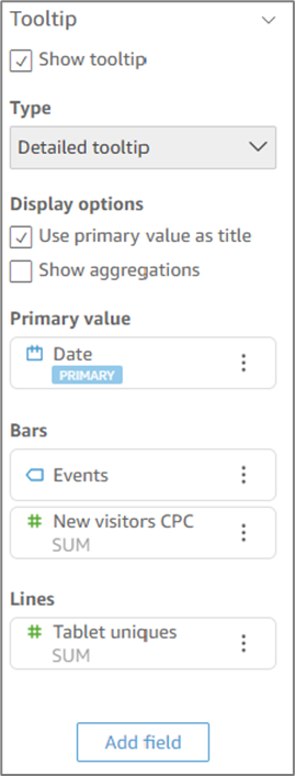
Figure 8: Detailed Tooltip Options
Tooltip - Adding Fields
(See Figure 9 and Figure 10)
To add a field to the tooltip, perform the following steps:
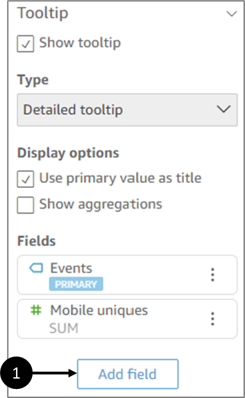
Figure 9: Add field
- Click Add Field (1).
Result:
The Add field to tooltip options appear:
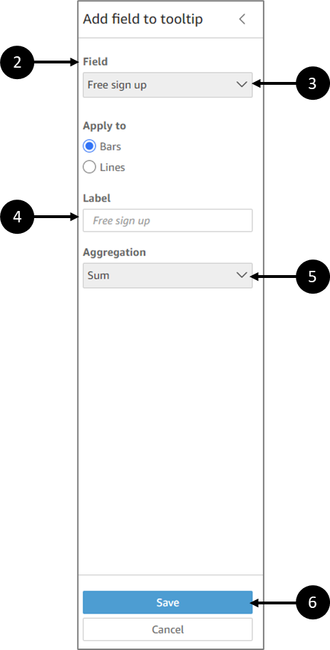
Figure 10: Add field to tooltip
- Under Field (2), click the Select field dropdown (3).
- Select a field.
You can add up to 10 fields to tooltips.
- If necessary, create a custom label (4) for the field in the tooltip.
- If you add a measure type field to the tooltip, select how you want the field to be aggregated:
- Click the Aggregation dropdown.
- Select an aggregation from the list.
- Click Save (6).
Result:
A new field is added to the list of fields in your tooltip.
Additional options may appear, depending on the visual type.
Tooltip - Additional Options
(See Figure 11)
Fields added to a tooltip can be moved, hidden, edited, or removed. Clicking the 3 dots (1) will display the options:
- Move up/down (will appear depending on field location in the list).
- Hide/Show (these options are only available for fields used in the visual).
- Delete (these options are only available for fields not used in the visual).
- Edit:
- For fields used in the visual - the ability to edit their label.
- For fields not used in the visual - the ability to edit their label and aggregation.
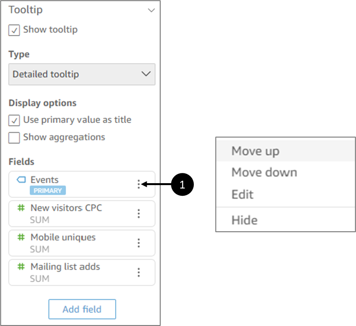
Figure 11: Additional Options
Visuals Additional Options
(See Figure 12)
You can display and use additional options using the three dots icon (1) Field wells. Additional options vary based on the type of visual.
Figure 12: Additional Options
Drill-Downs
All visual types except pivot tables offer the ability to create a hierarchy of fields for a visual element. The hierarchy lets you drill down to see data at different levels of the hierarchy. For example, you can associate the country, state, and city fields with the x-axis on a bar chart. Then, you can drill down or up to see data at each of those levels. As you drill down each level, the data displayed is defined by the value in the field you drill down on. For example, if you drill down on the state of California, you see data on all the cities in California.
The field wells you can use to create drill-downs vary by visual type. Refer to the topic on each visual type to learn more about its drill-down support.
Drill-down functionality is added automatically for dates when you associate a date field with the drill-down field well of a visual. In this case, you can always drill up and down through the levels of data granularity. Drill-down functionality is also added automatically for geospatial groupings after you define these in the dataset.
Table 2 identifies the field wells/on-visual editors that support drill-down for each visual type:
Table 2: Drill-Down Support
Number | Visual type | Field well or on-visual editor |
1 | Bar charts (all horizontal) | Y axis and Group/Color |
2 | Bar charts (all vertical) | X-axis and Group/Color |
3 | Combo charts (all) | X-axis and Group/Color |
4 | Geospatial charts | Geospatial and Color |
5 | Heat map | Rows and Columns |
6 | KPIs | Trend Group |
7 | Line charts (all) | X-axis and Color |
8 | Pie chart | Group/Color |
9 | Pivot table | Drill-down not supported |
10 | Scatter plot | Group/Color |
11 | Tabular Reports | Drill-down not supported |
12 | Tree map | Group by |
Adding a Drill-Down
(See Figure 13 to Figure 16)
To add a drill-down, perform the following steps:
- Click the visual that you want to add drill-downs to.
- Click anywhere on the Field wells to expand them.
- If your dataset has a defined hierarchy, drag the entire hierarchy into the Field well as one. An example is geospatial or coordinates data. In this case, you do not need to follow the remaining steps.
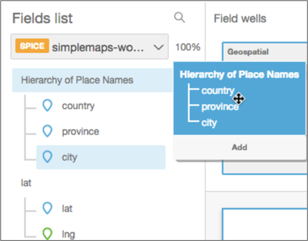
Figure 13: Fields List Options
- If you do not have a predefined hierarchy, you can create one in your analysis, as described in the remaining steps.
- Drag a field you want to use in the drill-down hierarchy to an appropriate Field well (1), depending on the visual type. Make sure that the label for the dragged field says Add drill-down layer (2).
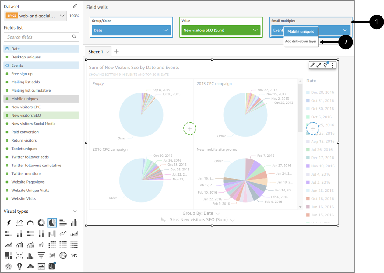
Figure 14: Add drill-down layer
- Reposition the dragged field (3) above or below the existing field based on where you want it to be in the hierarchy you're creating.
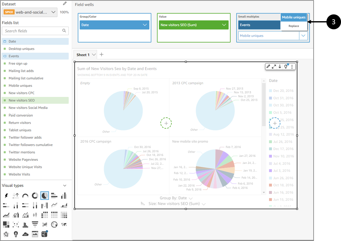
Figure 15: Repositioning
- Continue until you have added all the levels of hierarchy that you want. To remove a field from the hierarchy, choose the field, and then choose Remove.
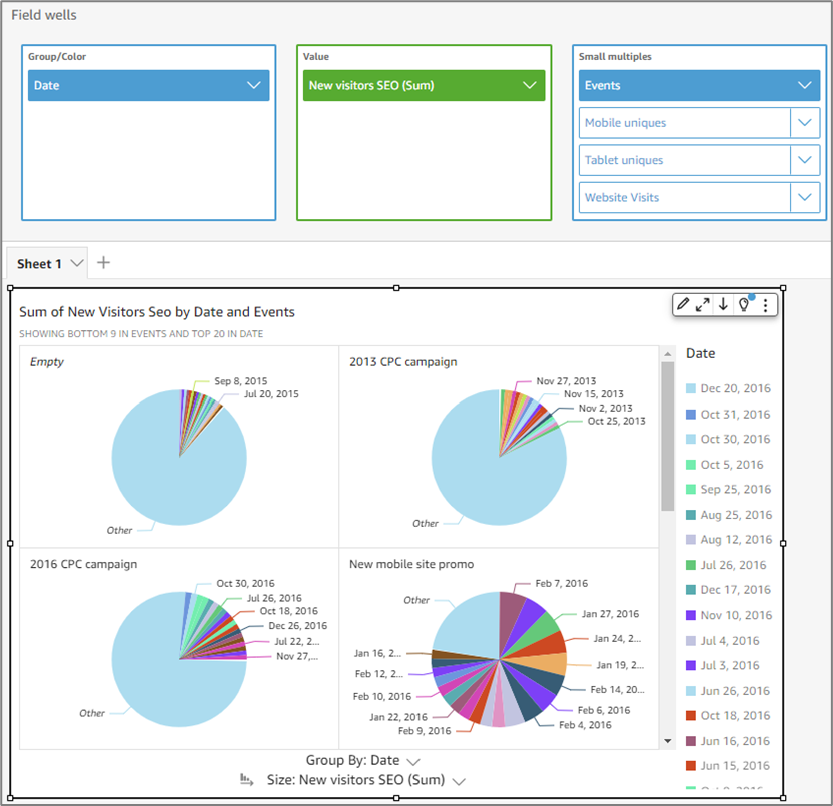
Figure 16: Levels of Hierarchy
- To drill down or up to see data at a different level of the hierarchy, choose an element on the visual (like a line or bar), and then choose Drill down to
Filtering
You can use filters to refine the data in an analysis. For example, a filter on the range of dates that you want to include in any visual.
When you create a filter in an analysis, that filter only applies to that analysis and any dashboards you publish from it. If someone duplicates your analysis, the filter persists in the new analysis. In analyses, you can scope filters to a single visual, some visuals, all visuals that use this dataset, or all applicable visuals.
Viewing Filters
(See Figure 17 and Figure 18)
To view filters, perform the following steps:

Figure 17: Filter
- Choose and access the desired analysis.
- Click a visual (1).
- Click Filter (2).
Result:
Any filter applied to the visual appears in the Filters pane:
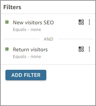
Figure 18: Filters
Adding Filters
(See Figure 19 to Figure 22)
To add filters, perform the following steps:
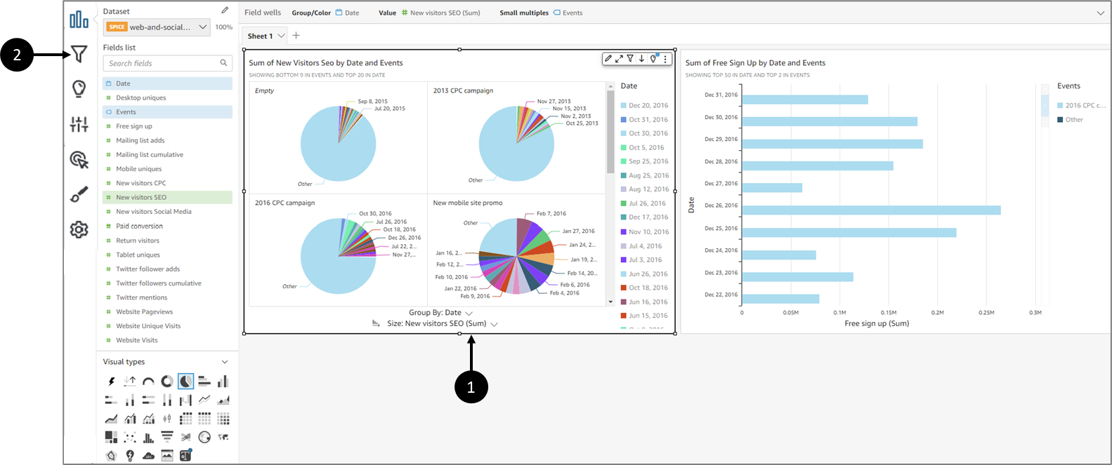
Figure 19: Filter
- Choose and access the desired analysis.
- Click a visual (1).
- Click Filter (2).
Result:
The Filters pane appears:
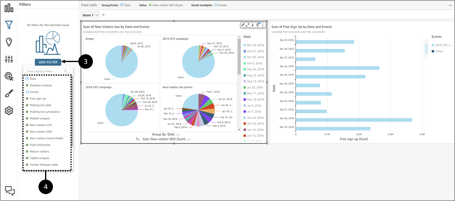
Figure 20: ADD FILTER
- Click ADDFILTER (3) and select a field from the list (4).
Result:
The new filter is added (5):
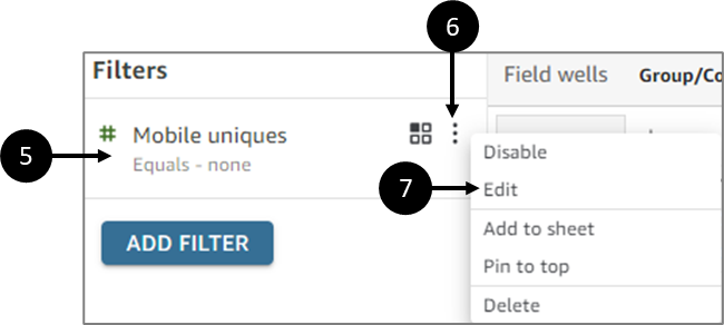
Figure 21: Added Filter
- Click the added filter (5) in the pane to configure it. Or click the three dots (6) and then click Edit (7).
Result:
The Edit filter pane appears:
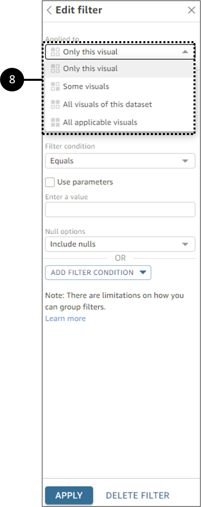
Figure 22: Edit filter
- In the Edit filter pane, select one of the Applied to options (8):
- Only this visual - the filter applies to the selected item only.
- Some visuals - the filter applies to visuals with valid column mappings.
- All visuals of this dataset - the filter applies to all the items based on this dataset.
- All applicable visuals - the filter applies to any visuals that have valid column mappings.
Depending on the data type of the field, the remaining options for configuring the filter vary. For more information about the types of filters you can create and their configurations, see the filter Types section.
Filter Types
You can create several different types of filters, depending on the data type of the field that you want to filter:
- Text filters
- Numeric filters
- Date filters
- Group filters with and/or operators
- Cascading filters
Filter Types - Text
(See Figure 23)
When you add a filter using a text field, you can create the following types of text filters:
- Filter list - this option creates a filter that you can use to select one or more field values to include or exclude from all the available values in the field.
- Custom filter list – with this option, you can enter one or more field values to filter on, and whether you want to include or exclude records that contain those values. The values that you enter must match the actual field values exactly for the filter to be applied to a given record.
- Custom filter - with this option, you enter a single value that the field value must match in some way. You can specify that the field value must equal, not equal, starts with, ends with, contains, or do not contain the value you specify. If you choose an equal comparison, the specified value and actual field value must match exactly for the filter to be applied to a given record.
- Top and bottom filter - you can use this option to show the top or bottom n value of one field ranked by the values in another field. For example, you might show the top five salespeople based on revenue. You can also use a parameter to allow dashboard users to dynamically choose how many top or bottom-ranking values to show. For more information about creating top and bottom filters, see Filtering a text field by a top or bottom value.
Figure 23: Edit filter
Filtering Text Field Values by a List
(See Figure 24)
You can filter a text field by selecting values to include or exclude from a list of all values in the field:
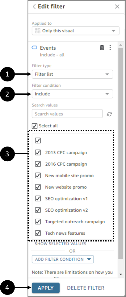
Figure 24: Filtering by List
- Create a new filter using a text field and expand it.
- For Filter type, select Filter list (1).
- For Filter condition, choose Include or Exclude (2).
- Check the boxes (3) of the field values that you want to filter.
- If there are too many values to choose from, use the Search values field. Search terms are case-insensitive, and wildcards aren't supported. Any field value that contains the search term is returned. For example, searching on L returns al, AL, la, and LA.
- The values display alphabetically unless there are more than 1000 distinct values. Then the control displays a search box instead. Each time that you search for the value that you want to use, it starts a new query. If the results contain more than 1,000 values, you can scroll through the values with pagination.
- When finished, click Apply (4).
Filtering Text Field Values by a Custom List
(See Figure 25)
You can specify one or more field values to filter on, and whether you want to include or exclude records that contain those values. The specified value and actual field value must match exactly for the filter to be applied to a given record:
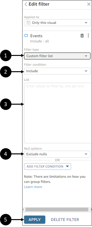
Figure 25: Filtering by a Custom List
- Create a new filter using a text field and expand it.
- For Filter type, select Custom filter list (1).
- For Filter condition, choose Include or Exclude (2).
- Enter a value in the List section (3). The value must match an existing field value exactly.
- To add additional values, enter them in the text box, one per line.
- For Null options choose Exclude nulls, Include nulls, or Nulls only (4).
- When finished, click Apply (5).
Filtering a Single Text Field Value
(See Figure 26)
With the Custom filter type, you specify a single value that the field value must equal or not equal or must match partially. If you choose an equal comparison, the specified and actual field values must match exactly for the filter to be applied to a given record:
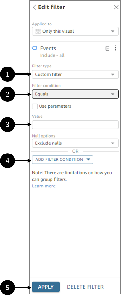
Figure 26: Filtering a Single Text Field Value
- Create a new filter using a text field and expand it.
- For Filter type, select Custom filter (1).
- For Filter condition, choose one of the following (2):
- Equals - when you choose this option, the values included or excluded in the field must match the value that you enter exactly.
- Does not equal - when you choose this option, the values included or excluded in the field must match the value that you enter exactly.
- Starts with - when you choose this option, the values included or excluded in the field must start with the value that you enter.
- Ends with - when you choose this option, the values included or excluded in the field must start with the value that you enter.
- Contains - when you choose this option, the values included or excluded in the field must contain the whole value that you enter.
- Does not contain - when you choose this option, the values included or excluded in the field must not contain any part of the value that you enter.
Comparison types are case-sensitive.
- Enter a Value (3).
- For Null options, choose to Exclude nulls, Include nulls, or Nulls only (4).
- When finished, click Apply (5).
Parameters are not covered in this article.
Filtering a Text Field by a Top or Bottom Value
(See Figure 27)
You can use a Top and bottom filter to show the top or bottom n value of one field ranked by the values in another field. For example, you might show the top five salespeople based on revenue. To create a top and bottom text filter, perform the following steps:
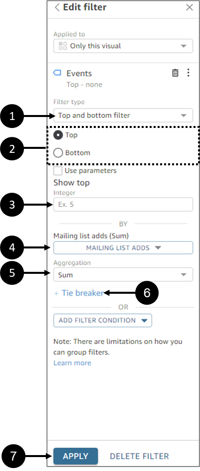
Figure 27: Filtering a text field by a top or bottom value
- Create a new filter using a text field and expand it.
- For Filter type, select Top and bottom filter (1).
- Select Top or Bottom filter (2).
- For Show top integer (or Show bottom integer) (3), enter the number of top or bottom items to show.
- Select a field (4).
- Select an Aggregation (5).
- If necessary, click Tie breaker (6) and then choose another field to add one or more aggregations as tie-breakers.
Tie breaker is useful, in the case of this example, when there are more than five results returned for the top five salespeople per revenue. This situation can happen if multiple salespeople have the same revenue amount.
- When finished, click Apply (7).
Filter Types - Numeric
Fields with decimal or int data types are considered numeric fields. You create filters on numeric fields by specifying a comparison type:
- Equals
- Does not equal
- Greater than
- Greater than or equal to
- Less than
- Less than or equal to
- Between
- Comparison values must be positive integers and cannot contain commas.
- To use a top and bottom filter for numeric data, first, change the field from a measure to a dimension. Doing this converts the data to text. Then you can use a text filter.
You can also optionally apply an aggregate function to the comparison value or values:
- Average
- Count
- Count distinct
- Max
- Median
- Min
- Percentile
- Standard deviation
- Standard deviation - population
- Sum
- Variance
- Variance - population
Creating Numeric Filters
(See Figure 28)
To create a numeric field filter, perform the following steps:
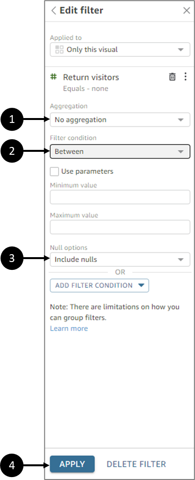
Figure 28: Creating Numeric Filters
- Create a new filter using a numeric field and expand it.
- If necessary, select an aggregation (1).
- Select a Filter condition (2):
- If you choose a comparison type other than Between, enter a comparison value.
- If you choose a comparison type of Between, enter the beginning of the value range in Minimum value and the end of the value range in Maximum value.
- For Null options choose Exclude nulls, Include nulls, or Nulls only (3).
- When finished, click Apply (4)
Parameters are not covered in this article.
Filter Types - Date
You create filters on date fields by selecting the filter conditions and date values that you want to use. There are three filter types for dates:
- Range - a series of dates based on a time range and comparison type. You can filter records based on whether the date field value is before or after a specified date, or within a date range. You enter date values in the format MM/DD/YYYY. You can use the following comparison types:
- Between - between a start date and an end date.
- After - after a specified date.
- Before - before a specified date.
- Equals - a specified date.
For each comparison type, you can alternatively choose a rolling date relative to a period or dataset value.
- Relative - a series of date and time elements based on the current date. You can filter records based on the current date and your selected unit of measure (UOM). Date filter units include years, quarters, months, weeks, days, hours, and minutes. You can exclude the current period, add support for Next N filters like Last N with an added capability to allow for an Anchor date. You can use the following comparison types:
- Previous - the previous UOM, for example, the previous year.
- This - this UOM, which includes all dates and times that fall within the select UOM, even if they occur in the future.
- To date or up to now - UOM to date, or UOM up to now. The displayed phrase adapts to the UOM that you choose. However, in all cases, this option filters out data that is not between the beginning of the current UOM and the current moment.
- Last n - the last specified number of the given UOM, which includes all this UOM and all the last n-1 UOM. For example, today is May 10, 2017. You choose to use years as your UOM and set Last n years to 3. The filtered data includes data for all of 2017, plus all of 2016, and all of 2015. If you have any data for the future dates of the current year (2017 in this example), these records are included in your dataset.
- Top and bottom - some date entries are ranked by another field. You can show the top or bottom n for the type of date or time UOM you choose, based on values in another field. For example, you can choose to show the top 5 sales days based on revenue.
Comparisons are applied inclusive of the date specified. For example, if you apply the filter Before 1/1/16, the records returned include all rows with date values through 1/1/16 23:59:59. If you don't want to include the date specified, you can clear the option to Include this date. If you want to omit a time range, you can use the Exclude the last N periods option to specify the number and type of periods (minutes, days, and so on) to filter out.
You can also choose to include or exclude nulls, or exclusively show rows that contain nulls in this field. If you pass in a null date parameter (one without a default value), it doesn't filter the data until you provide a value.
Creating Range Date Filters
(See Figure 29)
To create a range filter for a date field, perform the following steps:
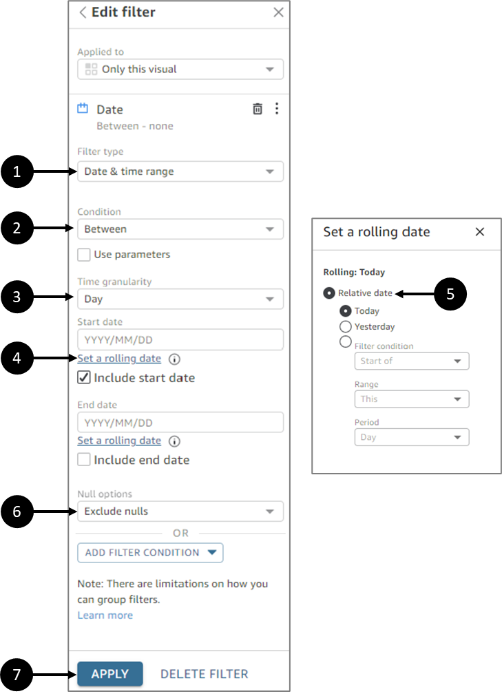
Figure 29: Creating Range Date Filters
- Create a new filter using a date field and expand it.
- For Filter type, select Date & time range (1).
- For Condition, choose a comparison type (2):
- To use Between as a comparison, choose Start date and End date and choose dates from the date picker controls that appear.
- To use a Before, After, or Equals comparison, enter a date, or choose the date field to bring up the date picker control and choose a date instead. You can include this date (the one you chose), to exclude the last N periods, and specify how to handle nulls.
- Set a Time granularity option (3):
- Day
- Hour
- Minute
- Second
- If necessary, set a rolling date for your comparison (4). In the Set a rolling date pane select a Relative date (5):
- Today
- Yesterday
- Filter condition:
- Start of/End of
- Range:
- This
- Previous
- Next
- Last N
- Next N
- Period:
- Year
- Quarter
- Month
- Week
- Day
- For Null options choose Exclude nulls, Include nulls, or Nulls only (5).
- When finished, click Apply (6).
Parameters are not covered in this article.
Creating Relative Date Filters
(See Figure 30)
To create a relative filter for a date field, perform the following steps:
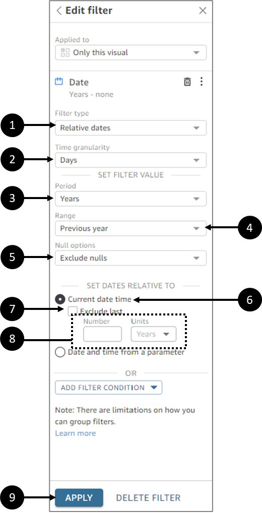
Figure 30: Creating Relative Date Filters
- Create a new filter using a date field and expand it.
- For Filter type, select Relative dates (1).
- Set a Time granularity option (2):
- Day
- Hour
- Minute
- Second
- Set a Period option (3):
- Years
- Quarters
- Months
- Weeks
- Days
- Set a Range option (4):
- Previous year
- This year
- Year to date
- Last N years
- Next N years
- For Null options choose Exclude nulls, Include nulls, or Nulls only (5).
- For SET DATES RELATIVE TO, select Current date time (6) - this option allows you to set it to Exclude last (7) and specify the Number and type (Units) of periods (8).
- When finished, click Apply (9).
Parameters are not covered in this article.
Creating Top and Bottom Date Filters in Analyses
(See Figure 31)
To create a relative filter for a date field, perform the following steps:
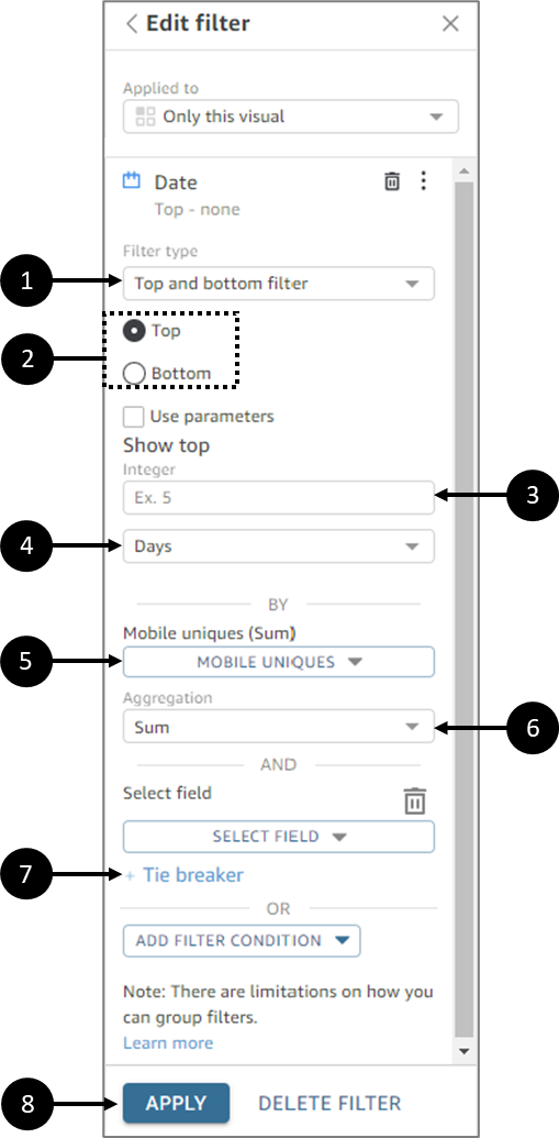
Figure 31: Creating Top and Bottom Date Filters in analyses
- Create a new filter using a date field and expand it.
- For Filter type, select Top and bottom filter (1).
- Select Top or Bottom (2).
- For Show, enter the number of top or bottom items you want to show (3) and select a unit of time (4):
- Years
- Quarters
- Months
- Weeks
- Days
- Hours
- Minutes
- For By, select a field (5) to base the ranking on.
- Select an Aggregation (6).
- If necessary, click Tie breaker (7) and then choose another field to add one or more aggregations as tie-breakers.
- When finished, click Apply (8).
Parameters are not covered in this article.
Filter Conditions
(See Figure 32 to Figure 34)
When you add multiple filters to a visual, EasySend analytics uses the AND operator to combine them. You can also add filter conditions to a single filter with the OR operator. This is called a compound filter, or filter group.
To add multiple filters using the OR operator, create a filter group. Filter grouping is available for all types of filters in analyses.
When you filter on multiple measures (green fields marked with #), you can apply the filter conditions to an aggregate of that field. Filters in a group can contain either aggregated or non-aggregated fields, but not both.
To create a filter group, perform the following steps:
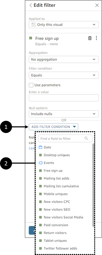
Figure 32: ADD FILTER CONDITION
- Create a new filter and expand it.
- Click ADD FILTER CONDITION (1) and select a field to filter on (2).
Result:
Filter options appear (3):
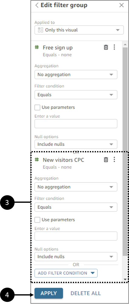
Figure 33: Added Filter
- Configure the filter.
- When finished, click Apply (4).
The type of selected field determines the available configuration options. For example, if you choose a numeric field, you can specify the aggregation, filter condition, and values. If you choose a text field, you can choose the filter type, filter condition, and values. And if you choose a date field, you can specify the filter type, condition, and time granularity.
- If required, add additional filter conditions.
- When finished, click Apply (4).
Result:
The filters appear as a group in the Filters pane:
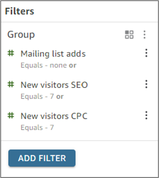
Figure 34: Added Filter