Article Overview
The following article details the design capabilities of the Form Button component.
Design Guidelines
Figure 1 and Table 1 describe the design capabilities of the Form Button component:
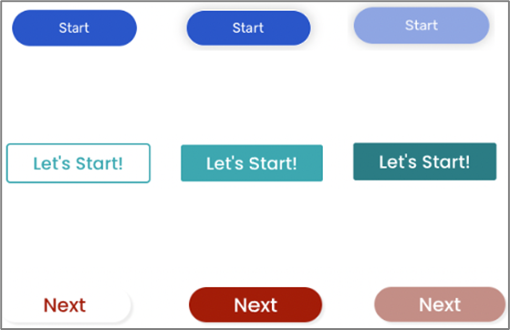
Figure 1: Design Capabilities
Table 1: Design Capabilities
Element | Design attribute | Change on hover? | Change on focus? |
Font | family | No | No |
| size | No | No | |
| color | Yes | Yes | |
| Background | color | Yes | Yes |
| Border | width | No | No |
| radius | No | No | |
| color | Yes | No | |
| Shadow | color | No | No |
| width | No | No | |
| Button | height | No | No |
| width | No | No |