File Upload
- PDF
File Upload
- PDF
Article summary
Did you find this summary helpful?
Thank you for your feedback!
Article Overview
The following article describes the Design properties of the File Upload component.
Viewing Design Properties
(See Figure 1)
To view the design properties of the File Upload component, perform one of the following:
- Drag and drop it onto its desired location in the canvas and click it.
- If the component is already added to the canvas, locate and click it.
- If the component is already added to the canvas, locate and click it using the Navigator.
The Design properties will appear in the right section under the Design tab.
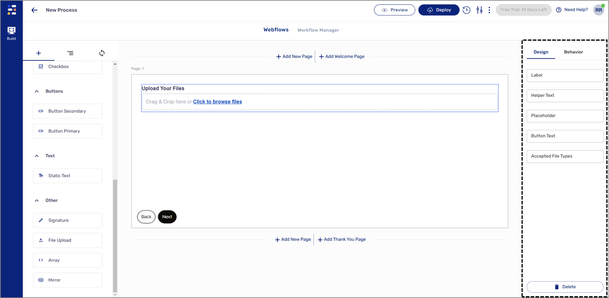
Figure 1: Design Properties
File Upload Design Properties
(See Figure 2)
The File Upload component has the following Design properties:
- Label - enables you to set the display name of the component. The name will be visible to end-users when interacting with the digital process.
- Helper Text - a text designed to guide end-users regarding the required input.
- Placeholder - a filler temporary text that will be displayed to end-users when interacting with the digital process. The placeholder text cannot be deleted and will remain until the end-user inputs new text.
- Button Text - enables you to set the display text of the File Upload button.
- Accepted File Type - enables you to specify the accepted file types for upload, for example:
- .jpg - only JPG files are accepted.
- .jpg, .pdf, .docx - only JPG, PDF, and Word files are accepted.
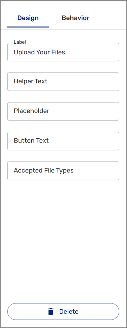
Figure 2: Signature Design Properties
Was this article helpful?