Edit Components Style
- PDF
Edit Components Style
- PDF
Article summary
Did you find this summary helpful?
Thank you for your feedback!
Article Overview
The following article details the style properties of each component.
Editing Components Style
Each component has different parameters to style. The changes will be reflected in the preview area.
Text Area
(See Figure 1)
- Text color
- Background color
- Border width
- Thin (1px)
- Medium (2px)
- Border color
- Radius:
- Round
- None (0px)
- Small (2px)
- Medium (4px)
- Large (8px)
- Xtra Large (16px)
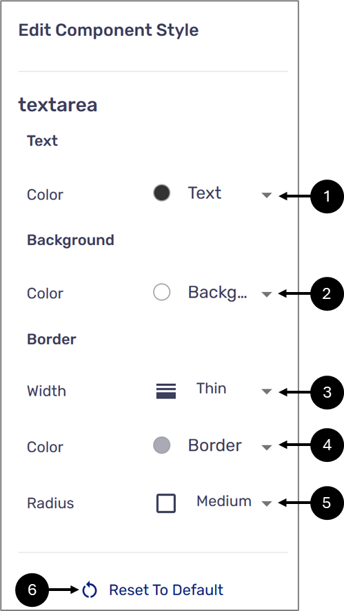
Figure 1: Component Style
NOTE
- The colors for selection are set according to different categories using the right section of the theme. For additional information, click here.
- Click the Reset To Default option (6) to cancel all changes.
Text Field
(See Figure 2)
- Input container:
- Background color
- Border width:
- Thin (1px)
- Medium (2px)
- Border color
- Radius:
- Round
- None (0px)
- Small (2px)
- Medium (4px)
- Large (8px)
- Xtra Large (16px)
- Input text color
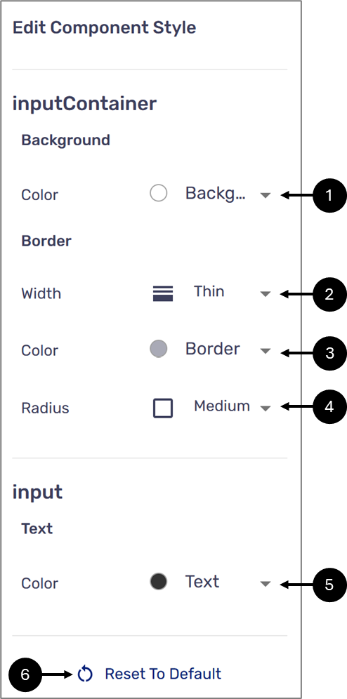
Figure 2: Component Style
NOTE
- The colors available for selection or set according to different categories using the Theme Branding. For additional information, click here.
- Click the Reset To Default option (6) to cancel all changes.
Radio Group
(See Figure 3)
- Options text color
- Option background
- Option border width
- Thin (1px)
- Medium (2px)
- Option border-color
- The color of a checked option
- The border color of a checked option
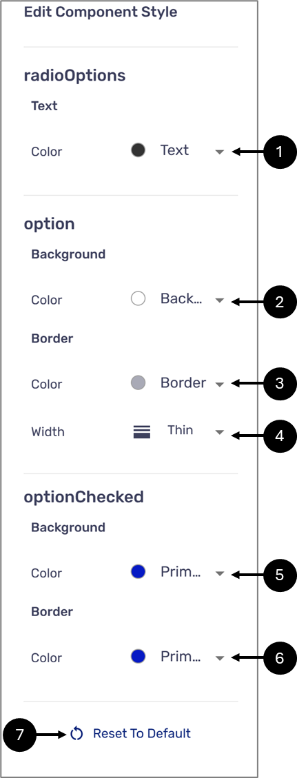
Figure 3: Component Style
NOTE
- The colors available for selection or set according to different categories using the Theme Branding. For additional information, click here.
- Click the Reset To Default option (7) to cancel all changes.
Dropdown
(See Figure 4)
- Selected dropdown option text color
- Selected dropdown option background color
- Dropdown border-color
- Dropdwon radius:
- Round
- None (0px)
- Small (2px)
- Medium (4px)
- Large (8px)
- Xtra Large (16px)
- Dropdown border width
- Thin (1px)
- Medium (2px)
- Display value placeholder text color
- Dropdown menu text color
- Dropdown menu background color
- Dropdown menu border-color
- Dropdown menu radius:
- Round
- None (0px)
- Small (2px)
- Medium (4px)
- Large (8px)
- Xtra Large (16px)
- Dropdown menu width:
- Thin (1px)
- Medium (2px)
- Dropdown arrow color
- Dropdown options color
- Hovering above dropdown options color
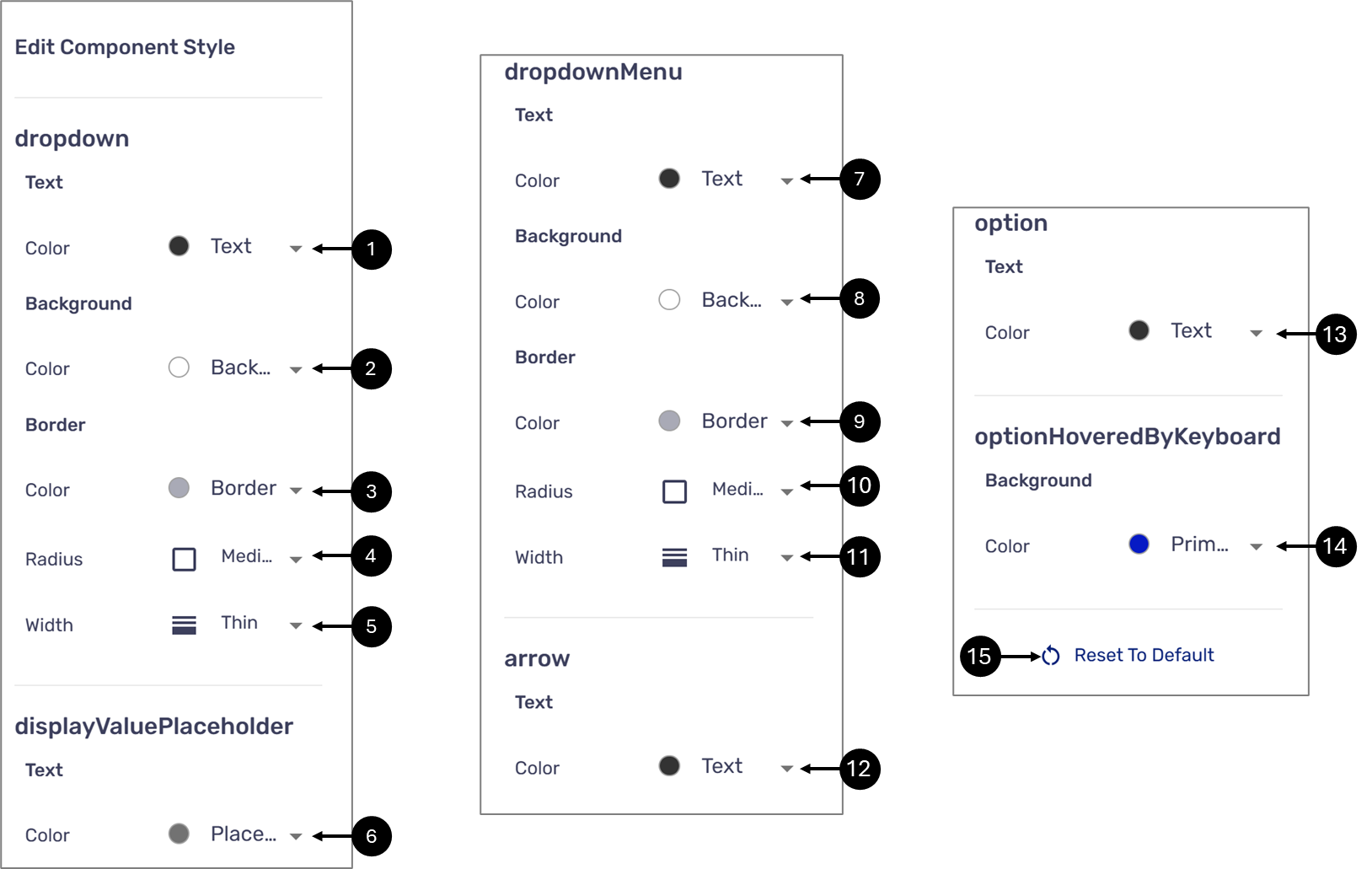
Figure 4: Component Style
NOTE
- The colors available for selection or set according to different categories using the Theme Branding. For additional information, click here.
- Click the Reset To Default option (15) to cancel all changes.
Checkbox
(See Figure 5)
- Checkbox text color
- Checkbox background color
- Checkbox border-color
- Checkbox radius:
- Round
- None (0px)
- Small (2px)
- Medium (4px)
- Large (8px)
- Xtra Large (16px)
- Checkbox border width
- Thin (1px)
- Medium (2px)
- The color of the checkbox when checked
- Checkmark color
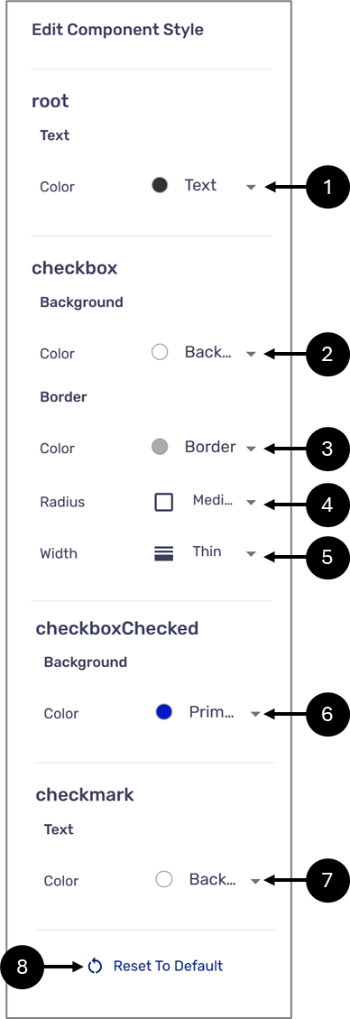
Figure 5: Component Style
NOTE
- The colors available for selection or set according to different categories using the Theme Branding. For additional information, click here.
- Click the Reset To Default option (8) to cancel all changes.
Buttons
(See Figure 6)
- Label text color
- Background color
- Border-color
- Radius:
- Round
- None (0px)
- Small (2px)
- Medium (4px)
- Large (8px)
- Xtra Large (16px)
- Width
- Thin (1px)
- Medium (2px)
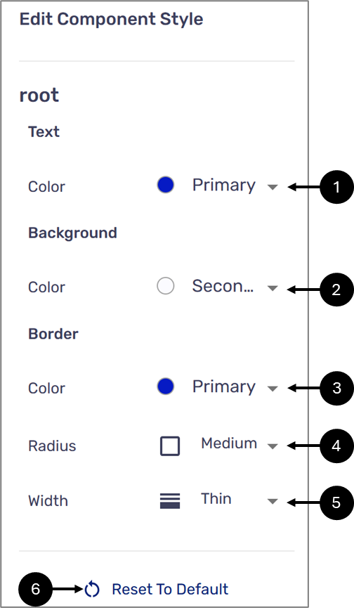
Figure 6: Component Style
NOTE
- The colors available for selection or set according to different categories using the Theme Branding. For additional information, click here.
- Click the Reset To Default option (6) to cancel all changes.
Signature
(See Figure 7)
- e-Signature color
- Signature container background color
- Signature container width:
- Thin (1px)
- Medium (2px)
- Signature container border-color
- Signature container radius:
- Round
- None (0px)
- Small (2px)
- Medium (4px)
- Large (8px)
- Xtra Large (16px)
- Button text color
- Button background color
- Button border-color
- Button radius:
- Round
- None (0px)
- Small (2px)
- Medium (4px)
- Large (8px)
- Xtra Large (16px)
- Button width
- Thin (1px)
- Medium (2px)
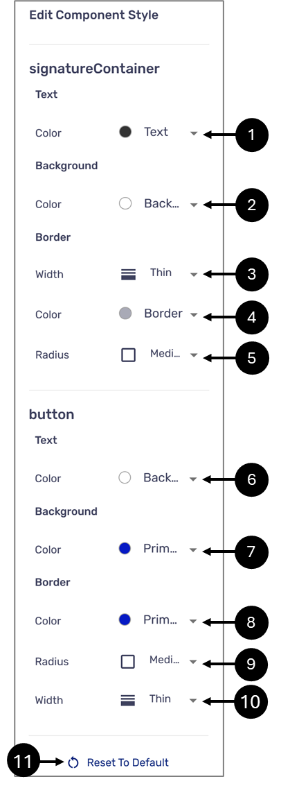
Figure 7: Component Style
NOTE
- The colors available for selection or set according to different categories using the Theme Branding. For additional information, click here.
- Click the Reset To Default option (11) to cancel all changes.
File Upload
(See Figure 8)
- Input container background color
- Input container border width
- Thin (1px)
- Medium (2px)
- Input container border-color
- Input container radius:
- Round
- None (0px)
- Small (2px)
- Medium (4px)
- Large (8px)
- Xtra Large (16px)
- Input text color
- Input with files text color
- Upload instructions text color
- Remove button background color
- Remove button border-color
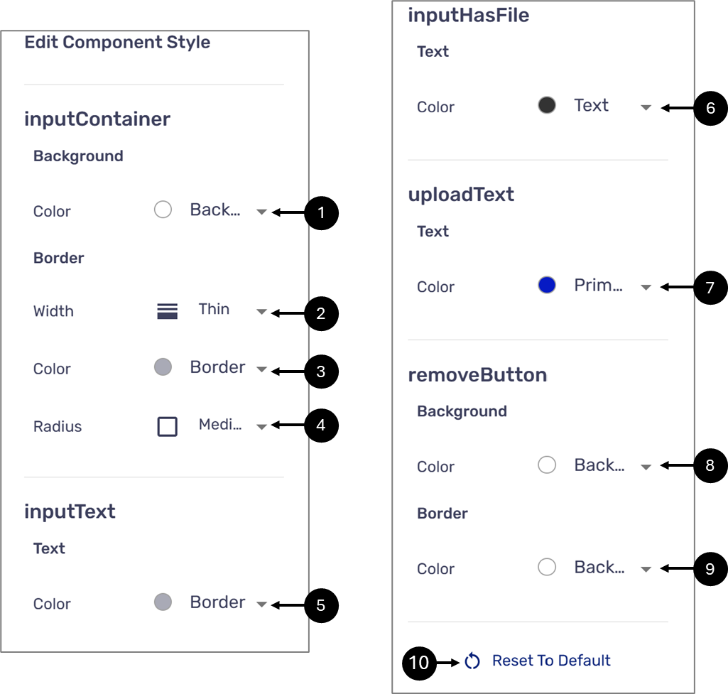
Figure 8: Component Style
NOTE
- The colors available for selection or set according to different categories using the Theme Branding. For additional information, click here.
- Click the Reset To Default option (10) to cancel all changes.
Date Input
(See Figure 9)
- Input container:
- Background color
- Border width:
- Thin (1px)
- Medium (2px)
- Border color
- Radius:
- Round
- None (0px)
- Small (2px)
- Medium (4px)
- Large (8px)
- Xtra Large (16px)
- Input text color
Figure 9: Component Style
NOTE
- The colors available for selection or set according to different categories using the Theme Branding. For additional information, click here.
- Click the Reset To Default option (6) to cancel all changes.
Was this article helpful?