Article Overview
The following article describes the edit components preview area.
Editing Components - Preview Area
(See Figure 1 to Figure 3)
Clicking a component enables you to edit it. Each component displays a preview area (1) that reflects your editing.
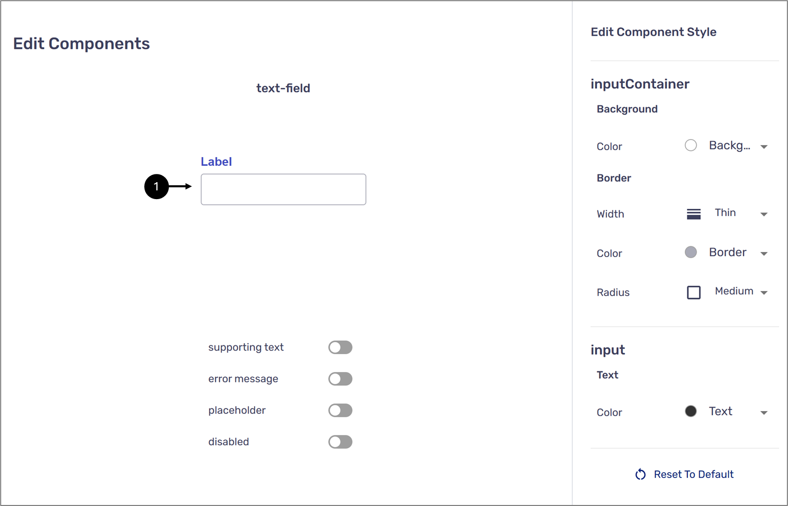
Figure 1: Preview 1 of 2
Underneath the preview there are four switches:
- supporting text
- error message
- placeholder
- disabled
Toggling the first three switches will add their display in the preview section (2).
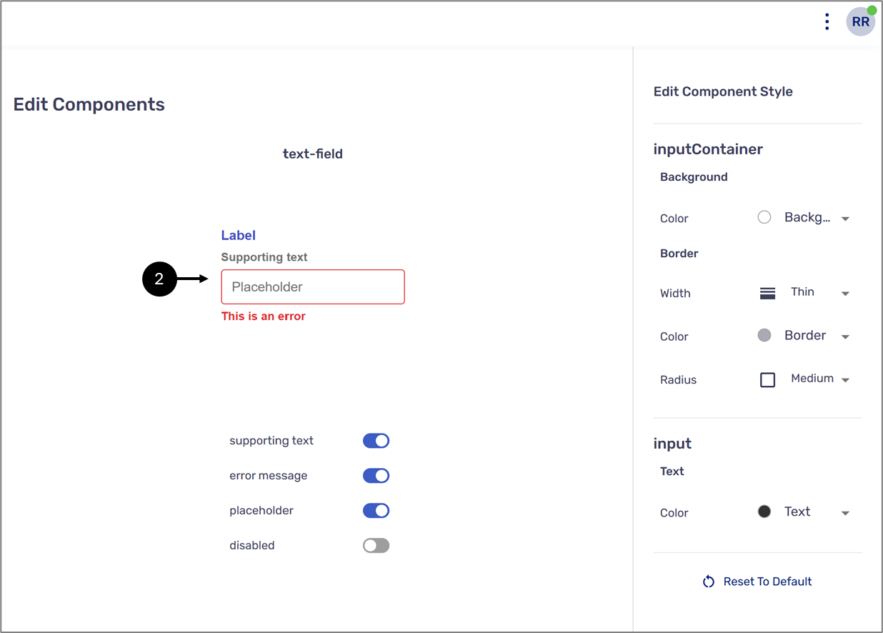
Figure 2: Preview 2 of 2
The fourth switch, disabled, displays the design of the component if it was disabled (3).
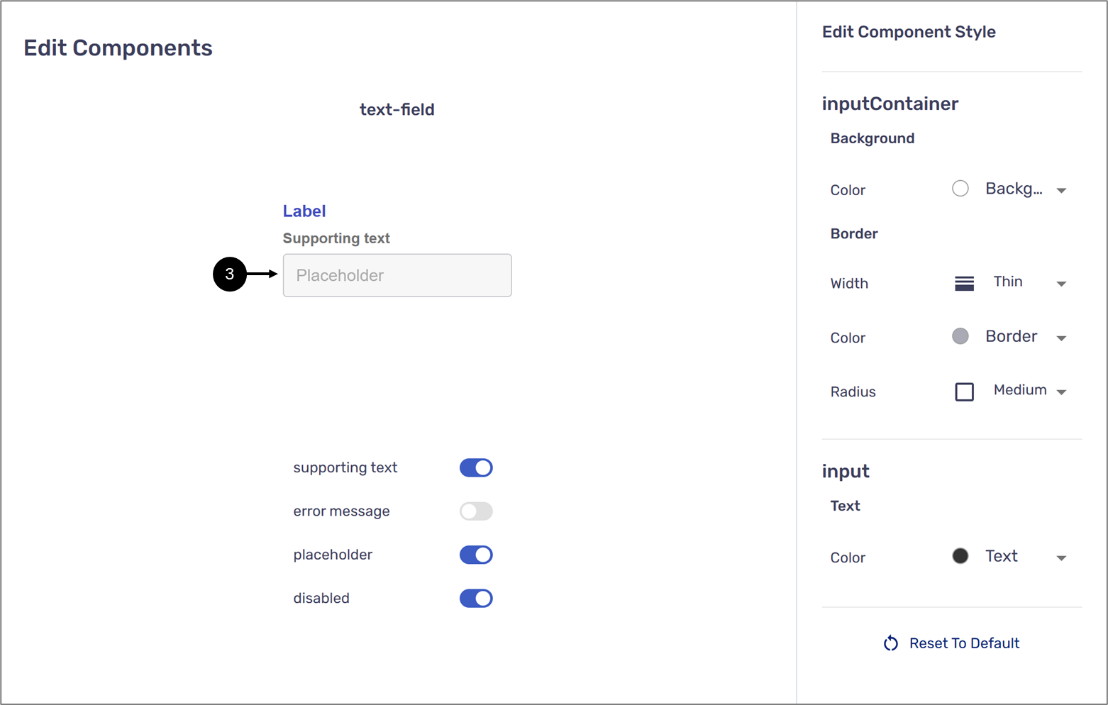
Figure 3: Preview With Disabled On
NOTE
- When the disabled switch is toggled to on, the error message switch is automatically toggled to off.
- Not all switches are available for every component.
- The preview area displays changes done using the Edit Component Style section of each component. For additional information, click here.