Article Overview
The following article describes EasySend’s analytics Overview tab. It details the different visualizations and what information each visualization displays.
The Overview Tab
The Overview tab displays dashboards filtered by business groups and date ranges. For example:
- Total created/opened/completed/expired transactions
- Transaction diversity by source:
- Salesforce
- Agent/Rep
- External app (API)
- Top ten processes
- Opened/completed conversion rate per business group
- The total conversion rate for all selected business groups
Overview Tab Structure
Figure 1 and Table 1 describe the structure of the Overview tab.
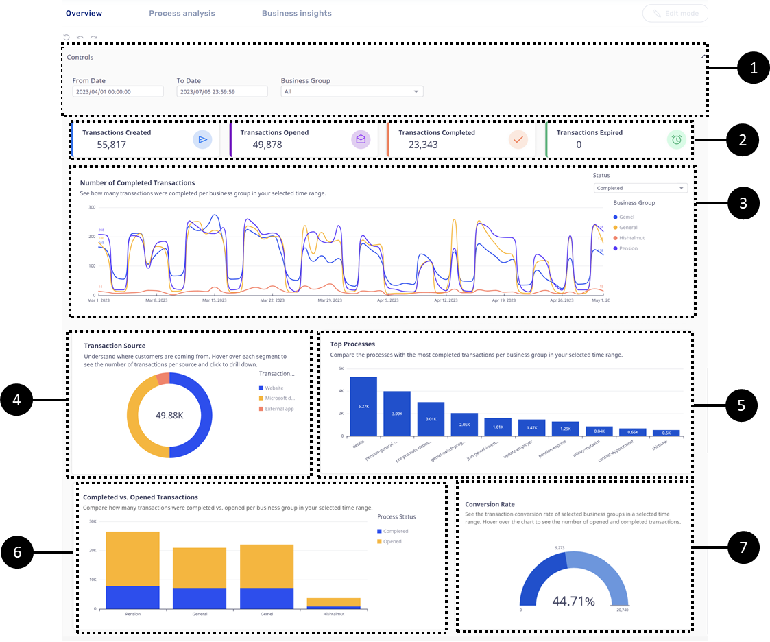
Figure 1: Overview Tab
Table 1: Overview Tab
Number | Name | Description |
1 | Controls | For a detailed description of the Controls filters, see the Controls section |
2 | Transaction Status | For a detailed description of the visualization, see the Transaction Status section |
3 | Number of Transactions | For a detailed description of the visualization, see the Number of Transactions section |
4 | Transaction Source | For a detailed description of the visualization, see the Transactions Source section |
5 | Top Processes | For a detailed description of the visualization, see the Top Processes section |
6 | Completed vs. Opened Transactions | For a detailed description of the visualization, see the Completed vs. Opened Transactions section |
7 | Conversion Rate | For a detailed description of the visualization, see the Conversion Rate section |
Controls
(See Figure 2 to Figure 5)
The Controls section enables you to filter and adjust the information displayed in the Overview tab. It contains two filters:
- From/To Date:
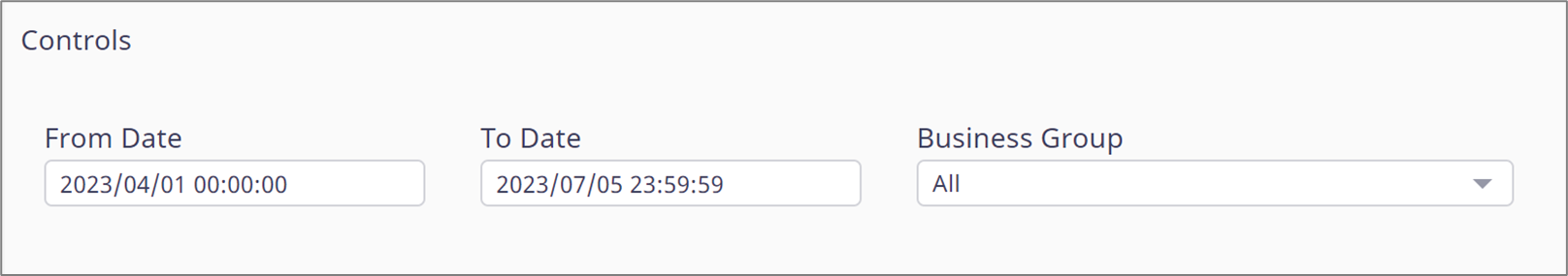
Figure 2: From/To Date
- Business Group:
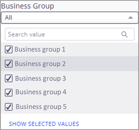
Figure 3: Business Group
The filters can be reset to their default state by clicking the three dots located above (1) them and then Reset (2). The page reset icon (3) rests all the filters at once.
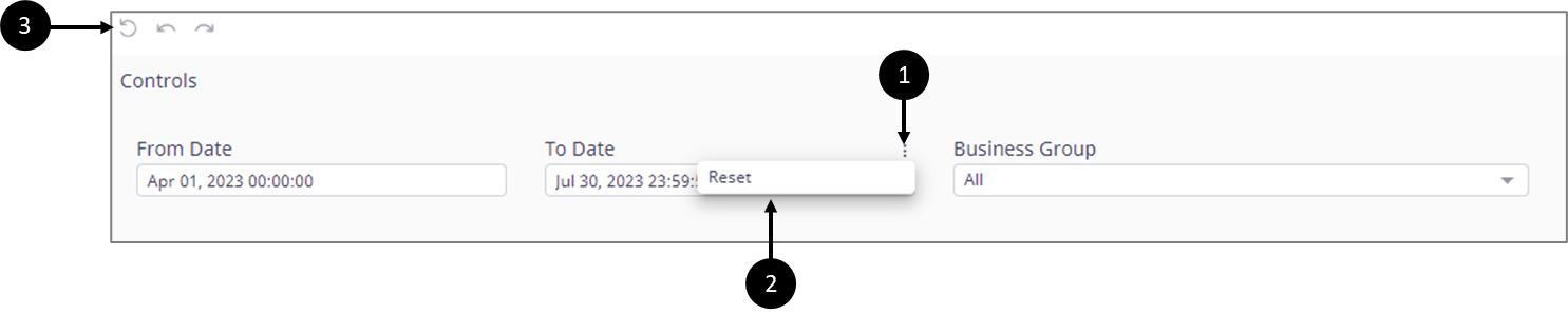
Figure 4: Reset
The Business Group filter also has a Refresh option (4) to update the visualizations with live data.
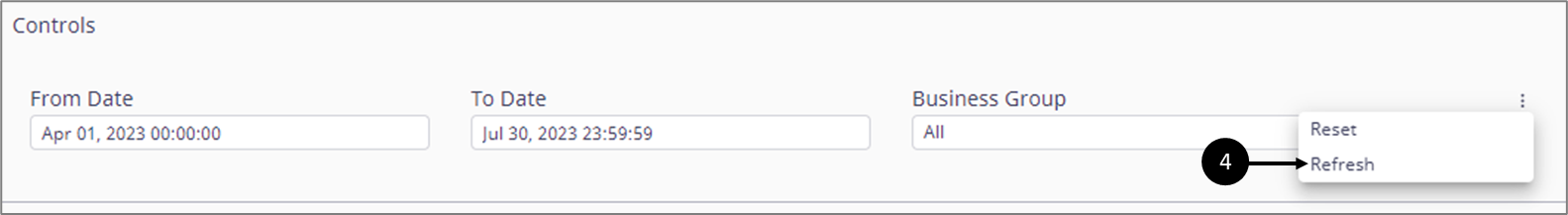
Figure 5: Refresh
Transaction Status
(See Figure 6)
Under transaction status, you view how many transactions were:
- Created
- Opened
- Completed
- Expired

Figure 6: Transaction Status
The displayed information can be filtered and adjusted according to the Controls section filters.
Transaction’s Life Cycle
A transaction is an instance of a process. Each transaction has a life cycle comprised of three stages:
- Created
- Opened
- Completed
Created Transaction Status
A transaction receives a Created status when it is generated by EasySend, for example:
- By using the Journey Sender/Bulk Sender
- By clicking an organic link (website)
- Calling an API
- Executing integration (Salesforce, Dynamic 365, Guidewire)
Opened Transaction Status
When the link of a transaction is clicked and accessed, its status changes to Opened.
If a transaction has several steps (each one for a different end-user), the last click to open the transaction will be counted for analytics.
Completed Transaction Status
The end-user interacts with the transaction until it is submitted. Once submitted, its status changes to Completed, and the life cycle of the transaction ends.
If a transaction has several steps (each one for a different end-user), only the final submission will be counted for analytics.
Example
- A transaction for customer onboarding was generated by EasySend and its link was sent to a customer’s email. At this stage, the status of the transaction is set to Created.
- The customer clicks the link to access the transaction to start it. At this stage, the status of the transaction is set to Opened.
- While interacting with the transaction, the customer specifies that a spouse must be involved in the onboarding process so an additional step must be completed.
- The customer submits the transaction to finish with the first step. At this stage, the status of the transaction remains Opened.
- The spouse receives an email and interacts with the transaction until the step is finished and submitted. At this stage, the status of the transaction is set to Completed.
Number of Transactions
(See Figure 7 to Figure 9)
The visualization displays how many transactions were:
- Created
- Opened
- Completed
per business group within a chosen time frame. The information is displayed according to a selected status (1) and according to the filters located in the Controls section.
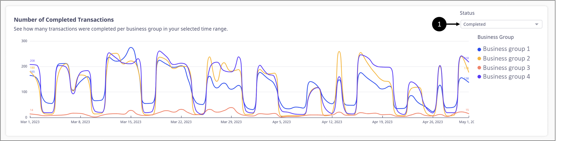
Figure 7: Number of Transactions
Hovering over any part of the visualization displays an exact number of transactions, for example:
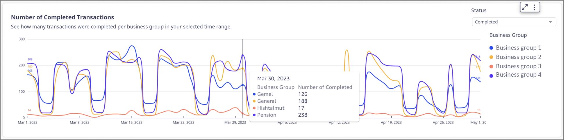
Figure 8: Business Groups Information
When clicking the visualization, an option to reset it appears (2). Clicking Reset (3) reverts the visualization to its original state (COMPLETED).
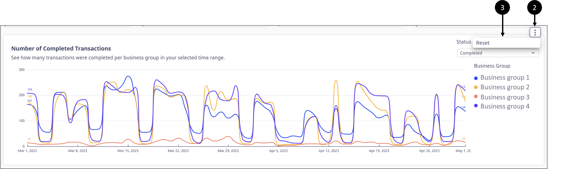
Figure 9: Reset Option
Transaction Source
(See Figure 10 to Figure 12)
The visualization displays where the transaction was initiated according to a source type, for example:
- Website
- Integration
- External app
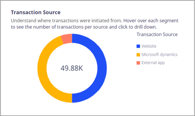
Figure 10: Transaction Source
The information is displayed according to the filters located in the Control section.
Hovering over any part of the visualization displays the number of initiated transactions per source (1). Clicking any part of it enables the user to perform a drill down or a drill up (2), for example:
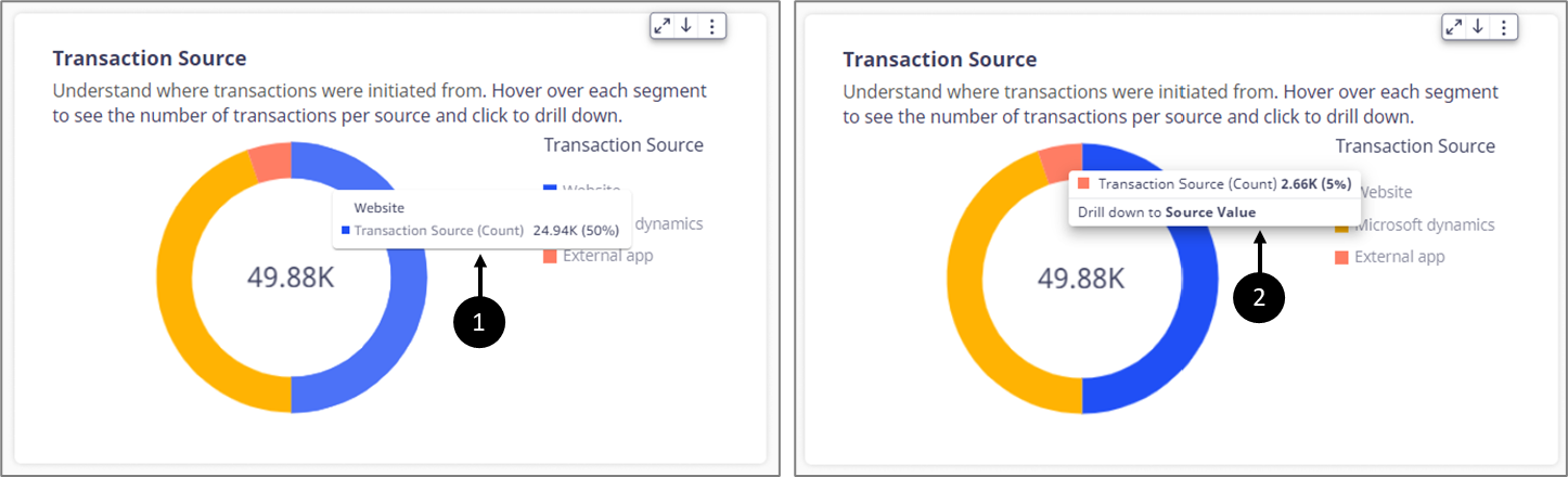
Figure 11: Hovering and Drill Down
Drilling down displays the source value of the source type, for example:
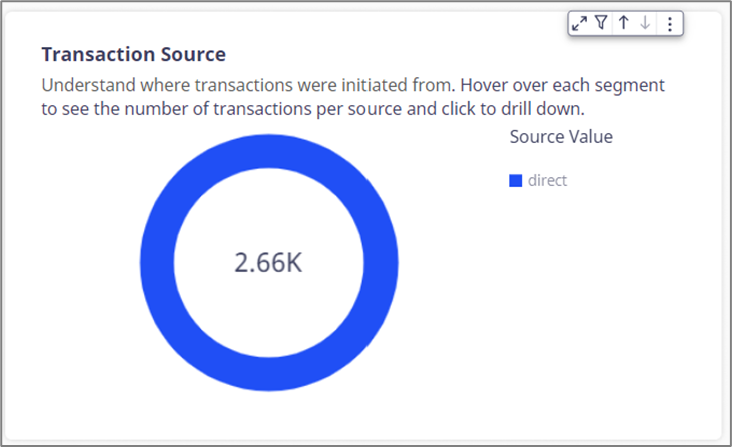
Figure 12: Drill Down
Top Processes
(See Figure 13 and Figure 14)
The visualization compares the top 10 processes with the most completed transactions. The information is displayed according to the filters located in the Control section.
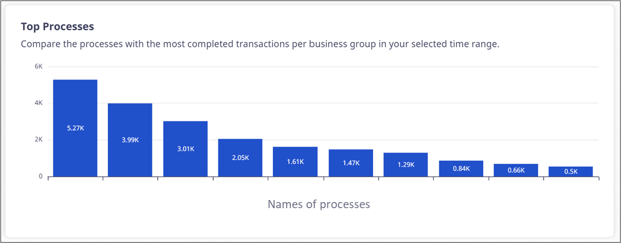
Figure 13: Top Processes
Hovering over any part of the visualization displays the exact number of completed transactions, for example:
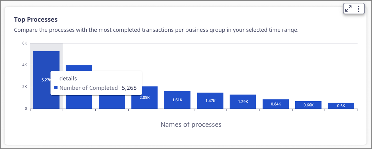
Figure 14: Hovering Information
Completed vs. Opened Transactions
(See Figure 15 and Figure 16)
The visualization displays how many transactions were opened and how many were completed within a business group. The information is displayed according to the filters located in the Control section.
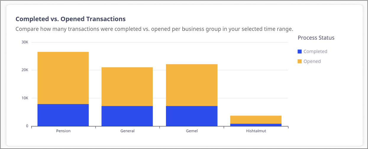
Figure 15: Completed vs. Opened Transactions
Hovering over any part of the visualization displays the exact number of opened and completed transactions, for example:
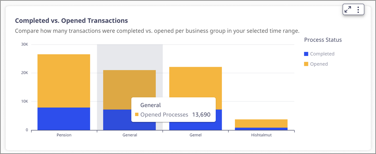
Figure 16: Hovering Information
Conversion Rate
(See Figure 17 and Figure 18)
The visualization displays the conversion rate of transactions. It displays how many transactions were opened and how many were completed. The information is displayed according to the filters located in the Control section.
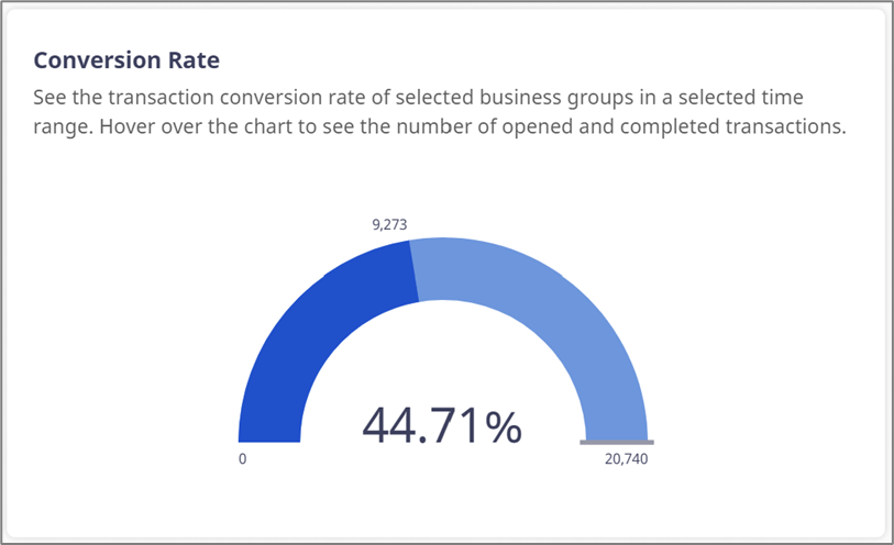
Figure 17: Conversion Rate
Hovering over any part of the visualization displays its legend, for example:

Figure 18: Conversion Rate Legend
Additional Options
(See Figure 19)
When clicking a visualization additional options appear:
- Maximize/Minimize (1) the visualization.
- Drill down/Drill up (when available) (2).
- Menu Options (3).
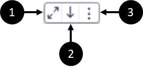
Figure 19: Conversion Rate Legend
Drill down/Drill up
(See Figure 20)
When this option is available, the user can drill down or up and view another level of the visualization. In the Overview tab, this option is available in the Transaction Source visualization, for example:
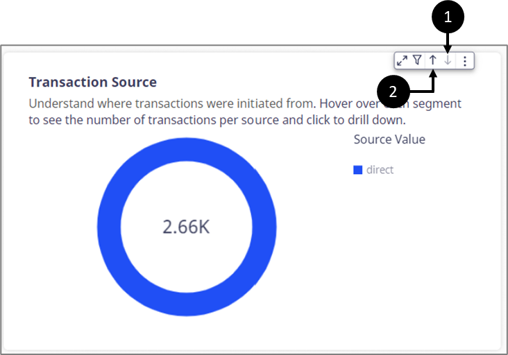
Figure 20: Drill Down/Up Options
After a drill down the icon becomes disabled (1) and the drill up icon appears (2).
Menu Options
(See Figure 21 to Figure 23)
Contain the following options:
- View summary data - displays a window with a textual summary of the visualized data.
- Export to CSV - exports the visualization to a CSV file.
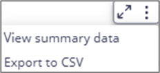
Figure 21: Menu Options
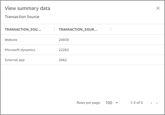
Figure 22: View summary data
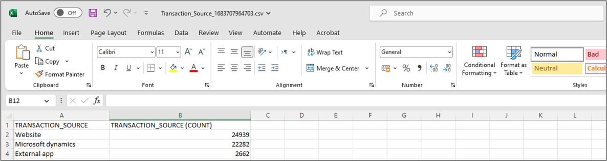
Figure 23: Exported CSV