Article Overview
The following article details the design capabilities of the Date Input component.
Design Guidelines
Figure 1 and Table 1 describe the design capabilities of the Date Input component:
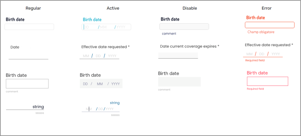
Figure 1: Design Capabilities
Table 1: Design Capabilities
Element | Design attribute | Change when filled? | Change on disable? | Change on active? | Change on error? | Notes |
Input | font | No | No | No | No |
|
| color | No | Yes | Yes | Yes | ||
| width | No | No | No | No | %/px | |
| format | No | No | No | No | ||
| sizing | No | No | No | No | ||
| Label | font | No | No | Yes | No |
|
| color | Yes | No | Yes | Yes | ||
| horizontal padding | No | No | No | No | ||
| bouncing label | No | No | No | No | See Figure 1 | |
| Border | width | No | Yes | Yes | No | |
| color | No | Yes | Yes | Yes | ||
| radius | No | No | No | No | ||
| type | No | Yes | No | No | ||
| Error | font | No | No | No | No | |
| color | No | No | No | No | ||
| margin top | No | No | No | No | ||
| Background | color | No | Yes | No | No | |
| Margins | No | No | No | No |
| |
Placeholder | day, month, year | No | No | No | No | |
| color | No | No | No | No | ||
| font | No | No | No | No | Type, size | |
| Separator | type | No | No | No | No | / or . or - |
| color | No | No | No | No | ||
| Layout | type | No | No | No | No | 2 types, see Figure 1 |
| Output | format | No | No | No | No | |
| Comment | width | No | No | No | No | Color, size |