Article Overview
The following article describes how to use datasets, visuals, and fields within an analysis. The article also describes how to add a calculated field.
Datasets
(See Figure 1 to Figure 3)
After creating an analysis, as described in the Analysis Overview article, it appears with the selected dataset by default (1).
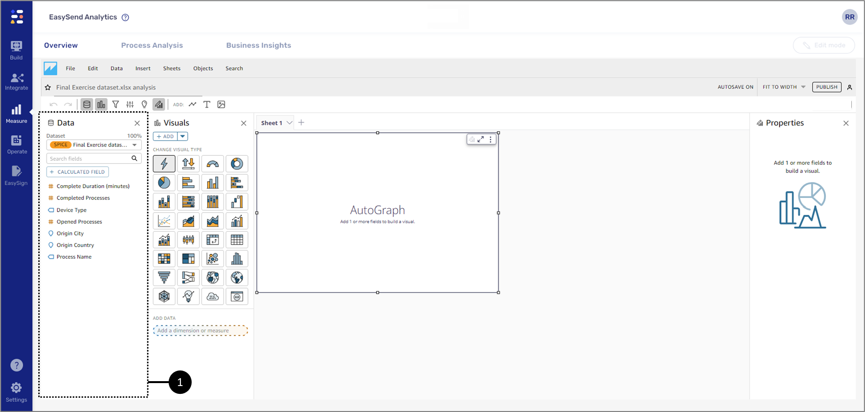
Figure 1: Selected Dataset
A dataset stores the fields that will be used for data visualization (2). Using the dataset dropdown (3) it is possible to add additional new datasets and manage them.
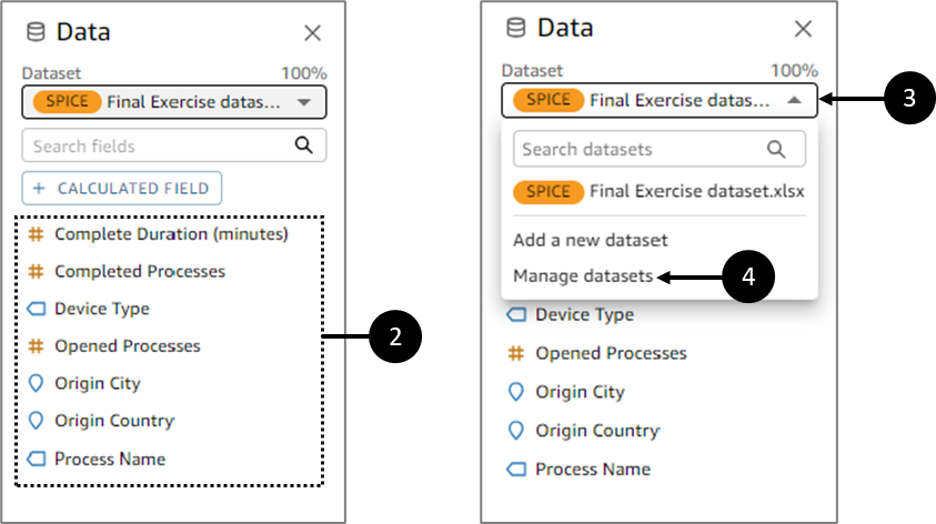
Figure 2: Dataset Fields and Dropdown
When clicking Manage datasets (4), the Datasets in this analysis window appears. Using the window you can replace a dataset (5) and/or add a new one (6).
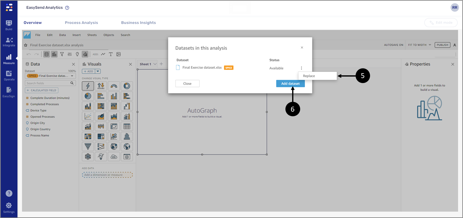
Figure 3: Datasets in this analysis Window
- To hide/display the dataset and its field, click the Datasets icon
 .
. - The dataset also contains an option to add calculated fields. For additional information, see the Adding Calculated Fields section.
The Data tab (7) can also be used for:
- Displaying the Datasets in this analysis window (8).
- Adding an additional dataset to the analysis (9).
- Adding a calculated field (10).
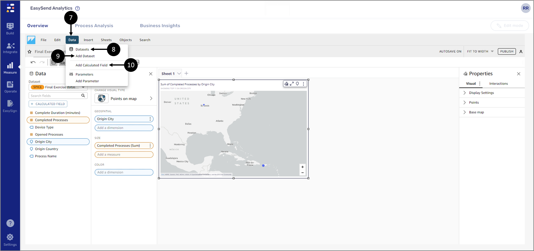
Figure 4: Datasets in this analysis Window
Dataset Fields
(See Figure 5)
Dataset fields contain data for visualization (1). When an analysis contains more than one dataset when switching between them, the Fields list updates.
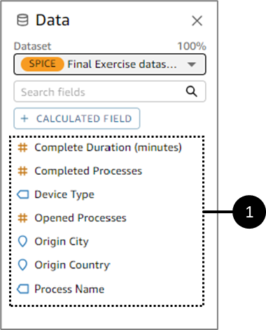
Figure 5: Dataset Fields
Dataset Fields - Dimensions and Measures
(See Figure 6 and Figure 7)
Each dataset field in is defined as a dimension or measure, depending on the type of data it contains:
- Dimensions are text or date fields that can be items like products, or attributes that are related to measures. You can use dimensions to partition these items or attributes, like sales dates for sales figures. A dimension field is identified by a blue icons (1).
- Measures are numeric values that are used for measurement, comparison, and aggregation. a measure field is identified by a yellow mustered icon (2).
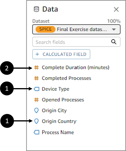
Figure 6: Dataset Fields
In some cases, EasySend Analytics interprets a field as a measure that you want to use as a dimension (or the other way around). If so, you can change the setting for that field.
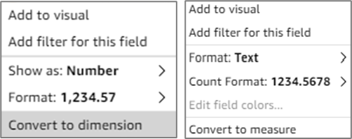
Figure 7: Conversion Options
Changing a field's measure or dimension setting affects all visuals in the analysis that use that dataset. However, it does not affect the dataset itself. You typically use a combination of dimension and measure fields to produce a visual, for example, sales totals (a measure) by sales date (a dimension).
Field Wells
(See Figure 8)
Field Wells are different types of measures (yellow mustered) and dimensions (blue) that appear according to the selected visual, for example:
- Measures:
- X-axis
- Y-axis
- Size
- Value
- Target value
- Dimensions:
- Group by
- Color
- Group/Color
- X-axis
- Trend group
- Breakdown
- Small multiples
Figure 8: Field Wells
Displaying Field Wells
(See Figure 9 to Figure 11)
Field Wells are located in the Visuals section. As mentioned in the section above each visual has its own Field Wells with dimensions and measures , for example, pie chart has the following dimensions and measures (1):
- Group/Color
- Value
- Small Multiples
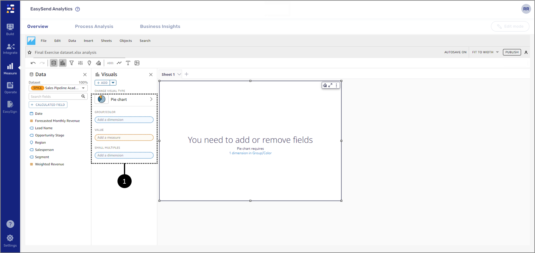
Figure 9: Pie Chart Field Wells
The one exception is the AutoGraph. This visual's Field Wells do not distinguish between measures and dimensions until the first dataset field is added and the type of the visual is automatically set (2):
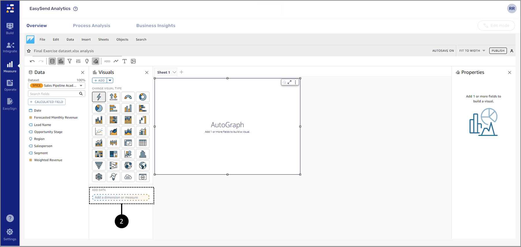
Figure 10: AutoGraph Field wells 1 of 2
Once the first dataset field is added and the type of the visual is set the visual's Field Wells appear (3). The ADD DATA (4) can be used to place dataset fields in the appropriate dimension/measure.
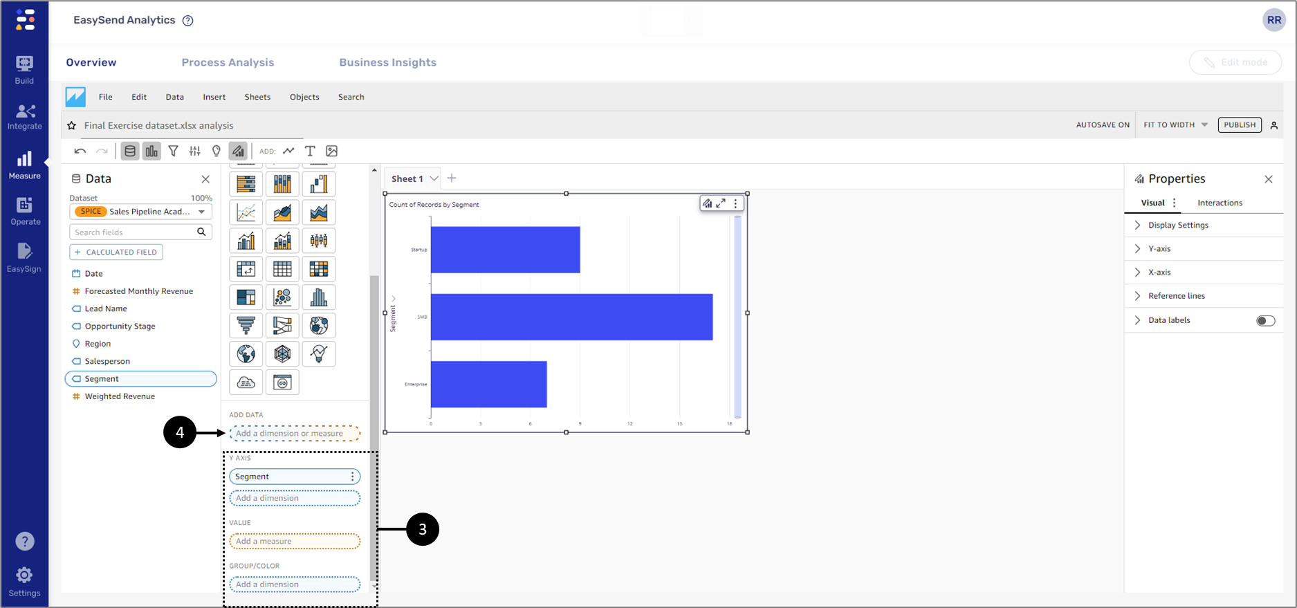
Figure 11: AutoGraph Field wells 2 of 2
Adding Dataset Fields to a Visual
The following sections describe methods of adding fields to a visual.
Clicking a Dataset Field
(See Figure 12)
When clicking a dataset field (1) EasySend Analytics adds the it to the visual by populating the first empty dimension/measure in the Field Wells (2) that corresponds with the field type.
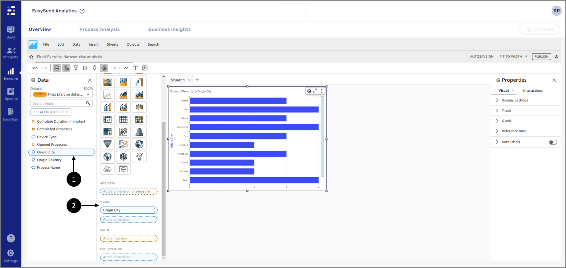
Figure 12: Clicked a Dataset Field
Adding a Dataset Field by Using a Drop Target
(See Figure 13)
To add a dataset field to a visual by using a drop target, first, choose a field, then drag it to your chosen drop target on the visual, making sure the drop indicator shows that the field is being added.
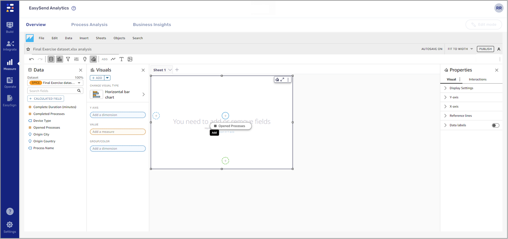
Figure 13: Visual Drop Target
Adding a Field by Using Field Wells
(See Figure 14)
To add a field to a visual by using Field Wells, choose a field, and drag it to the dimension/measure while making sure that the drop indicator shows that the field is being added.
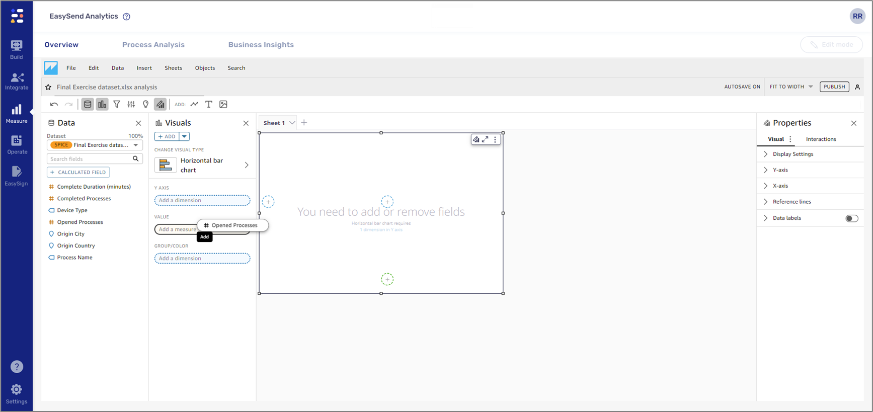
Figure 14: Field Wells
Adding Fields to the AutoGraph Visual Example
(See Figure 15)
If the visual you are adding fields to is an AutoGraph, use one of the following methods:
- Click a field
- Drag and drop a field directly into the visual (1) or into the ADD DATA Field Well (2)
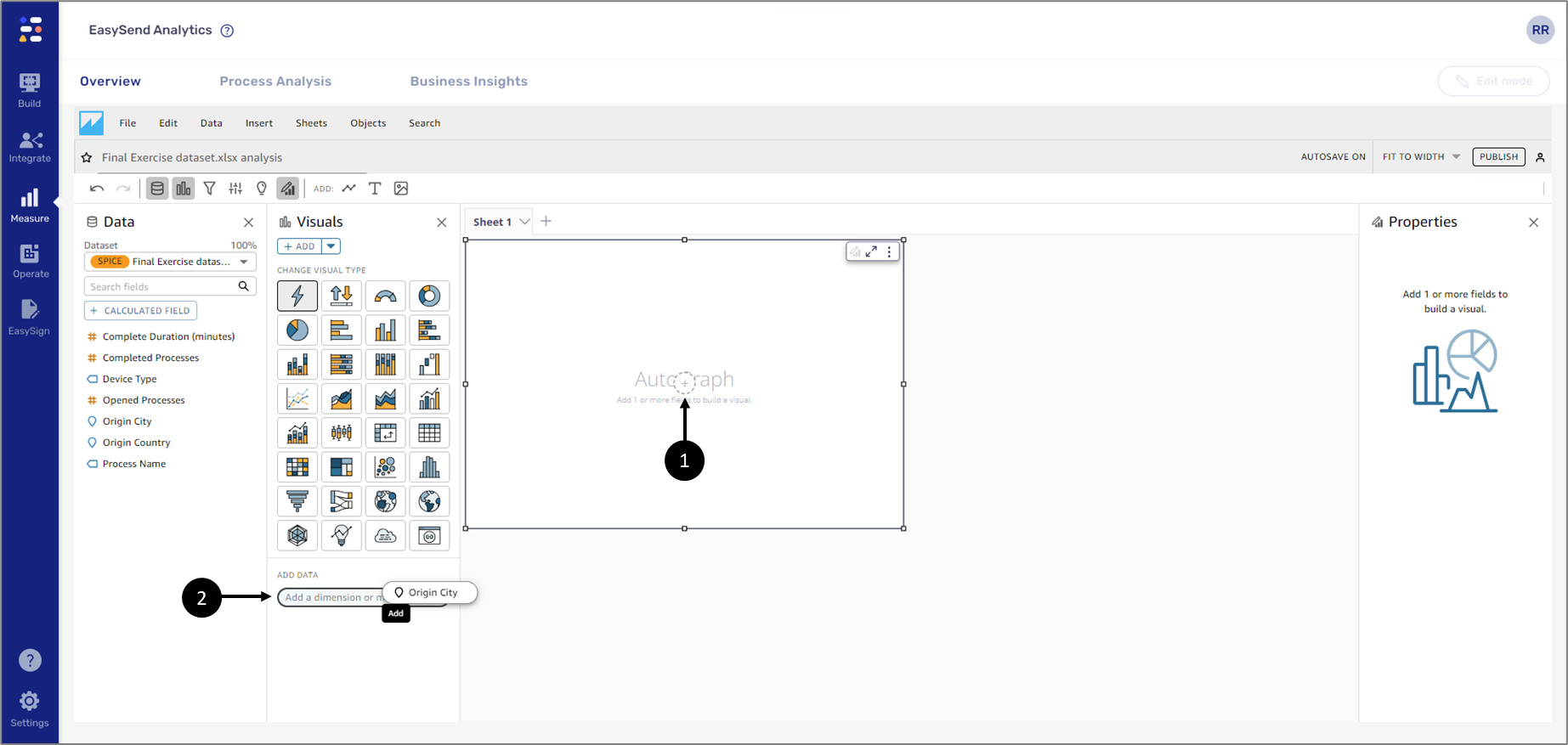
Figure 15: Drag Drop and ADD DATA
EasySend analytics will choose the most appropriate visual to display. In the following example, the clicked field was Device Type (1), a dimension, and the visual that was automatically selected by the AutoGraph was a horizontal bar chart (2) (see Figure 16):
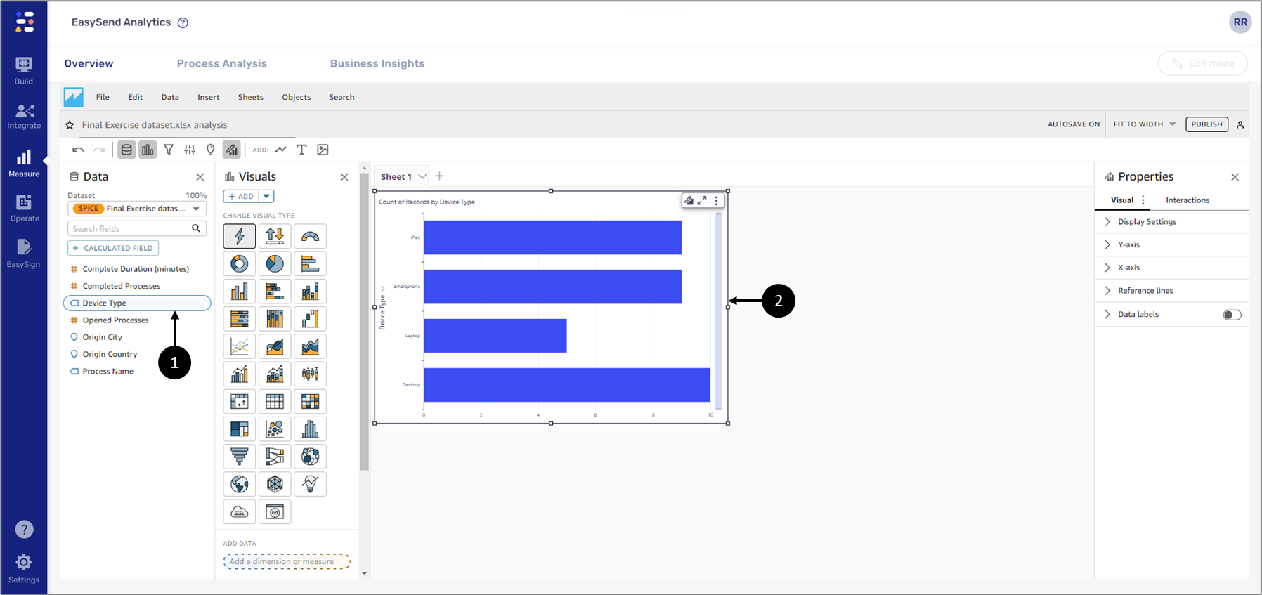
Figure 16: AutoGraph Visual Example
Adding Fields to a Visual (Not AutoGraph) Example
If the visual you are adding fields to is not an AutoGraph, first, add the desired visual types and then add fields by:
- Clicking
- Drag and drop into the visual
- Drag and drop into the Field Wells
In the following example the selected visual was horizontal bar chart (1) and the selected field was Process Name (2) (see Figure 17):
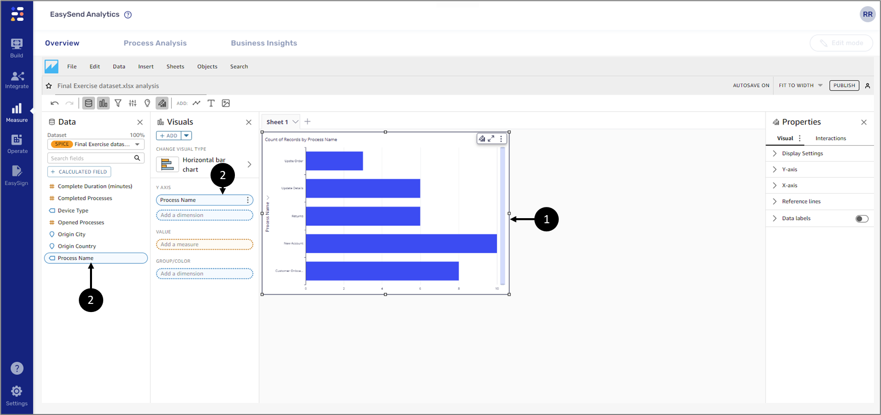
Figure 17: Horizontal Bar chart Visual Example
Using Field Wells
(See Figure 12 and Figure 13)
To edit Field Wells, it is mandatory to click and expand their section, for example:
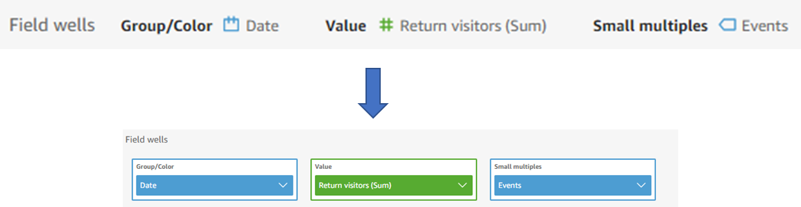
Figure 12: Expanded Field Wells
Each Field Well has a dropdown that displays different options, for example:
- Aggregating
- Sorting
- Display and formatting options
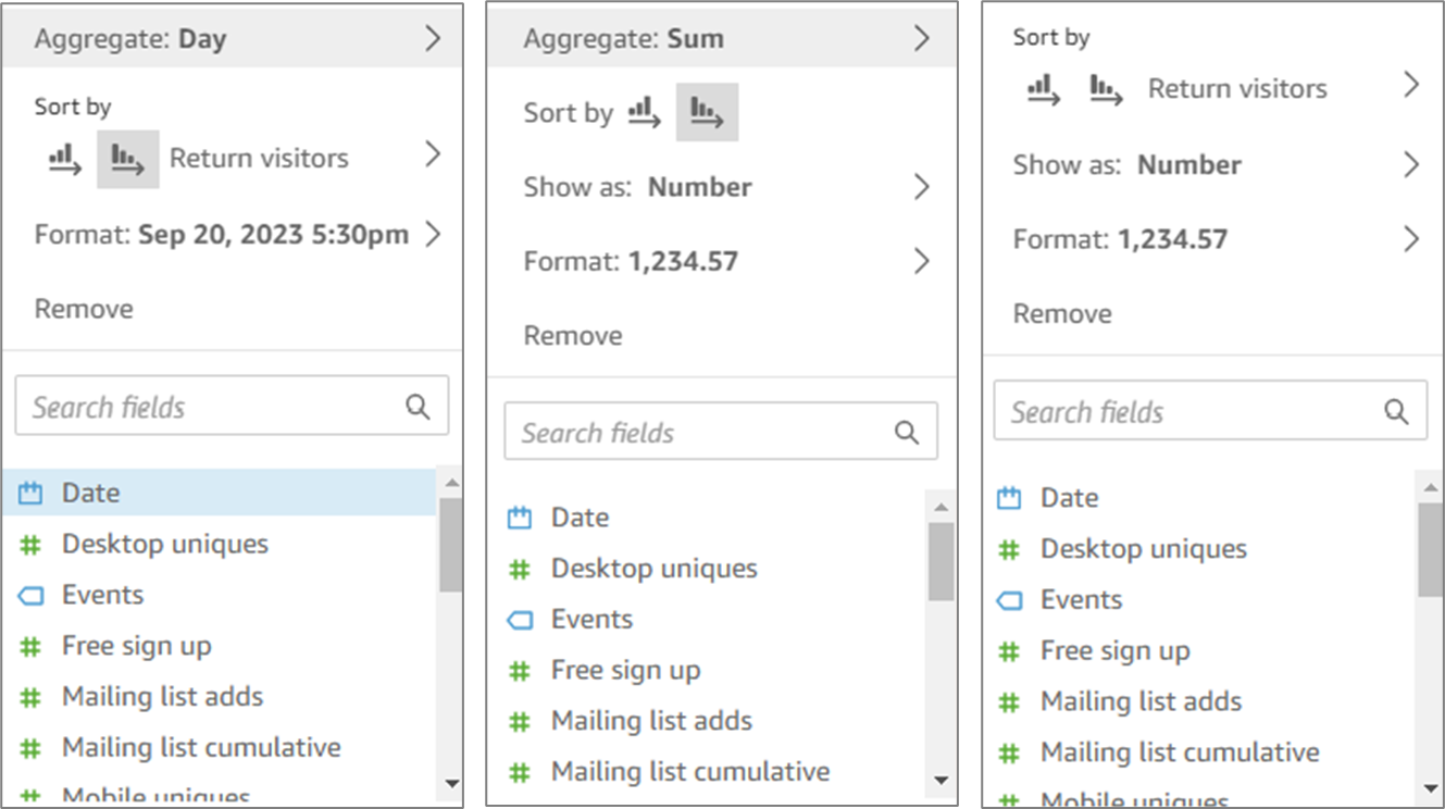
Figure 13: Dropdown Options
Aggregating
(See Figure 14)
You can apply functions to fields to display aggregate information, like the sum of the sales for a given product. You can apply an aggregate function by using the options in either an on-visual editor or a Field Well (1).
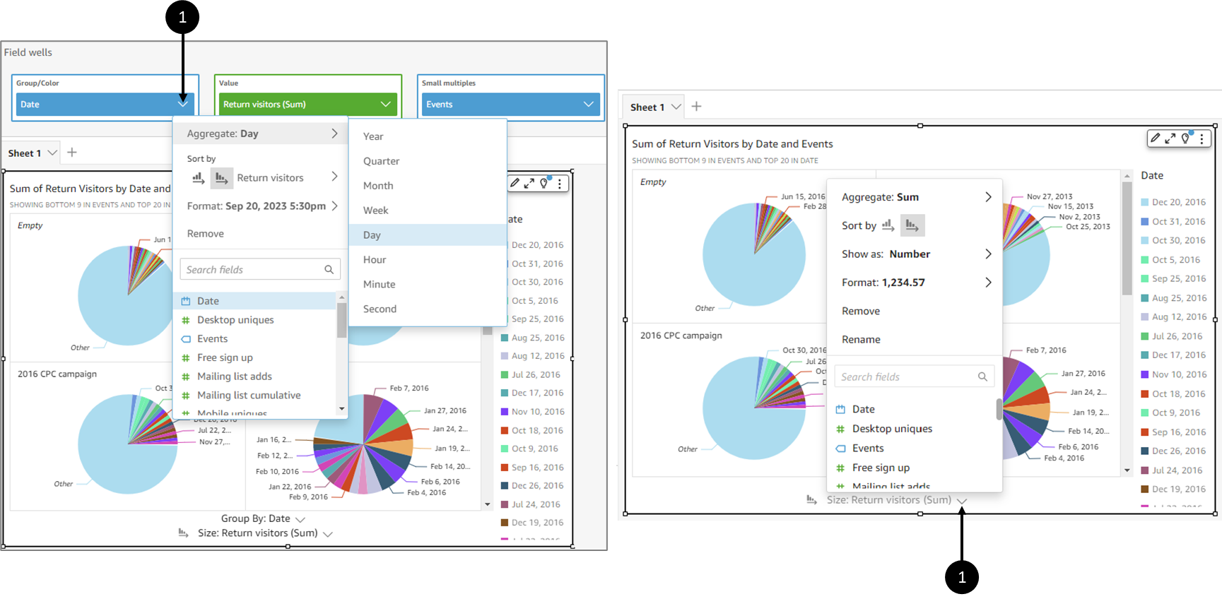
Figure 14: Aggregating Options
The following aggregate functions are available in EasySend Analytics:
- Average - calculates the average value for the selected field.
- Count - provides a count of the number of records containing the selected measure for a given dimension. An example is a count of Order IDs by State.
- Distinct Count - provides a count of how many different values are in the selected measure, for the selected dimension or dimensions. An example is a count of Products by Region. A simple count can show how many products are sold for each region. A distinct count can show how many different products are sold for each region. You might have sold 2000 items, but only two different types of items.
- Max - calculates the maximum value for the selected field.
- Min - calculates the minimum value for the selected field.
- Median - calculates the median value of the specified measure, grouped by the chosen dimension or dimensions.
- Sum - totals all the values for the selected field.
- Standard Deviation - calculates the standard deviation of the set of numbers in the specified measure, grouped by the chosen dimension or dimensions, based on a sample or a biased population.
- Variance - calculates the variance of the set of numbers in the specified measure, grouped by the chosen dimension or dimensions, based on a sample or a biased population.
- Percentile - computes the nth percentile of the specified measure, grouped by the chosen dimension or dimensions.
Sorting
(See Figure 15 and Figure 16)
You can sort data using multiple methods for most visual types. You can choose the sort order of on-visual data by using the quick sort option (1) or Field Wells (2).
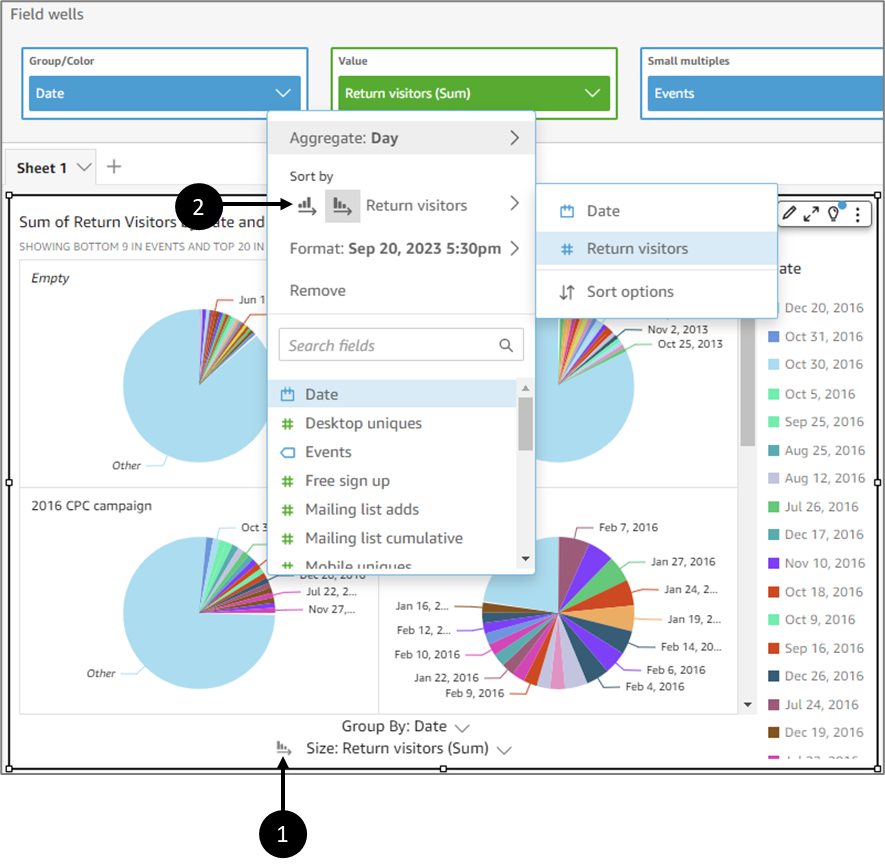
Figure 15: Sorting Options
Sorting data on a visual can be done by clicking the label (1) for the field you want to sort, and clicking one of the sort icons (2):
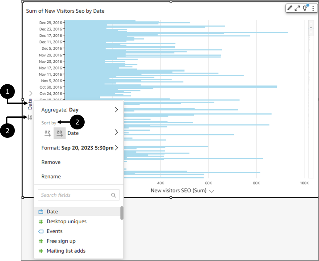
Figure 16: Sorting Data on a Visual
Sorting Data by an Off-Visual Metric
(See Figure 17 and Figure 18)
To use Field Wells to sort data by an off-visual metric, perform the following steps:
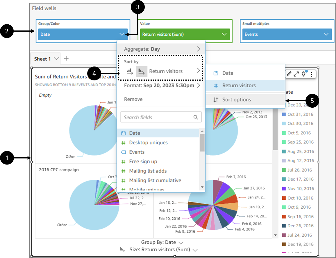
Figure 17: Sorting Data by an Off-Visual Metric
- Click a visual (1).
- Expand the Field Wells (2).
- Choose a sorting-supported field and click its dropdown (3).
- Hover over Sort by (4).
- Click Sort options (5).
Result:
The Sort options pane appears on the left side of the screen:
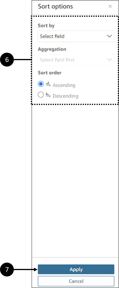
Figure 18: Sort options
- On the Sort options pane, sort by specific fields, choose an Aggregation and a Sort order, Ascending or Descending (6).
- Click Apply (7) to save the changes.
Display and Formatting Options
(See Figure 19 and Figure 20)
You can set display and formatting options using the Field Wells. Display (Show as) (1) and formatting (Format) (2) options vary based on the field's data type.
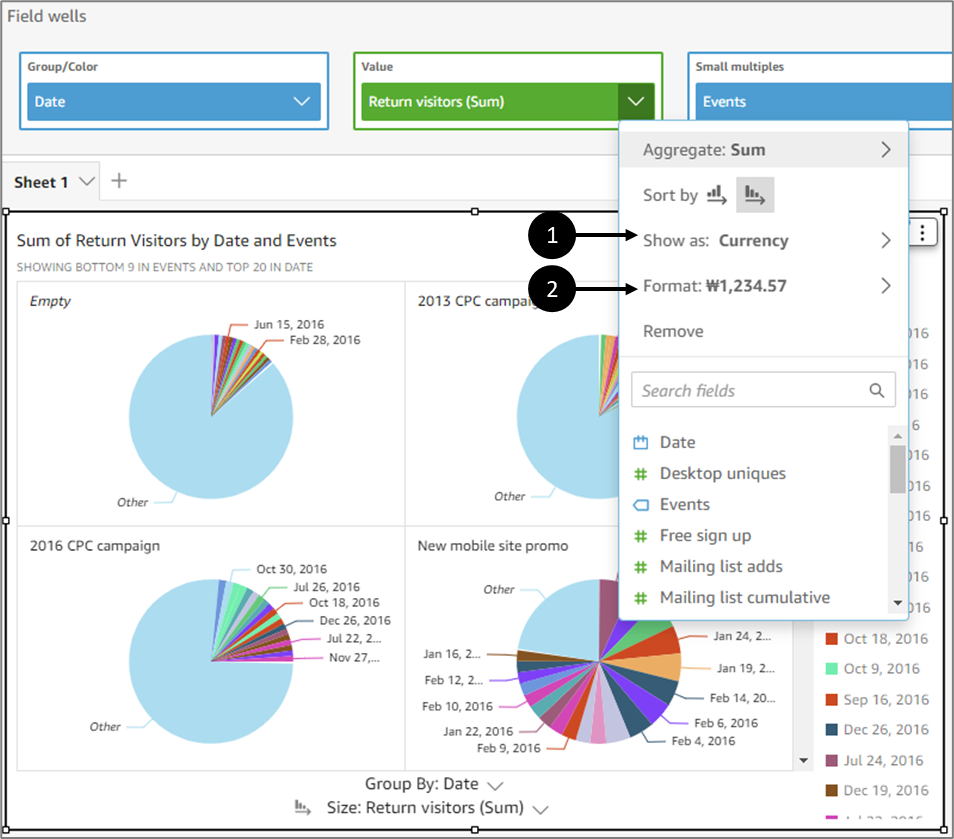
Figure 19: Show as and Format
If you do not see an option that you want to use, choose More formatting options from the context menu.
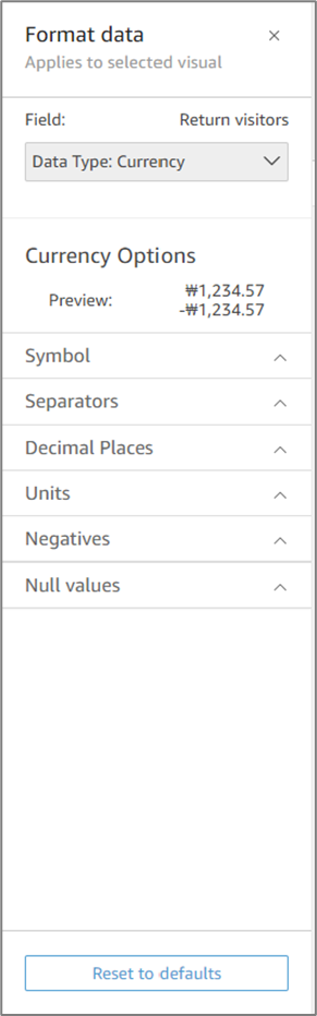
Figure 20: Format Data
Fields List Options
(See Figure 21)
Each field from the Fields list has a few options:
- Add to visual/Remove from visual
- Add a filter for this field
- Show as
- Format
- Count Format
- Convert to measure/dimension
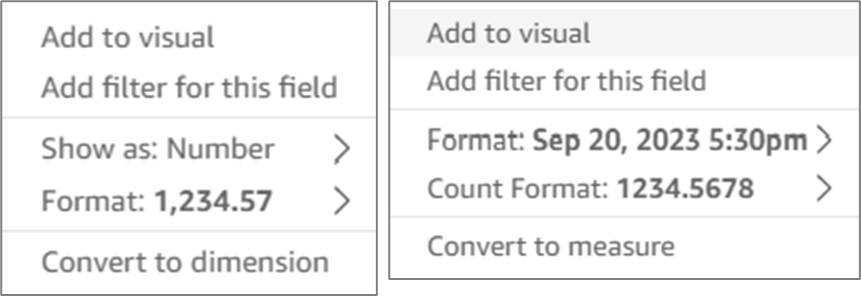
Figure 21: Fields List Options
Adding Calculated Fields
(See Figure 22 to Figure 24)
Datasets that were created using Model data items from your environment can be updated by adding calculated fields.
You can add calculations based on dataset fields and built-in functions by clicking the + Add button (1) and the Add calculated field option (2):
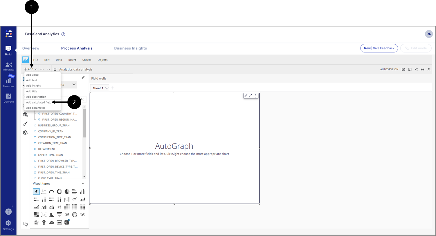
Figure 22: Add calculated field Option
After clicking the Add calculated field, an editor screen appears. You can use the different fields, parameters, and built-in functions to create new calculation formulas. For example, you can add a calculation of the average number of children:
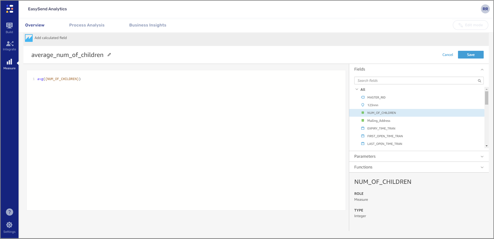
Figure 23: Usage Example
Clicking Save will apply the calculation and close the editor. The calculation will appear as a new dataset field (3):
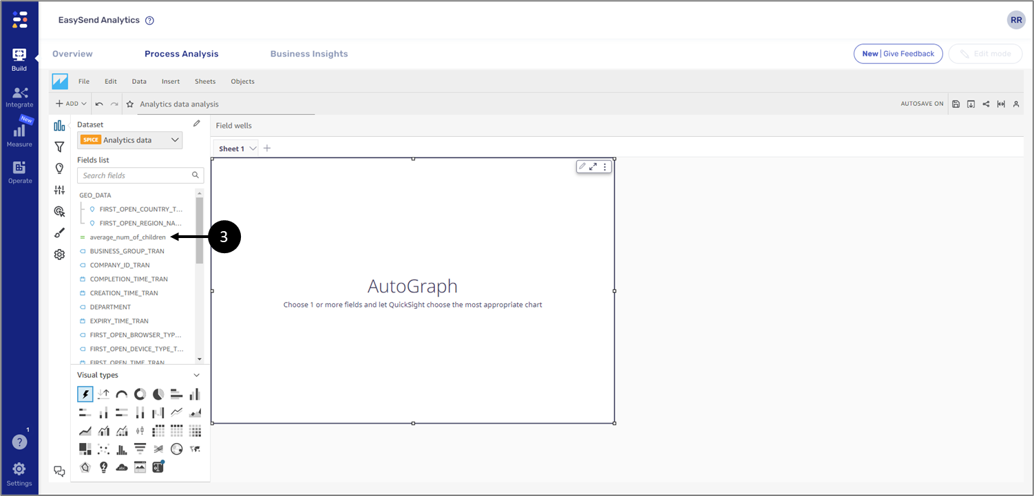
Figure 24: Added Calculated Field