Custom Select Overview
The Custom Select component is a dropdown that displays a list of multiple values from which the end-user can select only one.
The Properties section of this component contains only one filed that is used to connect it to the Model:
Figure 1 and Table 1 describe the properties of the Custom Select component:
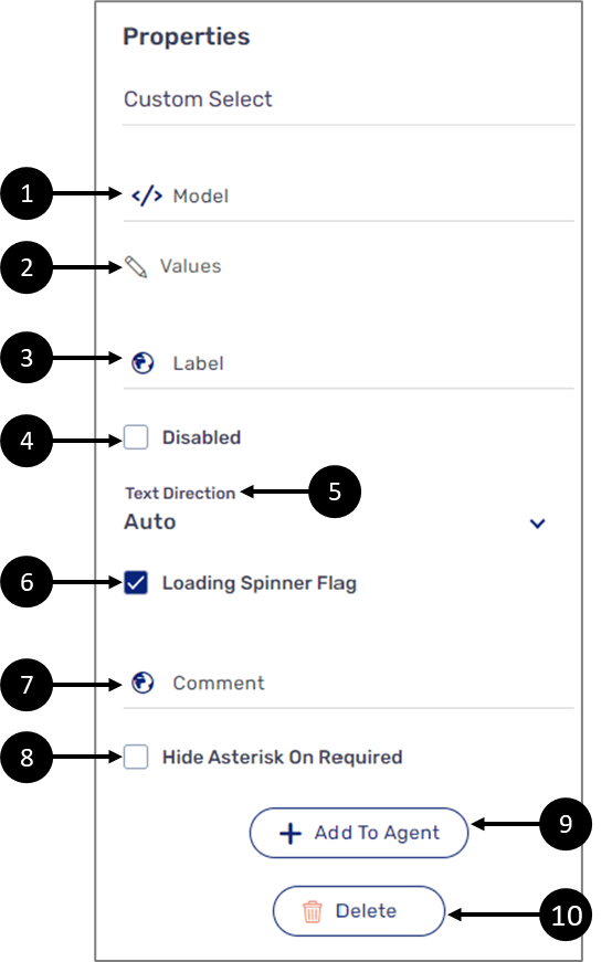
Figure 1: Custom Select Properties Section
Table 1: Custom Select Properties Section
Number | Icon | Name | Description |
| 1 |  | Model | Enables to connect the component to the Model by:
NOTE
|
| 2 |  | Values | Displays the Values window |
3 |
| Label | Enables to set the label of the component NOTE The globe icon allows you to set the label of the component in different languages and will appear only if the Webflow is set with more than one language, for additional information, see the Multi-Language article |
4 | - | Disabled |
|
5 | - | Text Direction | Enables to set the text direction of the label:
|
6 | - | Loading Spinner Flag |
NOTE Input data can be loaded automatically when setting the input value to Autocomplete Service using the Model, for additional information, see the Values article |
7 | - | Comment | Enables to write a comment underneath the component NOTE The globe icon allows you to write the comment in different languages and will appear only if the Webflow is set with more than one language, for additional information, see the Multi-Language article |
8 |
| Hide Asterisk On Required |
NOTE A field is set as required using the Model validations, for additional information, see the Validations article. |
9 | + Add to Agent | Enables to add the component to the Agent screen NOTE This button will only appear if the Journey Sender feature is enabled, for additional information, see the Journey Sender article | |
10 | - | Delete | Deletes the component |


The Values Window
(See Figure 2)
the Values window enables you to add (1) and set the options of a custom select. Each option is comprised out of a text (2) and a value (3). The text is displayed while using the digital process and value is used for conditions, expressions, or for displaying the selected radio option on top of a PDF. For additional information, see the Model Implementation and the Creating and Defining a PDF articles
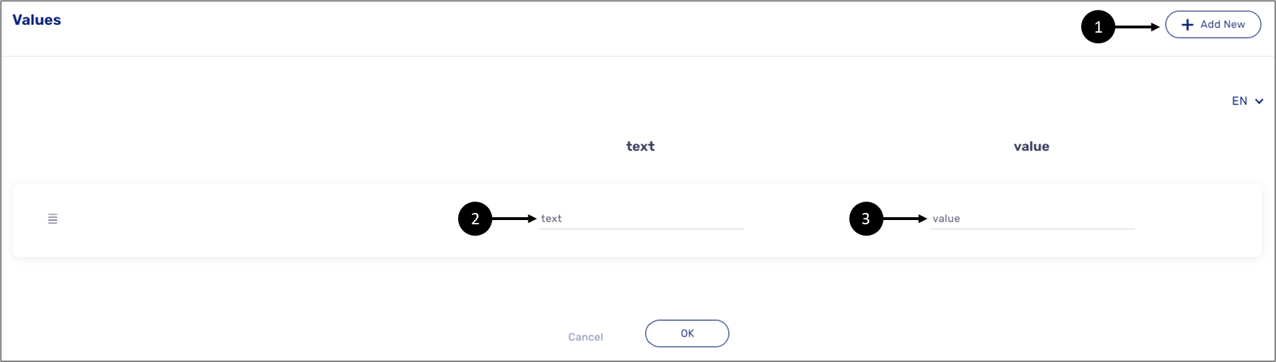
Figure 2: Values Window