Article Overview
The following article details the design capabilities of the Custom Select component.
Design Guidelines
Figure 1 and Table 1 describe the design capabilities of the Custom Select component:
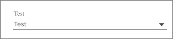
Figure 1: Design Capabilities
Table 1: Design Capabilities
Element | Design attribute | Change on hover? | Change on disable? | Change on focus? | Notes |
| Label | font | No | No | Yes |
|
| color | No | Yes | No | ||
| horizontal padding | No | No | No | ||
| bouncing label | No | No | No | ||
| Border | color | Yes | Yes | No | |
| radius | No | No | No | ||
| type | No | Yes | No | ||
| size | No | No | No | ||
| style | No | No | No | For example:
| |
| Error | color | No | No | No | |
| font | No | No | No |
| |
| margins and padding | No | No | No | ||
| Comment | color | No | No | No | |
| font | No | No | No | ||
| Arrow color | No | No | No | ||
| Spinner | width | No | No | No | 3 options, see Figure 1 |
| color | No | No | No | ||
| background color | No | No | No | ||
| Visible option number | No | No | No | Number of options visible at once in a dropdown | |
| Empty | placeholder when empty | No | No | No | |
| list object background color | Yes | No | No | ||
| Options | size | No | No | No | |
| color | Yes | Yes | No | ||
| background color | Yes | No | No | ||
| font | No | No | No | ||
| padding | No | No | No |
| |
| Selected | background color | No | No | No | |
| height | No | No | No | ||
| width | No | No | No | ||
| padding | No | No | No | Top |