Article Overview
The following article details the design capabilities of the Checkbox component.
Design Guidelines
Figure 1 and Table 1 describe the design capabilities of the Checkbox component:
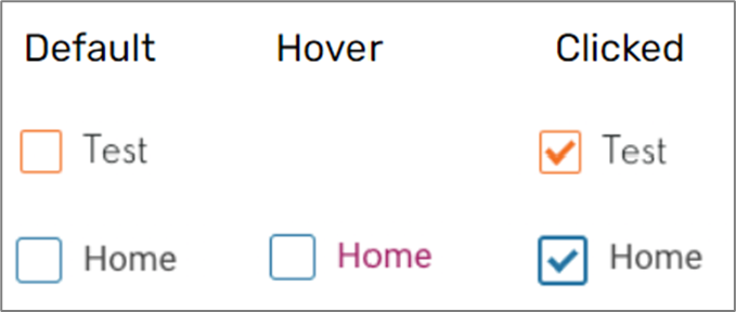
Figure 1: Design Capabilities
Table 1: Design Capabilities
Element | Design attribute | Change on hover? | Change on disable? | Change on focus? | Notes |
Font | family | No | No | No | |
| color | Yes | No | No | ||
| size | No | No | No | ||
| Label | color | No | Yes | No | |
| padding top | No | No | No | ||
| Background | color | Yes | Yes | No | |
| Border | color | Yes | Yes | Yes | |
| width | No | No | No | ||
| radius | No | No | No | ||
| type | No | Yes | No | ||
| size | No | No | Yes | ||
| Error | color | No | No | No | |
| font size | No | No | No | ||
| Checkmark | color | No | No | No | |
| position | No | No | No | ||
| Margins | top, bottom, left, right | No | No | No | |
| Check | background color | No | No | No | |
| border | No | No | No |
|