Layout Components Properties
The following sections detail the properties of the Layout section components:
- Container
- Grid
- Progress Bar
- Greeting Page
- Thank you Page
- Main Page
- Accordion
Container Properties
After adding the Container component to the canvas, configure its properties, design its look, and connect it to the Model.
Figure 1 and Table 1 describe the properties of the Container component:
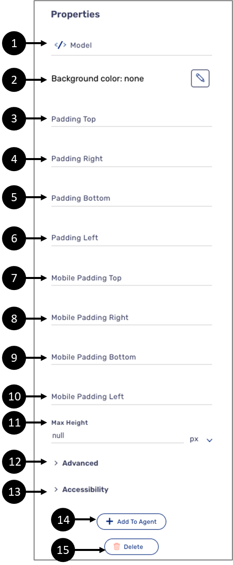
Figure 1: Container Properties Section
Table 1: Container Properties Section
Number | Icon | Name | Description |
1 |
| Model | Enables to connect the component to the Model by:
NOTE
|
2 |
| Background Color | Enables to select a background color for the component NOTE The background color is selected from a color palette or from the Theme of the Webflow. For additional information about Themes, see the Themes Overview article |
3 | - | Padding Top | Enables to add top padding to the component |
4 | - | Padding Right | Enables to add right padding to the component |
5 | - | Padding Bottom | Enables to add bottom padding to the component |
6 | - | Padding Left | Enables to add left padding to the component |
7 | - | Mobile Padding Top | Enables to add top padding to the component NOTE The padding will be effective when viewing the process on a mobile device |
8 | - | Mobile Padding Right | Enables to add right padding to the component NOTE The padding will be effective when viewing the process on a mobile device |
9 | - | Mobile Padding Bottom | Enables to add bottom padding to the component NOTE The padding will be effective when viewing the process on a mobile device |
10 | - | Mobile Padding Left | Enables to add left padding to the component NOTE The padding will be effective when viewing the process on a mobile device |
11 | - | Max Height | Enables to set the maximum height of the component in:
|
| 12 | - | Advanced | Displays advanced properties NOTE For additional information, click here. |
| 13 | - | Accessibility | Displays accessibility properties NOTE For additional information, click here. |
14 | - | + Add to Agent | Enables to add the component to the Agent screen NOTE This button will only appear if the Journey Sender feature is enabled, for additional information, see the Journey Sender article |
15 | - | Delete | Enables to delete the component NOTE Deleting a Container component that contains other components will delete them as well |

Container Advanced Properties
Some properties, that are not so common, will be available under the Advanced dropdown. Figure 2 and Table 2 describe the properties located under the Advanced dropdown.
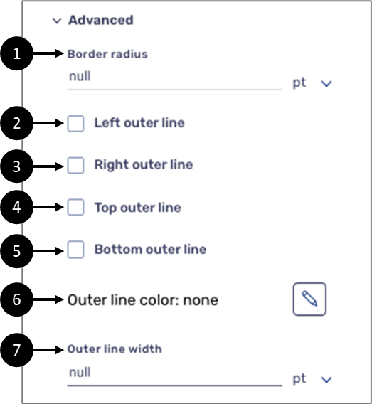
Figure 2: Container Advanced Properties
Table 2: Container Advanced Properties
Number | Icon | Name | Description |
1 | - | Border radius | Enables to set the border radius in:
|
2 | - | Left outer line |
|
| 3 | - | Right outer line |
|
| 4 | - | Top outer line |
|
| 5 | - | Bottom outer line |
|
| 6 |
| outer line color | Enables to select the color of the outer line NOTE The background color is selected from a color palette or from the Theme. For additional information about Themes, see the Themes Overview article |
| 7 | - | outer line width | Enables to set the width of the outer line in:
|

Container Accessibility Properties
EasySend incorporates accessibility enhancements into the Container component to facilitate the grouping of related components, thereby improving the usability of forms for all users. This grouping can be established visually and in the code, ensuring that assistive devices can effectively associate related form controls. The Accessibility section contains the option to mark the container as a group along with several properties related to the design of the title, and the title element functions as a clear heading to identify the group. Figure 3 and Table 3 describe the properties located under the Accessibility dropdown.
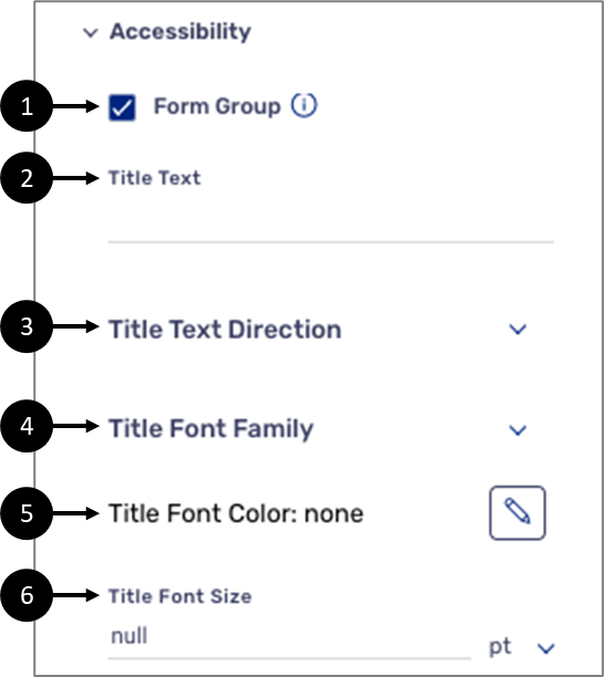
Figure 3: Container Accessibility Properties
Table 3: Container Accessibility Properties
Number | Icon | Name | Description |
1 | - | Form Group |
|
2 | - | Title Text | Enables to set the title text |
| 3 | - | Title Text Direction | Enables to set the text direction of the component:
|
| 4 | - | Title Font Family | Enables to set the font family of the title text NOTE The font family options will appear according to the selected Theme |
| 5 |
| Title Font Color | Enables to select the color of the title text NOTE The title font color is selected from a color palette or from the Theme. For additional information about Themes, see the Themes Overview article |
| 6 | - | Title Font size | Enables to select the font size of the title text |
Grid Properties
After adding the Grid component to the canvas, configure its properties and design its look. Figure 4 and Table 4 describe the properties of the Grid component:
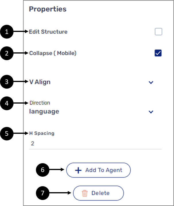
Figure 4: Grid Properties Section
Table 4: Grid Properties Section
Number | Name | Description |
1 | Edit Structure |
|
2 | Collapse (Mobile) |
|
3 | V Align | Enables to set the vertical alignment of the component:
|
| 4 | Direction | Enables to set the text direction of the component:
|
5 | H Spacing | Enables to set the horizontal spacing of the component |
6 | + Add to Agent | Enables to add the component to the Agent screen NOTE This button will only appear if the Journey Sender feature is enabled, for additional information, see the Journey Sender article |
7 | Delete | Enables to delete the component NOTE Deleting a Container component that contains other components will delete them as well Your content goes here |
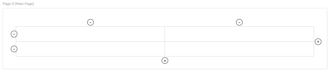
Figure 5: Editing Grid Structure
Grid - Cell Properties
You can also configure the properties of a grid cell and design its look. Figure 6 and Table 5 describe the properties of the grid cell:
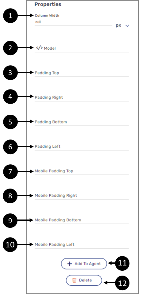
Figure 6: Grid Cell Properties Section
Table 5: Grid Cell Properties Section
Number | Icon | Name | Description |
1 | - | Column Width | Enables to set the maximum width of a column in:
NOTE
|
2 |
| Model | Not in use |
3 | - | Padding Top | Enables to add top padding to the component |
4 | - | Padding Right | Enables to add right padding to the component |
5 | - | Padding Bottom | Enables to add bottom padding to the component |
6 | - | Padding Left | Enables to add left padding to the component |
7 | - | Mobile Padding Top | Enables to add top padding to the component NOTE The padding will be effective when viewing the process on a mobile device |
| 8 | - | Mobile Padding Right | Enables to add a right padding to the component NOTE The padding will be effective when viewing the process on a mobile device |
| 9 | - | Mobile Padding Bottom | Enables to add a bottom padding to the component NOTE The padding will be effective when viewing the process on a mobile device |
10 | - | Mobile Padding Left | Enables to add a left padding to the component NOTE The padding will be effective when viewing the process on a mobile device |
11 | - | + Add to Agent | Not in use |
12 | - | Delete | Not in use |
Progress Bar
After adding the Progress Bar component configure its properties. Figure 7 and Table 6 describe the properties of the Progress Bar component:
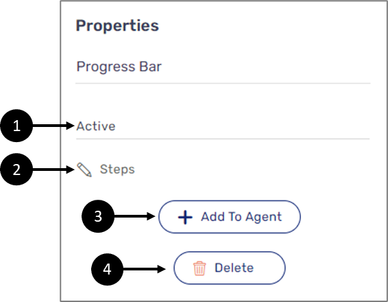
Figure 7: Progress Bar Component Properties Section
Table 6: Progress Bar Component Properties Section
Number | Icon | Name | Description |
1 | - | Active | Enables to set what is the current active Progress Bar step |
2 |
| Steps | Enables to set the steps of the Progress Bar NOTE The offset of the steps is +1 so the first step is set to 0 |
3 | - | + Add to Agent | Enables to add the component to the Agent screen NOTE This button will only appear if the Journey Sender feature is enabled, for additional information, see the Journey Sender article |
4 | - | Delete | Enables to delete the component |

Greeting Page Properties
After adding the Greeting Page component to the canvas, configure its properties, design its look, and connect it to the Model. Figure 8 and Table 7 describe the properties of the Main Page component:
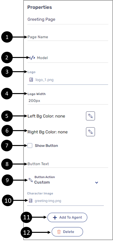
Figure 8: Greeting Page Properties Section
Table 7: Greeting Page Properties Section
Number | Icon | Name | Description |
| 1 | - | Page Name | Enables to write a name for the page |
| 2 |  | Model | Enables to connect the component to the Model by:
NOTE
|
| 3 |  | Logo | Enables to select an image file such as .jpg and .png to be a logo NOTE Image files must be added to the Theme of the Webflow before they are available for selection. For additional information about Themes, see the Themes Overview article |
| 4 | - | Logo_Width | Enables to set the width of the logo |
| 5 |  | Left_Bg_Color | Enables to set the background color of the left side of the screen NOTE The background color is selected from a color palette or from the Theme of the Webflow. For additional information about Themes, see the Themes Overview article |
| 6 | | Right_Bg_Color | Enables to set the background color of the left side of the screen NOTE The background color is selected from a color palette or from the Theme of the Webflow. For additional information about Themes, see the Themes Overview article |
| 7 | - | Show Button |
|
| 8 | - | Button Text | Enables to set the text of the button |
| 9 |  | Button_Action | Enables to set the button with a built-in action or with an action customized with code:
NOTE
|
| 10 | | Charachter_Image | Enables to select an image file such as .jpg and .png to be a background picture NOTE Image files must be added to the Theme of the Webflow before they are available for selection. For additional information about Themes, see the Themes Overview article |
| 11 | - | + Add to Agent | Enables to add the component to the Agent screen NOTE This button will only appear if the Journey Sender feature is enabled, for additional information, see the Journey Sender article |
| 12 | - | Delete | Enables to delete the component from the canvas NOTE Deleting a Greeting Page component that contains other components will delete them as well |
Thank You Page Properties
After adding the Thank You Page component to the canvas, configure its properties, design its look, and connect it to the Model. Figure 9 and Table 8 describe the properties of the Main Page component:
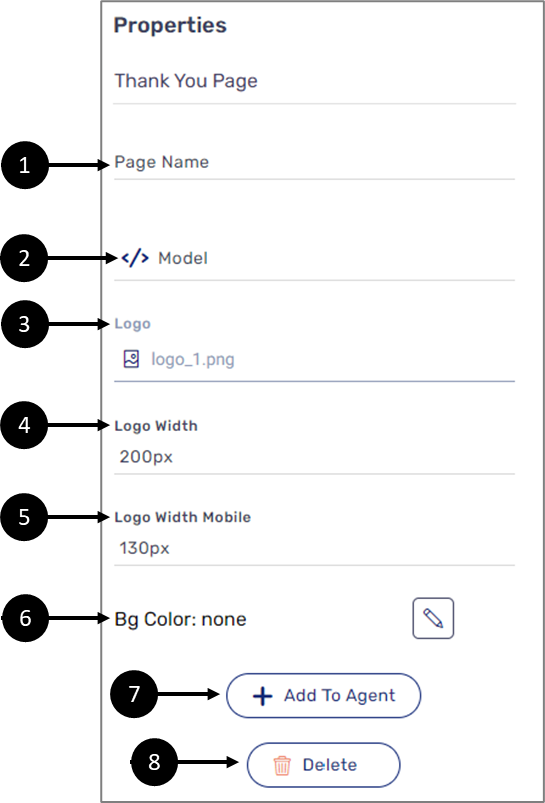
Figure 9: Thank You Page Properties Section
Table 8: Thank You Page Properties Section
Number | Icon | Name | Description |
| 1 | - | Page Name | Enables to write a name for the page |
| 2 | | Model | Enables to connect the component to the Model by:
NOTE
|
| 3 | | Logo | Enables to select an image file such as .jpg and .png to be a logo NOTE Image files must be added to the Theme of the Webflow before they are available for selection. For additional information about Themes, see the Themes Overview article |
| 4 | - | Logo_Width | Enables to set the width of the logo |
| 5 | - | Logo_Width_Mobile | Enables to set the width of the logo for mobile view |
6 | | Bg_Color | Enables to set the background color of the screen NOTE The background color is selected from a color palette or from the Theme of the Webflow. For additional information about Themes, see the Themes Overview article |
| 7 | - | + Add to Agent | Enables to add the component to the Agent screen NOTE This button will only appear if the Journey Sender feature is enabled, for additional information, see the Journey Sender article |
| 8 | - | Delete | Enables to delete the component from the canvas NOTE Deleting a Greeting Page component that contains other components will delete them as well |
Main Page Properties
After adding the Main Page component to the canvas, configure its properties, design its look, configure its form buttons, set the co-browsing option, and connect it to the Model. Figure 10 and Table 8 describe the properties of the Main Page component:
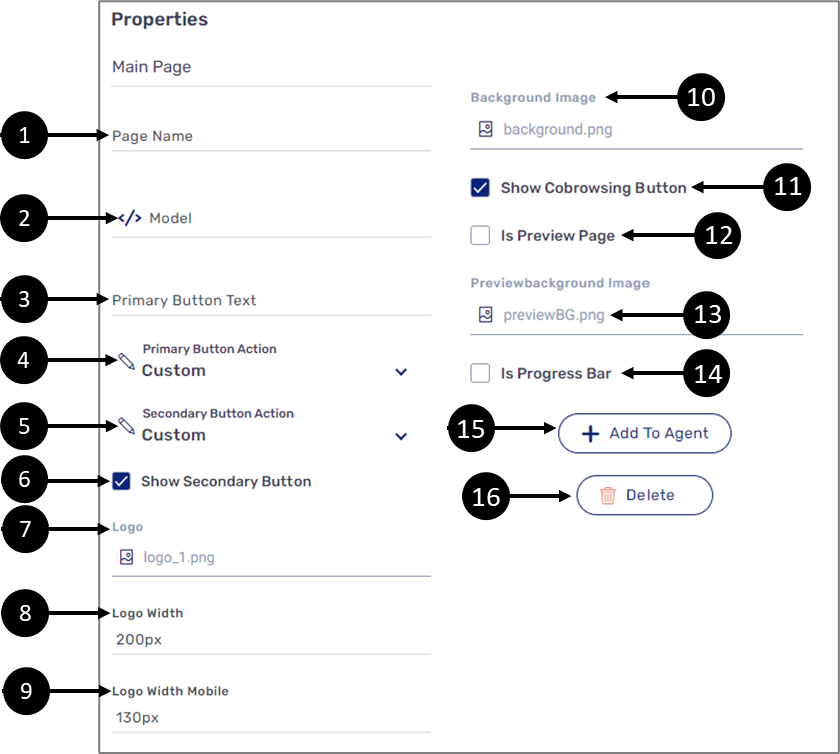
Figure 10: Main Page Properties Section
Table 8: Main Page Properties Section
Number | Icon | Name | Description |
1 | - | Page Name | Enables to write a name for the page |
| 2 | | Model | Enables to connect the component to the Model by:
NOTE
|
3 | - | Primary Button Text | Enables to set the label of the primary form button NOTE If the Primary Button Text is not set, the primary form button will not be visible |
4 |
| Primary Button Action | Enables to set the primary button with a built-in action or with an action customized with code:
NOTE
|
| 5 |  | Secondary Button Action | Enables to set the secondary button with a built-in action or with an action customized with code:
NOTE
|
6 | - | Show Secondary Button |
|
7 |
| Logo | Enables to select an image file such as .jpg and .png to be a logo NOTE Image files must be added to the Theme of the Webflow before they are available for selection. For additional information about Themes, see the Themes Overview article |
| 8 | - | Logo width | Enables to set the width of the logo |
| 9 | - | Logo width Mobile | Enables to set the width of the logo for mobile view |
| 10 | | Background Image | Enables to select an image file such as .jpg and .png to be a background picture NOTE Image files must be added to the Theme of the Webflow before they are available for selection. For additional information about Themes, see the Themes Overview article |
11 | - | Show Cobrowsing Button |
|
| 12 | - | Is Preview Page |
|
13 |
| Previewbackground Image | Enables to select an image file such as .jpg and .png to be a background picture for the preview page NOTE Image files must be added to the Theme of the Webflow before they are available for selection. For additional information about Themes, see the Themes Overview article |
14 | - | Is Progress Bar |
|
15 | - | + Add to Agent | Enables to add the component to the Agent screen NOTE This button will only appear if the Journey Sender feature is enabled, for additional information, see the Journey Sender article |
16 | - | Delete | Enables to delete the component from the canvas NOTE Deleting a Main Page component that contains other components will delete them as well |
Accordion Properties
After adding the Accordion component to the canvas, configure its properties. Figure 11 and Table 9 describe the properties of the Main Page component:
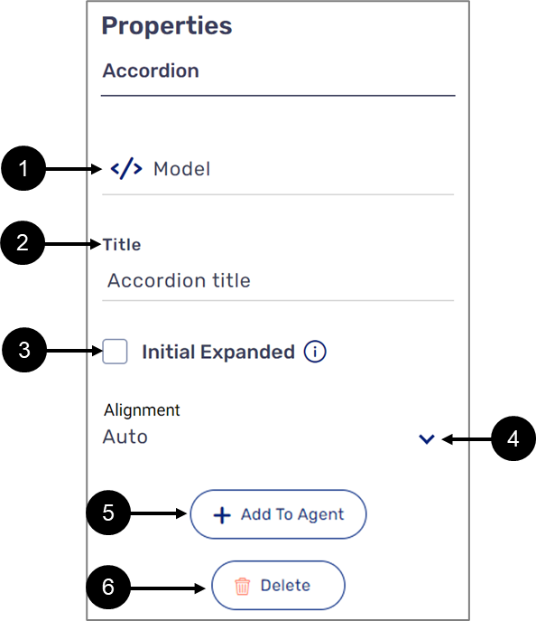
Figure 11: Main Page Properties Section
Table 9: Main Page Properties Section
Number | Icon | Name | Description |
| 1 | | Model | Enables to connect the component to the Model by:
NOTE
|
2 | - | Title | Enables to set the label of the component |
3 | - | Initial Expended |
|
| 4 | - | Alignment | Enables to set the alignment of the component:
|
5 | - | + Add to Agent | Enables to add the component to the Agent screen NOTE This button will only appear if the Journey Sender feature is enabled, for additional information, see the Journey Sender article |
6 | - | Delete | Enables to delete the component from the canvas |
How to Videos
To quickly learn how to use Container components watch the following videos.
- Container Component:
- Grid Component:
- Greeting Page:
- Main Page: