Article Overview
The following article describes the Checkbox component.
Checkbox Component
This component allows end-users to select an option by checking a box. Within a group of Checkbox components, users can choose from multiple options. Each Checkbox operates independently, allowing users to check or uncheck them separately. A Checkbox has two states that return values, which can be used for conditions:
- When checked, the returned value is true.
- When unchecked, the returned value is false.
Figure 1 displays three Checkbox components (1) on top of a Page component.
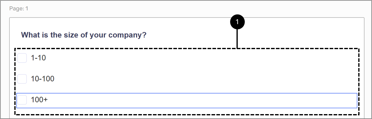
Figure 1: Checkbox Components