Article Overview
The following article describes the Autocomplete component.
Date Input Component
(See Figure 1 and Figure 2)
This component enables end-users to use different autocomplete APIs. Once the component is added to the canvas, the Autocomplete Services window appears. It contains a dropdown to select a service (1), for example, Full address by Google, and an option to enable (2) and display a validation message (3).
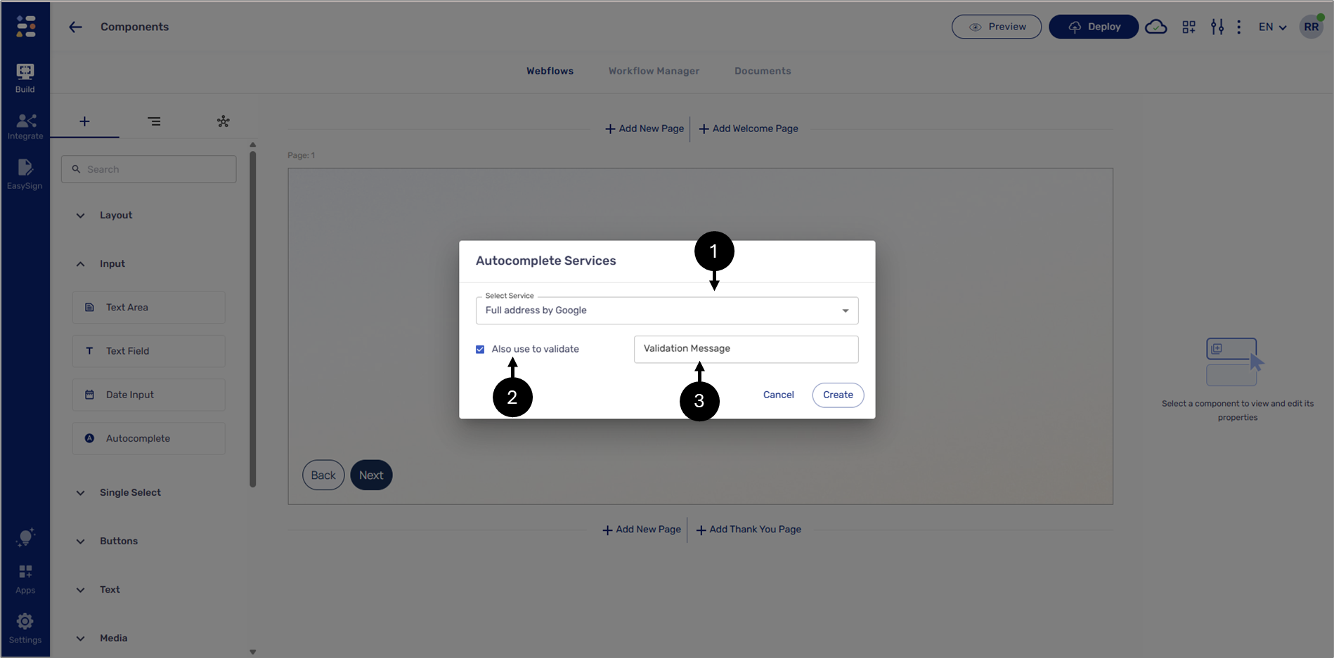
Figure 1: Autocomplete Component
When interacting with the journey, the end-user will start typing, and the API will present different options for selection.
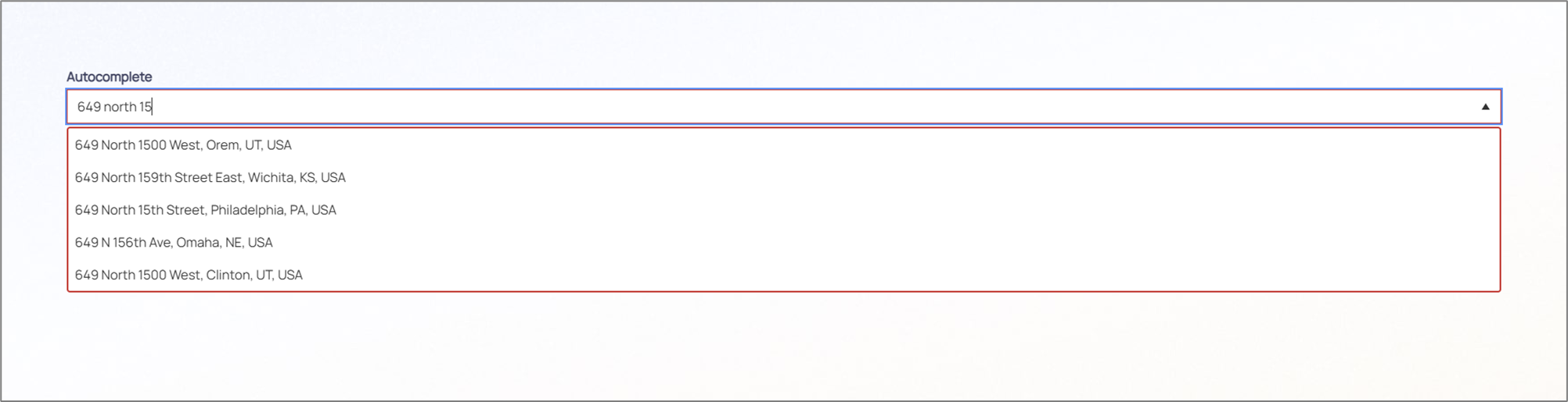
Figure 2: Autocomplete Example