Article Overview
The following article describes the structure of a Webflow.
Structure Overview
(See Figure 1)
An AI-generated Webflow is comprised of the following icons, sections, and tabs:
- Webflows tab - Displays the Webflow screen.
- Workflow Manager tab - Displays the Workflow Manager screen.
- Documents tab - Displays the Documents screen.
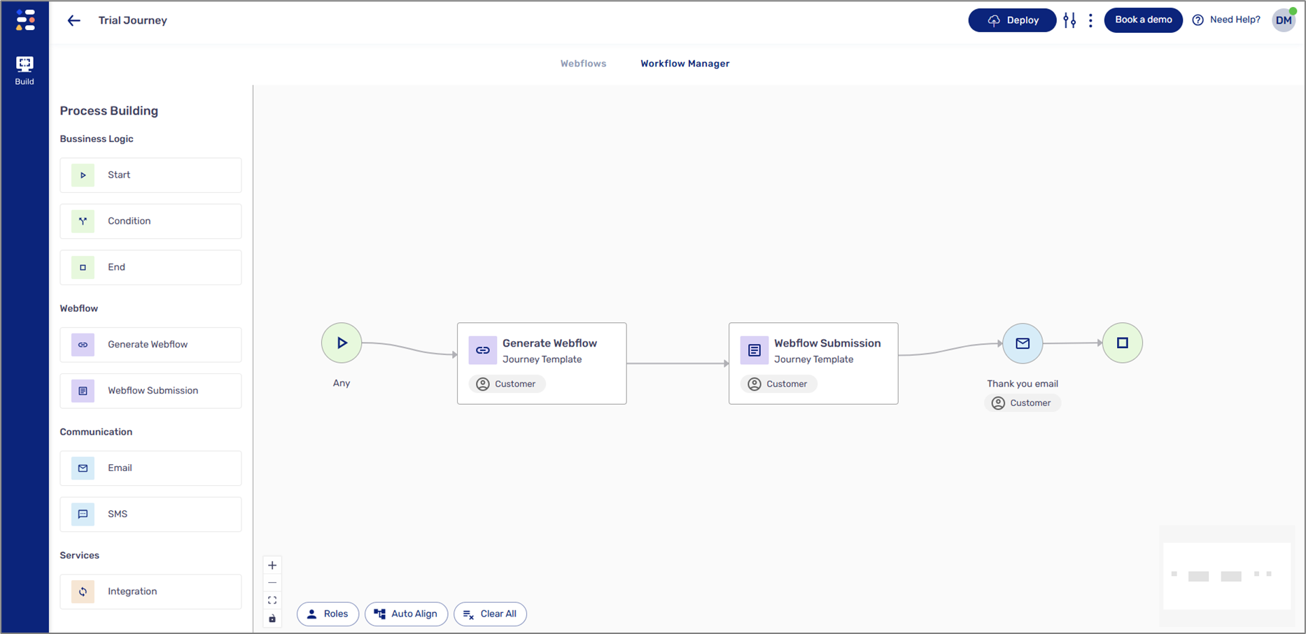
- Components
 - when this icon is clicked, the left section displays a list of components. The components are used to build the physical structure of a digital process.
- Navigator
 - when this icon is clicked, the left section displays the logical structure and hierarchy of the components that were added to the canvas.
- CRM
 - when this icon is clicked, the left section displays fields for CRM integration.
- Canvas - this section contains the added components.
- If a process is not created from scratch, the canvas will automatically contain added components.
- All components besides the page are added by drag and drop.
- Design tab - when this tab is clicked, the right section displays the Design properties of a selected component.
- Behavior tab - when this tab is clicked, the right section displays the options to add conditions and validations.
- The upper section - contains different options and buttons.
- Figure 1: Webflow Structure
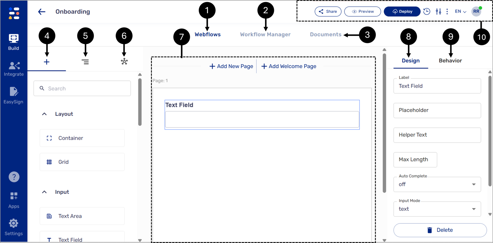
The Upper Section
(See Figure 2 and Figure 3)
The upper section allows you to access the Process Settings screen (1), where you can create roles, set a default role, select from different themes for your process, and configure your Salesforce integration. Additionally, the upper section features buttons to restore previous process versions (2), deploy (3), and view a process (4). It is also possible to share (5) a process via the Jorueny Lancher or by copying its link.
- Figure 2: Upper Section
- NOTE
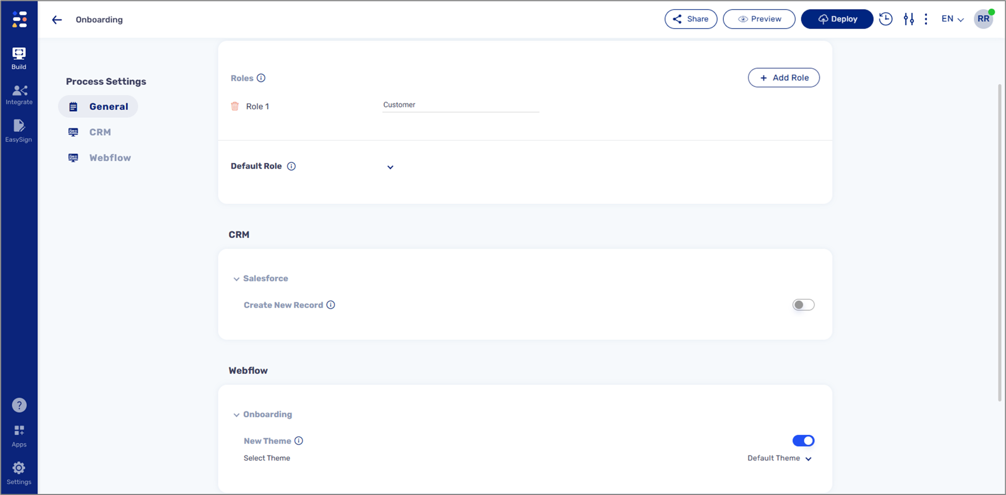
- Figure 3: Process Settings Screen
Adding/Editing/Deleting Webflows
(See Figure 4)
To add, edit, or delete a Webflow, click the Webflow dropdown (1) and select one of the options:
- Edit (2) - rename the Webflow.
- Delete (3) - remove the Webflow.
- + Add New (4) - add additional Webflow.
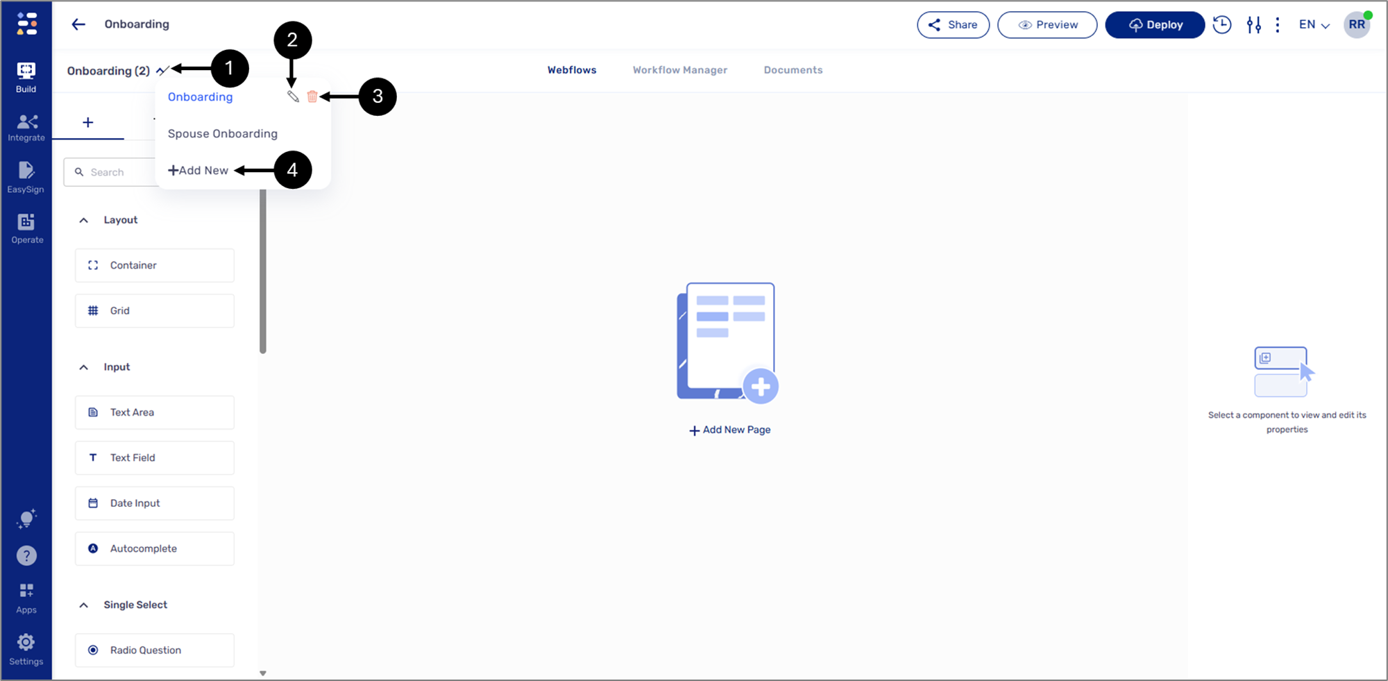
- Figure 4: Process Link
Deploy and Preview
(See Figure 5)
Deployment and preview refer to the process of publishing a digital process. They can be performed at various stages of development - for example, a user may deploy and preview the process for quality assurance testing or when it’s ready to be shared with the world. When a deployment process ends, it will display an indicator:
- Successful deployment

- The deployment process failed with errors

- The deployment process passed, but with warnings

After a successful deployment, a link to the process becomes available for copying and pasting.
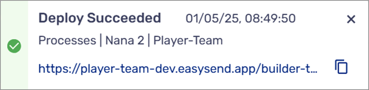
- Figure 5: Successful Deployment
Warnings and Errors System Logic
The deployment process may produce warnings and/or errors in case something goes wrong. Figure 6 describes the warnings and errors system logic: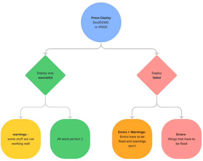
Figure 6: Warnings and Errors System Logic
Deployment Warnings
(See Figure 7)
Deployment warnings appear only when deploying a process to a dev environment, and there is an incorrect setup in one of the modules, such as Webflow, Model, PDF, and Workflow Manager. For example, a component is linked to a data item from the model that no longer exists. Warnings do not prevent the process from being deployed, but the process might not work well. Clicking the warnings indicator (1) opens a pop-up window that displays the deployment status. For additional information, see the Viewing and Resolving Warnings and Errors section.
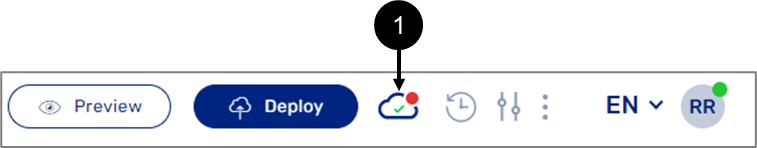
Figure 7: Warnings Indicator
Viewing a Digital Process with Warnings
(See Figure 8)
As mentioned above, a digital process deployed to a dev environment can still be viewed even if warnings were discovered and have not been resolved yet. When viewing a digital process with warnings, the following message will appear:
Figure 8: Viewed Digital Process with Warnings
Deployment Errors
(See Figure 9)
Deployment errors appear when deploying a digital process to a dev or a PROD environment, and the system discovers failures that prevent the deployment process from finishing, for example, a Preview component is not connected to a PDF form. Clicking the error indicator (1) opens a pop-up window that displays the deployment status. For additional information, see the Viewing and Resolving Warnings and Errors section.
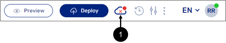
Figure 9: Errors Indicator
Viewing and Resolving Warnings and Errors
When warnings or errors occur, clicking the indicators will open a pop-up window that displays the deployment status. There are four types of deployment messages (see Figure 10 to Figure 13):
- Deployment Succeeded:
Figure 10: Deployment Succeeded
- Deployment Succeeded with warnings to resolve:
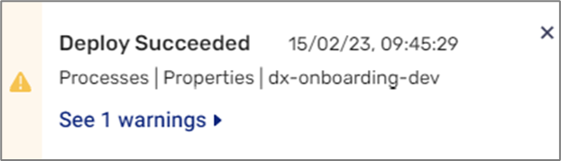
Figure 11: Deployment Succeeded with Warnings to Resolve
- Deployment failed with errors:
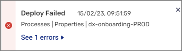
Figure 12: Deployment Failed with Errors
- Deployment Failed with Warnings/Errors:
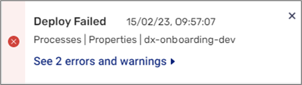
Figure 13: Deployment Failed with Warnings/Errors
A deployment message contains the following information (see Figure 14):
- Timestamp (1) - the exact time and date of deployment.
- Deployment information (2).
- Warnings/errors (3) - displays the number of deployment warnings/errors or an indication that all the warnings and errors were resolved.
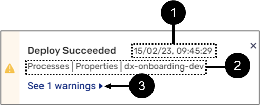
Figure 14: Deployment Message Information
When clicking the number of deployment warnings/errors (3), the Fixing mode window appears.
Go to Item
(See Figure 15)
To locate the source of a warning or error, click Go to Item to navigate directly to it.
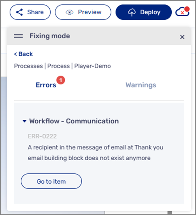
Figure 15: Go to item
Sharing a Process
(See Figure 16)
The Share button enables you to share a process via the Journey Launcher or by copying its link. Please note that you must deploy the process first.
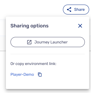
Figure 16: Share Options
NOTE
To learn more about the Journey Launcher, click here.